
- Tips & Tricks
- PowerPoint Templates
- Training Programs
- Free E-Courses

How to Summarize Presentations
Home > How To Present > How to Summarize
Does your audience seem lost during your long presentation? You can see this happening when you ask them to recall a point and they look blank.
Do they find it difficult to put your information in context?
Chances are you may not be summarizing your points frequently enough. We will see how you can summarize your presentation effectively to enhance audience retention.
Let’s start by asking a simple question:
When should you summarize your presentation?
Did I hear you saying, “Towards the end”?
Wrong! You would’ve lost your audience by then.
An effective presentation habit is to summarize at the end of every major point. It’s all the more important to do so, if your presentation is long and content-rich.
The logic behind summarizing your points:
Do you remember building a tower with playing cards when you were a child? Every time you added a new card on top, you carefully adjusted and aligned all the other cards under it. It helped you build a tall and stable tower.
The principle applies to your presentations as well. Every new point puts a strain on memory of what was covered earlier. Unless you summarize periodically, your audience can’t remember your points beyond a point (pun intended).
How to summarize your presentation in a structured way?

This simple structure allows you to refresh the memory of your audience periodically. It helps your audience to place new information in the right context. It lays the foundation for an effective ‘call to action’. Remember, the call to action and WIIFM has been set right at the start.
Example of an effective presentation summary:
A good summary is short and quick. Here is an example of a sales presentation summary:
“I understood that your main requirements in choosing a home loan are – interest rates, long tenure and high loan amount. So far, we saw how our scheme offers you a highly competitive rate and the longest tenure for your age. Now, we’ll talk about loan amount.”
This summary gives you a chance to showcase your main benefits over and over again- in a reassuring way. It maximizes your opportunity to win business in a sales presentation.
Some creative ways to summarize your presentations:
Here are 3 creative ways to summarize your presentations.
1. Use a quiz format to summarize a training presentation:
There can be many variations to this. Some presenters choose to show just the title and ask the participants to recollect the content. Some choose to use fill in the blanks format or true/false format to test the memory. Whichever way you choose, summarize your training presentations frequently.
We have found Quizzes to be an extremely effective way to summarize in a training. That is why we put together 45 different types of PowerPoint Quiz templates in a pack. Just select the type of quiz and add your questions. You can find out more about the Quiz pack and download it here:
2. Use a mid-session Q & A to summarize your business presentation:
We’ve seen presenters disguise their summary like – “We’ve covered Point A, Point B, and Point C – are there any questions in what we’ve covered so far?”
This helps them recollect their main benefits without sounding repetitive or pushy.
3. Repeat some key images and terms from earlier points to serve as memory hook:
Repeating images and key terms on your slides help you recount your points automatically. So, constantly referring to your earlier segments is a useful practice.
Finally, to summarize this article on ‘How to Summarize’ your presentation…
- Summarize at the end of every major point.
- Use your agenda slide to serve as guidepost.
- Let your summary be quick and short
- Explore creative ways to recall your key points
Return to: How to Present Main Page
Return to Top of How to Summarize Page
Share these tips & tutorials
Get 25 creative powerpoint ideas mini course & members-only tips & offers. sign up for free below:.
How to Summarize a PowerPoint Presentation: A Step-by-Step Guide
Summarizing a PowerPoint presentation is a skill that can come in handy in various situations. Maybe you’ve just watched a colleague’s presentation and need to report back to your team, or perhaps you’re studying for an exam and want to condense the material. To summarize a PowerPoint effectively, you’ll need to identify the key points, understand the presentation’s purpose, and distill the information into a concise format. By mastering these steps, you’ll be able to communicate the essence of any presentation to your audience efficiently.
Once you’ve summarized the PowerPoint presentation, you’ll have a handy reference that captures the main ideas and supporting details without the fluff. This summary can serve as a study aid, a quick refresher, or a tool to brief others who may not have the time to go through the entire presentation.
Introduction
Let’s face it, sitting through a lengthy PowerPoint presentation can sometimes feel like a chore, especially when all you need are the highlights. Maybe you’re a busy professional with back-to-back meetings, a student juggling multiple assignments, or just someone who values efficiency. Whatever the case, being able to summarize a PowerPoint presentation is a valuable skill that can save you time and keep you informed.
Why is this ability so important? For starters, it helps you to quickly sift through information and focus on what’s essential. In our fast-paced world, time is of the essence, and being able to distill a lengthy presentation into a few key points can be a game-changer. Moreover, it’s not only about personal convenience; summarizing skills are crucial when you have to convey the gist of a presentation to others. Whether you’re briefing a colleague, preparing notes for a study group, or delivering a report to a client, a well-crafted summary can make all the difference. So, let’s dive into the how-to of summarizing a PowerPoint presentation, shall we?
Step by Step Tutorial: How to Summarize a PowerPoint Presentation
Before we jump into the steps, let’s establish what we’re aiming for. A good summary of a PowerPoint presentation should capture the main ideas, the supporting details, and the presenter’s intended message, all while being brief and easy to understand.
Step 1: Review the Entire Presentation
Start by going through the entire PowerPoint presentation.
Reviewing the presentation in its entirety allows you to get a sense of the overall flow and the key themes. Pay attention to the title slides and the concluding slides, as they often contain the main message and summary points.
Step 2: Identify the Key Points
Look for the main ideas in each slide.
Each slide usually focuses on a single main idea. Look for bullet points, bolded text, or headings as clues to what the presenter considers important. Make note of these points as they will form the backbone of your summary.
Step 3: Understand the Purpose
Determine the purpose of the presentation.
Understanding why the presentation was created helps to frame your summary. Was it to inform, persuade, or instruct? Knowing the intent will guide you in deciding what details are crucial for your summary.
Step 4: Condense the Information
- Condense the information into a concise format.
Now that you have the key points and the purpose, start writing your summary. Aim to express the ideas as simply and clearly as possible, without losing the original meaning. If a slide’s content can be said in one sentence instead of three, do it.
Step 5: Review and Edit
Review your summary and refine it.
Go through your summary to ensure it’s coherent and that it accurately reflects the presentation’s content and purpose. Edit out any redundancies or unclear statements.
Additional Information
When summarizing a PowerPoint presentation, it’s essential to keep the audience in mind. Who will be reading your summary? What do they need to know? Tailoring the summary to the needs of your audience can make it more effective. Additionally, consider using visual aids from the original presentation, such as charts or graphs, if they help illustrate a point more clearly.
Remember, a good summary is not just a list of points but a coherent mini-version of the presentation. It should flow logically and be engaging to read. Lastly, practice makes perfect. The more you practice summarizing presentations, the better you’ll become at capturing the essence of the content. So next time you sit through a PowerPoint, why not give it a try?
- Review the entire PowerPoint presentation.
- Identify the key points in each slide.
- Understand the purpose of the presentation.
- Review and edit your summary.
Frequently Asked Questions
What if the powerpoint presentation is very long.
Start by breaking it down into sections, and summarize each section before attempting to summarize the whole presentation. This will make the task more manageable.
Can I include quotes from the presentation in my summary?
Yes, but use them sparingly and only if they emphasize a key point effectively.
Should I use the same slide titles in my summary?
You can, but it’s not necessary. The aim is to capture the main ideas, not to replicate the presentation’s structure.
Is it okay to leave out examples used in the presentation?
If the examples are used to illustrate key points, briefly mention them. Otherwise, focus on the main ideas and leave out specific examples.
How long should my summary be?
There’s no one-size-fits-all answer, but a good rule of thumb is to make it as brief as possible while still covering all key points.
Summarizing a PowerPoint presentation is an art and a skill that can be honed with practice. Whether you’re a student, a professional, or simply someone who values brevity, being able to condense information efficiently is incredibly valuable. Remember, the goal is to capture the essence of the presentation, not to replicate it.
Use your judgment to determine what’s essential and what can be left out. With the steps and tips outlined in this article, you’re well on your way to becoming an expert summarizer. So next time you’re faced with a lengthy presentation, don’t despair. Embrace the challenge and flex those summarizing muscles!

Matthew Burleigh has been writing tech tutorials since 2008. His writing has appeared on dozens of different websites and been read over 50 million times.
After receiving his Bachelor’s and Master’s degrees in Computer Science he spent several years working in IT management for small businesses. However, he now works full time writing content online and creating websites.
His main writing topics include iPhones, Microsoft Office, Google Apps, Android, and Photoshop, but he has also written about many other tech topics as well.
Read his full bio here.
Share this:
Join our free newsletter.
Featured guides and deals
You may opt out at any time. Read our Privacy Policy
Related posts:
- How to Set Time for Slides in Powerpoint
- How to Save Powerpoint as PDF with Notes
- How to Add Page Numbers in Powerpoint 2010
- How to Loop a Slideshow on Powerpoint 2013
- How to Delete a Slide in Powerpoint 2010
- How to Unhide a Slide in Powerpoint 2013
- How to End Powerpoint on Last Slide in Powerpoint 2010
- How to Hide a Slide in Powerpoint 2010
- How to Make a Powerpoint Slide Vertical in Powerpoint 2013
- How to Rotate a Slide in PowerPoint: A Step-by-Step Guide
- How to Change Hyperlink Color in Powerpoint 2010 (An Easy 5 Step Guide)
- How Is Microsoft PowerPoint Used in Business: A Comprehensive Guide
- How to Drag Slides From One PowerPoint to Another: A Step-by-Step Guide
- How to Duplicate a Slide in Powerpoint 2010
- How to Insert Slides from Another Presentation in Powerpoint 2010
- How to Copy a PowerPoint to a New PowerPoint: A Step-by-Step Guide
- How to: Effortlessly Create PowerPoint Looping Presentations
- How to Embed a GIF in PowerPoint: A Step-by-Step Guide
- How to Insert Clipart in PowerPoint: A Step-by-Step Guide
- How to Hide a Selected Slide in Powerpoint 2013
Home Blog Business Executive Summary: A Guide to Writing and Presentation
Executive Summary: A Guide to Writing and Presentation

Executive summaries precede nearly every type of business document. Despite being the shortest part, they often leave the biggest impression on the reader. Yet, many writers choose to treat an executive summary as an afterthought. (And some presenters too!). Why? Because writing an executive summary is a seemingly hard task. But our mission is to prove otherwise!
What is an Executive Summary?
An executive summary is a preface to a larger business document such as an annual report, business plan, or whitepaper, succinctly summarizing the key discussion points. Effectively, an executive summary offers a preview of the content, so that the reader could form a baseline opinion about the contents prior to diving into a deep reading session.

The University of Arizona offers a more elaborated executive summary definition which also notes that an executive summary should:
- Restate the purpose of the follow-up document
- Highlight the key discussion points and most notable facts
- Relay any notable results, conclusions, or recommendations
Though an executive summary is just a foreword to a bigger report, it’s one of the most labor-intensive items as you have to condense a lot of information into a high-level summary. Oftentimes, an executive summary also gets prominent placement in the follow-up presentation, done on the report.
Executive Summary Examples
Nearly every type of business document will have an executive summary. Some are better structured and presented than others. But it’s not just limited to business documents. Executive summaries are also used in scientific projects, articles, and education. Below are several admirable executive summary examples you may want to use as an inspiration for writing.
Accenture: Gaming: The Next Super Platform

This executive summary for an industry report opens with some big quantifiable claims, clearly communicating the main agenda — describing the size and state of the global gaming market. The gaming industry is a huge market. The pullout texts on the sidebar further detail the scope of the document. Plus clarify for whom this report is intended.
IBM: Cost of a Data Breach Report 2020

IBM conducts an annual joint report on cybersecurity with Ponemon Institute. They open the executive summary with a brief recap of their mission and past research. Then dwell on this year’s findings and methodology. If you are writing an executive summary for a similarly massive original research, it’s worth focusing more on your techniques for obtaining data and arriving at the conclusions as IBM did.
Deloitte Digital: Exploring the value of emotion-driven engagement

Deloitte selected a more narrative style for this executive summary, mixing some key data points and methodology with the core messaging of the report. This is a good example of structured data presentation . On one hand, you have an engaging narration flow. On the other, the summary covers all the important discussion points.
Executive Summary Format
As the above executive summary examples illustrated, there is no one fit-it-all format for writing an executive study. The best approach depends on your report type, purpose, and contents.
That being said, an executive summary needs to fulfill several earlier mentioned criteria — offer a preview, provide key information at glance, showcase any results, recommendations. That’s what most readers expect to see on the first page after all.
The easiest way to approach writing is to draft a preliminary executive summary outline featuring the following subsections:
- General introduction, explaining the key problems discussed
- Main problem statement(s)
- Selected findings or recommendations
- The importance of discussed points
Since you’d also be likely working on presenting the executive summary to other stakeholders , it helps you keep the above structured as bullet points at first. So that you could easily transfer the main ideas to your executive summary PowerPoint slide .
How Long Should an Executive Summary Be?
As a rule of thumb, an executive summary should not go longer than one vertical page. That is an equivalent of 300-500 words, depending on the typeface. For longer reports, two pages (a horizontal split) may be acceptable. But remember, brevity is key. You are working on a trailer for a movie (the full report).
How to Write an Executive Summary: a 3-Step Framework
You can start with the aforementioned loose format and then adapt it to your document type. Remember, you don’t need to follow all the recommendations to a T. Instead, mix some ideas to make your executive summary sound both professional and engaging. Here are several tips for that:

1. Start with a Problem Statement
Think of the first paragraph as if of an opening slide for a presentation : you need to make a big compelling statement that immediately communicates your agenda. Set the scene for the reader. There are several ways to do so:
- Answer the “why now” question in the opening paragraph
- Address the urgency of the matter
- Highlight the importance of the discussed issue
Alternatively, you can also go for a more traditional opening and explain the background of the research and discussed issue. For example, if you have conducted a go-to-market strategy evaluation for the team you can start by saying that “This report analyzed online furniture brand performance in 5 target EMEA markets in terms of market share, local brand recall, brand preference, and estimated online sales volumes.” Afterward, briefly communicate the main aim of the report.
2. Present the Main Discussion Points
Next, flesh out what’s included in the scope of this report to properly manage the reader’s expectations. You can use the report’s section subheads as key discussion points or come up with snappier, more descriptive statements.
Here are several good writing practices to follow:
- Use bullet points and numbered lists to break down text blocks.
- Quantify the biggest findings when possible. Style them as “call-outs”.
- Mention the limitations of your report and what it does not account for.
- Discuss the used research methods and data sources.
Finally, summarize the findings in one concluding paragraph if you have space. Or style it as a featured quote to draw the reader’s eye towards crucial information.
3. List the Recommendations or Next Steps
The bottom part of the page, around 100-150 words should be allocated towards underlining the results, conclusions, and follow-up action expected from the reader. Summarize what you have found during the course of your research. Mention if you have identified any specific type of solution or a type of recommended action.
Once you are done, send over an executive summary draft to a team member who hasn’t seen the complete report. Ask for their feedback. Can they tell what the report content is after reading the summary? Does the summary intrigue them? Is it descriptive enough for someone without any other context into the matter? Use the critique to further improve the document.

How to Prepare an Executive Summary Presentation
High chances are that you’ll also be asked to write the copy for the executive summary presentation, and perhaps even design it too. So let’s get you up to speed on this aspect as well.
How Does an Executive Summary Slide Look Like in PPT?
There’s no ultimate look for an executive summary slide as most presenters customize it to best reflect the content they’d want to showcase. But if you want some universal example, here’s our executive summary slide template :

You can build an entire slide deck tailored for an executive summary or business presentation by using our AI Presentation Maker . Fill the topic, analyze & edit the proposed outline, and select a design. That’s it! You can create an engaging executive summary slide deck with any number of slides.
What Makes a Good Executive Summary Slide?
A good executive summary slide visually communicates all the important information from the full report. Typically, it’s an even more condensed version of the written executive summary, prefacing the document. Thus to create a good executive summary slide, be prepared to do some ruthless editing.
Include a condensed version of the:
- Main problem statement or report agenda
- Key findings. Prioritize quantifiable ones
- Recommendations and next steps.
Also, you will need some PowerPoint design mastery to ensure that an executive summary in your PowerPoint presentation looks compelling, but not cluttered. Prioritize white space. Here is where a good executive summary template can make your life easier. To minimize the number of texts, add icons and other simple visualizations. Trim headers and subheads to give the slide even more breathing room.
For those looking to create an engaging and visually appealing presentation, consider utilizing professional presentation templates to enhance the visuals of your executive summary slide. These templates are specifically designed to help presenters convey their message effectively and with style, ensuring that your audience remains captivated and fully understands the key points of your report.
How to Write an Executive Summary for a Presentation
Most likely you won’t need to write a brand new copy for this slide, but rather adapt the text at hand. That already makes your job a lot easier when summarizing a presentation into an executive summary slide. Still, you don’t want to mess anything up. So stick with the executive summary template you’ve chosen and fill in the gaps using our tips.
1. Keep the Tone Consistent
Use the same tone of voice and word choices in your slide deck as you’ve adopted in the report. If the tone of your presentation speech differs too much with terms used on the slide and in the report copy, some audience members may get confused, and then disengaged.
2. Focus on Telling a Story
Stakeholders will have the extra time to read the “dry” report. During the presentation, your main goal is to draw their attention to the most important issue, showcase the value-packed inside the report, and make them eager to learn more by actually flipping the full copy afterward.
3. Chop Full Sentences into Bullet Points
Go snappy and present information in a snackable manner. Remember, our brain can only keep 3-5 items at once in the working memory. So you shouldn’t try to overload the audience with a long list of “very important points” in one sitting.
Also, per a recent presentation survey, among the 3 things that annoy audiences most about presentations are slides that include full sentences of text. So, when working on your presentation summary slide, trim those lengthy texts and move on some of the other points to separate slides.
4. Don’t Go Data Galore
Including numbers and data visualizations is a great way to present your executive summary. However, overloading your data slides with data nuggets makes your presentation less impactful.
As presentation design expert Nancy Duarte explains :
“Data slides aren’t really about the data. They’re about the meaning of the data. It’s up to you to make that meaning clear before you click away. Otherwise, the audience won’t process — let alone buy — your argument.”
It’s a good idea to spotlight 3 main data points on your executive summary slide. Then use some extra minutes to comment on why you’ve chosen to present these.
To Conclude
An executive summary is the first page and/or slide a reader will see. That’s why the stakes are high to make it look just right. Granted, that shouldn’t be an issue. Since you now know how to write, design, and present a compelling executive summary to others!
1. Project Summary PowerPoint Template

Use This Template
2. Simple Executive Summary Slide Template for PowerPoint

3. One Page Strategy Summary PowerPoint Template

4. Executive Summary PowerPoint Template

5. Executive Business PowerPoint Template

Like this article? Please share
Executive Reports, Executive Summary Filed under Business
Related Articles

Filed under Business • August 31st, 2023
How to Build a Project Status Report Template: Complete Guide
Project status reports provide timely insights into project progress. Here are practical tips and a one-pager template for concise updates.

Filed under Business • October 25th, 2022
Business Presentation: The Ultimate Guide to Making Powerful Presentations (+ Examples)
A business presentation is a purpose-led summary of key information about your company’s plans, products, or practices, designed for either internal or external audiences. This guide teaches you how to design and deliver excellent business presentations. Plus, breaks down some best practices from business presentation examples by popular companies.

Filed under Business • October 7th, 2022
Consulting Report: How to Write and Present One
Consultants have many tools of the trade at their disposal: Frameworks, analytics dashboards, data science models, and more. Yet many clients still expect to receive a narrated consulting report. So how do you write one? This guide will show you.
Leave a Reply
How To Summarize A Presentation
- Success Team
- December 14, 2022
Top-Rated AI Meeting Assistant With Incredible ChatGPT & Qualitative Data Analysis Capabilities
Join 150,000+ individuals and teams who rely on speak ai to capture and analyze unstructured language data for valuable insights. streamline your workflows, unlock new revenue streams and keep doing what you love..
Get a 7-day fully-featured trial!
Presentations are a great way to share information and ideas with an audience. But when you’re done presenting, it’s important to summarize the key points and takeaways. Summarizing a presentation is a crucial step in ensuring that your audience has a clear understanding of the information you shared.
Why Summarizing Is Important
Summarizing a presentation is important for a few reasons. First, it helps to reinforce the key points and takeaways that you want your audience to remember. Second, it helps to ensure that your audience understands the information you shared. Third, it helps to ensure that everyone is on the same page and that everyone has the same understanding of the information. Finally, summarizing a presentation helps to provide closure and helps to ensure that everyone leaves with a clear understanding of the information you shared.
Tips For Summarizing A Presentation
Summarizing a presentation can be a challenge, but there are a few tips that can help make it easier.
1. Identify The Main Points
The first step in summarizing a presentation is to identify the main points. Take a few moments to review the presentation and identify the key points and takeaways. This will help you to ensure that you don’t miss any important information.
2. Use Simple Language
When summarizing a presentation, it’s important to use simple language. Avoid using jargon or technical terms that your audience may not understand. Instead, use language that is easy to understand and that everyone can follow.
3. Focus On The Big Picture
When summarizing a presentation, it’s important to focus on the big picture. Don’t get bogged down in the details. Instead, focus on the main points and takeaways that you want your audience to remember.
4. Ask Questions
Asking questions is a great way to ensure that everyone understands the information. Ask questions to make sure that everyone is on the same page and that everyone has the same understanding of the information.
5. Provide Examples
Providing examples is a great way to help your audience understand the information. Examples can help to illustrate the main points and takeaways and can help to ensure that everyone has a clear understanding of the information.
6. Use Visual Aids
Using visual aids is a great way to help your audience understand the information. Visual aids can help to illustrate the main points and takeaways and can help to ensure that everyone has a clear understanding of the information.
7. Give A Summary
Finally, give a summary of the presentation. This will help to reinforce the key points and takeaways and will help to ensure that everyone has a clear understanding of the information.
Summarizing a presentation is an important step in ensuring that your audience has a clear understanding of the information you shared. By following the tips outlined above, you can ensure that your audience has a clear understanding of the information you shared and that everyone is on the same page.
How To Summarize A Presentation With Speak
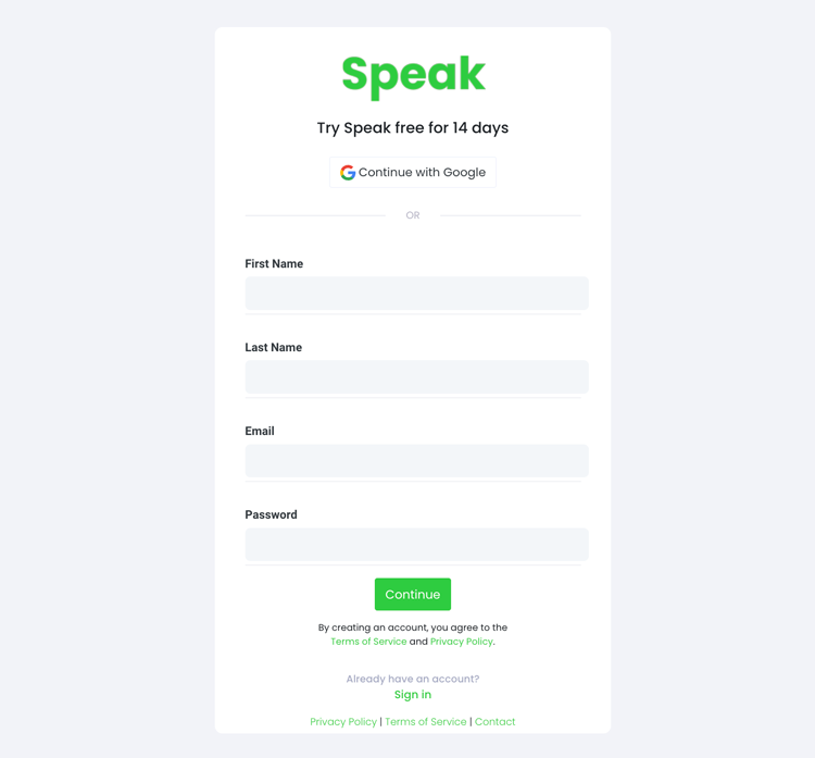
Step 1: Create Your Speak Account
To start your transcription and analysis, you first need to create a Speak account . No worries, this is super easy to do!
Get a 7-day trial with 30 minutes of free English audio and video transcription included when you sign up for Speak.
To sign up for Speak and start using Speak Magic Prompts, visit the Speak app register page here .
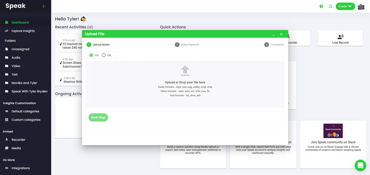
Step 2: Upload Your Language Data
We typically recommend MP4s for video or MP3s for audio.
However, we accept a range of audio, video and text file types.
You can upload your file for transcription in several ways using Speak:
Accepted Audio File Types
Accepted video file types, accepted text file types, csv imports.
You can also upload CSVs of text files or audio and video files. You can learn more about CSV uploads and download Speak-compatible CSVs here .
With the CSVs, you can upload anything from dozens of YouTube videos to thousands of Interview Data.
Publicly Available URLs
You can also upload media to Speak through a publicly available URL.
As long as the file type extension is available at the end of the URL you will have no problem importing your recording for automatic transcription and analysis.
YouTube URLs
Speak is compatible with YouTube videos. All you have to do is copy the URL of the YouTube video (for example, https://www.youtube.com/watch?v=qKfcLcHeivc ).
Speak will automatically find the file, calculate the length, and import the video.
If using YouTube videos, please make sure you use the full link and not the shortened YouTube snippet. Additionally, make sure you remove the channel name from the URL.
Speak Integrations
As mentioned, Speak also contains a range of integrations for Zoom , Zapier , Vimeo and more that will help you automatically transcribe your media.
This library of integrations continues to grow! Have a request? Feel encouraged to send us a message.
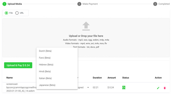
Step 3: Calculate and Pay the Total Automatically
Once you have your file(s) ready and load it into Speak, it will automatically calculate the total cost (you get 30 minutes of audio and video free in the 7-day trial - take advantage of it!).
If you are uploading text data into Speak, you do not currently have to pay any cost. Only the Speak Magic Prompts analysis would create a fee which will be detailed below.
Once you go over your 30 minutes or need to use Speak Magic Prompts, you can pay by subscribing to a personalized plan using our real-time calculator .
You can also add a balance or pay for uploads and analysis without a plan using your credit card .
Step 4: Wait for Speak to Analyze Your Language Data
If you are uploading audio and video, our automated transcription software will prepare your transcript quickly. Once completed, you will get an email notification that your transcript is complete. That email will contain a link back to the file so you can access the interactive media player with the transcript, analysis, and export formats ready for you.
If you are importing CSVs or uploading text files Speak will generally analyze the information much more quickly.
Step 5: Visit Your File Or Folder
Speak is capable of analyzing both individual files and entire folders of data.
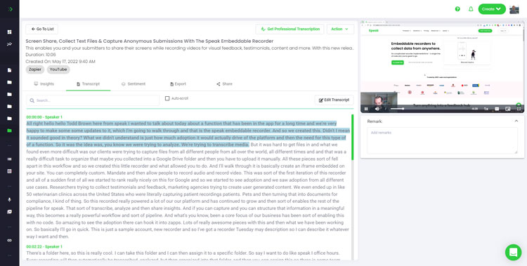
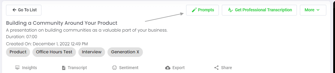
When you are viewing any individual file in Speak, all you have to do is click on the "Prompts" button.
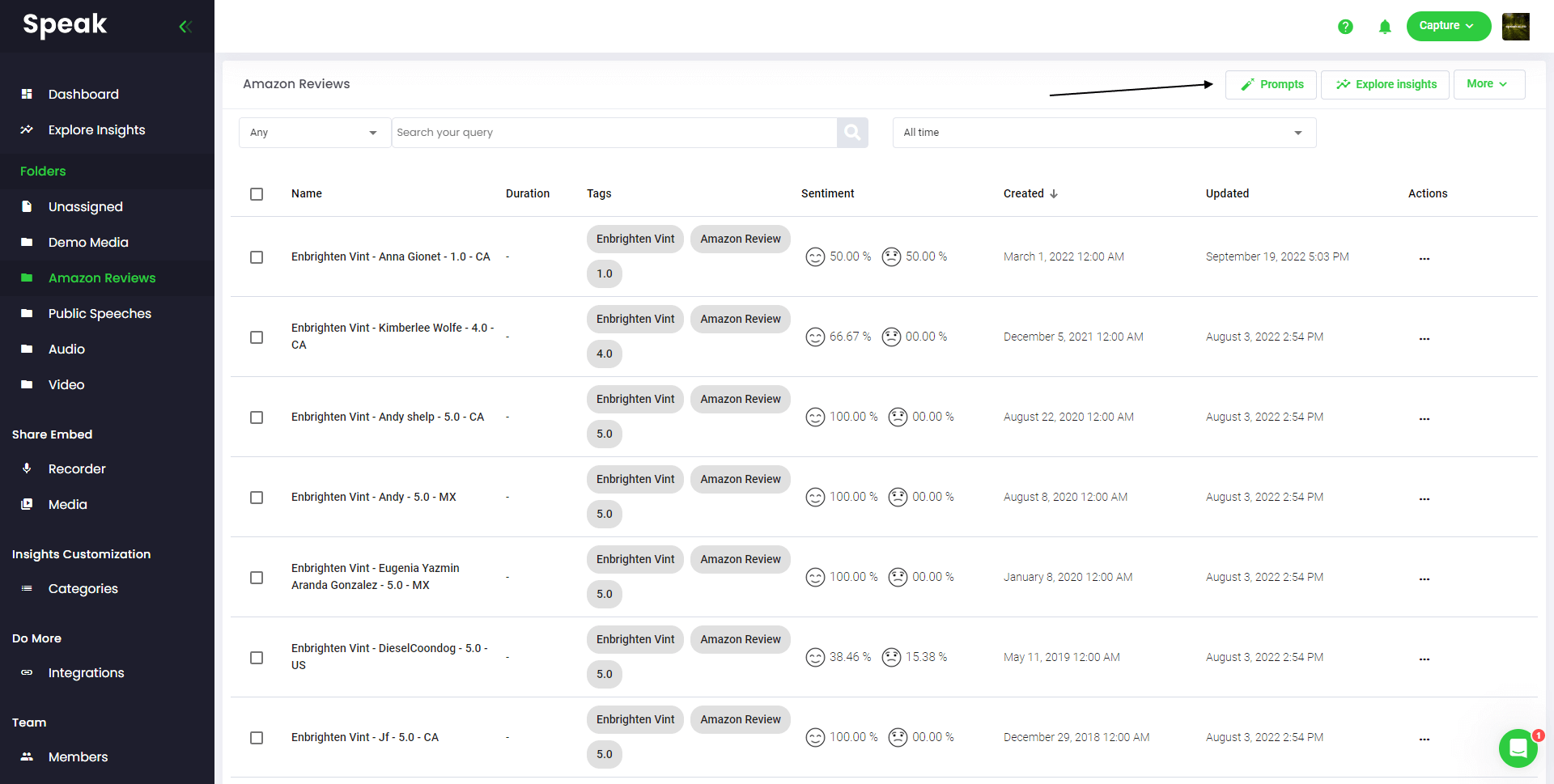
If you want to analyze many files, all you have to do is add the files you want to analyze into a folder within Speak.
You can do that by adding new files into Speak or you can organize your current files into your desired folder with the software's easy editing functionality.
Step 6: Select Speak Magic Prompts To Analyze Your Data
What are magic prompts.
Speak Magic Prompts leverage innovation in artificial intelligence models often referred to as "generative AI".
These models have analyzed huge amounts of data from across the internet to gain an understanding of language.
With that understanding, these "large language models" are capable of performing mind-bending tasks!
With Speak Magic Prompts, you can now perform those tasks on the audio, video and text data in your Speak account.
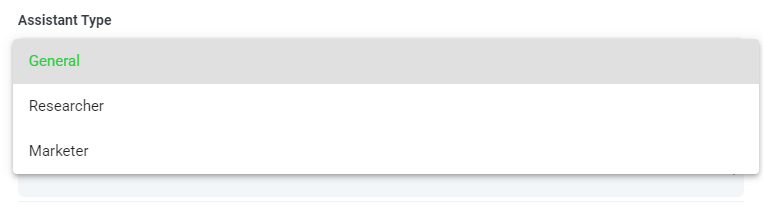
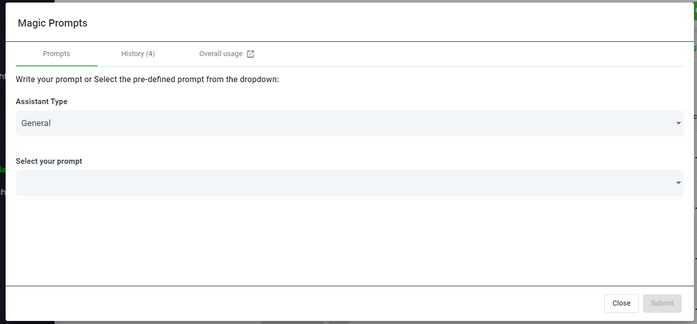
Step 7: Select Your Assistant Type
To help you get better results from Speak Magic Prompts, Speak has introduced "Assistant Type".
These assistant types pre-set and provide context to the prompt engine for more concise, meaningful outputs based on your needs.
To begin, we have included:
Choose the most relevant assistant type from the dropdown.
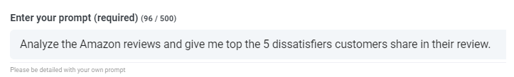
Step 8: Create Or Select Your Desired Prompt
Here are some examples prompts that you can apply to any file right now:
- Create a SWOT Analysis
- Give me the top action items
- Create a bullet point list summary
- Tell me the key issues that were left unresolved
- Tell me what questions were asked
- Create Your Own Custom Prompts
A modal will pop up so you can use the suggested prompts we shared above to instantly and magically get your answers.
If you have your own prompts you want to create, select "Custom Prompt" from the dropdown and another text box will open where you can ask anything you want of your data!
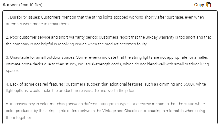
Step 9: Review & Share Responses
Speak will generate a concise response for you in a text box below the prompt selection dropdown.
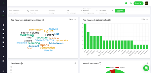
In this example, we ask to analyze all the Interview Data in the folder at once for the top product dissatisfiers.
You can easily copy that response for your presentations, content, emails, team members and more!
Speak Magic Prompts As ChatGPT For Interview Data Pricing
Our team at Speak Ai continues to optimize the pricing for Magic Prompts and Speak as a whole.
Right now, anyone in the 7-day trial of Speak gets 100,000 characters included in their account.
If you need more characters, you can easily include Speak Magic Prompts in your plan when you create a subscription.
You can also upgrade the number of characters in your account if you already have a subscription.
Both options are available on the subscription page .
Alternatively, you can use Speak Magic Prompts by adding a balance to your account. The balance will be used as you analyze characters.
Completely Personalize Your Plan 📝
Here at Speak, we've made it incredibly easy to personalize your subscription.
Once you sign-up, just visit our custom plan builder and select the media volume, team size, and features you want to get a plan that fits your needs.
No more rigid plans. Upgrade, downgrade or cancel at any time.
Claim Your Special Offer 🎁
When you subscribe, you will also get a free premium add-on for three months!
That means you save up to $50 USD per month and $150 USD in total.
Once you subscribe to a plan, all you have to do is send us a live chat with your selected premium add-on from the list below:
- Premium Export Options (Word, CSV & More)
- Custom Categories & Insights
- Bulk Editing & Data Organization
- Recorder Customization (Branding, Input & More)
- Media Player Customization
- Shareable Media Libraries
We will put the add-on live in your account free of charge!
What are you waiting for?
Refer Others & Earn Real Money 💸
If you have friends, peers and followers interested in using our platform, you can earn real monthly money.
You will get paid a percentage of all sales whether the customers you refer to pay for a plan, automatically transcribe media or leverage professional transcription services.
Use this link to become an official Speak affiliate.
Check Out Our Dedicated Resources📚
- Speak Ai YouTube Channel
- Guide To Building Your Perfect Speak Plan
Book A Free Implementation Session 🤝
It would be an honour to personally jump on an introductory call with you to make sure you are set up for success.
Just use our Calendly link to find a time that works well for you. We look forward to meeting you!
Top-Rated AI Meeting Assistant With Incredible ChatGPT & Qualitative Data Analysis Capabilities
Save 99% of your time and costs!
Use Speak's powerful AI to transcribe, analyze, automate and produce incredible insights for you and your team.

How to Summarize a Presentation with AI
Saving time and effort with Notta, starting from today!
Over the past ten years, I've created hundreds of presentations on PowerPoint (and sometimes on Google Slides) — and I know how important these are for different uses. Whether you want to give a speech, present a product, or share finances in a board meeting, everything is typically possible with a PowerPoint presentation.
But there's no point in watching a two-hour-long presentation only to know it does not contain any relevant information, right? Thankfully, that's where summarizing a presentation can help. It's like creating a short description that reveals what the viewers can expect from the long slideshow.
So, how to summarize a presentation , especially when you don't have enough time for it? In this guide, I'll reveal my tried and tested tips to create a short summary.
What is a Presentation Summary?
A presentation summary is a short, sweet, and meaningful version of the long video in which you introduce the different components of the presentation and a few key points that you’re talking about.
In other words, it typically includes the main points or key takeaways that'll provide you with the gist of the presentation — without you having to watch the presentation from start to end.
Here, you're not trying to convey the entire business strategy or selling points — instead, your goal here is to help the attendees understand the core concept of the presentation.

How to Summarize a Presentation
As a freelance writer who wears all the hats of the business, I try to save as much time as I can. As much as I value my time, I look for ways to save energy and effort for my audience. Writing a summary of lengthy videos , articles, documents, interviews , and presentations is one method to help everyone get all the important information in a clear and concise way. However, condensing all information into a few paragraphs (or one page) isn't an easy task.
Here's the process I follow to summarize presentations in a few paragraphs.
Identify the Main Goal
People love free stuff — but only if it's useful. Nobody wants to waste their time and/or effort watching a presentation that does not have the information they need. That's why your first step is to identify the main goal or objective . Here, you'll need to tell them what the presentation is about, what it includes, and what the key takeaways are.
Write the Summary
Your ultimate goal is to write the key points in the most concise, easy-to-read way possible. Before you're tempted to include everything in the summary, know that viewers are looking for specific information before they watch the presentation. Tell them why they should spend time on the presentation and fearlessly let them know who the presentation is not meant for.
Use Visual Aids
While summarizing the presentation, write as though you're talking to someone whose attention you don't want to lose. Get your ideas with the fewest, most effective words possible — but don't forget to add visual aids that keep the audience engaged. It's a great practice for every writer to help their audience not feel overwhelmed with a wall of texts.

Include Examples and Quotations
Any presentation is incomplete if you don't include proper examples and quotations. When you write the summary, allot some space for writing examples (two examples per page). Remember, holding onto the reader's attention is very important — and quotations can help you do just that.
Example of a Presentation Summary
The presentation summary begins with a hook that draws the audience in, helps them understand the value you offer, provides some proof, and finally ends with a strong CTA. It's relatively easy to incorporate these elements and create a summary. But if you're still finding it hard, here's a real-life presentation summary example for inspiration.
Today, we are excited to share with you our new Product X — the future of eyewear technology. At Company X, glasses aren't just for style — but it's a combination of comfort, innovation, and productivity. That's why we developed Product X, which combines two top technologies — AI and AR. The users reported a 20% boost in productivity and a 40% reduction in eye fatigue. It's now available for everyone — and anyone can place their orders on the website.
Tips for Summarizing a Presentation
Summaries can be incredibly effective for both hosts and audiences — only if you know how to craft attention-grabbing ones. Here, I'll show you how I summarize a presentation that gets positive responses from almost all the attendees.
Use Simple Language
The best presentation summary should be clear, concise, direct, and descriptive . Your main aim is to use simple language and give the attendees what they want.
My best tip is to: write for your audience, not yourself — and, for this, you need to put yourself in the shoes of a specific audience as you write.

Be Scannable
Use bullet points, numbers, and/or bolding to make your summary skimmable and digestible — that emphasizes the key points. The success of the summary will depend upon making the presentation's key takeaways easy for your readers to quickly process the main points.
Use AI Presentation Summarizer
If you struggle to condense information into a basic, short summary, give Notta a try. Unlike nearly all other AI presentation summarizer apps on the market, Notta is a more accurate transcriber and summarizer that can condense long audio/video files into an informative summary.
What I really found useful is Notta's ability to structure a summary into an overview, key chapters, and action items. You can even share this summarized version with the presentation attendees once the meeting is over — helping them understand what was covered in the presentation and what the next steps are.

Try Notta - the best online transcription & summarization tool. Transcribe and summarize your conversations and meetings quickly with high accuracy.
Start for Free
How to Do a Good Summary on PowerPoint?
PowerPoint has become synonymous with presentations — it's a free tool where you can make a slide deck and collaborate with your team. A good summary on PowerPoint can attract more audience to your presentation and even help the attendees get more clarity. Here, I'll reveal the three pillars of writing a good summary.
Include Key Points: The first thing is to write the key (or main) points in a concise and focused way. You can even use bullet points or some visual aids to keep things clear and uncluttered on slides.
Identify & Summarize Each Section: If you're giving a lengthy presentation, I'm assuming you've categorized it into different sections. While summarizing, you'll need to focus on each section and identify the key takeaway from it.
Highlight the Main Takeaway: If the presentation focuses on any problem and offers a solution, it's time to highlight it. As a presenter, you'll need to introduce the problem in the first line, followed by the solution that's offered in the presentation.
Is There an AI that Summarizes PowerPoint Slides?
Yes, there are many AI online summarizers that can summarize PowerPoint slides. Copilot in PowerPoint, for example, can read through the slides and provide a bulleted summary with key points. If you've pre-recorded presentation recordings, you are probably searching for a dedicated way to summarize the slides.
Notta is one powerful and popular AI note-taking application — and, that too, for a good reason. There's a summarizing feature for almost imaginable purposes: just upload the presentation audio/video, and Notta will automatically transcribe the spoken words and then summarize the content.
Key Takeaways
Once you discover the power of summaries, the temptation to create summaries for everything is real. But this can leave you with a new problem: a lot of manual work. So, how to summarize a presentation without much time and effort? That's where the third-party AI summary generators make it easy for you.
Notta is an AI note-taking and AI presentation summarizer tool, especially for people who are not making presentations for fun. It comes with a free generous plan and affordable paid plans that help you record, transcribe, and then summarize media files (including presentations) — with high accuracy.
Chrome Extension
Help Center
vs Otter.ai
vs Fireflies.ai
vs Happy Scribe
vs Sonix.ai
Integrations
Microsoft Teams
Google Meet
Google Drive
Audio to Text Converter
Video to Text Converter
Online Video Converter
Online Audio Converter
Online Vocal Remover
YouTube Video Summarizer

- SUGGESTED TOPICS
- The Magazine
- Newsletters
- Managing Yourself
- Managing Teams
- Work-life Balance
- The Big Idea
- Data & Visuals
- Reading Lists
- Case Selections
- HBR Learning
- Topic Feeds
- Account Settings
- Email Preferences
How to Make a “Good” Presentation “Great”
- Guy Kawasaki

Remember: Less is more.
A strong presentation is so much more than information pasted onto a series of slides with fancy backgrounds. Whether you’re pitching an idea, reporting market research, or sharing something else, a great presentation can give you a competitive advantage, and be a powerful tool when aiming to persuade, educate, or inspire others. Here are some unique elements that make a presentation stand out.
- Fonts: Sans Serif fonts such as Helvetica or Arial are preferred for their clean lines, which make them easy to digest at various sizes and distances. Limit the number of font styles to two: one for headings and another for body text, to avoid visual confusion or distractions.
- Colors: Colors can evoke emotions and highlight critical points, but their overuse can lead to a cluttered and confusing presentation. A limited palette of two to three main colors, complemented by a simple background, can help you draw attention to key elements without overwhelming the audience.
- Pictures: Pictures can communicate complex ideas quickly and memorably but choosing the right images is key. Images or pictures should be big (perhaps 20-25% of the page), bold, and have a clear purpose that complements the slide’s text.
- Layout: Don’t overcrowd your slides with too much information. When in doubt, adhere to the principle of simplicity, and aim for a clean and uncluttered layout with plenty of white space around text and images. Think phrases and bullets, not sentences.
As an intern or early career professional, chances are that you’ll be tasked with making or giving a presentation in the near future. Whether you’re pitching an idea, reporting market research, or sharing something else, a great presentation can give you a competitive advantage, and be a powerful tool when aiming to persuade, educate, or inspire others.
- Guy Kawasaki is the chief evangelist at Canva and was the former chief evangelist at Apple. Guy is the author of 16 books including Think Remarkable : 9 Paths to Transform Your Life and Make a Difference.
Partner Center
Improve your practice.
Enhance your soft skills with a range of award-winning courses.
How to Structure your Presentation, with Examples
August 3, 2018 - Dom Barnard
For many people the thought of delivering a presentation is a daunting task and brings about a great deal of nerves . However, if you take some time to understand how effective presentations are structured and then apply this structure to your own presentation, you’ll appear much more confident and relaxed.
Here is our complete guide for structuring your presentation, with examples at the end of the article to demonstrate these points.
Why is structuring a presentation so important?
If you’ve ever sat through a great presentation, you’ll have left feeling either inspired or informed on a given topic. This isn’t because the speaker was the most knowledgeable or motivating person in the world. Instead, it’s because they know how to structure presentations – they have crafted their message in a logical and simple way that has allowed the audience can keep up with them and take away key messages.
Research has supported this, with studies showing that audiences retain structured information 40% more accurately than unstructured information.
In fact, not only is structuring a presentation important for the benefit of the audience’s understanding, it’s also important for you as the speaker. A good structure helps you remain calm, stay on topic, and avoid any awkward silences.
What will affect your presentation structure?
Generally speaking, there is a natural flow that any decent presentation will follow which we will go into shortly. However, you should be aware that all presentation structures will be different in their own unique way and this will be due to a number of factors, including:
- Whether you need to deliver any demonstrations
- How knowledgeable the audience already is on the given subject
- How much interaction you want from the audience
- Any time constraints there are for your talk
- What setting you are in
- Your ability to use any kinds of visual assistance
Before choosing the presentation’s structure answer these questions first:
- What is your presentation’s aim?
- Who are the audience?
- What are the main points your audience should remember afterwards?
When reading the points below, think critically about what things may cause your presentation structure to be slightly different. You can add in certain elements and add more focus to certain moments if that works better for your speech.

What is the typical presentation structure?
This is the usual flow of a presentation, which covers all the vital sections and is a good starting point for yours. It allows your audience to easily follow along and sets out a solid structure you can add your content to.
1. Greet the audience and introduce yourself
Before you start delivering your talk, introduce yourself to the audience and clarify who you are and your relevant expertise. This does not need to be long or incredibly detailed, but will help build an immediate relationship between you and the audience. It gives you the chance to briefly clarify your expertise and why you are worth listening to. This will help establish your ethos so the audience will trust you more and think you’re credible.
Read our tips on How to Start a Presentation Effectively
2. Introduction
In the introduction you need to explain the subject and purpose of your presentation whilst gaining the audience’s interest and confidence. It’s sometimes helpful to think of your introduction as funnel-shaped to help filter down your topic:
- Introduce your general topic
- Explain your topic area
- State the issues/challenges in this area you will be exploring
- State your presentation’s purpose – this is the basis of your presentation so ensure that you provide a statement explaining how the topic will be treated, for example, “I will argue that…” or maybe you will “compare”, “analyse”, “evaluate”, “describe” etc.
- Provide a statement of what you’re hoping the outcome of the presentation will be, for example, “I’m hoping this will be provide you with…”
- Show a preview of the organisation of your presentation
In this section also explain:
- The length of the talk.
- Signal whether you want audience interaction – some presenters prefer the audience to ask questions throughout whereas others allocate a specific section for this.
- If it applies, inform the audience whether to take notes or whether you will be providing handouts.
The way you structure your introduction can depend on the amount of time you have been given to present: a sales pitch may consist of a quick presentation so you may begin with your conclusion and then provide the evidence. Conversely, a speaker presenting their idea for change in the world would be better suited to start with the evidence and then conclude what this means for the audience.
Keep in mind that the main aim of the introduction is to grab the audience’s attention and connect with them.
3. The main body of your talk
The main body of your talk needs to meet the promises you made in the introduction. Depending on the nature of your presentation, clearly segment the different topics you will be discussing, and then work your way through them one at a time – it’s important for everything to be organised logically for the audience to fully understand. There are many different ways to organise your main points, such as, by priority, theme, chronologically etc.
- Main points should be addressed one by one with supporting evidence and examples.
- Before moving on to the next point you should provide a mini-summary.
- Links should be clearly stated between ideas and you must make it clear when you’re moving onto the next point.
- Allow time for people to take relevant notes and stick to the topics you have prepared beforehand rather than straying too far off topic.
When planning your presentation write a list of main points you want to make and ask yourself “What I am telling the audience? What should they understand from this?” refining your answers this way will help you produce clear messages.
4. Conclusion
In presentations the conclusion is frequently underdeveloped and lacks purpose which is a shame as it’s the best place to reinforce your messages. Typically, your presentation has a specific goal – that could be to convert a number of the audience members into customers, lead to a certain number of enquiries to make people knowledgeable on specific key points, or to motivate them towards a shared goal.
Regardless of what that goal is, be sure to summarise your main points and their implications. This clarifies the overall purpose of your talk and reinforces your reason for being there.
Follow these steps:
- Signal that it’s nearly the end of your presentation, for example, “As we wrap up/as we wind down the talk…”
- Restate the topic and purpose of your presentation – “In this speech I wanted to compare…”
- Summarise the main points, including their implications and conclusions
- Indicate what is next/a call to action/a thought-provoking takeaway
- Move on to the last section
5. Thank the audience and invite questions
Conclude your talk by thanking the audience for their time and invite them to ask any questions they may have. As mentioned earlier, personal circumstances will affect the structure of your presentation.
Many presenters prefer to make the Q&A session the key part of their talk and try to speed through the main body of the presentation. This is totally fine, but it is still best to focus on delivering some sort of initial presentation to set the tone and topics for discussion in the Q&A.

Other common presentation structures
The above was a description of a basic presentation, here are some more specific presentation layouts:
Demonstration
Use the demonstration structure when you have something useful to show. This is usually used when you want to show how a product works. Steve Jobs frequently used this technique in his presentations.
- Explain why the product is valuable.
- Describe why the product is necessary.
- Explain what problems it can solve for the audience.
- Demonstrate the product to support what you’ve been saying.
- Make suggestions of other things it can do to make the audience curious.
Problem-solution
This structure is particularly useful in persuading the audience.
- Briefly frame the issue.
- Go into the issue in detail showing why it ‘s such a problem. Use logos and pathos for this – the logical and emotional appeals.
- Provide the solution and explain why this would also help the audience.
- Call to action – something you want the audience to do which is straightforward and pertinent to the solution.
Storytelling
As well as incorporating stories in your presentation , you can organise your whole presentation as a story. There are lots of different type of story structures you can use – a popular choice is the monomyth – the hero’s journey. In a monomyth, a hero goes on a difficult journey or takes on a challenge – they move from the familiar into the unknown. After facing obstacles and ultimately succeeding the hero returns home, transformed and with newfound wisdom.
Storytelling for Business Success webinar , where well-know storyteller Javier Bernad shares strategies for crafting compelling narratives.
Another popular choice for using a story to structure your presentation is in media ras (in the middle of thing). In this type of story you launch right into the action by providing a snippet/teaser of what’s happening and then you start explaining the events that led to that event. This is engaging because you’re starting your story at the most exciting part which will make the audience curious – they’ll want to know how you got there.
- Great storytelling: Examples from Alibaba Founder, Jack Ma
Remaining method
The remaining method structure is good for situations where you’re presenting your perspective on a controversial topic which has split people’s opinions.
- Go into the issue in detail showing why it’s such a problem – use logos and pathos.
- Rebut your opponents’ solutions – explain why their solutions could be useful because the audience will see this as fair and will therefore think you’re trustworthy, and then explain why you think these solutions are not valid.
- After you’ve presented all the alternatives provide your solution, the remaining solution. This is very persuasive because it looks like the winning idea, especially with the audience believing that you’re fair and trustworthy.
Transitions
When delivering presentations it’s important for your words and ideas to flow so your audience can understand how everything links together and why it’s all relevant. This can be done using speech transitions which are words and phrases that allow you to smoothly move from one point to another so that your speech flows and your presentation is unified.
Transitions can be one word, a phrase or a full sentence – there are many different forms, here are some examples:
Moving from the introduction to the first point
Signify to the audience that you will now begin discussing the first main point:
- Now that you’re aware of the overview, let’s begin with…
- First, let’s begin with…
- I will first cover…
- My first point covers…
- To get started, let’s look at…
Shifting between similar points
Move from one point to a similar one:
- In the same way…
- Likewise…
- Equally…
- This is similar to…
- Similarly…
Internal summaries
Internal summarising consists of summarising before moving on to the next point. You must inform the audience:
- What part of the presentation you covered – “In the first part of this speech we’ve covered…”
- What the key points were – “Precisely how…”
- How this links in with the overall presentation – “So that’s the context…”
- What you’re moving on to – “Now I’d like to move on to the second part of presentation which looks at…”
Physical movement
You can move your body and your standing location when you transition to another point. The audience find it easier to follow your presentation and movement will increase their interest.
A common technique for incorporating movement into your presentation is to:
- Start your introduction by standing in the centre of the stage.
- For your first point you stand on the left side of the stage.
- You discuss your second point from the centre again.
- You stand on the right side of the stage for your third point.
- The conclusion occurs in the centre.
Key slides for your presentation
Slides are a useful tool for most presentations: they can greatly assist in the delivery of your message and help the audience follow along with what you are saying. Key slides include:
- An intro slide outlining your ideas
- A summary slide with core points to remember
- High quality image slides to supplement what you are saying
There are some presenters who choose not to use slides at all, though this is more of a rarity. Slides can be a powerful tool if used properly, but the problem is that many fail to do just that. Here are some golden rules to follow when using slides in a presentation:
- Don’t over fill them – your slides are there to assist your speech, rather than be the focal point. They should have as little information as possible, to avoid distracting people from your talk.
- A picture says a thousand words – instead of filling a slide with text, instead, focus on one or two images or diagrams to help support and explain the point you are discussing at that time.
- Make them readable – depending on the size of your audience, some may not be able to see small text or images, so make everything large enough to fill the space.
- Don’t rush through slides – give the audience enough time to digest each slide.
Guy Kawasaki, an entrepreneur and author, suggests that slideshows should follow a 10-20-30 rule :
- There should be a maximum of 10 slides – people rarely remember more than one concept afterwards so there’s no point overwhelming them with unnecessary information.
- The presentation should last no longer than 20 minutes as this will leave time for questions and discussion.
- The font size should be a minimum of 30pt because the audience reads faster than you talk so less information on the slides means that there is less chance of the audience being distracted.
Here are some additional resources for slide design:
- 7 design tips for effective, beautiful PowerPoint presentations
- 11 design tips for beautiful presentations
- 10 tips on how to make slides that communicate your idea
Group Presentations
Group presentations are structured in the same way as presentations with one speaker but usually require more rehearsal and practices. Clean transitioning between speakers is very important in producing a presentation that flows well. One way of doing this consists of:
- Briefly recap on what you covered in your section: “So that was a brief introduction on what health anxiety is and how it can affect somebody”
- Introduce the next speaker in the team and explain what they will discuss: “Now Elnaz will talk about the prevalence of health anxiety.”
- Then end by looking at the next speaker, gesturing towards them and saying their name: “Elnaz”.
- The next speaker should acknowledge this with a quick: “Thank you Joe.”
From this example you can see how the different sections of the presentations link which makes it easier for the audience to follow and remain engaged.
Example of great presentation structure and delivery
Having examples of great presentations will help inspire your own structures, here are a few such examples, each unique and inspiring in their own way.
How Google Works – by Eric Schmidt
This presentation by ex-Google CEO Eric Schmidt demonstrates some of the most important lessons he and his team have learnt with regards to working with some of the most talented individuals they hired. The simplistic yet cohesive style of all of the slides is something to be appreciated. They are relatively straightforward, yet add power and clarity to the narrative of the presentation.
Start with why – by Simon Sinek
Since being released in 2009, this presentation has been viewed almost four million times all around the world. The message itself is very powerful, however, it’s not an idea that hasn’t been heard before. What makes this presentation so powerful is the simple message he is getting across, and the straightforward and understandable manner in which he delivers it. Also note that he doesn’t use any slides, just a whiteboard where he creates a simple diagram of his opinion.
The Wisdom of a Third Grade Dropout – by Rick Rigsby
Here’s an example of a presentation given by a relatively unknown individual looking to inspire the next generation of graduates. Rick’s presentation is unique in many ways compared to the two above. Notably, he uses no visual prompts and includes a great deal of humour.
However, what is similar is the structure he uses. He first introduces his message that the wisest man he knew was a third-grade dropout. He then proceeds to deliver his main body of argument, and in the end, concludes with his message. This powerful speech keeps the viewer engaged throughout, through a mixture of heart-warming sentiment, powerful life advice and engaging humour.
As you can see from the examples above, and as it has been expressed throughout, a great presentation structure means analysing the core message of your presentation. Decide on a key message you want to impart the audience with, and then craft an engaging way of delivering it.
By preparing a solid structure, and practising your talk beforehand, you can walk into the presentation with confidence and deliver a meaningful message to an interested audience.
It’s important for a presentation to be well-structured so it can have the most impact on your audience. An unstructured presentation can be difficult to follow and even frustrating to listen to. The heart of your speech are your main points supported by evidence and your transitions should assist the movement between points and clarify how everything is linked.
Research suggests that the audience remember the first and last things you say so your introduction and conclusion are vital for reinforcing your points. Essentially, ensure you spend the time structuring your presentation and addressing all of the sections.

How to Summarize a Presentation
How to structure a presentation.
Summarizing a presentation provides the opportunity to leave a lasting impression on the audience. The concluding remarks of a presentation are what usually sticks in the audience's head. At one level, the concluding remarks of a summary are like sound bites. They are short and condensed version of the the presentation. If someone missed the actual presentation and only heard the summary, they should have a good idea about the essence of the presentation.
Tell the audience that you are concluding the presentation. This sets the context for the summary and prepares the audience members for your concluding remarks.
Briefly summarize the primary points of the presentation. Avoid digressing into new information, arguments or points of view. Also avoid running a point into the ground that you have already discussed in detail during the presentation. The point of the summary is to remind the audience about the essential core of the presentation. Concentrate on the major ideas and the argument you made that supported the ideas..
Inform the audience about future work that you are interested in pursuing. The subject matter of a presentation usually has room for growth,development or elaboration. It is impossible to cover all of the bases in the time span of a presentation.
Conclude the summary be thanking the audience for listening. Tell the audience that you would be happy to respond to any questions they may having that relate to the presentation.
Related Articles

How to Do a Paper Review Presentation

How to Write an Introduction to a Reflective Essay

How to Evaluate an Oral Presentation

How to Write an Introduction to an Analytical Essay

How to Set Up a Rhetorical Analysis

How to Write a Conclusion for PowerPoint Presentation

How to Write a Dissertation Summary

Tips on Writing a Welcome Address at a High School Graduation
- English Club: Presentations In English
Robert Russell began writing online professionally in 2010. He holds a Ph.D. in philosophy and is currently working on a book project exploring the relationship between art, entertainment and culture. He is the guitar player for the nationally touring cajun/zydeco band Creole Stomp. Russell travels with his laptop and writes many of his articles on the road between gigs.
Blog > How to structure a good PowerPoint Presentation
How to structure a good PowerPoint Presentation
08.09.21 • #powerpoint #tips.
When creating presentations, it is particularly important that they are well organized and have a consistent structure.
A logical structure helps the audience to follow you and to remember the core information as best as possible. It is also important for the presenter, as a good presentation structure helps to keep calm, to stay on the topic and to avoid awkward pauses.
But what does such a structure actually look like? Here we show you how to best organize your presentation and what a good structure looks like.
Plan your presentation
Before you start creating your presentation, you should always brainstorm. Think about the topic and write all your ideas down. Then think about the message you want to communicate, what your goal is and what you want your audience to remember at the end.
Think about who your audience is so that you can address them in the best possible way. One possibility is to start your presentation with a few polls to get to know your audience better. Based on the results, you can then adapt your presentation a little. Use the poll function of SlideLizard and have all the answers at a glance. SlideLizard makes it possible to integrate the polls directly into your PowerPoint presentation which helps you to avoid annoying switching between presentation and interaction tool. You can keep an eye on the results while the votes come in and then decide whether you want to share them or not.

- an informative
- an entertaining
- an inspiring
- or a persuasive presentation?
Typical Presentation Structure
The basic structure of a presentation is actually always the same and should consist of:
Introduction

Make sure that the structure of your presentation is not too complicated. The simpler it is, the better the audience can follow.
Personal Introduction
It is best to start your presentation by briefly introducing yourself which helps to build a connection with your audience right away.
Introduce the topic
Then introduce the topic, state the purpose of the presentation and provide a brief outline of the main points you will be addressing.
Mention the length
In the introduction, mention the approximate length of the talk and then also make sure you stick to it.
The introduction should be no longer than two slides and provide a good overview of the topic.
Icebreaker Polls
According to studies, people in the audience only have an average attention span of 10 minutes, which is why it is important to increase their attention right at the beginning and to arouse the audience's interest. You could make a good start with a few icebreaker polls for example. They lighten the mood right at the beginning and you can secure your audience's attention from the start.
For example, you could use SlideLizard to have all the answers at a glance and share them with your audience. In addition, the audience can try out how the polls work and already know how it works if you include more polls in the main part.

Get to know your audience
As mentioned earlier, it is always useful to think about who your audience actually is. Ask them questions at the beginning about how well they already know the topic of your presentation. Use SlideLizard for this so that you have a clear overview about the answers. You can use both single- and multiple-choice questions or also open questions and display their results as a WordCloud in your presentation, for example.
Include a quote
To make the beginning (or the end) of your presentation more exciting, it is always a good idea to include a quote. We have selected some powerful quotes for PowerPoint presentations for you.
Present your topic
The main part of a presentation should explain the topic well, state facts, justify them and give examples. Keep all the promises you made earlier in the introduction.
Length and Structure
The main part should make up about 70% of the presentation and also include a clear structure. Explain your ideas in detail and build them up logically. It should be organized chronologically, by priority or by topic. There should be a smooth transition between the individual issues. However, it is also important to use phrases that make it clear that a new topic is starting. We have listed some useful phrases for presentations here.
Visualize data and statistics and show pictures to underline facts. If you are still looking for good images, we have selected 5 sources of free images for you here.
Focus on the essentials
Focus on what is most important and summarize a bit. You don't have to say everything about a topic because your audience won’t remember everything either. Avoid complicated sentence structure, because if the audience does not understand something, they will not be able to read it again.
Make your presentation interactive
Make your presentation interactive to keep the attention of your audience. Use SlideLizard to include polls in your presentation, where your audience can vote directly from their smartphone and discuss the answers as soon as you received all votes. Here you can also find more tips for increasing audience engagement.

Repeat the main points
The conclusion should contain a summary of the most important key points. Repeat the main points you have made, summarize what the audience should have learned and explain how the new information can help in the future.
Include a Q&A part
Include a Q&A part at the end to make sure you don't leave any questions open. It's a good idea to use tools like SlideLizard for it. Your audience can ask anonymous questions and if there is not enough time, you can give them the answers afterwards. You can read more about the right way to do a question slide in PowerPoint here.
Get Feedback
It is also important to get feedback on your presentation at the end to keep improving. With SlideLizard you can ask your audience for anonymous feedback through star ratings, number ratings or open texts directly after your presentation. You can then export the responses and analyse them later in Excel.

Presentation style
Depending on the type of presentation you give, the structure will always be slightly different. We have selected a few different presentation styles and their structure for you.
Short Presentation

If you are one of many presenters on the day, you will only have a very limited time to present your idea and to convince your audience. It is very important to stand out with your presentation.
So you need to summarize your ideas as briefly as possible and probably should not need more than 3-5 slides.
Problem Solving Presentation

Start your presentation by explaining a problem and giving a short overview of it.
Then go into the problem a little more, providing both intellectual and emotional arguments for the seriousness of the problem. You should spend about the first 25% of your presentation on the problem.
After that, you should spend about 50% of your presentation proposing a solution and explaining it in detail.
In the last 25%, describe what benefits this solution will bring to your audience and ask them to take a simple but relevant action that relates to the problem being discussed.
Tell a Story

A great way to build an emotional connection with the audience is to structure a presentation like a story.
In the introduction, introduce a character who has to deal with a conflict. In the main part, tell how he tries to solve his problem but fails again and again. In the end, he manages to find a solution and wins.
Stories have the power to win customers, align colleagues and motivate employees. They’re the most compelling platform we have for managing imaginations. - Nancy Duarte / HBR Guide to Persuasive Presentations
Make a demonstration

Use the demonstration structure to show how a product works. First talk about a need or a problem that has to be solved.
Then explain how the product will help solve the problem and try to convince your audience of the need for your product.
Spend the end clarifying where and when the product can be purchased.
Chronological structure

When you have something historical to tell, it is always good to use a chronological structure. You always have to ask yourself what happens next.
To make it more interesting and exciting, it is a good idea to start by telling the end of something and after that you explain how you got there. This way you make the audience curious and you can gain their attention faster.
Nancy Duarte TED Talk
Nancy Duarte is a speaker and presentation design expert. She gives speeches all over the world, trying to improve the power of public presentations.
In her famous TED Talk "The Secret Structure of Great Talks" she dissects famous speeches such as Steve Jobs' iPhone launch speech and Martin Luther King's "I have a dream" speech. In doing so, she found out that each presentation is made up of 4 parts:
- What could be
- A moment to remember
- Promise of “New Bliss”
Related articles
About the author.

Helena Reitinger
Helena supports the SlideLizard team in marketing and design. She loves to express her creativity in texts and graphics.

Get 1 Month for free!
Do you want to make your presentations more interactive.
With SlideLizard you can engage your audience with live polls, questions and feedback . Directly within your PowerPoint Presentation. Learn more
Top blog articles More posts

6 Tips to turn your boring slides into stunning presentations

The History and Evolution of PowerPoint

Get started with Live Polls, Q&A and slides
for your PowerPoint Presentations
The big SlideLizard presentation glossary
Process questions.
Process questions are similar to recall questions but they need some deeper thoughts and maybe also analysis.
An e-lecture is a lecture that is held online. Many schools and universities offer e-lectures as technical opportunities improve.
Internal Communication
Internal communication is particularly important for corporate communication. It communicates important information from leadership to staff so that they can do their jobs in the best possible way and work processes run well.
Glossophobia
Glossophobia means the strong fear of public speaking.
Be the first to know!
The latest SlideLizard news, articles, and resources, sent straight to your inbox.
- or follow us on -
We use cookies to personalize content and analyze traffic to our website. You can choose to accept only cookies that are necessary for the website to function or to also allow tracking cookies. For more information, please see our privacy policy .
Cookie Settings
Necessary cookies are required for the proper functioning of the website. These cookies ensure basic functionalities and security features of the website.
Analytical cookies are used to understand how visitors interact with the website. These cookies help provide information about the number of visitors, etc.
30 Examples: How to Conclude a Presentation (Effective Closing Techniques)
By Status.net Editorial Team on March 4, 2024 — 9 minutes to read
Ending a presentation on a high note is a skill that can set you apart from the rest. It’s the final chance to leave an impact on your audience, ensuring they walk away with the key messages embedded in their minds. This moment is about driving your points home and making sure they resonate. Crafting a memorable closing isn’t just about summarizing key points, though that’s part of it, but also about providing value that sticks with your listeners long after they’ve left the room.
Crafting Your Core Message
To leave a lasting impression, your presentation’s conclusion should clearly reflect your core message. This is your chance to reinforce the takeaways and leave the audience thinking about your presentation long after it ends.
Identifying Key Points
Start by recognizing what you want your audience to remember. Think about the main ideas that shaped your talk. Make a list like this:
- The problem your presentation addresses.
- The evidence that supports your argument.
- The solution you propose or the action you want the audience to take.
These key points become the pillars of your core message.
Contextualizing the Presentation
Provide context by briefly relating back to the content of the whole presentation. For example:
- Reference a statistic you shared in the opening, and how it ties into the conclusion.
- Mention a case study that underlines the importance of your message.
Connecting these elements gives your message cohesion and makes your conclusion resonate with the framework of your presentation.
30 Example Phrases: How to Conclude a Presentation
- 1. “In summary, let’s revisit the key takeaways from today’s presentation.”
- 2. “Thank you for your attention. Let’s move forward together.”
- 3. “That brings us to the end. I’m open to any questions you may have.”
- 4. “I’ll leave you with this final thought to ponder as we conclude.”
- 5. “Let’s recap the main points before we wrap up.”
- 6. “I appreciate your engagement. Now, let’s turn these ideas into action.”
- 7. “We’ve covered a lot today. To conclude, remember these crucial points.”
- 8. “As we reach the end, I’d like to emphasize our call to action.”
- 9. “Before we close, let’s quickly review what we’ve learned.”
- 10. “Thank you for joining me on this journey. I look forward to our next steps.”
- 11. “In closing, I’d like to thank everyone for their participation.”
- 12. “Let’s conclude with a reminder of the impact we can make together.”
- 13. “To wrap up our session, here’s a brief summary of our discussion.”
- 14. “I’m grateful for the opportunity to present to you. Any final thoughts?”
- 15. “And that’s a wrap. I welcome any final questions or comments.”
- 16. “As we conclude, let’s remember the objectives we’ve set today.”
- 17. “Thank you for your time. Let’s apply these insights to achieve success.”
- 18. “In conclusion, your feedback is valuable, and I’m here to listen.”
- 19. “Before we part, let’s take a moment to reflect on our key messages.”
- 20. “I’ll end with an invitation for all of us to take the next step.”
- 21. “As we close, let’s commit to the goals we’ve outlined today.”
- 22. “Thank you for your attention. Let’s keep the conversation going.”
- 23. “In conclusion, let’s make a difference, starting now.”
- 24. “I’ll leave you with these final words to consider as we end our time together.”
- 25. “Before we conclude, remember that change starts with our actions today.”
- 26. “Thank you for the lively discussion. Let’s continue to build on these ideas.”
- 27. “As we wrap up, I encourage you to reach out with any further questions.”
- 28. “In closing, I’d like to express my gratitude for your valuable input.”
- 29. “Let’s conclude on a high note and take these learnings forward.”
- 30. “Thank you for your time today. Let’s end with a commitment to progress.”
Summarizing the Main Points
When you reach the end of your presentation, summarizing the main points helps your audience retain the important information you’ve shared. Crafting a memorable summary enables your listeners to walk away with a clear understanding of your message.
Effective Methods of Summarization
To effectively summarize your presentation, you need to distill complex information into concise, digestible pieces. Start by revisiting the overarching theme of your talk and then narrow down to the core messages. Use plain language and imagery to make the enduring ideas stick. Here are some examples of how to do this:
- Use analogies that relate to common experiences to recap complex concepts.
- Incorporate visuals or gestures that reinforce your main arguments.
The Rule of Three
The Rule of Three is a classic writing and communication principle. It means presenting ideas in a trio, which is a pattern that’s easy for people to understand and remember. For instance, you might say, “Our plan will save time, cut costs, and improve quality.” This structure has a pleasing rhythm and makes the content more memorable. Some examples include:
- “This software is fast, user-friendly, and secure.”
- Pointing out a product’s “durability, affordability, and eco-friendliness.”
Reiterating the Main Points
Finally, you want to circle back to the key takeaways of your presentation. Rephrase your main points without introducing new information. This reinforcement supports your audience’s memory and understanding of the material. You might summarize key takeaways like this:
- Mention the problem you addressed, the solution you propose, and the benefits of this solution.
- Highlighting the outcomes of adopting your strategy: higher efficiency, greater satisfaction, and increased revenue.
Creating a Strong Conclusion
The final moments of your presentation are your chance to leave your audience with a powerful lasting impression. A strong conclusion is more than just summarizing—it’s your opportunity to invoke thought, inspire action, and make your message memorable.
Incorporating a Call to Action
A call to action is your parting request to your audience. You want to inspire them to take a specific action or think differently as a result of what they’ve heard. To do this effectively:
- Be clear about what you’re asking.
- Explain why their action is needed.
- Make it as simple as possible for them to take the next steps.
Example Phrases:
- “Start making a difference today by…”
- “Join us in this effort by…”
- “Take the leap and commit to…”
Leaving a Lasting Impression
End your presentation with something memorable. This can be a powerful quote, an inspirational statement, or a compelling story that underscores your main points. The goal here is to resonate with your audience on an emotional level so that your message sticks with them long after they leave.
- “In the words of [Influential Person], ‘…'”
- “Imagine a world where…”
- “This is more than just [Topic]; it’s about…”
Enhancing Audience Engagement
To hold your audience’s attention and ensure they leave with a lasting impression of your presentation, fostering interaction is key.
Q&A Sessions
It’s important to integrate a Q&A session because it allows for direct communication between you and your audience. This interactive segment helps clarify any uncertainties and encourages active participation. Plan for this by designating a time slot towards the end of your presentation and invite questions that promote discussion.
- “I’d love to hear your thoughts; what questions do you have?”
- “Let’s dive into any questions you might have. Who would like to start?”
- “Feel free to ask any questions, whether they’re clarifications or deeper inquiries about the topic.”
Encouraging Audience Participation
Getting your audience involved can transform a good presentation into a great one. Use open-ended questions that provoke thought and allow audience members to reflect on how your content relates to them. Additionally, inviting volunteers to participate in a demonstration or share their experiences keeps everyone engaged and adds a personal touch to your talk.
- “Could someone give me an example of how you’ve encountered this in your work?”
- “I’d appreciate a volunteer to help demonstrate this concept. Who’s interested?”
- “How do you see this information impacting your daily tasks? Let’s discuss!”
Delivering a Persuasive Ending
At the end of your presentation, you have the power to leave a lasting impact on your audience. A persuasive ending can drive home your key message and encourage action.
Sales and Persuasion Tactics
When you’re concluding a presentation with the goal of selling a product or idea, employ carefully chosen sales and persuasion tactics. One method is to summarize the key benefits of your offering, reminding your audience why it’s important to act. For example, if you’ve just presented a new software tool, recap how it will save time and increase productivity. Another tactic is the ‘call to action’, which should be clear and direct, such as “Start your free trial today to experience the benefits first-hand!” Furthermore, using a touch of urgency, like “Offer expires soon!”, can nudge your audience to act promptly.
Final Impressions and Professionalism
Your closing statement is a chance to solidify your professional image and leave a positive impression. It’s important to display confidence and poise. Consider thanking your audience for their time and offering to answer any questions. Make sure to end on a high note by summarizing your message in a concise and memorable way. If your topic was on renewable energy, you might conclude by saying, “Let’s take a leap towards a greener future by adopting these solutions today.” This reinforces your main points and encourages your listeners to think or act differently when they leave.
Frequently Asked Questions
What are some creative strategies for ending a presentation memorably.
To end your presentation in a memorable way, consider incorporating a call to action that engages your audience to take the next step. Another strategy is to finish with a thought-provoking question or a surprising fact that resonates with your listeners.
Can you suggest some powerful quotes suitable for concluding a presentation?
Yes, using a quote can be very effective. For example, Maya Angelou’s “People will forget what you said, people will forget what you did, but people will never forget how you made them feel,” can reinforce the emotional impact of your presentation.
What is an effective way to write a conclusion that summarizes a presentation?
An effective conclusion should recap the main points succinctly, highlighting what you want your audience to remember. A good way to conclude is by restating your thesis and then briefly summarizing the supporting points you made.
As a student, how can I leave a strong impression with my presentation’s closing remarks?
To leave a strong impression, consider sharing a personal anecdote related to your topic that demonstrates passion and conviction. This helps humanize your content and makes the message more relatable to your audience.
How can I appropriately thank my audience at the close of my presentation?
A simple and sincere expression of gratitude is always appropriate. You might say, “Thank you for your attention and engagement today,” to convey appreciation while also acknowledging their participation.
What are some examples of a compelling closing sentence in a presentation?
A compelling closing sentence could be something like, “Together, let’s take the leap towards a greener future,” if you’re presenting on sustainability. This sentence is impactful, calls for united action, and leaves your audience with a clear message.
- How to Build Rapport: Effective Techniques
- Active Listening (Techniques, Examples, Tips)
- Effective Nonverbal Communication in the Workplace (Examples)
- What is Problem Solving? (Steps, Techniques, Examples)
- 2 Examples of an Effective and Warm Letter of Welcome
- 8 Examples of Effective Interview Confirmation Emails

How to Summarize a Presentation: 5 Easy Steps
Table of Contents
Introduction
Different people have varying needs for summaries. For a student, summaries are a great way to keep notes. They help them during their exam preparations.
In businesses, summaries are often required during executive meetings. Any kind of report, plan, or strategy could require an executive summary. This is also where summarizing presentations is required. In businesses, presentations are much more valuable and time-saving than a simple article or paper.
The reason presentations are used is that they can, paired with images and graphs, effectively utilize the least amount of text. However, even these need to be summarized frequently because the executives do not have a lot of time to go through an entire presentation.In this post, we will check out some ways to summarize presentations.
Using a Tool
Not all people have the time to manually summarize a presentation. Businessmen, in general, are always short on time especially when they belong to large corporations.
They can use summarizing tools to generate succinct summaries of presentations or plans/strategies.
Summarizing tools are widely available on the internet. And a lot of them are free to use. A great text summarizer can summarize your content in the shortest possible time using the number of words you like. Some summarizers come with the option of condensing the source material into a paragraph or a series of bullet points. Since there are a lot of tools to pick from, you can try out a few and use the ones that suit your needs best.
By Hand/Manually
Read and understand the presentation, segment the material into sections, identify key points, write the summary, compare to the original and revise.
Summarizing can be a difficult task depending on what kind of topic is being talked about or who is doing the summarizing. Some people have a way with words and they are naturally able to say things in a concise manner, while others have to learn how to do so.
Summarizing is a skill that is required in presentations and speeches. These are both mediums using which information and possibly new concepts are provided to the audience. At the end of both, a summary is required to nicely round up the entire topic. Using summarizing tools is an easier way as compared to manually writing a summary since they save a lot of time and effort.
Related Posts:
- English Summary Home
- Importance of the UPSC Special Class Railway Apprentice Exam for Aspiring Engineers
- Of Friendship Essay | Summary by Francis Bacon
- What is Digital Humanities and What is it Doing in English Departments Summary
- Random Idiom Generator
- The Raven by Edgar Allen Poe Complete Poem
Knowt AI PowerPoint Summarizer
Upload any PPT & Kai will make notes & flashcards instantly. In < 30 seconds Kai will study your slides and tell you all the important stuff in it.
Drag & drop a PowerPoint or Google Slides file to upload
Tap to upload a PowerPoint or Google Slides file
select files
Or upload from Google Drive
1,300,000 +
students & teachers
1,100,000 +
notes created
4,000,000 +
flashcards created
Learn your powerpoints faster with our AI-powered PPT Summarizing Tool
The ppt summarizer built to help you learn..
It’s as simple as sending a text to Kai, and he’ll explain anything in your PPT to you like a tutor would.
Take practice tests generated from your PPT
Kai will read through your PPT and create a test that highlights the key concepts.
Upload a PPT now
Upload video
Upload PPTs from any site in seconds
Use our Chrome extension to upload a PPT from any webpage to Knowt in seconds.
Download the chrome extension
Do more in less time with the Knowt PPT Summarizer
We're all about helping you learn better, but quicker.
Instant PPT Summaries
Kai will read through your PPT, find the key details, and make you a summary of the important stuff.
AI PPT Summarizer
Flashcards ready for you
Kai will read through your PPT, find the key details, and make flashcards for you to practice.
Upload a PPT
Mark up your PPT with annotations and comments
Our PDF editor lets you write directly on your uploaded files.

I loved knowt for vocab flashcards! Especially to import from quizlet with a link literally chefs kisss.

I used knowt to study for my apush midterm and it saved my butt! The import from quizlet feature helped a ton too. Slayed that test with an A!! 😻😻😻
Trusted by millions across the globe
Our community of students and teachers trust Knowt to create and study on.
Knowt helped me tremendously with my AP exams, World History and Chem in particular. Taking notes and immediately having a study guide created was such a life saver when I was on a time crunch. I did way better than I expected thanks to Knowt!!

Knowt’s quiz and spaced repetition features have been a lifesaver. I’m going to Columbia now and studying with Knowt helped me get there!

This app really came in clutch when AP exams were around the corner. Especially with the spaced repetition method, it helped me remember the important concepts. :)

Knowt has been a lifesaver! The learn features in flashcards let me find time and make studying a little more digestible.

Absolutely excellent. Easy to use, much more visually pleasant than Cram and no rudimentary features are behind a paywall. It’s simply excellent.

I used Knowt to study for my APUSH midterm and it saved my butt! The import from Quizlet feature helped a ton too. Slayed that test with an A!! 😻😻😻

I loved the AI for flashcard writing, it saves so much time! The unique spaced repetition can really come in clutch for last minute studying and helps you remember everything!

I love Knowt so much! The platform is a dream and seeing all of the new features each update makes me so happy! Thank you, Knowt, for being so amazing :)

Knowt has been an absolute life-saver for me - no other revision methods worked for me. It’s also incredible considering Knowt is free! The variety of tools available is perfect for any learning or revision type. Thanks, Knowt!
Endless ways to use Knowt
Not a PowerPoint person? No problem -- you can do so much more.
Make flashcards from PDFs
Kai will read your PDF, find the key details for you and make notes and flashcards for you to practice
AI PDF Summarizer

Video Summarizer
Kai will watch your lecture videos, turn them into notes and flashcards instantly.
AI Video Summarizer
AI Flashcards
You can make flashcards and study them for free with learn mode, spaced repetition, and more.
Make flashcards from notes
You can take notes and Kai will make flashcards from them instantly.
Oh you’re an explorer?
We have over 2 million resources across various exams, and subjects to refer to at any point.
Browse by exam
Knowt AP Hub
AP Study Guides
Knowt IB Hub
IB Study Guides
Knowt GCSE Hub
GCSE Study Guides
Explore top flashcards
Explore top notes, explore subjects, engineering, social studies.
We use essential cookies to make Venngage work. By clicking “Accept All Cookies”, you agree to the storing of cookies on your device to enhance site navigation, analyze site usage, and assist in our marketing efforts.
Manage Cookies
Cookies and similar technologies collect certain information about how you’re using our website. Some of them are essential, and without them you wouldn’t be able to use Venngage. But others are optional, and you get to choose whether we use them or not.
Strictly Necessary Cookies
These cookies are always on, as they’re essential for making Venngage work, and making it safe. Without these cookies, services you’ve asked for can’t be provided.
Show cookie providers
- Google Login
Functionality Cookies
These cookies help us provide enhanced functionality and personalisation, and remember your settings. They may be set by us or by third party providers.
Performance Cookies
These cookies help us analyze how many people are using Venngage, where they come from and how they're using it. If you opt out of these cookies, we can’t get feedback to make Venngage better for you and all our users.
- Google Analytics
Targeting Cookies
These cookies are set by our advertising partners to track your activity and show you relevant Venngage ads on other sites as you browse the internet.
- Google Tag Manager
- Infographics
- Daily Infographics
- Template Lists
- Graphic Design
- Graphs and Charts
- Data Visualization
- Human Resources
- Beginner Guides
Blog Data Visualization
How to Summarize Information and Present it Visually
By Midori Nediger , Mar 02, 2018

So you have some content, maybe a blog article or a lengthy report, and you want to turn it into an infographic .
You know that visuals can make your content more engaging , more memorable, and easier to understand, but you have no idea where to start.
While it might be tempting to just copy and paste your text into a template right away, that rarely ends well. Too often I see people with no design experience try to shoehorn a ton of text into an infographic template that’s much too small!
To make an infographic that your audience will actually find useful, you need to know how to summarize content for this format.
To get you on your way, let’s walk through a case study. Together, we’ll review how to summarize a long-form article into a bite-sized, digestible infographic.
NEW! Introducing: Marketing Statistics Report 2022
It’s 2022 already. Marketers, are you still using data from pre-COVID times?
Don’t make decisions based on outdated data that no longer applies. It’s time you keep yourself informed of the latest marketing statistics and trends during the past two years, and learn how COVID-19 has affected marketing efforts in different industries — with this FREE marketing statistics report put together by Venngage and HubSpot .
The report uses data gathered from over 100,000 customers of HubSpot CRM. In addition to that, you’ll also know about the trends in using visuals in content marketing and the impacts of the pandemic on visual content, from 200+ marketers all over the world interviewed by Venngage.

GET YOUR FREE COPY
How to summarize long-form content for an infographic
We’ll be summarizing this article from the New York Times , with the aim of turning it into a single-page infographic fact sheet–an informational infographic that a parent could use as a handy reference if their child has the flu.
The original piece is a pretty typical informational article, packed with a lot of valuable information…but lacking in the visual department.
We can do better.
The goal is to cut the existing 1100 words down to around 200-300 words, maximum. Enough to give a quick, skimmable breakdown of the main points of the article without getting too wordy.
If you’re worried that 300 words won’t be enough, take a look at three of our most popular infographic templates . Each one contains less than 200 words:

CREATE THIS FLYER TEMPLATE

USE THIS TEMPLATE
So, how do we cut an article down from 1100 words to less than 300?
Follow the 3S framework:
- Select the most important information
- Split up the information into logical parts
- Sequence the parts to tell a compelling story
1. Select the most important information
Start by reading through your text and identifying the essential ideas. Distinguish the bits of information that really matter from those that are less important.
To get this right, it’s critical to have a clear idea of what you want your audience to get out of the final product. This will help you define what information matters most.
For our article, our goal is to create something that parents can use as a reference to determine whether their child’s flu is particularly dangerous. It’s reasonable to assume that parents would want to know about the risk factors and symptoms they need to watch for if they have a sick child, and the potential treatments that the child might need.
With this in mind, we can go through the article and bold any information about risk factors, symptoms, or treatment (I’m only showing you the first page, but I’ve continued this process for the entirety of the article):

Key ideas established. Next we strike out any descriptive fluff.
Get rid of anything that doesn’t directly support that bolded information. We should remove about 80% of the copy at this stage:

In these two simple steps, we’ve already cut our article down to less than 300 words.
2. Split up the information into logical parts
Now the volume of our text is quite manageable, but we’ve gotten rid of so much that it no longer flows logically from one idea to the next.
To structure it in a way that makes more sense, we need to first up our split up our text into stand-alone bullet points:

Now we can start organizing these bullet points in a way that will lends itself more nicely to an infographic.
Most infographics have 4 components:
- An introduction
- A few section headings
- The main content of each section
Since the heading and introduction are best left till the end, our priority is to organize our copy into named sections.
We already know that we want highlight risk factors, symptoms, and treatments. These will become our section headings, so let’s split up our bullet points into those three sections:

Any bullet points that don’t make sense in any of these three main sections can be used as supplementary information that we’ll later use to build an introduction, create section subheadings, or add as separate callouts.
3. Sequence the parts to tell a compelling story
At this point we know what our main sections will be, and exactly what information each section will contain. The final and most important step in creating a summary is all about connecting and sequencing that information so that it will immediately make sense to our audience.
This is where the magic happens.
At this stage, we need to ask ourselves a few questions about each bullet point:
1. How does this piece of information relate to other ideas in this section?
- Can I create any further groupings?
- Does it make sense as part of a list?
- Does it have an inherent order?
- Is it describing something? Could it be replaced with an image?
- It is particularly important? Should it be emphasized?
2. How does this section relate to the other sections?
- Would one section flow nicely into another? Is that flow unidirectional, bidirectional, or cyclic?
The aim of these questions is to a) understand the relationships within your copy and b) remove any redundancies within the text by identifying and grouping related elements .
The added bonus of grouping related elements? It introduces an extra layer of hierarchy, which can make the final product more skimmable.
Using this process to re-organize our summary, we end up with something much more structured:

While it may look longer, we’ve actually removed even more copy and made the language much more straightforward.
You can see that we’re left with very few transition words, like “and”, “but”, “then”, or “or”. Words like these are usually used to connect related ideas, but our bullet points, tables, and information hierarchy render them unnecessary.
These structural elements are the perfect foundation on which to build an infographic.
All that’s left now is to turn the supplementary information into a few brief introductory sentences, tying everything together into one cohesive story. Let’s also rework our section headings so they better represent their section contents:

Notice that this completed summary has a very clear hierarchy of information. The main heading and section headings stand out, and tables concisely summarize relationships in larger sections. This hierarchy will translate beautifully into an infographic.
How to turn a written summary into a visual infographic
How do we go about turning this summary into an infographic? In order to make a design that complements our content , our content must drive the design.
Believe it or not, we’ve already tackled the hard stuff. We’ve combed through our copy, pulled out the most essential information, and organized it into a summary that makes sense and flows nicely.
Most importantly, we’ve identified how each piece of information relates to all of the others. To make an infographic, all we need to do is add graphic elements to reinforce and highlight those relationships.
This means keeping a few simple principles in mind when adding design elements. Each infographic design elements and principles should contribute to at least one of three things:
- Establishing visual hierarchy among elements
- Clarifying relationships among elements
- Drawing attention to a significant fact or detail
Let’s see how we can apply these principles to our summary in a few quick steps. (If you still don’t feel quite prepared to begin designing your infographic, consider creating an outline for your infographic first.)

SAVE MY SPOT
Step 1: Layout text elements in Venngage
The first step can sometimes feel like the hardest. Staring at that blank page on your screen, it’s natural to feel overwhelmed and give up.
That’s why I’ve made this first step as easy as pie: just put your text on the page!
It’s no more complicated than that.
Keep your text centered to start. Humans have a natural preference for symmetry, so it’s an easy way to make your design seem pleasing and complete.
Make sure you don’t lose any of that content hierarchy you developed when building your summary. Create that hierarchy by amping up the size and weight of your headings and leaving space between major sections. Bold keywords or statistics within blocks of text, and remember that headings at the same level should have the same styling:

It’s a good idea to do most of the design work in shades of grey before adding pops of color at the very end. A design that communicates well in greyscale will very likely be successful in color, and working without color makes the design process much simpler.
Step 2: Add design elements and principles that clarify relationships among elements
With all of our text in place, it’s time to start adding some design elements and principles. The priority is to add elements that will help viewers understand the content. Don’t worry about making anything flashy yet.
There are a few easy strategies for making that happen.
Use shapes, borders, and repetition to group related elements
Every successful infographic uses basic shapes and outlines to indicate groupings.
Enclosing related information within a shape immediately suggests to the viewer that information belongs together:

Alternatively, shapes and borders can be used to create clear distinctions between unrelated elements:

MAKE THIS TEMPLATE
Many repeated, aligned shapes provide a satisfying sense of structure and rhythm:

Use lines and arrows to connect elements
Lines can be used to associate elements or groups of elements:

Like tying a label to its parent element:

Similarly, arrows can tie elements together to suggest progression:

Or highlight a particular reading order:

Let’s see how we can use shapes, lines, and arrows in our own infographic. Enclosing each section in a basic rectangle creates some essential order, and adding a subtle arrow to the title section directs the eye downwards into the graphic:

Using a timeline to represent age, we can tie together the elements in the top section, add some visual interest, and reduce our text to the bare minimum:

Carrying similar styling down into the next section creates repetition to provide some much needed structure.
Step 3: Add visual elements that draw attention to significant details
Now we’re getting somewhere.
Next we need to pull out key concepts and add supporting visuals in the form of icons, images, and symbols. The goal is to draw some extra attention to those essential details with the hope of making them more memorable and immediately apparent.
Symbols like checkmarks are universally understood:

Icons can help define the style of the graphic:

MAKE THIS INFOGRAPHIC

And sometimes images and icons can be combined for extra impact:

With Venngage, finding the right icon for the job is often as simple as typing the word you’re trying to highlight into the icon search bar. Searching for “baby”, “child”, “medical”, “check”, “ex”, “medicine”, “hydrate”, and “rest” gave me all of the icons I needed for our infographic:

You’ll notice that for each icon I’ve added, I’ve also added a circular background. Repeating elements in this way helps pull everything together. Using a background on both the icon and its corresponding title also helps us see them as a unified whole instead of two disparate elements.
Step 4: Style and polish your infographic
Now our infographic structure is in place. Our final step is to add a little flair, finesse, and color.
First, let’s add some visual interest by varying the alignment of a few elements. We can make the subheadings in the “What to Watch For” section stand out by pulling them out to the left, and make the supplementary information more of a feature by pulling it out to the right:

Next let’s tackle the fonts. Fonts have a huge impact on how your infographic is perceived–they set the mood of the piece and dictate the ease at which your infographic will be read.
It’s usually a good idea to limit yourself to a maximum of 2-3 fonts per infographic. Use one highly readable font for the main body text, and 1-2 more stylized fonts for headers and subheaders:

It’s already looking worlds better.
For more on infographic fonts, check out our tips on choosing and pairing fonts .
Time for some color, which can be used to make important information salient, reinforce visual hierarchy, create contrast, and add visual interest. Just like the rest of our design elements, colors should not be applied at random.
In our infographic, our main goal should be to communicate the distinction between the normal flu and signs of a serious illness. With that in mind, we can use a high-contrast color scheme to distinguish between those opposing categories and really draw attention to those main takeaways:

While any high-contrast color scheme would do, the red-blue color scheme is particularly fitting for our healthcare-related content. For a full rundown on how to use color in infographics, check out our article featuring color scheme suggestions for every infographic .
Finally, all that’s left is a little extra polishing.
I’ll underline my header for extra emphasis and shift some things around to ensure I’m making the most of my page:

Everything in this final polish and style step should back up that basic structure we established earlier. Our fonts and colors should help reinforce those relationships and hierarchies, connecting similar elements and creating contrast between unrelated elements.
Always do a final check to make sure you’ve used your graphic elements consistently. Things should be spaced evenly, aligned (vertically and horizontally), and styled the same throughout.
The best infographics don’t just cobble together some disparate copy, add charts, and pepper in some icons for good measure. They tell a cohesive, compelling story.
As a beginner, you should focus on summarizing your copy to tell that single story. Give your reader some clear headings and subheadings work with, use a few sentences to introduce the topic, and then do your best to enhance that information visually.
By following these tips, you’ll be able to create infographics that make even the most boring information—from business processes, to legalese, to investment lingo —engaging and maybe even fun to read.
If the idea of building an infographic from scratch is too daunting, you can always pop your summarized copy into a pre-designed Venngage template . Keep an eye out for an article on how to choose the right template for your project.
More beginner guides to making infographics:
How to Make an Infographic in 5 Steps
How to Create an Infographic Outline
How to Choose Fonts That Make (Not Break) Your Infographic
How to Pick Colors to Captivate Readers and Communicate Effectively
GET STARTED NOW
- Study Guides
- Homework Questions
ARTS1060 Presentation Individual Summary
We will keep fighting for all libraries - stand with us!
Internet Archive Audio

- This Just In
- Grateful Dead
- Old Time Radio
- 78 RPMs and Cylinder Recordings
- Audio Books & Poetry
- Computers, Technology and Science
- Music, Arts & Culture
- News & Public Affairs
- Spirituality & Religion
- Radio News Archive

- Flickr Commons
- Occupy Wall Street Flickr
- NASA Images
- Solar System Collection
- Ames Research Center

- All Software
- Old School Emulation
- MS-DOS Games
- Historical Software
- Classic PC Games
- Software Library
- Kodi Archive and Support File
- Vintage Software
- CD-ROM Software
- CD-ROM Software Library
- Software Sites
- Tucows Software Library
- Shareware CD-ROMs
- Software Capsules Compilation
- CD-ROM Images
- ZX Spectrum
- DOOM Level CD

- Smithsonian Libraries
- FEDLINK (US)
- Lincoln Collection
- American Libraries
- Canadian Libraries
- Universal Library
- Project Gutenberg
- Children's Library
- Biodiversity Heritage Library
- Books by Language
- Additional Collections

- Prelinger Archives
- Democracy Now!
- Occupy Wall Street
- TV NSA Clip Library
- Animation & Cartoons
- Arts & Music
- Computers & Technology
- Cultural & Academic Films
- Ephemeral Films
- Sports Videos
- Videogame Videos
- Youth Media
Search the history of over 866 billion web pages on the Internet.
Mobile Apps
- Wayback Machine (iOS)
- Wayback Machine (Android)
Browser Extensions
Archive-it subscription.
- Explore the Collections
- Build Collections
Save Page Now
Capture a web page as it appears now for use as a trusted citation in the future.
Please enter a valid web address
- Donate Donate icon An illustration of a heart shape
2024 Annual Town Meeting Presentation - Financial Summary and Article Overview
Video item preview, share or embed this item, flag this item for.
- Graphic Violence
- Explicit Sexual Content
- Hate Speech
- Misinformation/Disinformation
- Marketing/Phishing/Advertising
- Misleading/Inaccurate/Missing Metadata
plus-circle Add Review comment Reviews
Download options, in collections.
Uploaded by John Hauser on April 27, 2024
SIMILAR ITEMS (based on metadata)

An official website of the United States government
Here's how you know
The .gov means it's official. Federal government websites often end in .gov or .mil. Before sharing sensitive information, make sure you’re on a federal government site.
The site is secure. The https:// ensures that you are connecting to the official website and that any information you provide is encrypted and transmitted securely.
What the New Overtime Rule Means for Workers

One of the basic principles of the American workplace is that a hard day’s work deserves a fair day’s pay. Simply put, every worker’s time has value. A cornerstone of that promise is the Fair Labor Standards Act ’s (FLSA) requirement that when most workers work more than 40 hours in a week, they get paid more. The Department of Labor ’s new overtime regulation is restoring and extending this promise for millions more lower-paid salaried workers in the U.S.
Overtime protections have been a critical part of the FLSA since 1938 and were established to protect workers from exploitation and to benefit workers, their families and our communities. Strong overtime protections help build America’s middle class and ensure that workers are not overworked and underpaid.
Some workers are specifically exempt from the FLSA’s minimum wage and overtime protections, including bona fide executive, administrative or professional employees. This exemption, typically referred to as the “EAP” exemption, applies when:
1. An employee is paid a salary,
2. The salary is not less than a minimum salary threshold amount, and
3. The employee primarily performs executive, administrative or professional duties.
While the department increased the minimum salary required for the EAP exemption from overtime pay every 5 to 9 years between 1938 and 1975, long periods between increases to the salary requirement after 1975 have caused an erosion of the real value of the salary threshold, lessening its effectiveness in helping to identify exempt EAP employees.
The department’s new overtime rule was developed based on almost 30 listening sessions across the country and the final rule was issued after reviewing over 33,000 written comments. We heard from a wide variety of members of the public who shared valuable insights to help us develop this Administration’s overtime rule, including from workers who told us: “I would love the opportunity to...be compensated for time worked beyond 40 hours, or alternately be given a raise,” and “I make around $40,000 a year and most week[s] work well over 40 hours (likely in the 45-50 range). This rule change would benefit me greatly and ensure that my time is paid for!” and “Please, I would love to be paid for the extra hours I work!”
The department’s final rule, which will go into effect on July 1, 2024, will increase the standard salary level that helps define and delimit which salaried workers are entitled to overtime pay protections under the FLSA.
Starting July 1, most salaried workers who earn less than $844 per week will become eligible for overtime pay under the final rule. And on Jan. 1, 2025, most salaried workers who make less than $1,128 per week will become eligible for overtime pay. As these changes occur, job duties will continue to determine overtime exemption status for most salaried employees.

The rule will also increase the total annual compensation requirement for highly compensated employees (who are not entitled to overtime pay under the FLSA if certain requirements are met) from $107,432 per year to $132,964 per year on July 1, 2024, and then set it equal to $151,164 per year on Jan. 1, 2025.
Starting July 1, 2027, these earnings thresholds will be updated every three years so they keep pace with changes in worker salaries, ensuring that employers can adapt more easily because they’ll know when salary updates will happen and how they’ll be calculated.
The final rule will restore and extend the right to overtime pay to many salaried workers, including workers who historically were entitled to overtime pay under the FLSA because of their lower pay or the type of work they performed.
We urge workers and employers to visit our website to learn more about the final rule.
Jessica Looman is the administrator for the U.S. Department of Labor’s Wage and Hour Division. Follow the Wage and Hour Division on Twitter at @WHD_DOL and LinkedIn . Editor's note: This blog was edited to correct a typo (changing "administrator" to "administrative.")
- Wage and Hour Division (WHD)
- Fair Labor Standards Act
- overtime rule
SHARE THIS:

Refine Results By
The federal budget and health care policy.
Presentation by Phillip Swagel, CBO’s Director, at a conference organized by the Economic Policy Innovation Center and the Paragon Health Institute.
This presentation provides a brief summary of CBO’s long-term projections of federal health care spending, the distribution of federal subsidies for health care, the drivers of cost growth in health care, and options for reducing federal spending on health care.
Related Publications
- The Long-Term Budget Outlook: 2024 to 2054 March 20, 2024
- Federal Subsidies for Health Insurance: 2023 to 2033 September 28, 2023
- CBO’s Projections of Federal Health Care Spending March 17, 2023
- Options for Reducing the Deficit, 2023 to 2032--Volume I: Larger Reductions December 7, 2022
IMAGES
VIDEO
COMMENTS
Learn how to summarize your presentation points frequently and effectively to enhance audience retention. Find out when, how and why to summarize, and see examples and creative ways to do so.
Step 1: Review the Entire Presentation. Start by going through the entire PowerPoint presentation. Reviewing the presentation in its entirety allows you to get a sense of the overall flow and the key themes. Pay attention to the title slides and the concluding slides, as they often contain the main message and summary points.
5. Include a Compelling Call to Action. A compelling call to action at the end of your presentation summary is crucial in motivating your audience to take the desired next steps. To ensure effectiveness, it's essential to be specific and concrete, leaving no room for ambiguity.
A presentation summary is an essential part of a talk, providing a brief and clear overview of the main points and key takeaways for the audience. It condenses the speaker's ideas and any critical conclusions or recommendations, so the audience can easily understand and remember the presentation.
Filed under Business • October 25th, 2022. Business Presentation: The Ultimate Guide to Making Powerful Presentations (+ Examples) A business presentation is a purpose-led summary of key information about your company's plans, products, or practices, designed for either internal or external audiences.
Use a simple structure. Be the first to add your personal experience. 4. Be concise and clear. Be the first to add your personal experience. 5. Adapt to your audience. Be the first to add your ...
Here are a few tips for business professionals who want to move from being good speakers to great ones: be concise (the fewer words, the better); never use bullet points (photos and images paired ...
An executive summary slide is a one- or two-page overview of a much longer presentation added to the start of a deck. The goal is to provide a reader with the main messages, so they don't have to read the entire communication. Executive summary slides often retain the horizontal orientation of the rest of the slide deck.
How Should You Summarize Your Presentation? What Is The Best Way? BTW, If You're Ready To Grab Your Audience's Attention From Beginning To End, Click Here: h...
7. Give A Summary. Finally, give a summary of the presentation. This will help to reinforce the key points and takeaways and will help to ensure that everyone has a clear understanding of the information. Conclusion. Summarizing a presentation is an important step in ensuring that your audience has a clear understanding of the information you ...
How to summarize a presentation. 1. Identify the main goal. 2. Write the summary. 3. Use visual aids. 4. Include examples and quotations.
Summary. A strong presentation is so much more than information pasted onto a series of slides with fancy backgrounds. Whether you're pitching an idea, reporting market research, or sharing ...
In summary. It's important for a presentation to be well-structured so it can have the most impact on your audience. An unstructured presentation can be difficult to follow and even frustrating to listen to. The heart of your speech are your main points supported by evidence and your transitions should assist the movement between points and ...
In this video I'm going to show you how to easily summarize your presentation. You must always tell your audience what you talked about so they remember the ...
The point of the summary is to remind the audience about the essential core of the presentation. Concentrate on the major ideas and the argument you made that supported the ideas.. Inform the audience about future work that you are interested in pursuing. The subject matter of a presentation usually has room for growth,development or elaboration.
Length and Structure. The main part should make up about 70% of the presentation and also include a clear structure. Explain your ideas in detail and build them up logically. It should be organized chronologically, by priority or by topic. There should be a smooth transition between the individual issues.
30 Example Phrases: How to Conclude a Presentation. 1. "In summary, let's revisit the key takeaways from today's presentation.". 2. "Thank you for your attention. Let's move forward together.". 3. "That brings us to the end. I'm open to any questions you may have.".
Before writing a summary for a presentation, make sure to time your talk! You only have fifteen minutes to deliver your presentation. Creating effective notes will help you get your point across in a short time. Don't write out your entire presentation - use your outline to create quick reminders of what you want to say.
Table of contents. When to write a summary. Step 1: Read the text. Step 2: Break the text down into sections. Step 3: Identify the key points in each section. Step 4: Write the summary. Step 5: Check the summary against the article. Other interesting articles. Frequently asked questions about summarizing.
The reason presentations are used is that they can, paired with images and graphs, effectively utilize the least amount of text. However, even these need to be summarized frequently because the executives do not have a lot of time to go through an entire presentation.In this post, we will check out some ways to summarize presentations.
Step 1: Open your PowerPoint presentation. Step 2: Click on the "File" tab in the top-left corner of the PowerPoint window. Step 3: In the drop-down menu, click on "Save As". Step 4: In ...
Once the summary is generated, Kai can also create practice questions and flashcards from your PPT for you to practice with. What is the Knowt PPT Summarizer? The Knowt AI PPT Summarizer is a PPT Summarizing Tool build specifically for students to learn and understand their readings better. It saves students lots of time by outlining the key ...
In your coursework, you may be asked to write a summary of an essay, book, film, video, or presentation. A summary is generally short, written objectively and in present tense. What is a summary? A summary is a short objective overview of the main ideas of a larger work. It includes only the broader points or purpose of a work rather than the ...
Split up the information into logical parts. Sequence the parts to tell a compelling story. 1. Select the most important information. Start by reading through your text and identifying the essential ideas. Distinguish the bits of information that really matter from those that are less important.
ARTS1060 Introduction to Film Studies Tutorial Presentation Individual Summary (800-1000 words) Week and Topic: Week 2 -Mise-en-scène Key concepts/terms addressed in your presentation Props -Instrumental props -Metaphorical props Costumes Colors Summary of key concept/s (approx. 600-700 words) According to Nashville Film Institute, the art of mis-en-scène refers to the process of planning ...
2024 Annual Town Meeting Presentation - Financial Summary and Article Overview by WMC. Publication date 2024-04-25 Topics Massachusetts, Westwood, Westwood Media Center, WMC, Public Access TV, Community Media, PEG, Youtube, Government Meeting, Annual Town Meeting, 2024 Language English. Addeddate
The Department of Labor's new overtime regulation is restoring and extending this promise for millions more lower-paid salaried workers in the U.S.
Presentation by Phillip Swagel, CBO's Director, at a conference organized by the Economic Policy Innovation Center and the Paragon Health Institute. View Document591.6 KB. Summary. This presentation provides a brief summary of CBO's long-term projections of federal health care spending, the distribution of federal subsidies for health care ...
The information in the presentations on these pages was factually accurate on the date of publication. These presentations remain on the Novartis website for historical purposes only. Novartis assumes no responsibility to update the information to reflect subsequent developments. Readers should not rely upon the information in these pages as ...
The Hartford Financial Services Group, Inc. 2024 Q1 - Results - Earnings Call Presentation. Apr. 26, 2024 8:45 AM ET The Hartford Financial Services Group, Inc. (HIG) Stock, HIG.PR.G Stock.