Want to create or adapt books like this? Learn more about how Pressbooks supports open publishing practices.
Qualitative Data Analysis

23 Presenting the Results of Qualitative Analysis
Mikaila Mariel Lemonik Arthur
Qualitative research is not finished just because you have determined the main findings or conclusions of your study. Indeed, disseminating the results is an essential part of the research process. By sharing your results with others, whether in written form as scholarly paper or an applied report or in some alternative format like an oral presentation, an infographic, or a video, you ensure that your findings become part of the ongoing conversation of scholarship in your field, forming part of the foundation for future researchers. This chapter provides an introduction to writing about qualitative research findings. It will outline how writing continues to contribute to the analysis process, what concerns researchers should keep in mind as they draft their presentations of findings, and how best to organize qualitative research writing
As you move through the research process, it is essential to keep yourself organized. Organizing your data, memos, and notes aids both the analytical and the writing processes. Whether you use electronic or physical, real-world filing and organizational systems, these systems help make sense of the mountains of data you have and assure you focus your attention on the themes and ideas you have determined are important (Warren and Karner 2015). Be sure that you have kept detailed notes on all of the decisions you have made and procedures you have followed in carrying out research design, data collection, and analysis, as these will guide your ultimate write-up.
First and foremost, researchers should keep in mind that writing is in fact a form of thinking. Writing is an excellent way to discover ideas and arguments and to further develop an analysis. As you write, more ideas will occur to you, things that were previously confusing will start to make sense, and arguments will take a clear shape rather than being amorphous and poorly-organized. However, writing-as-thinking cannot be the final version that you share with others. Good-quality writing does not display the workings of your thought process. It is reorganized and revised (more on that later) to present the data and arguments important in a particular piece. And revision is totally normal! No one expects the first draft of a piece of writing to be ready for prime time. So write rough drafts and memos and notes to yourself and use them to think, and then revise them until the piece is the way you want it to be for sharing.
Bergin (2018) lays out a set of key concerns for appropriate writing about research. First, present your results accurately, without exaggerating or misrepresenting. It is very easy to overstate your findings by accident if you are enthusiastic about what you have found, so it is important to take care and use appropriate cautions about the limitations of the research. You also need to work to ensure that you communicate your findings in a way people can understand, using clear and appropriate language that is adjusted to the level of those you are communicating with. And you must be clear and transparent about the methodological strategies employed in the research. Remember, the goal is, as much as possible, to describe your research in a way that would permit others to replicate the study. There are a variety of other concerns and decision points that qualitative researchers must keep in mind, including the extent to which to include quantification in their presentation of results, ethics, considerations of audience and voice, and how to bring the richness of qualitative data to life.
Quantification, as you have learned, refers to the process of turning data into numbers. It can indeed be very useful to count and tabulate quantitative data drawn from qualitative research. For instance, if you were doing a study of dual-earner households and wanted to know how many had an equal division of household labor and how many did not, you might want to count those numbers up and include them as part of the final write-up. However, researchers need to take care when they are writing about quantified qualitative data. Qualitative data is not as generalizable as quantitative data, so quantification can be very misleading. Thus, qualitative researchers should strive to use raw numbers instead of the percentages that are more appropriate for quantitative research. Writing, for instance, “15 of the 20 people I interviewed prefer pancakes to waffles” is a simple description of the data; writing “75% of people prefer pancakes” suggests a generalizable claim that is not likely supported by the data. Note that mixing numbers with qualitative data is really a type of mixed-methods approach. Mixed-methods approaches are good, but sometimes they seduce researchers into focusing on the persuasive power of numbers and tables rather than capitalizing on the inherent richness of their qualitative data.
A variety of issues of scholarly ethics and research integrity are raised by the writing process. Some of these are unique to qualitative research, while others are more universal concerns for all academic and professional writing. For example, it is essential to avoid plagiarism and misuse of sources. All quotations that appear in a text must be properly cited, whether with in-text and bibliographic citations to the source or with an attribution to the research participant (or the participant’s pseudonym or description in order to protect confidentiality) who said those words. Where writers will paraphrase a text or a participant’s words, they need to make sure that the paraphrase they develop accurately reflects the meaning of the original words. Thus, some scholars suggest that participants should have the opportunity to read (or to have read to them, if they cannot read the text themselves) all sections of the text in which they, their words, or their ideas are presented to ensure accuracy and enable participants to maintain control over their lives.
Audience and Voice
When writing, researchers must consider their audience(s) and the effects they want their writing to have on these audiences. The designated audience will dictate the voice used in the writing, or the individual style and personality of a piece of text. Keep in mind that the potential audience for qualitative research is often much more diverse than that for quantitative research because of the accessibility of the data and the extent to which the writing can be accessible and interesting. Yet individual pieces of writing are typically pitched to a more specific subset of the audience.
Let us consider one potential research study, an ethnography involving participant-observation of the same children both when they are at daycare facility and when they are at home with their families to try to understand how daycare might impact behavior and social development. The findings of this study might be of interest to a wide variety of potential audiences: academic peers, whether at your own academic institution, in your broader discipline, or multidisciplinary; people responsible for creating laws and policies; practitioners who run or teach at day care centers; and the general public, including both people who are interested in child development more generally and those who are themselves parents making decisions about child care for their own children. And the way you write for each of these audiences will be somewhat different. Take a moment and think through what some of these differences might look like.
If you are writing to academic audiences, using specialized academic language and working within the typical constraints of scholarly genres, as will be discussed below, can be an important part of convincing others that your work is legitimate and should be taken seriously. Your writing will be formal. Even if you are writing for students and faculty you already know—your classmates, for instance—you are often asked to imitate the style of academic writing that is used in publications, as this is part of learning to become part of the scholarly conversation. When speaking to academic audiences outside your discipline, you may need to be more careful about jargon and specialized language, as disciplines do not always share the same key terms. For instance, in sociology, scholars use the term diffusion to refer to the way new ideas or practices spread from organization to organization. In the field of international relations, scholars often used the term cascade to refer to the way ideas or practices spread from nation to nation. These terms are describing what is fundamentally the same concept, but they are different terms—and a scholar from one field might have no idea what a scholar from a different field is talking about! Therefore, while the formality and academic structure of the text would stay the same, a writer with a multidisciplinary audience might need to pay more attention to defining their terms in the body of the text.
It is not only other academic scholars who expect to see formal writing. Policymakers tend to expect formality when ideas are presented to them, as well. However, the content and style of the writing will be different. Much less academic jargon should be used, and the most important findings and policy implications should be emphasized right from the start rather than initially focusing on prior literature and theoretical models as you might for an academic audience. Long discussions of research methods should also be minimized. Similarly, when you write for practitioners, the findings and implications for practice should be highlighted. The reading level of the text will vary depending on the typical background of the practitioners to whom you are writing—you can make very different assumptions about the general knowledge and reading abilities of a group of hospital medical directors with MDs than you can about a group of case workers who have a post-high-school certificate. Consider the primary language of your audience as well. The fact that someone can get by in spoken English does not mean they have the vocabulary or English reading skills to digest a complex report. But the fact that someone’s vocabulary is limited says little about their intellectual abilities, so try your best to convey the important complexity of the ideas and findings from your research without dumbing them down—even if you must limit your vocabulary usage.
When writing for the general public, you will want to move even further towards emphasizing key findings and policy implications, but you also want to draw on the most interesting aspects of your data. General readers will read sociological texts that are rich with ethnographic or other kinds of detail—it is almost like reality television on a page! And this is a contrast to busy policymakers and practitioners, who probably want to learn the main findings as quickly as possible so they can go about their busy lives. But also keep in mind that there is a wide variation in reading levels. Journalists at publications pegged to the general public are often advised to write at about a tenth-grade reading level, which would leave most of the specialized terminology we develop in our research fields out of reach. If you want to be accessible to even more people, your vocabulary must be even more limited. The excellent exercise of trying to write using the 1,000 most common English words, available at the Up-Goer Five website ( https://www.splasho.com/upgoer5/ ) does a good job of illustrating this challenge (Sanderson n.d.).
Another element of voice is whether to write in the first person. While many students are instructed to avoid the use of the first person in academic writing, this advice needs to be taken with a grain of salt. There are indeed many contexts in which the first person is best avoided, at least as long as writers can find ways to build strong, comprehensible sentences without its use, including most quantitative research writing. However, if the alternative to using the first person is crafting a sentence like “it is proposed that the researcher will conduct interviews,” it is preferable to write “I propose to conduct interviews.” In qualitative research, in fact, the use of the first person is far more common. This is because the researcher is central to the research project. Qualitative researchers can themselves be understood as research instruments, and thus eliminating the use of the first person in writing is in a sense eliminating information about the conduct of the researchers themselves.
But the question really extends beyond the issue of first-person or third-person. Qualitative researchers have choices about how and whether to foreground themselves in their writing, not just in terms of using the first person, but also in terms of whether to emphasize their own subjectivity and reflexivity, their impressions and ideas, and their role in the setting. In contrast, conventional quantitative research in the positivist tradition really tries to eliminate the author from the study—which indeed is exactly why typical quantitative research avoids the use of the first person. Keep in mind that emphasizing researchers’ roles and reflexivity and using the first person does not mean crafting articles that provide overwhelming detail about the author’s thoughts and practices. Readers do not need to hear, and should not be told, which database you used to search for journal articles, how many hours you spent transcribing, or whether the research process was stressful—save these things for the memos you write to yourself. Rather, readers need to hear how you interacted with research participants, how your standpoint may have shaped the findings, and what analytical procedures you carried out.
Making Data Come Alive
One of the most important parts of writing about qualitative research is presenting the data in a way that makes its richness and value accessible to readers. As the discussion of analysis in the prior chapter suggests, there are a variety of ways to do this. Researchers may select key quotes or images to illustrate points, write up specific case studies that exemplify their argument, or develop vignettes (little stories) that illustrate ideas and themes, all drawing directly on the research data. Researchers can also write more lengthy summaries, narratives, and thick descriptions.
Nearly all qualitative work includes quotes from research participants or documents to some extent, though ethnographic work may focus more on thick description than on relaying participants’ own words. When quotes are presented, they must be explained and interpreted—they cannot stand on their own. This is one of the ways in which qualitative research can be distinguished from journalism. Journalism presents what happened, but social science needs to present the “why,” and the why is best explained by the researcher.
So how do authors go about integrating quotes into their written work? Julie Posselt (2017), a sociologist who studies graduate education, provides a set of instructions. First of all, authors need to remain focused on the core questions of their research, and avoid getting distracted by quotes that are interesting or attention-grabbing but not so relevant to the research question. Selecting the right quotes, those that illustrate the ideas and arguments of the paper, is an important part of the writing process. Second, not all quotes should be the same length (just like not all sentences or paragraphs in a paper should be the same length). Include some quotes that are just phrases, others that are a sentence or so, and others that are longer. We call longer quotes, generally those more than about three lines long, block quotes , and they are typically indented on both sides to set them off from the surrounding text. For all quotes, be sure to summarize what the quote should be telling or showing the reader, connect this quote to other quotes that are similar or different, and provide transitions in the discussion to move from quote to quote and from topic to topic. Especially for longer quotes, it is helpful to do some of this writing before the quote to preview what is coming and other writing after the quote to make clear what readers should have come to understand. Remember, it is always the author’s job to interpret the data. Presenting excerpts of the data, like quotes, in a form the reader can access does not minimize the importance of this job. Be sure that you are explaining the meaning of the data you present.
A few more notes about writing with quotes: avoid patchwriting, whether in your literature review or the section of your paper in which quotes from respondents are presented. Patchwriting is a writing practice wherein the author lightly paraphrases original texts but stays so close to those texts that there is little the author has added. Sometimes, this even takes the form of presenting a series of quotes, properly documented, with nothing much in the way of text generated by the author. A patchwriting approach does not build the scholarly conversation forward, as it does not represent any kind of new contribution on the part of the author. It is of course fine to paraphrase quotes, as long as the meaning is not changed. But if you use direct quotes, do not edit the text of the quotes unless how you edit them does not change the meaning and you have made clear through the use of ellipses (…) and brackets ([])what kinds of edits have been made. For example, consider this exchange from Matthew Desmond’s (2012:1317) research on evictions:
The thing was, I wasn’t never gonna let Crystal come and stay with me from the get go. I just told her that to throw her off. And she wasn’t fittin’ to come stay with me with no money…No. Nope. You might as well stay in that shelter.
A paraphrase of this exchange might read “She said that she was going to let Crystal stay with her if Crystal did not have any money.” Paraphrases like that are fine. What is not fine is rewording the statement but treating it like a quote, for instance writing:
The thing was, I was not going to let Crystal come and stay with me from beginning. I just told her that to throw her off. And it was not proper for her to come stay with me without any money…No. Nope. You might as well stay in that shelter.
But as you can see, the change in language and style removes some of the distinct meaning of the original quote. Instead, writers should leave as much of the original language as possible. If some text in the middle of the quote needs to be removed, as in this example, ellipses are used to show that this has occurred. And if a word needs to be added to clarify, it is placed in square brackets to show that it was not part of the original quote.
Data can also be presented through the use of data displays like tables, charts, graphs, diagrams, and infographics created for publication or presentation, as well as through the use of visual material collected during the research process. Note that if visuals are used, the author must have the legal right to use them. Photographs or diagrams created by the author themselves—or by research participants who have signed consent forms for their work to be used, are fine. But photographs, and sometimes even excerpts from archival documents, may be owned by others from whom researchers must get permission in order to use them.
A large percentage of qualitative research does not include any data displays or visualizations. Therefore, researchers should carefully consider whether the use of data displays will help the reader understand the data. One of the most common types of data displays used by qualitative researchers are simple tables. These might include tables summarizing key data about cases included in the study; tables laying out the characteristics of different taxonomic elements or types developed as part of the analysis; tables counting the incidence of various elements; and 2×2 tables (two columns and two rows) illuminating a theory. Basic network or process diagrams are also commonly included. If data displays are used, it is essential that researchers include context and analysis alongside data displays rather than letting them stand by themselves, and it is preferable to continue to present excerpts and examples from the data rather than just relying on summaries in the tables.
If you will be using graphs, infographics, or other data visualizations, it is important that you attend to making them useful and accurate (Bergin 2018). Think about the viewer or user as your audience and ensure the data visualizations will be comprehensible. You may need to include more detail or labels than you might think. Ensure that data visualizations are laid out and labeled clearly and that you make visual choices that enhance viewers’ ability to understand the points you intend to communicate using the visual in question. Finally, given the ease with which it is possible to design visuals that are deceptive or misleading, it is essential to make ethical and responsible choices in the construction of visualization so that viewers will interpret them in accurate ways.
The Genre of Research Writing
As discussed above, the style and format in which results are presented depends on the audience they are intended for. These differences in styles and format are part of the genre of writing. Genre is a term referring to the rules of a specific form of creative or productive work. Thus, the academic journal article—and student papers based on this form—is one genre. A report or policy paper is another. The discussion below will focus on the academic journal article, but note that reports and policy papers follow somewhat different formats. They might begin with an executive summary of one or a few pages, include minimal background, focus on key findings, and conclude with policy implications, shifting methods and details about the data to an appendix. But both academic journal articles and policy papers share some things in common, for instance the necessity for clear writing, a well-organized structure, and the use of headings.
So what factors make up the genre of the academic journal article in sociology? While there is some flexibility, particularly for ethnographic work, academic journal articles tend to follow a fairly standard format. They begin with a “title page” that includes the article title (often witty and involving scholarly inside jokes, but more importantly clearly describing the content of the article); the authors’ names and institutional affiliations, an abstract , and sometimes keywords designed to help others find the article in databases. An abstract is a short summary of the article that appears both at the very beginning of the article and in search databases. Abstracts are designed to aid readers by giving them the opportunity to learn enough about an article that they can determine whether it is worth their time to read the complete text. They are written about the article, and thus not in the first person, and clearly summarize the research question, methodological approach, main findings, and often the implications of the research.
After the abstract comes an “introduction” of a page or two that details the research question, why it matters, and what approach the paper will take. This is followed by a literature review of about a quarter to a third the length of the entire paper. The literature review is often divided, with headings, into topical subsections, and is designed to provide a clear, thorough overview of the prior research literature on which a paper has built—including prior literature the new paper contradicts. At the end of the literature review it should be made clear what researchers know about the research topic and question, what they do not know, and what this new paper aims to do to address what is not known.
The next major section of the paper is the section that describes research design, data collection, and data analysis, often referred to as “research methods” or “methodology.” This section is an essential part of any written or oral presentation of your research. Here, you tell your readers or listeners “how you collected and interpreted your data” (Taylor, Bogdan, and DeVault 2016:215). Taylor, Bogdan, and DeVault suggest that the discussion of your research methods include the following:
- The particular approach to data collection used in the study;
- Any theoretical perspective(s) that shaped your data collection and analytical approach;
- When the study occurred, over how long, and where (concealing identifiable details as needed);
- A description of the setting and participants, including sampling and selection criteria (if an interview-based study, the number of participants should be clearly stated);
- The researcher’s perspective in carrying out the study, including relevant elements of their identity and standpoint, as well as their role (if any) in research settings; and
- The approach to analyzing the data.
After the methods section comes a section, variously titled but often called “data,” that takes readers through the analysis. This section is where the thick description narrative; the quotes, broken up by theme or topic, with their interpretation; the discussions of case studies; most data displays (other than perhaps those outlining a theoretical model or summarizing descriptive data about cases); and other similar material appears. The idea of the data section is to give readers the ability to see the data for themselves and to understand how this data supports the ultimate conclusions. Note that all tables and figures included in formal publications should be titled and numbered.
At the end of the paper come one or two summary sections, often called “discussion” and/or “conclusion.” If there is a separate discussion section, it will focus on exploring the overall themes and findings of the paper. The conclusion clearly and succinctly summarizes the findings and conclusions of the paper, the limitations of the research and analysis, any suggestions for future research building on the paper or addressing these limitations, and implications, be they for scholarship and theory or policy and practice.
After the end of the textual material in the paper comes the bibliography, typically called “works cited” or “references.” The references should appear in a consistent citation style—in sociology, we often use the American Sociological Association format (American Sociological Association 2019), but other formats may be used depending on where the piece will eventually be published. Care should be taken to ensure that in-text citations also reflect the chosen citation style. In some papers, there may be an appendix containing supplemental information such as a list of interview questions or an additional data visualization.
Note that when researchers give presentations to scholarly audiences, the presentations typically follow a format similar to that of scholarly papers, though given time limitations they are compressed. Abstracts and works cited are often not part of the presentation, though in-text citations are still used. The literature review presented will be shortened to only focus on the most important aspects of the prior literature, and only key examples from the discussion of data will be included. For long or complex papers, sometimes only one of several findings is the focus of the presentation. Of course, presentations for other audiences may be constructed differently, with greater attention to interesting elements of the data and findings as well as implications and less to the literature review and methods.
Concluding Your Work
After you have written a complete draft of the paper, be sure you take the time to revise and edit your work. There are several important strategies for revision. First, put your work away for a little while. Even waiting a day to revise is better than nothing, but it is best, if possible, to take much more time away from the text. This helps you forget what your writing looks like and makes it easier to find errors, mistakes, and omissions. Second, show your work to others. Ask them to read your work and critique it, pointing out places where the argument is weak, where you may have overlooked alternative explanations, where the writing could be improved, and what else you need to work on. Finally, read your work out loud to yourself (or, if you really need an audience, try reading to some stuffed animals). Reading out loud helps you catch wrong words, tricky sentences, and many other issues. But as important as revision is, try to avoid perfectionism in writing (Warren and Karner 2015). Writing can always be improved, no matter how much time you spend on it. Those improvements, however, have diminishing returns, and at some point the writing process needs to conclude so the writing can be shared with the world.
Of course, the main goal of writing up the results of a research project is to share with others. Thus, researchers should be considering how they intend to disseminate their results. What conferences might be appropriate? Where can the paper be submitted? Note that if you are an undergraduate student, there are a wide variety of journals that accept and publish research conducted by undergraduates. Some publish across disciplines, while others are specific to disciplines. Other work, such as reports, may be best disseminated by publication online on relevant organizational websites.
After a project is completed, be sure to take some time to organize your research materials and archive them for longer-term storage. Some Institutional Review Board (IRB) protocols require that original data, such as interview recordings, transcripts, and field notes, be preserved for a specific number of years in a protected (locked for paper or password-protected for digital) form and then destroyed, so be sure that your plans adhere to the IRB requirements. Be sure you keep any materials that might be relevant for future related research or for answering questions people may ask later about your project.
And then what? Well, then it is time to move on to your next research project. Research is a long-term endeavor, not a one-time-only activity. We build our skills and our expertise as we continue to pursue research. So keep at it.
- Find a short article that uses qualitative methods. The sociological magazine Contexts is a good place to find such pieces. Write an abstract of the article.
- Choose a sociological journal article on a topic you are interested in that uses some form of qualitative methods and is at least 20 pages long. Rewrite the article as a five-page research summary accessible to non-scholarly audiences.
- Choose a concept or idea you have learned in this course and write an explanation of it using the Up-Goer Five Text Editor ( https://www.splasho.com/upgoer5/ ), a website that restricts your writing to the 1,000 most common English words. What was this experience like? What did it teach you about communicating with people who have a more limited English-language vocabulary—and what did it teach you about the utility of having access to complex academic language?
- Select five or more sociological journal articles that all use the same basic type of qualitative methods (interviewing, ethnography, documents, or visual sociology). Using what you have learned about coding, code the methods sections of each article, and use your coding to figure out what is common in how such articles discuss their research design, data collection, and analysis methods.
- Return to an exercise you completed earlier in this course and revise your work. What did you change? How did revising impact the final product?
- Find a quote from the transcript of an interview, a social media post, or elsewhere that has not yet been interpreted or explained. Write a paragraph that includes the quote along with an explanation of its sociological meaning or significance.
The style or personality of a piece of writing, including such elements as tone, word choice, syntax, and rhythm.
A quotation, usually one of some length, which is set off from the main text by being indented on both sides rather than being placed in quotation marks.
A classification of written or artistic work based on form, content, and style.
A short summary of a text written from the perspective of a reader rather than from the perspective of an author.
Social Data Analysis Copyright © 2021 by Mikaila Mariel Lemonik Arthur is licensed under a Creative Commons Attribution-NonCommercial-ShareAlike 4.0 International License , except where otherwise noted.

The Ultimate Guide to Qualitative Research - Part 3: Presenting Qualitative Data

- Introduction
How do you present qualitative data?
Data visualization.
- Research paper writing
- Transparency and rigor in research
- How to publish a research paper
Table of contents
- Transparency and rigor
Navigate to other guide parts:
Part 1: The Basics or Part 2: Handling Qualitative Data
- Presenting qualitative data
In the end, presenting qualitative research findings is just as important a skill as mastery of qualitative research methods for the data collection and data analysis process . Simply uncovering insights is insufficient to the research process; presenting a qualitative analysis holds the challenge of persuading your audience of the value of your research. As a result, it's worth spending some time considering how best to report your research to facilitate its contribution to scientific knowledge.

When it comes to research, presenting data in a meaningful and accessible way is as important as gathering it. This is particularly true for qualitative research , where the richness and complexity of the data demand careful and thoughtful presentation. Poorly written research is taken less seriously and left undiscussed by the greater scholarly community; quality research reporting that persuades its audience stands a greater chance of being incorporated in discussions of scientific knowledge.
Qualitative data presentation differs fundamentally from that found in quantitative research. While quantitative data tend to be numerical and easily lend themselves to statistical analysis and graphical representation, qualitative data are often textual and unstructured, requiring an interpretive approach to bring out their inherent meanings. Regardless of the methodological approach , the ultimate goal of data presentation is to communicate research findings effectively to an audience so they can incorporate the generated knowledge into their research inquiry.
As the section on research rigor will suggest, an effective presentation of your research depends on a thorough scientific process that organizes raw data into a structure that allows for a thorough analysis for scientific understanding.
Preparing the data
The first step in presenting qualitative data is preparing the data. This preparation process often begins with cleaning and organizing the data. Cleaning involves checking the data for accuracy and completeness, removing any irrelevant information, and making corrections as needed. Organizing the data often entails arranging the data into categories or groups that make sense for your research framework.

Coding the data
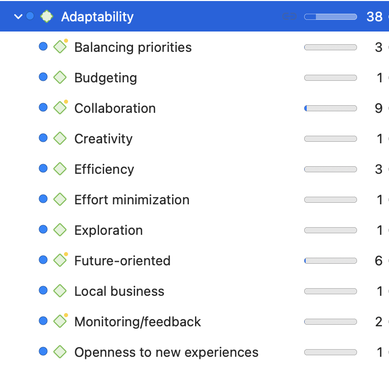
Once the data are cleaned and organized, the next step is coding , a crucial part of qualitative data analysis. Coding involves assigning labels to segments of the data to summarize or categorize them. This process helps to identify patterns and themes in the data, laying the groundwork for subsequent data interpretation and presentation. Qualitative research often involves multiple iterations of coding, creating new and meaningful codes while discarding unnecessary ones , to generate a rich structure through which data analysis can occur.
Uncovering insights
As you navigate through these initial steps, keep in mind the broader aim of qualitative research, which is to provide rich, detailed, and nuanced understandings of people's experiences, behaviors, and social realities. These guiding principles will help to ensure that your data presentation is not only accurate and comprehensive but also meaningful and impactful.
While this process might seem intimidating at first, it's an essential part of any qualitative research project. It's also a skill that can be learned and refined over time, so don't be discouraged if you find it challenging at first. Remember, the goal of presenting qualitative data is to make your research findings accessible and understandable to others. This requires careful preparation, a clear understanding of your data, and a commitment to presenting your findings in a way that respects and honors the complexity of the phenomena you're studying.
In the following sections, we'll delve deeper into how to create a comprehensive narrative from your data, the visualization of qualitative data , and the writing and publication processes . Let's briefly excerpt some of the content in the articles in this part of the guide.
ATLAS.ti helps you make sense of your data
Find out how with a free trial of our powerful data analysis interface.
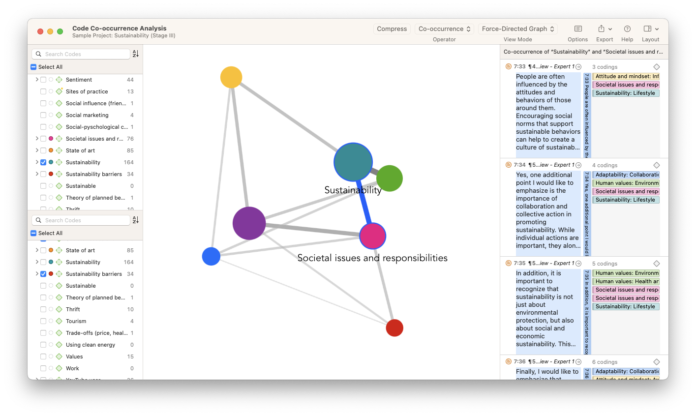
How often do you read a research article and skip straight to the tables and figures? That's because data visualizations representing qualitative and quantitative data have the power to make large and complex research projects with thousands of data points comprehensible when authors present data to research audiences. Researchers create visual representations to help summarize the data generated from their study and make clear the pathways for actionable insights.
In everyday situations, a picture is always worth a thousand words. Illustrations, figures, and charts convey messages that words alone cannot. In research, data visualization can help explain scientific knowledge, evidence for data insights, and key performance indicators in an orderly manner based on data that is otherwise unstructured.
For all of the various data formats available to researchers, a significant portion of qualitative and social science research is still text-based. Essays, reports, and research articles still rely on writing practices aimed at repackaging research in prose form. This can create the impression that simply writing more will persuade research audiences. Instead, framing research in terms that are easy for your target readers to understand makes it easier for your research to become published in peer-reviewed scholarly journals or find engagement at scholarly conferences. Even in market or professional settings, data visualization is an essential concept when you need to convince others about the insights of your research and the recommendations you make based on the data.
Importance of data visualization
Data visualization is important because it makes it easy for your research audience to understand your data sets and your findings. Also, data visualization helps you organize your data more efficiently. As the explanation of ATLAS.ti's tools will illustrate in this section, data visualization might point you to research inquiries that you might not even be aware of, helping you get the most out of your data. Strictly speaking, the primary role of data visualization is to make the analysis of your data , if not the data itself, clear. Especially in social science research, data visualization makes it easy to see how data scientists collect and analyze data.
Prerequisites for generating data visualizations
Data visualization is effective in explaining research to others only if the researcher or data scientist can make sense of the data in front of them. Traditional research with unstructured data usually calls for coding the data with short, descriptive codes that can be analyzed later, whether statistically or thematically. These codes form the basic data points of a meaningful qualitative analysis. They represent the structure of qualitative data sets, without which a scientific visualization with research rigor would be extremely difficult to achieve. In most respects, data visualization of a qualitative research project requires coding the entire data set so that the codes adequately represent the collected data.
A successfully crafted research study culminates in the writing of the research paper . While a pilot study or preliminary research might guide the research design , a full research study leads to discussion that highlights avenues for further research. As such, the importance of the research paper cannot be overestimated in the overall generation of scientific knowledge.

The physical and natural sciences tend to have a clinical structure for a research paper that mirrors the scientific method: outline the background research, explain the materials and methods of the study, outline the research findings generated from data analysis, and discuss the implications. Qualitative research tends to preserve much of this structure, but there are notable and numerous variations from a traditional research paper that it's worth emphasizing the flexibility in the social sciences with respect to the writing process.
Requirements for research writing
While there aren't any hard and fast rules regarding what belongs in a qualitative research paper , readers expect to find a number of pieces of relevant information in a rigorously-written report. The best way to know what belongs in a full research paper is to look at articles in your target journal or articles that share a particular topic similar to yours and examine how successfully published papers are written.
It's important to emphasize the more mundane but equally important concerns of proofreading and formatting guidelines commonly found when you write a research paper. Research publication shouldn't strictly be a test of one's writing skills, but acknowledging the importance of convincing peer reviewers of the credibility of your research means accepting the responsibility of preparing your research manuscript to commonly accepted standards in research.
As a result, seemingly insignificant things such as spelling mistakes, page numbers, and proper grammar can make a difference with a particularly strict reviewer. Even when you expect to develop a paper through reviewer comments and peer feedback, your manuscript should be as close to a polished final draft as you can make it prior to submission.
Qualitative researchers face particular challenges in convincing their target audience of the value and credibility of their subsequent analysis. Numbers and quantifiable concepts in quantitative studies are relatively easier to understand than their counterparts associated with qualitative methods . Think about how easy it is to make conclusions about the value of items at a store based on their prices, then imagine trying to compare those items based on their design, function, and effectiveness.
Qualitative research involves and requires these sorts of discussions. The goal of qualitative data analysis is to allow a qualitative researcher and their audience to make such determinations, but before the audience can accept these determinations, the process of conducting research that produces the qualitative analysis must first be seen as trustworthy. As a result, it is on the researcher to persuade their audience that their data collection process and subsequent analysis is rigorous.
Qualitative rigor refers to the meticulousness, consistency, and transparency of the research. It is the application of systematic, disciplined, and stringent methods to ensure the credibility, dependability, confirmability, and transferability of research findings. In qualitative inquiry, these attributes ensure the research accurately reflects the phenomenon it is intended to represent, that its findings can be understood or used by others, and that its processes and results are open to scrutiny and validation.
Transparency
It is easier to believe the information presented to you if there is a rigorous analysis process behind that information, and if that process is explicitly detailed. The same is true for qualitative research results, making transparency a key element in qualitative research methodologies. Transparency is a fundamental aspect of rigor in qualitative research. It involves the clear, detailed, and explicit documentation of all stages of the research process. This allows other researchers to understand, evaluate, replicate, and build upon the study. Transparency in qualitative research is essential for maintaining rigor, trustworthiness, and ethical integrity. By being transparent, researchers allow their work to be scrutinized, critiqued, and improved upon, contributing to the ongoing development and refinement of knowledge in their field.
Research papers are only as useful as their audience in the scientific community is wide. To reach that audience, a paper needs to pass the peer review process of an academic journal. However, the idea of having research published in peer-reviewed journals may seem daunting to newer researchers, so it's important to provide a guide on how an academic journal looks at your research paper as well as how to determine what is the right journal for your research.

In simple terms, a research article is good if it is accepted as credible and rigorous by the scientific community. A study that isn't seen as a valid contribution to scientific knowledge shouldn't be published; ultimately, it is up to peers within the field in which the study is being considered to determine the study's value. In established academic research, this determination is manifest in the peer review process. Journal editors at a peer-reviewed journal assign papers to reviewers who will determine the credibility of the research. A peer-reviewed article that completed this process and is published in a reputable journal can be seen as credible with novel research that can make a profound contribution to scientific knowledge.
The process of research publication
The process has been codified and standardized within the scholarly community to include three main stages. These stages include the initial submission stage where the editor reviews the relevance of the paper, the review stage where experts in your field offer feedback, and, if reviewers approve your paper, the copyediting stage where you work with the journal to prepare the paper for inclusion in their journal.
Publishing a research paper may seem like an opaque process where those involved with academic journals make arbitrary decisions about the worthiness of research manuscripts. In reality, reputable publications assign a rubric or a set of guidelines that reviewers need to keep in mind when they review a submission. These guidelines will most likely differ depending on the journal, but they fall into a number of typical categories that are applicable regardless of the research area or the type of methods employed in a research study, including the strength of the literature review , rigor in research methodology , and novelty of findings.
Choosing the right journal isn't simply a matter of which journal is the most famous or has the broadest reach. Many universities keep lists of prominent journals where graduate students and faculty members should publish a research paper , but oftentimes this list is determined by a journal's impact factor and their inclusion in major academic databases.

Guide your research to publication with ATLAS.ti
Turn insights into visualizations with our easy-to-use interface. Download a free trial today.
This section is part of an entire guide. Use this table of contents to jump to any page in the guide.
Part 1: The Basics
- What is qualitative data?
- 10 examples of qualitative data
- Qualitative vs. quantitative research
- What is mixed methods research?
- Theoretical perspective
- Theoretical framework
- Literature reviews
- Research questions
- Conceptual framework
- Conceptual vs. theoretical framework
- Focus groups
- Observational research
- Case studies
- Survey research
- What is ethnographic research?
- Confidentiality and privacy in research
- Bias in research
- Power dynamics in research
- Reflexivity
Part 2: Handling Qualitative Data
- Research transcripts
- Field notes in research
- Research memos
- Survey data
- Images, audio, and video in qualitative research
- Coding qualitative data
- Coding frame
- Auto-coding and smart coding
- Organizing codes
- Content analysis
- Thematic analysis
- Thematic analysis vs. content analysis
- Narrative research
- Phenomenological research
- Discourse analysis
- Grounded theory
- Deductive reasoning
- What is inductive reasoning?
- Inductive vs. deductive reasoning
- What is data interpretation?
- Qualitative analysis software
Part 3: Presenting Qualitative Data
- Data visualization - What is it and why is it important?
How to Present Results in a Research Paper
- First Online: 01 October 2023
Cite this chapter

- Aparna Mukherjee 4 ,
- Gunjan Kumar 4 &
- Rakesh Lodha 5
772 Accesses
The results section is the core of a research manuscript where the study data and analyses are presented in an organized, uncluttered manner such that the reader can easily understand and interpret the findings. This section is completely factual; there is no place for opinions or explanations from the authors. The results should correspond to the objectives of the study in an orderly manner. Self-explanatory tables and figures add value to this section and make data presentation more convenient and appealing. The results presented in this section should have a link with both the preceding methods section and the following discussion section. A well-written, articulate results section lends clarity and credibility to the research paper and the study as a whole. This chapter provides an overview and important pointers to effective drafting of the results section in a research manuscript and also in theses.
This is a preview of subscription content, log in via an institution to check access.
Access this chapter
- Available as PDF
- Read on any device
- Instant download
- Own it forever
- Available as EPUB and PDF
- Durable hardcover edition
- Dispatched in 3 to 5 business days
- Free shipping worldwide - see info
Tax calculation will be finalised at checkout
Purchases are for personal use only
Institutional subscriptions
Kallestinova ED (2011) How to write your first research paper. Yale J Biol Med 84(3):181–190
PubMed PubMed Central Google Scholar
STROBE. STROBE. [cited 2022 Nov 10]. https://www.strobe-statement.org/
Consort—Welcome to the CONSORT Website. http://www.consort-statement.org/ . Accessed 10 Nov 2022
Korevaar DA, Cohen JF, Reitsma JB, Bruns DE, Gatsonis CA, Glasziou PP et al (2016) Updating standards for reporting diagnostic accuracy: the development of STARD 2015. Res Integr Peer Rev 1(1):7
Article PubMed PubMed Central Google Scholar
Page MJ, McKenzie JE, Bossuyt PM, Boutron I, Hoffmann TC, Mulrow CD et al (2021) The PRISMA 2020 statement: an updated guideline for reporting systematic reviews. BMJ 372:n71
Page MJ, Moher D, Bossuyt PM, Boutron I, Hoffmann TC, Mulrow CD et al (2021) PRISMA 2020 explanation and elaboration: updated guidance and exemplars for reporting systematic reviews. BMJ 372:n160
Consolidated criteria for reporting qualitative research (COREQ): a 32-item checklist for interviews and focus groups | EQUATOR Network. https://www.equator-network.org/reporting-guidelines/coreq/ . Accessed 10 Nov 2022
Aggarwal R, Sahni P (2015) The results section. In: Aggarwal R, Sahni P (eds) Reporting and publishing research in the biomedical sciences, 1st edn. National Medical Journal of India, Delhi, pp 24–44
Google Scholar
Mukherjee A, Lodha R (2016) Writing the results. Indian Pediatr 53(5):409–415
Article PubMed Google Scholar
Lodha R, Randev S, Kabra SK (2016) Oral antibiotics for community acquired pneumonia with chest indrawing in children aged below five years: a systematic review. Indian Pediatr 53(6):489–495
Anderson C (2010) Presenting and evaluating qualitative research. Am J Pharm Educ 74(8):141
Roberts C, Kumar K, Finn G (2020) Navigating the qualitative manuscript writing process: some tips for authors and reviewers. BMC Med Educ 20:439
Bigby C (2015) Preparing manuscripts that report qualitative research: avoiding common pitfalls and illegitimate questions. Aust Soc Work 68(3):384–391
Article Google Scholar
Vincent BP, Kumar G, Parameswaran S, Kar SS (2019) Barriers and suggestions towards deceased organ donation in a government tertiary care teaching hospital: qualitative study using socio-ecological model framework. Indian J Transplant 13(3):194
McCormick JB, Hopkins MA (2021) Exploring public concerns for sharing and governance of personal health information: a focus group study. JAMIA Open 4(4):ooab098
Groenland -emeritus professor E. Employing the matrix method as a tool for the analysis of qualitative research data in the business domain. Rochester, NY; 2014. https://papers.ssrn.com/abstract=2495330 . Accessed 10 Nov 2022
Download references
Acknowledgments
The book chapter is derived in part from our article “Mukherjee A, Lodha R. Writing the Results. Indian Pediatr. 2016 May 8;53(5):409-15.” We thank the Editor-in-Chief of the journal “Indian Pediatrics” for the permission for the same.
Author information
Authors and affiliations.
Clinical Studies, Trials and Projection Unit, Indian Council of Medical Research, New Delhi, India
Aparna Mukherjee & Gunjan Kumar
Department of Pediatrics, All India Institute of Medical Sciences, New Delhi, India
Rakesh Lodha
You can also search for this author in PubMed Google Scholar
Corresponding author
Correspondence to Rakesh Lodha .
Editor information
Editors and affiliations.
Retired Senior Expert Pharmacologist at the Office of Cardiology, Hematology, Endocrinology, and Nephrology, Center for Drug Evaluation and Research, US Food and Drug Administration, Silver Spring, MD, USA
Gowraganahalli Jagadeesh
Professor & Director, Research Training and Publications, The Office of Research and Development, Periyar Maniammai Institute of Science & Technology (Deemed to be University), Vallam, Tamil Nadu, India
Pitchai Balakumar
Division Cardiology & Nephrology, Office of Cardiology, Hematology, Endocrinology and Nephrology, Center for Drug Evaluation and Research, US Food and Drug Administration, Silver Spring, MD, USA
Fortunato Senatore
Ethics declarations
Rights and permissions.
Reprints and permissions
Copyright information
© 2023 The Author(s), under exclusive license to Springer Nature Singapore Pte Ltd.
About this chapter
Mukherjee, A., Kumar, G., Lodha, R. (2023). How to Present Results in a Research Paper. In: Jagadeesh, G., Balakumar, P., Senatore, F. (eds) The Quintessence of Basic and Clinical Research and Scientific Publishing. Springer, Singapore. https://doi.org/10.1007/978-981-99-1284-1_44
Download citation
DOI : https://doi.org/10.1007/978-981-99-1284-1_44
Published : 01 October 2023
Publisher Name : Springer, Singapore
Print ISBN : 978-981-99-1283-4
Online ISBN : 978-981-99-1284-1
eBook Packages : Biomedical and Life Sciences Biomedical and Life Sciences (R0)
Share this chapter
Anyone you share the following link with will be able to read this content:
Sorry, a shareable link is not currently available for this article.
Provided by the Springer Nature SharedIt content-sharing initiative
- Publish with us
Policies and ethics
- Find a journal
- Track your research
Skills for Learning : Research Skills
Data analysis is an ongoing process that should occur throughout your research project. Suitable data-analysis methods must be selected when you write your research proposal. The nature of your data (i.e. quantitative or qualitative) will be influenced by your research design and purpose. The data will also influence the analysis methods selected.
We run interactive workshops to help you develop skills related to doing research, such as data analysis, writing literature reviews and preparing for dissertations. Find out more on the Skills for Learning Workshops page.
We have online academic skills modules within MyBeckett for all levels of university study. These modules will help your academic development and support your success at LBU. You can work through the modules at your own pace, revisiting them as required. Find out more from our FAQ What academic skills modules are available?
Quantitative data analysis
Broadly speaking, 'statistics' refers to methods, tools and techniques used to collect, organise and interpret data. The goal of statistics is to gain understanding from data. Therefore, you need to know how to:
- Produce data – for example, by handing out a questionnaire or doing an experiment.
- Organise, summarise, present and analyse data.
- Draw valid conclusions from findings.
There are a number of statistical methods you can use to analyse data. Choosing an appropriate statistical method should follow naturally, however, from your research design. Therefore, you should think about data analysis at the early stages of your study design. You may need to consult a statistician for help with this.
Tips for working with statistical data
- Plan so that the data you get has a good chance of successfully tackling the research problem. This will involve reading literature on your subject, as well as on what makes a good study.
- To reach useful conclusions, you need to reduce uncertainties or 'noise'. Thus, you will need a sufficiently large data sample. A large sample will improve precision. However, this must be balanced against the 'costs' (time and money) of collection.
- Consider the logistics. Will there be problems in obtaining sufficient high-quality data? Think about accuracy, trustworthiness and completeness.
- Statistics are based on random samples. Consider whether your sample will be suited to this sort of analysis. Might there be biases to think about?
- How will you deal with missing values (any data that is not recorded for some reason)? These can result from gaps in a record or whole records being missed out.
- When analysing data, start by looking at each variable separately. Conduct initial/exploratory data analysis using graphical displays. Do this before looking at variables in conjunction or anything more complicated. This process can help locate errors in the data and also gives you a 'feel' for the data.
- Look out for patterns of 'missingness'. They are likely to alert you if there’s a problem. If the 'missingness' is not random, then it will have an impact on the results.
- Be vigilant and think through what you are doing at all times. Think critically. Statistics are not just mathematical tricks that a computer sorts out. Rather, analysing statistical data is a process that the human mind must interpret!
Top tips! Try inventing or generating the sort of data you might get and see if you can analyse it. Make sure that your process works before gathering actual data. Think what the output of an analytic procedure will look like before doing it for real.
(Note: it is actually difficult to generate realistic data. There are fraud-detection methods in place to identify data that has been fabricated. So, remember to get rid of your practice data before analysing the real stuff!)
Statistical software packages
Software packages can be used to analyse and present data. The most widely used ones are SPSS and NVivo.
SPSS is a statistical-analysis and data-management package for quantitative data analysis. Click on ‘ How do I install SPSS? ’ to learn how to download SPSS to your personal device. SPSS can perform a wide variety of statistical procedures. Some examples are:
- Data management (i.e. creating subsets of data or transforming data).
- Summarising, describing or presenting data (i.e. mean, median and frequency).
- Looking at the distribution of data (i.e. standard deviation).
- Comparing groups for significant differences using parametric (i.e. t-test) and non-parametric (i.e. Chi-square) tests.
- Identifying significant relationships between variables (i.e. correlation).
NVivo can be used for qualitative data analysis. It is suitable for use with a wide range of methodologies. Click on ‘ How do I access NVivo ’ to learn how to download NVivo to your personal device. NVivo supports grounded theory, survey data, case studies, focus groups, phenomenology, field research and action research.
- Process data such as interview transcripts, literature or media extracts, and historical documents.
- Code data on screen and explore all coding and documents interactively.
- Rearrange, restructure, extend and edit text, coding and coding relationships.
- Search imported text for words, phrases or patterns, and automatically code the results.
Qualitative data analysis
Miles and Huberman (1994) point out that there are diverse approaches to qualitative research and analysis. They suggest, however, that it is possible to identify 'a fairly classic set of analytic moves arranged in sequence'. This involves:
- Affixing codes to a set of field notes drawn from observation or interviews.
- Noting reflections or other remarks in the margins.
- Sorting/sifting through these materials to identify: a) similar phrases, relationships between variables, patterns and themes and b) distinct differences between subgroups and common sequences.
- Isolating these patterns/processes and commonalties/differences. Then, taking them out to the field in the next wave of data collection.
- Highlighting generalisations and relating them to your original research themes.
- Taking the generalisations and analysing them in relation to theoretical perspectives.
(Miles and Huberman, 1994.)
Patterns and generalisations are usually arrived at through a process of analytic induction (see above points 5 and 6). Qualitative analysis rarely involves statistical analysis of relationships between variables. Qualitative analysis aims to gain in-depth understanding of concepts, opinions or experiences.
Presenting information
There are a number of different ways of presenting and communicating information. The particular format you use is dependent upon the type of data generated from the methods you have employed.
Here are some appropriate ways of presenting information for different types of data:
Bar charts: These may be useful for comparing relative sizes. However, they tend to use a large amount of ink to display a relatively small amount of information. Consider a simple line chart as an alternative.
Pie charts: These have the benefit of indicating that the data must add up to 100%. However, they make it difficult for viewers to distinguish relative sizes, especially if two slices have a difference of less than 10%.
Other examples of presenting data in graphical form include line charts and scatter plots .
Qualitative data is more likely to be presented in text form. For example, using quotations from interviews or field diaries.
- Plan ahead, thinking carefully about how you will analyse and present your data.
- Think through possible restrictions to resources you may encounter and plan accordingly.
- Find out about the different IT packages available for analysing your data and select the most appropriate.
- If necessary, allow time to attend an introductory course on a particular computer package. You can book SPSS and NVivo workshops via MyHub .
- Code your data appropriately, assigning conceptual or numerical codes as suitable.
- Organise your data so it can be analysed and presented easily.
- Choose the most suitable way of presenting your information, according to the type of data collected. This will allow your information to be understood and interpreted better.
Primary, secondary and tertiary sources
Information sources are sometimes categorised as primary, secondary or tertiary sources depending on whether or not they are ‘original’ materials or data. For some research projects, you may need to use primary sources as well as secondary or tertiary sources. However the distinction between primary and secondary sources is not always clear and depends on the context. For example, a newspaper article might usually be categorised as a secondary source. But it could also be regarded as a primary source if it were an article giving a first-hand account of a historical event written close to the time it occurred.
- Primary sources
- Secondary sources
- Tertiary sources
- Grey literature
Primary sources are original sources of information that provide first-hand accounts of what is being experienced or researched. They enable you to get as close to the actual event or research as possible. They are useful for getting the most contemporary information about a topic.
Examples include diary entries, newspaper articles, census data, journal articles with original reports of research, letters, email or other correspondence, original manuscripts and archives, interviews, research data and reports, statistics, autobiographies, exhibitions, films, and artists' writings.
Some information will be available on an Open Access basis, freely accessible online. However, many academic sources are paywalled, and you may need to login as a Leeds Beckett student to access them. Where Leeds Beckett does not have access to a source, you can use our Request It! Service .
Secondary sources interpret, evaluate or analyse primary sources. They're useful for providing background information on a topic, or for looking back at an event from a current perspective. The majority of your literature searching will probably be done to find secondary sources on your topic.
Examples include journal articles which review or interpret original findings, popular magazine articles commenting on more serious research, textbooks and biographies.
The term tertiary sources isn't used a great deal. There's overlap between what might be considered a secondary source and a tertiary source. One definition is that a tertiary source brings together secondary sources.
Examples include almanacs, fact books, bibliographies, dictionaries and encyclopaedias, directories, indexes and abstracts. They can be useful for introductory information or an overview of a topic in the early stages of research.
Depending on your subject of study, grey literature may be another source you need to use. Grey literature includes technical or research reports, theses and dissertations, conference papers, government documents, white papers, and so on.
Artificial intelligence tools
Before using any generative artificial intelligence or paraphrasing tools in your assessments, you should check if this is permitted on your course.
If their use is permitted on your course, you must acknowledge any use of generative artificial intelligence tools such as ChatGPT or paraphrasing tools (e.g., Grammarly, Quillbot, etc.), even if you have only used them to generate ideas for your assessments or for proofreading.
- Academic Integrity Module in MyBeckett
- Assignment Calculator
- Building on Feedback
- Disability Advice
- Essay X-ray tool
- International Students' Academic Introduction
- Manchester Academic Phrasebank
- Quote, Unquote
- Skills and Subject Suppor t
- Turnitin Grammar Checker
{{You can add more boxes below for links specific to this page [this note will not appear on user pages] }}
- Research Methods Checklist
- Sampling Checklist
Skills for Learning FAQs

0113 812 1000
- University Disclaimer
- Accessibility
Top tips for presenting your data according to research
What do we really know about how to present complex data in ways that are easy to understand and have impacts that might help address complex issues such as climate change? Dr Lucy Richardson explores some of the useful tips provided by data visualisation and communication research that can help you effectively communicate complex information.

This article is part of the ISC’s Transform21 series, which features resources from our network of scientists and change-makers to help inform the urgent transformations needed to achieve climate and biodiversity goals.
Over the last year or so, many people across the world have become used to seeing charts and graphs with COVID-19 statistics in their news feeds, but all charts are not created equal when it comes to effectively communicating a key message.
Researchers have been examining how different aspects of data presentation influence audiences for many years. They have looked at the issue from diverse angles such as which components are viewed in what order and why, and whether text, graphs or maps are more engaging and easily understood. These diverse research questions have been addressed using a wide variety of methods ranging from tracking audience eye movements to surveys and social media polls. From this collection of research, we have gained valuable insights that can help make data visuals more effective communication tools.
A useful framework to think about when designing data visualisations follows the broad process of audience interaction with the presented information: (a) first the audience perceives the information (b) then they think about the information, and (c) then some sort of change or impact occurs due to those thoughts.
Perceiving the information (Perception)
Assuming that your data visualisation is presented to your target audience in a time and place where they are likely to see it, your audience needs to be able to perceive and differentiate each of the key components of your visualisation in order to discern its meaning.
Perception tends to happen in sequence, following a visual hierarchy of attention based on the following characteristics of any object (including maps and graphs): size, colour, contrast, alignment, repetition, proximity, whitespace, and texture and styles. Within each of these elements are further sub-hierarchies. For example, people tend to notice large elements before smaller ones, and bright colours before muted ones. Similarly, dramatic contrasting components are noticed more than those with less contrast.
The effect of these hierarchical elements can be impacted by perception challenges and should be carefully considered to ensure that they promote your message rather than confusing or distracting your audience. There are a range of different perception challenges that can impact on the effectiveness of data visualisations, but did you know there are actually seven different forms of colour blindness ? You can even run your data visualisation through a colour blindness simulator to see how it might be viewed by someone with these challenges.
Thinking about the information (Cognition)
When your audience thinks about and derives meaning from information they perceive, this is known as cognitive processing. It includes thinking, knowing, remembering, judging, and problem-solving; any number of which may be used when processing information associated with visualised data.
Some things you can do to help encourage the desired interpretation of meaning from your data visualisation include providing chart titles that are the main message rather than just a description of the content. A title such as ‘Higher amounts of green vegetation in cities is associated with lower summer temperatures’ is much more effective at guiding meaning-making than titling the same chart as ‘Green vegetation and temperature in Australian cities’.
Some topic areas that may require data visualisations can also have underlying psycho-social (psychological, social and/or political) factors that should be considered. This is particularly the case for climate change, a heavily politicised issue that is quite polarising in some countries. When presenting data relating to climate change, some valuable tips include:
- Avoid catastrophic messaging that can cause people to shut down as a coping response to their fear.
- Include solutions-based information can help counteract fear by promoting a sense that climate change can be addressed.
- Provide locally relevant information where possible, as this will resonate more strongly. People are naturally most interested in what happens in their local area.
- Where possible, consider if there are other ways to cover the issue without mentioning ‘climate change’ if communicating to audiences who may not accept current scientific evidence of its existence and urgency. This is easier for messages relating to adapting to changes in climate than mitigation, as there are often diverse benefits beyond climate change that can be used to frame adaptation information.
It’s also important to recognize that people are generally more likely to remember meaning than detail. This means that people are more likely to remember a trend—such as it’s getting ‘worse’ or ‘better’, ‘increasing’ or ‘decreasing’—but may not remember the specific amount or rate of that increase or decrease.
Changes effected (Impact)
There are a range of possible impacts that might arise from audiences viewing your data visualisation. These could be changes in thought (for example, awareness, understanding, attitudes or concern), or changes in behaviour (for example, information seeking, discussion with others, or even adoption of climate-friendly behaviours). The likelihood of change being effected due to your data visualisation will be enhanced by ensuring your messages are clear and relevant, where clarity will come from effectively addressing perception and cognition considerations and relevance will come from appropriate message framing and consideration of psycho-social factors. Knowing the kind of change you want to achieve will be critical in determining how best to integrate these various factors into your work.
Alternative formats
While most people wishing to present complex scientific data tend to think of charts, graphs, maps, and infographics, it is also possible to present information for perception by other senses such as through sound. Some researchers have been testing data sonification as an alternative to visual data representation. Sonification takes each data point and applies a mix of sound elements that can allow trends to be distinguished—for example, pitch, volume, and choice of instrument—to provide an audio representation of the information. NASA has done this so that people can ‘listen’ to the Milky Way Galaxy , and researchers at the Monash University Climate Change Communication Research Hub have sonified cyclone Debbie ’s movements around Australia in 2017.
A free best practice guide has been developed based on a review of data visualisation research. Hopefully, it will help you decide how you can best present your data for effective perception, cognition and impact. You can access the Best practice data visualisation: Guidelines and case study on the Monash Climate Change Communication Research Hub website .
Lucy Richardson
Dr Lucy Richardson is based at the Monash Climate Change Communication Research Hub, Monash University, on the lands of the Kulin Nations, Melbourne, Australia, and a member of the Commonwealth Futures Climate Research Cohort established by The Association of Commonwealth Universities and the British Council to support 26 rising-star researchers to bring local knowledge to a global stage in the lead-up to COP26.
The header image was created by NASA’s Scientific Visualization Studio to support a series of talks from NASA scientists for COP26. It is a still from a video that shows the atmosphere in three dimensions and highlights the accumulation of CO 2 during a single calendar year. You can watch the visualisation and find out more about the data on which it’s based here .
Related Items
Call for experts to participate in the scoping meeting for the ipcc seventh assessment report | deadline: 3 june.

INGSA 2024: Science advisors of the world united

Asia and the Pacific call for better science advice links to government

Insights from Dr. Pedro Jaureguiberry, Frontiers Planet Prize National Champion, on biodiversity loss and planetary boundaries

Plastic Treaty negotiations must prioritize health

2024 National Champions in line for the Frontiers Planet Prize announced

publications
A guide for policy-makers: evaluating rapidly developing technologies including ai, large language models and beyond.

Disaster risk reduction: UNDRR and ISC to review Hazard Information Profiles ahead of 2025 Global Platform

The ISC’s Centre for Science Futures secures over one million dollars grant to explore the impacts of AI on science systems in the Global South

New report on future of wood supply highlights importance of innovation

1 in every 10 women in the world lives in extreme poverty

2024 World Data System Scientific Committee (WDS-SC) Nominations are Now Open

Pacific Islands Academy of Sciences and Humanities: A Pivotal Step Towards a Resilient Future

Spacecrafts burning in the upper atmosphere: what consequences on climate?

Establishment of the ISC expert group on plastic pollution

World Climate Research Programme launches a Lighthouse Activity on Climate Intervention Research

Kigali Declaration: Climate science for a sustainable future for all

Climate inequality: The stark realities and the road to equitable solutions

Biodiversity data is distorted by past inequities. Scientists are wrestling to get a clearer picture.

Early-career researchers' insights on climate

Science reading list from the International Science Council

Readers' choice: our most shared science blogs this year

Seizing the momentum: a year of climate science advocacy

Large Ocean States and climate change: a plea for adaptation

COP28 agreement: embracing the urgency of the scientific consensus?

Fostering tomorrow’s science: the ISC's engagements with Early and Mid-Career Researchers in 2023

"What's holding us back?": how economists and social scientists might hold the key to climate action

Podcast with Cory Doctorow: Science Fiction and the Future of Science: Leveraging Digital Advancements for the Future

"Beyond weathering the storm": rethinking climate resilience

For science-based decision-making on the climate emergency: 10 new insights in climate science

COP28: The International Science Council's engagement in climate science

Scientific communication: Join the Ethnografilm festival for a filmmaking experience in Paris

Policy Brief: Global Sea-Level Rise
The costs of shifting scenarios: why the ipcc should maintain consistent vocabulary in climate assessments.

New ISC policy brief: A call for a formal scientific voice in the global fight against plastic pollution

Converging and interdependent crises are amplifying the impacts of one another with often devastating consequences

Reframing Trust in Science for Multilateral Policy: Insights from the Science Journalists Forum

One Planet Polar Summit, scientists striving to bridge the science-policy gap for urgent action: "every tenth of a degree Celsius matters"

Science Fiction and the Future of Science

Call for nomination of experts to draft an outline of the IPCC Special Report on Climate Change and Cities - deadline 15 November

Kigali declaration pledges to bridge climate injustice

The human dimension of disaster risk reduction: social sciences and climate adaptation

From monsoon joy to fear: a climate crisis awakening

Global solidarity for climate justice: perspectives from an early-career researcher

One world, one climate: a planetary call to action

Transdisciplinary research for sustainability solutions in urban Africa

Cultivating a proactive approach to crises: first meeting of the UNEP/ISC foresight expert panel

Clearing the air: is ammonia our key to cleaner skies?

Unearthing sustainability: soil science for the SDGs

Helping newsrooms get disaster risk ready, an International Science Council and World Editors Forum collaboration

Our Future Depends on Us: Antarctic climate change and the environment

Unveiling the health benefits of forests and trees

How do we talk about science and uncertainty?

From Authoritarian Threats to Funding Disparities: Key Challenges in Global Science

Frontiers Planet Prize, second edition: celebrating the world’s most innovative sustainability scientists by 1 November

Protecting the ocean: 5 essential reads on invasive species, overfishing and other threats to sea life

The Frontiers Planet Prize unveils its champions

ISC's nomination track ensures transdisciplinary and global representation in UNEP's Scientific Advisory Group for GEO-7 Assessment

UN 2023 Water Conference carries new engagements towards realizing SDG6 and future avenues for a decade of action

IPCC report: the world must cut emissions and urgently adapt to the new climate realities

ISC-BBC StoryWorks partnership ends on a high note, delivering some of the highest engagement for the BBC

Youth perspectives on climate ‘COP’ negotiations and ways to get involved

Public participation in scientific programmes: Citizen science for biodiversity

The ISC and UNEP to cooperate on advancing the use of science in environmental policy and decision-making

Science in Times of Crisis Episode 3 - The Fallout of Conflict: The Arctic and Outer Space

Innovative approaches to storytelling in science celebrated at Women in Science Film Festival in Cape Town

Ten key messages for the Convention on Biological Diversity

COP27 ends with commitment on financial support

There are 8 years left to meet the UN Sustainable Development Goals, but is it enough time?

Special interview series on COP 27- Interview with Nick Perkins about climate change and science communication

People on the front lines of climate change must be included in climate action

Are we in a new era of climate adaptation implementation? The role of regional governments in facilitating local action

In the face of climate threats, we cannot afford not to act

The Role of Integrated Science in Understanding the Earth-Human System

In the face of extreme weather events, coordinated global action to address climate change is needed at COP27

Perspectives from the ISC network on expectations for the COP

Professor Carlos Lopes on why Africa needs to stick to renewables despite the temptation of gas

How can scientists make a difference at COP27?

Call for contributions for the Sustainability Research & Innovation Congress (SRI 2023)

Frontiers Planet Prize: Science for a Sustainable Planet
The scientific community can support the call for decisive action at cop27.

Stories of transformations to sustainability

Happy birthday to the Montreal Protocol – the most successful environmental treaty of all time?

Risk of passing multiple climate tipping points escalates above 1.5°C global warming

World Youth Skills Day 2022: From Resilience to Fearlessness

WorldFAIR: Global cooperation on FAIR data policy and practice – Kick-Off Meeting introduces major new initiative to advance implementation of the FAIR data principles

Six Takeaways on Science Communication from our Talk Back Better Webinar Series

What's on the horizon for scientific data services? The latest from the World Data System

Implementing FAIR data principles – what’s behind the acronym?

WorldFAIR: Global cooperation on FAIR data policy and practice

A letter to our fellow citizens of Earth

The Biggest Carbon Sink of All

Policy Brief: Harnessing data to accelerate the transition from disaster response to recovery

CODATA and ISC celebrate Metrology in the Digital Era on World Metrology Day

Managed retreat from areas threatened by floods can catalyse positive social transformations

‘Now or never’ to limit warming to 1.5°C, according to latest IPCC report

How Science Affects my Everyday Life as a Fourteen-Year-Old

Joint Statement of Intent on the Digital Transformation in the International Scientific and Quality Infrastructure

The African Open Science Platform begins to take shape

Video tutorials on science ethics and science communication

Women Leading on Equitable and Inclusive Solutions to address the Climate Emergency: Webinar

Principles and Structures of Science Advice: An outline

The window for climate action to avoid dangerous systemic risks is narrowing, warns latest IPCC report

The transformative potential of managed retreat in the face of rising sea levels

The seven warmest years on record were the last seven

The Paris Agreement is working as intended, but we’ve still got a long way to go

An early career perspective on the science-policy interface in the decade of climate action following COP26

Holiday binge-watching: Science edition

Our most popular stories from 2021

Global Risks Perceptions Report 2021 released
Staying below 1.5°c: what are the chances.

Picturing the future of complex, cascading climate risks

If universities want to hit climate targets, they should use their land for carbon offsetting

Emerging Climate Risks and what will it take to limit global warming to 2.0°C?

What Antarctica can teach us about global climate change

How to teach energy transition and climate in business schools

Convening the scientific knowledge required to boost climate action

Major scientific assessment of the Amazon region issues urgent call to end deforestation and avert tipping points

Urban Health and Wellbeing in the Anthropocene

Compelling stories, curious science: #UnlockingScience launched
Building resilience in a climate challenged world.

Climate change projections for Pakistan: the need for sustainable solutions to protect its people and biodiversity

Four considerations for accelerating progress on climate change at the science-policy interface

Ten New Insights in Climate Science 2021 report highlights critical research and policy implications for addressing the climate crisis

Ahead of COP26, Ekanem I. Braide shares her perspective on the priorities for action and the role of science

Climate risk assessment gaps: seamless integration of weather and climate information for community resilience

Increasing the participation of women in the climate change debate, including as leaders, is essential for a carbon-zero future

Deepening interactions between science and policy on the way to COP26: What role for science publishers?

Predicting the climate of the next decade

Global citizens and scientists on how to achieve a thriving net zero future

Big Earth Data Advances Science and Engineering for SDGs

Call for emergency action to limit global temperature increases, restore biodiversity, and protect health

Professor Karen O'Brien: People are the most powerful solution to climate change

Climate justice and the decarbonization of shipping

A call for reconceptualizing carbon pricing policies with both eyes open

Coastal communities in the Arctic rely on structural measures to adapt to climate change, but should they?

Enabling positive tipping points towards global sustainability in uncertain times

Solar Geoengineering at a Standstill?

Scientific advances underpinning latest IPCC report demonstrate need for rapid action

Deep and sustained emissions reductions required to head off rapid climate change affecting all regions of the world

The carbon skyscraper

What we are reading

The mental health burden of climate change is growing – now it’s time to act

Climate finance - a sticking point for the COP26?

Call for papers: Discussion meeting on statistical aspects of climate change

World Youth Skills Day 2021: resilience and creativity

Tell me a story – why climate change communication needs to embrace our childlike curiosity

Climate change solutions in focus ahead of COP26

Four insights on collaborating at scale to advance climate adaptation

We're in the midst of a global wake-up call

A Global Survey of Science Offers Hope and Challenging Lessons

Can zero emissions and economic growth go together? Yes, but conditions apply

Climate explained: why is the Arctic warming faster than other parts of the world?

Why water-driven migration and displacement must be part of the climate agenda

COP26 Climate Action Champion Nigel Topping on creating an 'ambition loop' for bolder pathways to change

Climate scientists: concept of net zero is a dangerous trap

Building a climate future requires a regional approach

Designing responsible policy pathways for a zero-carbon transition

Earth Day 2021: we need bold, creative, innovative solutions

Strengthening the links between science and society for action on climate change in France

Target high-carbon emitters to accelerate green transition, say leading experts on behavioural change

What would a 3°C warmer world mean for Australia?

Citizen scientists: perhaps without a degree but certainly making a difference

The new climate change activism is emotional, and it’s a good thing

ISC Science Communications Network

Top ten insights in climate science from the past year

Mary Robinson - No Time to Spare for the Paris Climate Promise

Global change research and the COVID-19 pandemic

Children’s comic book series introduces solar-terrestrial physics

Working together: Future Earth and WCRP announce partnership to jointly address major societal challenges

Global Carbon Budget 2020 Finds Record Drop in Emissions

What are the climate breakthroughs in 2020?

Taking the temperature of the Paris Agreement: perspectives from our community

The “How” of transformation

Project Syndicate talks with Mary Robinson on climate change and her new podcast
Taking stock of progress on global change: what to expect from the unep global assessments synthesis report.

Ozone hole over Antarctica ‘largest’ and ‘deepest’ it has been in years

Redefining business as usual for scientific publishing

Learning from COVID-19 and building more resilient food systems

Global Science TV: Arctic ice keeps shrinking. Here’s what that means for all of us

The COVID-19 Pandemic Illustrates the Need for Open Science

World’s first high-level science initiative dedicated to the survival of the Amazon

Statistical thinking as an essential skill for reading the news

Global Science TV: Why can't we deal with climate change as urgently as COVID-19?

Why can’t we deal with climate change as urgently as COVID-19?
Earth day 50th anniversary calls for climate action.

A Data Ecosystem to Defeat COVID-19

Making data work for cross-domain grand challenges

Tackling Climate Change with COVID-19 Urgency - by ISC Patron, Mary Robinson and ISC President, Daya Reddy

Four major international data organizations join forces to optimize the research data ecosystem, launching a COVID-19 appeal as their first joint action

Call for Expressions of Interest to Host the World Data System International Programme Office (Partial Submissions Allowed)

Join the first ‘Transformation Talks’ webinar to explore how research communication can be transformative

TROP ICSU - Climate Change Education Across the Globe

A rapidly-evolving new normal: Pep Canadell comments on Australia’s Fires

ISC joins WCRP in celebrating its 40th year of international climate science

COP25: Time for action

Call for nominations of experts to serve on the Editorial Board of the IPCC Emission Factor Database

Why we need a UN charter

World Data System Data Stewardship Award 2019

Achieving Risk Reduction Across Sendai, Paris And The SDGs

Disaster Loss Data In Monitoring The Implementation Of The Sendai Framework

The political challenge of achieving transformations to 1.5ºC – the role of social justice

A vision for the African Open Science Platform

COP24 side event on The CitiesIPCC Research and Action Agenda for effective urban responses to climate change

International data week gets underway in Gaborone, Botswana

Transforming southern African cities in a changing climate – Q and A with Alice McClure from the University of Cape Town

Review of the World Climate Research Programme (WCRP)

Ten essentials for research that responds to the climate challenge
Vacancy: executive director of the icsu world data system (wds) (re-advertised).

Vacancy: Communications Intern for the LIRA 2030 programme

News from LIRA2030: Seedbeds of Transformation conference, South Africa
World data system workshop held in rio de janeiro.

ICSU World Data System International Technology Office to open in Canada

Pavel Kabat appointed WMO Chief Scientist and Research Director

Why the IPCC's upcoming 1.5°C report offers an unexpected glimpse of hope

The IPCC at 30: Is the 1.5°C Special Report a turning point?

The origins of the IPCC: How the world woke up to climate change

The state of biodiversity in the regions: What to expect from the IPBES in 2018

Highlights of 2017

Why 2018 is a big year for global environmental assessments

Heide Hackmann recieves award for science diplomacy

IAMAS urges United States to continue support of Earth Observation systems
Cop23 side event on climate change- when and where will habitability limits be reached.

Largest Ever Science Gathering in the Middle East for World Science Forum 2017

Belmont Forum announces Mustapha Mokrane as new Co-Lead of Open Data Initiative
Future of science: voices from our partners.

Future of science: Voices from our partners
Call for scientific and non-academic reviewers for lira 2030, early career scientists gather for lira trans-disciplinary workshop in uganda.

Focus on Interactions: Second Nexus Conference Announced for 2018

International Council for Science calls on United States to support international efforts to combat dangerous climate change

ICSU President to receive International Meterological Prize from WMO

ICSU at the U.N. Ocean Conference

Science Plan on Global Environmental Change – ICSU Regional Office for Africa
Climate change.

"Open Data in a Big Data World" accord passes 120 endorsements

NZ Government thanks IRDR and CODATA groups for their help following 2016 Kaikoura earthquake

Making a case for science at the United Nations

ICSU Unions receive award to launch multi-year initiatives in science outreach and education
New commentary published: climate research must sharpen its view, african open science platform to boost the impact of open data for science and society, icsu co-organizes side event at cop22 on urgent questions in climate research.

Future Earth-PROVIA-IPCC risks and solutions workshop: livestream available
Call for nominations - early career scientists at habitat iii, open data in a big data world, world data system marks fifth anniversary of international programme office, advisory note: science communication (2010/2016), leading science groups urge global accord on open data in a big data world, 30 years pioneering collaboration on global change research: igbp closes down dec 2015, the international council for science and climate change.

Twelve things we've learned on the Road to Paris

Science International to agree international accord on open data
New scientific committee and chair appointed for icsu world data system, landmark scientifc data conference ends with strong support of data sharing for sustainability, future earth 2025 vision.

Future Earth Strategic Research Agenda 2014

Open access to scientific data and literature and the assessment of research by metrics
Icsu-endorsed initiative sustainable deltas 2015 launches in rotterdam.

International Council for Science endorses open access to scientific record; cautions against misuse of metrics
Celebrating 30 years of global change research, call for proposals: transformations to sustainability.

Review of CODATA, the Committee on Data for Science and Technology
Future earth initial design report: executive summary.

Annual global carbon emissions set to reach record 36 billion tonnes in 2013
World social science report 2013: changing global environments.

Scientists meet at the UN for Expert Group Meeting on Sustainable Development Goals
Black carbon report from igbp project generates significant media coverage, ad-hoc strategic coordinating committee on information and data (sccid report), how to describe nanomaterials – an icsu workshop in paris, the international council for science pledges support for scientists in the l’aquila case, icsu-unesco regional science and technology workshops for rio+20, climate research in the next decade of earth system research, icsu's new world data system opens new international progamme office in tokyo, international programme office of icsu’s new world data system opened, icsu foresight analysis peer-reviewed, workshop on the description of nanomaterials, advisory note on access to shared data to reduce global inequality, rio+20 policy briefs released by the gec programmes, advisory note on sharing scientific data, with a focus on developing countries, icsu releases statement on the controversy around the 4th ipcc assessment, polar year comes to a close, a vision for earth system research: have your say, polar research reveals new evidence of global environmental change, upcoming release of new evidence about change in the polar regions, review of the international geosphere-biosphere programme, review of the world climate research programme (2009), ipy polar day focusing above the polar regions, international science community agrees on first steps to establish a global virtual library for scientific data, icsu launches new programme to understand the human impact on earth’s life-support systems, international council for science (icsu) launches major research programme on natural disasters, ipy polar day focusing on people, ipy polar land and life day, report from the ad hoc strategic committee on information and data, ipy day focusing on changing earth, ipy day focusing on ice sheets, ipy presents sea ice day, global launch of international polar year (ipy) 2007-2008, co2 rise heightens concern over vulnerability of polar regions, icsu hosts conference on hazards and disasters, icsu and climate science (2006), at pivotal event in china, the international council for science releases new strategy to strengthen international science for the benefit of society, international experts call for new approach to ensure challenges to data access and management don’t slow scientific progress, icsu pursues new initiative that challenges science to do more to prevent natural disasters, socioeconomic data in relation to the integrated global observing strategy partnership igos-p (2004), priority area assessment on scientific data and information, cern announces major conference on the information society, icsu launches an agenda for action in advance of the world summit on the information society, science in the information society: policy issues for scientific information (2003), science in the information society: optimizing knowledge (2003), science in the information society: decision making and governance (2003), science in the information society: universal access to scientific knowledge (2003), icsu/codata launch online forum for world summit on the information society.
VIEW ALL RELATED ITEMS
https://council.science/current/blog/tips-for-presenting-your-data-research/">
- Disclaimer: The translations are automatically generated by Google Translate and may contain errors. The ISC is not liable for any damage or issues that may arise from these translations. You can provide your feedback by emailing us at [email protected] Note: Please note that the ‘Science Summit at the UN General Assembly’ in September 2023 is not an event of the International Science Council. The International Science Council has no association with this event nor with the organizer of the event.
Privacy Overview
Princeton Correspondents on Undergraduate Research
How to Make a Successful Research Presentation
Turning a research paper into a visual presentation is difficult; there are pitfalls, and navigating the path to a brief, informative presentation takes time and practice. As a TA for GEO/WRI 201: Methods in Data Analysis & Scientific Writing this past fall, I saw how this process works from an instructor’s standpoint. I’ve presented my own research before, but helping others present theirs taught me a bit more about the process. Here are some tips I learned that may help you with your next research presentation:
More is more
In general, your presentation will always benefit from more practice, more feedback, and more revision. By practicing in front of friends, you can get comfortable with presenting your work while receiving feedback. It is hard to know how to revise your presentation if you never practice. If you are presenting to a general audience, getting feedback from someone outside of your discipline is crucial. Terms and ideas that seem intuitive to you may be completely foreign to someone else, and your well-crafted presentation could fall flat.
Less is more
Limit the scope of your presentation, the number of slides, and the text on each slide. In my experience, text works well for organizing slides, orienting the audience to key terms, and annotating important figures–not for explaining complex ideas. Having fewer slides is usually better as well. In general, about one slide per minute of presentation is an appropriate budget. Too many slides is usually a sign that your topic is too broad.

Limit the scope of your presentation
Don’t present your paper. Presentations are usually around 10 min long. You will not have time to explain all of the research you did in a semester (or a year!) in such a short span of time. Instead, focus on the highlight(s). Identify a single compelling research question which your work addressed, and craft a succinct but complete narrative around it.
You will not have time to explain all of the research you did. Instead, focus on the highlights. Identify a single compelling research question which your work addressed, and craft a succinct but complete narrative around it.
Craft a compelling research narrative
After identifying the focused research question, walk your audience through your research as if it were a story. Presentations with strong narrative arcs are clear, captivating, and compelling.
- Introduction (exposition — rising action)
Orient the audience and draw them in by demonstrating the relevance and importance of your research story with strong global motive. Provide them with the necessary vocabulary and background knowledge to understand the plot of your story. Introduce the key studies (characters) relevant in your story and build tension and conflict with scholarly and data motive. By the end of your introduction, your audience should clearly understand your research question and be dying to know how you resolve the tension built through motive.

- Methods (rising action)
The methods section should transition smoothly and logically from the introduction. Beware of presenting your methods in a boring, arc-killing, ‘this is what I did.’ Focus on the details that set your story apart from the stories other people have already told. Keep the audience interested by clearly motivating your decisions based on your original research question or the tension built in your introduction.
- Results (climax)
Less is usually more here. Only present results which are clearly related to the focused research question you are presenting. Make sure you explain the results clearly so that your audience understands what your research found. This is the peak of tension in your narrative arc, so don’t undercut it by quickly clicking through to your discussion.
- Discussion (falling action)
By now your audience should be dying for a satisfying resolution. Here is where you contextualize your results and begin resolving the tension between past research. Be thorough. If you have too many conflicts left unresolved, or you don’t have enough time to present all of the resolutions, you probably need to further narrow the scope of your presentation.
- Conclusion (denouement)
Return back to your initial research question and motive, resolving any final conflicts and tying up loose ends. Leave the audience with a clear resolution of your focus research question, and use unresolved tension to set up potential sequels (i.e. further research).
Use your medium to enhance the narrative
Visual presentations should be dominated by clear, intentional graphics. Subtle animation in key moments (usually during the results or discussion) can add drama to the narrative arc and make conflict resolutions more satisfying. You are narrating a story written in images, videos, cartoons, and graphs. While your paper is mostly text, with graphics to highlight crucial points, your slides should be the opposite. Adapting to the new medium may require you to create or acquire far more graphics than you included in your paper, but it is necessary to create an engaging presentation.
The most important thing you can do for your presentation is to practice and revise. Bother your friends, your roommates, TAs–anybody who will sit down and listen to your work. Beyond that, think about presentations you have found compelling and try to incorporate some of those elements into your own. Remember you want your work to be comprehensible; you aren’t creating experts in 10 minutes. Above all, try to stay passionate about what you did and why. You put the time in, so show your audience that it’s worth it.
For more insight into research presentations, check out these past PCUR posts written by Emma and Ellie .
— Alec Getraer, Natural Sciences Correspondent
Share this:
- Share on Tumblr

Home Blog Design Understanding Data Presentations (Guide + Examples)
Understanding Data Presentations (Guide + Examples)

In this age of overwhelming information, the skill to effectively convey data has become extremely valuable. Initiating a discussion on data presentation types involves thoughtful consideration of the nature of your data and the message you aim to convey. Different types of visualizations serve distinct purposes. Whether you’re dealing with how to develop a report or simply trying to communicate complex information, how you present data influences how well your audience understands and engages with it. This extensive guide leads you through the different ways of data presentation.
Table of Contents
What is a Data Presentation?
What should a data presentation include, line graphs, treemap chart, scatter plot, how to choose a data presentation type, recommended data presentation templates, common mistakes done in data presentation.
A data presentation is a slide deck that aims to disclose quantitative information to an audience through the use of visual formats and narrative techniques derived from data analysis, making complex data understandable and actionable. This process requires a series of tools, such as charts, graphs, tables, infographics, dashboards, and so on, supported by concise textual explanations to improve understanding and boost retention rate.
Data presentations require us to cull data in a format that allows the presenter to highlight trends, patterns, and insights so that the audience can act upon the shared information. In a few words, the goal of data presentations is to enable viewers to grasp complicated concepts or trends quickly, facilitating informed decision-making or deeper analysis.
Data presentations go beyond the mere usage of graphical elements. Seasoned presenters encompass visuals with the art of data storytelling , so the speech skillfully connects the points through a narrative that resonates with the audience. Depending on the purpose – inspire, persuade, inform, support decision-making processes, etc. – is the data presentation format that is better suited to help us in this journey.
To nail your upcoming data presentation, ensure to count with the following elements:
- Clear Objectives: Understand the intent of your presentation before selecting the graphical layout and metaphors to make content easier to grasp.
- Engaging introduction: Use a powerful hook from the get-go. For instance, you can ask a big question or present a problem that your data will answer. Take a look at our guide on how to start a presentation for tips & insights.
- Structured Narrative: Your data presentation must tell a coherent story. This means a beginning where you present the context, a middle section in which you present the data, and an ending that uses a call-to-action. Check our guide on presentation structure for further information.
- Visual Elements: These are the charts, graphs, and other elements of visual communication we ought to use to present data. This article will cover one by one the different types of data representation methods we can use, and provide further guidance on choosing between them.
- Insights and Analysis: This is not just showcasing a graph and letting people get an idea about it. A proper data presentation includes the interpretation of that data, the reason why it’s included, and why it matters to your research.
- Conclusion & CTA: Ending your presentation with a call to action is necessary. Whether you intend to wow your audience into acquiring your services, inspire them to change the world, or whatever the purpose of your presentation, there must be a stage in which you convey all that you shared and show the path to staying in touch. Plan ahead whether you want to use a thank-you slide, a video presentation, or which method is apt and tailored to the kind of presentation you deliver.
- Q&A Session: After your speech is concluded, allocate 3-5 minutes for the audience to raise any questions about the information you disclosed. This is an extra chance to establish your authority on the topic. Check our guide on questions and answer sessions in presentations here.
Bar charts are a graphical representation of data using rectangular bars to show quantities or frequencies in an established category. They make it easy for readers to spot patterns or trends. Bar charts can be horizontal or vertical, although the vertical format is commonly known as a column chart. They display categorical, discrete, or continuous variables grouped in class intervals [1] . They include an axis and a set of labeled bars horizontally or vertically. These bars represent the frequencies of variable values or the values themselves. Numbers on the y-axis of a vertical bar chart or the x-axis of a horizontal bar chart are called the scale.

Real-Life Application of Bar Charts
Let’s say a sales manager is presenting sales to their audience. Using a bar chart, he follows these steps.
Step 1: Selecting Data
The first step is to identify the specific data you will present to your audience.
The sales manager has highlighted these products for the presentation.
- Product A: Men’s Shoes
- Product B: Women’s Apparel
- Product C: Electronics
- Product D: Home Decor
Step 2: Choosing Orientation
Opt for a vertical layout for simplicity. Vertical bar charts help compare different categories in case there are not too many categories [1] . They can also help show different trends. A vertical bar chart is used where each bar represents one of the four chosen products. After plotting the data, it is seen that the height of each bar directly represents the sales performance of the respective product.
It is visible that the tallest bar (Electronics – Product C) is showing the highest sales. However, the shorter bars (Women’s Apparel – Product B and Home Decor – Product D) need attention. It indicates areas that require further analysis or strategies for improvement.
Step 3: Colorful Insights
Different colors are used to differentiate each product. It is essential to show a color-coded chart where the audience can distinguish between products.
- Men’s Shoes (Product A): Yellow
- Women’s Apparel (Product B): Orange
- Electronics (Product C): Violet
- Home Decor (Product D): Blue

Bar charts are straightforward and easily understandable for presenting data. They are versatile when comparing products or any categorical data [2] . Bar charts adapt seamlessly to retail scenarios. Despite that, bar charts have a few shortcomings. They cannot illustrate data trends over time. Besides, overloading the chart with numerous products can lead to visual clutter, diminishing its effectiveness.
For more information, check our collection of bar chart templates for PowerPoint .
Line graphs help illustrate data trends, progressions, or fluctuations by connecting a series of data points called ‘markers’ with straight line segments. This provides a straightforward representation of how values change [5] . Their versatility makes them invaluable for scenarios requiring a visual understanding of continuous data. In addition, line graphs are also useful for comparing multiple datasets over the same timeline. Using multiple line graphs allows us to compare more than one data set. They simplify complex information so the audience can quickly grasp the ups and downs of values. From tracking stock prices to analyzing experimental results, you can use line graphs to show how data changes over a continuous timeline. They show trends with simplicity and clarity.
Real-life Application of Line Graphs
To understand line graphs thoroughly, we will use a real case. Imagine you’re a financial analyst presenting a tech company’s monthly sales for a licensed product over the past year. Investors want insights into sales behavior by month, how market trends may have influenced sales performance and reception to the new pricing strategy. To present data via a line graph, you will complete these steps.
First, you need to gather the data. In this case, your data will be the sales numbers. For example:
- January: $45,000
- February: $55,000
- March: $45,000
- April: $60,000
- May: $ 70,000
- June: $65,000
- July: $62,000
- August: $68,000
- September: $81,000
- October: $76,000
- November: $87,000
- December: $91,000
After choosing the data, the next step is to select the orientation. Like bar charts, you can use vertical or horizontal line graphs. However, we want to keep this simple, so we will keep the timeline (x-axis) horizontal while the sales numbers (y-axis) vertical.
Step 3: Connecting Trends
After adding the data to your preferred software, you will plot a line graph. In the graph, each month’s sales are represented by data points connected by a line.

Step 4: Adding Clarity with Color
If there are multiple lines, you can also add colors to highlight each one, making it easier to follow.
Line graphs excel at visually presenting trends over time. These presentation aids identify patterns, like upward or downward trends. However, too many data points can clutter the graph, making it harder to interpret. Line graphs work best with continuous data but are not suitable for categories.
For more information, check our collection of line chart templates for PowerPoint and our article about how to make a presentation graph .
A data dashboard is a visual tool for analyzing information. Different graphs, charts, and tables are consolidated in a layout to showcase the information required to achieve one or more objectives. Dashboards help quickly see Key Performance Indicators (KPIs). You don’t make new visuals in the dashboard; instead, you use it to display visuals you’ve already made in worksheets [3] .
Keeping the number of visuals on a dashboard to three or four is recommended. Adding too many can make it hard to see the main points [4]. Dashboards can be used for business analytics to analyze sales, revenue, and marketing metrics at a time. They are also used in the manufacturing industry, as they allow users to grasp the entire production scenario at the moment while tracking the core KPIs for each line.
Real-Life Application of a Dashboard
Consider a project manager presenting a software development project’s progress to a tech company’s leadership team. He follows the following steps.
Step 1: Defining Key Metrics
To effectively communicate the project’s status, identify key metrics such as completion status, budget, and bug resolution rates. Then, choose measurable metrics aligned with project objectives.
Step 2: Choosing Visualization Widgets
After finalizing the data, presentation aids that align with each metric are selected. For this project, the project manager chooses a progress bar for the completion status and uses bar charts for budget allocation. Likewise, he implements line charts for bug resolution rates.

Step 3: Dashboard Layout
Key metrics are prominently placed in the dashboard for easy visibility, and the manager ensures that it appears clean and organized.
Dashboards provide a comprehensive view of key project metrics. Users can interact with data, customize views, and drill down for detailed analysis. However, creating an effective dashboard requires careful planning to avoid clutter. Besides, dashboards rely on the availability and accuracy of underlying data sources.
For more information, check our article on how to design a dashboard presentation , and discover our collection of dashboard PowerPoint templates .
Treemap charts represent hierarchical data structured in a series of nested rectangles [6] . As each branch of the ‘tree’ is given a rectangle, smaller tiles can be seen representing sub-branches, meaning elements on a lower hierarchical level than the parent rectangle. Each one of those rectangular nodes is built by representing an area proportional to the specified data dimension.
Treemaps are useful for visualizing large datasets in compact space. It is easy to identify patterns, such as which categories are dominant. Common applications of the treemap chart are seen in the IT industry, such as resource allocation, disk space management, website analytics, etc. Also, they can be used in multiple industries like healthcare data analysis, market share across different product categories, or even in finance to visualize portfolios.
Real-Life Application of a Treemap Chart
Let’s consider a financial scenario where a financial team wants to represent the budget allocation of a company. There is a hierarchy in the process, so it is helpful to use a treemap chart. In the chart, the top-level rectangle could represent the total budget, and it would be subdivided into smaller rectangles, each denoting a specific department. Further subdivisions within these smaller rectangles might represent individual projects or cost categories.
Step 1: Define Your Data Hierarchy
While presenting data on the budget allocation, start by outlining the hierarchical structure. The sequence will be like the overall budget at the top, followed by departments, projects within each department, and finally, individual cost categories for each project.
- Top-level rectangle: Total Budget
- Second-level rectangles: Departments (Engineering, Marketing, Sales)
- Third-level rectangles: Projects within each department
- Fourth-level rectangles: Cost categories for each project (Personnel, Marketing Expenses, Equipment)
Step 2: Choose a Suitable Tool
It’s time to select a data visualization tool supporting Treemaps. Popular choices include Tableau, Microsoft Power BI, PowerPoint, or even coding with libraries like D3.js. It is vital to ensure that the chosen tool provides customization options for colors, labels, and hierarchical structures.
Here, the team uses PowerPoint for this guide because of its user-friendly interface and robust Treemap capabilities.
Step 3: Make a Treemap Chart with PowerPoint
After opening the PowerPoint presentation, they chose “SmartArt” to form the chart. The SmartArt Graphic window has a “Hierarchy” category on the left. Here, you will see multiple options. You can choose any layout that resembles a Treemap. The “Table Hierarchy” or “Organization Chart” options can be adapted. The team selects the Table Hierarchy as it looks close to a Treemap.
Step 5: Input Your Data
After that, a new window will open with a basic structure. They add the data one by one by clicking on the text boxes. They start with the top-level rectangle, representing the total budget.

Step 6: Customize the Treemap
By clicking on each shape, they customize its color, size, and label. At the same time, they can adjust the font size, style, and color of labels by using the options in the “Format” tab in PowerPoint. Using different colors for each level enhances the visual difference.
Treemaps excel at illustrating hierarchical structures. These charts make it easy to understand relationships and dependencies. They efficiently use space, compactly displaying a large amount of data, reducing the need for excessive scrolling or navigation. Additionally, using colors enhances the understanding of data by representing different variables or categories.
In some cases, treemaps might become complex, especially with deep hierarchies. It becomes challenging for some users to interpret the chart. At the same time, displaying detailed information within each rectangle might be constrained by space. It potentially limits the amount of data that can be shown clearly. Without proper labeling and color coding, there’s a risk of misinterpretation.
A heatmap is a data visualization tool that uses color coding to represent values across a two-dimensional surface. In these, colors replace numbers to indicate the magnitude of each cell. This color-shaded matrix display is valuable for summarizing and understanding data sets with a glance [7] . The intensity of the color corresponds to the value it represents, making it easy to identify patterns, trends, and variations in the data.
As a tool, heatmaps help businesses analyze website interactions, revealing user behavior patterns and preferences to enhance overall user experience. In addition, companies use heatmaps to assess content engagement, identifying popular sections and areas of improvement for more effective communication. They excel at highlighting patterns and trends in large datasets, making it easy to identify areas of interest.
We can implement heatmaps to express multiple data types, such as numerical values, percentages, or even categorical data. Heatmaps help us easily spot areas with lots of activity, making them helpful in figuring out clusters [8] . When making these maps, it is important to pick colors carefully. The colors need to show the differences between groups or levels of something. And it is good to use colors that people with colorblindness can easily see.
Check our detailed guide on how to create a heatmap here. Also discover our collection of heatmap PowerPoint templates .
Pie charts are circular statistical graphics divided into slices to illustrate numerical proportions. Each slice represents a proportionate part of the whole, making it easy to visualize the contribution of each component to the total.
The size of the pie charts is influenced by the value of data points within each pie. The total of all data points in a pie determines its size. The pie with the highest data points appears as the largest, whereas the others are proportionally smaller. However, you can present all pies of the same size if proportional representation is not required [9] . Sometimes, pie charts are difficult to read, or additional information is required. A variation of this tool can be used instead, known as the donut chart , which has the same structure but a blank center, creating a ring shape. Presenters can add extra information, and the ring shape helps to declutter the graph.
Pie charts are used in business to show percentage distribution, compare relative sizes of categories, or present straightforward data sets where visualizing ratios is essential.
Real-Life Application of Pie Charts
Consider a scenario where you want to represent the distribution of the data. Each slice of the pie chart would represent a different category, and the size of each slice would indicate the percentage of the total portion allocated to that category.
Step 1: Define Your Data Structure
Imagine you are presenting the distribution of a project budget among different expense categories.
- Column A: Expense Categories (Personnel, Equipment, Marketing, Miscellaneous)
- Column B: Budget Amounts ($40,000, $30,000, $20,000, $10,000) Column B represents the values of your categories in Column A.
Step 2: Insert a Pie Chart
Using any of the accessible tools, you can create a pie chart. The most convenient tools for forming a pie chart in a presentation are presentation tools such as PowerPoint or Google Slides. You will notice that the pie chart assigns each expense category a percentage of the total budget by dividing it by the total budget.
For instance:
- Personnel: $40,000 / ($40,000 + $30,000 + $20,000 + $10,000) = 40%
- Equipment: $30,000 / ($40,000 + $30,000 + $20,000 + $10,000) = 30%
- Marketing: $20,000 / ($40,000 + $30,000 + $20,000 + $10,000) = 20%
- Miscellaneous: $10,000 / ($40,000 + $30,000 + $20,000 + $10,000) = 10%
You can make a chart out of this or just pull out the pie chart from the data.

3D pie charts and 3D donut charts are quite popular among the audience. They stand out as visual elements in any presentation slide, so let’s take a look at how our pie chart example would look in 3D pie chart format.

Step 03: Results Interpretation
The pie chart visually illustrates the distribution of the project budget among different expense categories. Personnel constitutes the largest portion at 40%, followed by equipment at 30%, marketing at 20%, and miscellaneous at 10%. This breakdown provides a clear overview of where the project funds are allocated, which helps in informed decision-making and resource management. It is evident that personnel are a significant investment, emphasizing their importance in the overall project budget.
Pie charts provide a straightforward way to represent proportions and percentages. They are easy to understand, even for individuals with limited data analysis experience. These charts work well for small datasets with a limited number of categories.
However, a pie chart can become cluttered and less effective in situations with many categories. Accurate interpretation may be challenging, especially when dealing with slight differences in slice sizes. In addition, these charts are static and do not effectively convey trends over time.
For more information, check our collection of pie chart templates for PowerPoint .
Histograms present the distribution of numerical variables. Unlike a bar chart that records each unique response separately, histograms organize numeric responses into bins and show the frequency of reactions within each bin [10] . The x-axis of a histogram shows the range of values for a numeric variable. At the same time, the y-axis indicates the relative frequencies (percentage of the total counts) for that range of values.
Whenever you want to understand the distribution of your data, check which values are more common, or identify outliers, histograms are your go-to. Think of them as a spotlight on the story your data is telling. A histogram can provide a quick and insightful overview if you’re curious about exam scores, sales figures, or any numerical data distribution.
Real-Life Application of a Histogram
In the histogram data analysis presentation example, imagine an instructor analyzing a class’s grades to identify the most common score range. A histogram could effectively display the distribution. It will show whether most students scored in the average range or if there are significant outliers.
Step 1: Gather Data
He begins by gathering the data. The scores of each student in class are gathered to analyze exam scores.
After arranging the scores in ascending order, bin ranges are set.
Step 2: Define Bins
Bins are like categories that group similar values. Think of them as buckets that organize your data. The presenter decides how wide each bin should be based on the range of the values. For instance, the instructor sets the bin ranges based on score intervals: 60-69, 70-79, 80-89, and 90-100.
Step 3: Count Frequency
Now, he counts how many data points fall into each bin. This step is crucial because it tells you how often specific ranges of values occur. The result is the frequency distribution, showing the occurrences of each group.
Here, the instructor counts the number of students in each category.
- 60-69: 1 student (Kate)
- 70-79: 4 students (David, Emma, Grace, Jack)
- 80-89: 7 students (Alice, Bob, Frank, Isabel, Liam, Mia, Noah)
- 90-100: 3 students (Clara, Henry, Olivia)
Step 4: Create the Histogram
It’s time to turn the data into a visual representation. Draw a bar for each bin on a graph. The width of the bar should correspond to the range of the bin, and the height should correspond to the frequency. To make your histogram understandable, label the X and Y axes.
In this case, the X-axis should represent the bins (e.g., test score ranges), and the Y-axis represents the frequency.

The histogram of the class grades reveals insightful patterns in the distribution. Most students, with seven students, fall within the 80-89 score range. The histogram provides a clear visualization of the class’s performance. It showcases a concentration of grades in the upper-middle range with few outliers at both ends. This analysis helps in understanding the overall academic standing of the class. It also identifies the areas for potential improvement or recognition.
Thus, histograms provide a clear visual representation of data distribution. They are easy to interpret, even for those without a statistical background. They apply to various types of data, including continuous and discrete variables. One weak point is that histograms do not capture detailed patterns in students’ data, with seven compared to other visualization methods.
A scatter plot is a graphical representation of the relationship between two variables. It consists of individual data points on a two-dimensional plane. This plane plots one variable on the x-axis and the other on the y-axis. Each point represents a unique observation. It visualizes patterns, trends, or correlations between the two variables.
Scatter plots are also effective in revealing the strength and direction of relationships. They identify outliers and assess the overall distribution of data points. The points’ dispersion and clustering reflect the relationship’s nature, whether it is positive, negative, or lacks a discernible pattern. In business, scatter plots assess relationships between variables such as marketing cost and sales revenue. They help present data correlations and decision-making.
Real-Life Application of Scatter Plot
A group of scientists is conducting a study on the relationship between daily hours of screen time and sleep quality. After reviewing the data, they managed to create this table to help them build a scatter plot graph:
In the provided example, the x-axis represents Daily Hours of Screen Time, and the y-axis represents the Sleep Quality Rating.

The scientists observe a negative correlation between the amount of screen time and the quality of sleep. This is consistent with their hypothesis that blue light, especially before bedtime, has a significant impact on sleep quality and metabolic processes.
There are a few things to remember when using a scatter plot. Even when a scatter diagram indicates a relationship, it doesn’t mean one variable affects the other. A third factor can influence both variables. The more the plot resembles a straight line, the stronger the relationship is perceived [11] . If it suggests no ties, the observed pattern might be due to random fluctuations in data. When the scatter diagram depicts no correlation, whether the data might be stratified is worth considering.
Choosing the appropriate data presentation type is crucial when making a presentation . Understanding the nature of your data and the message you intend to convey will guide this selection process. For instance, when showcasing quantitative relationships, scatter plots become instrumental in revealing correlations between variables. If the focus is on emphasizing parts of a whole, pie charts offer a concise display of proportions. Histograms, on the other hand, prove valuable for illustrating distributions and frequency patterns.
Bar charts provide a clear visual comparison of different categories. Likewise, line charts excel in showcasing trends over time, while tables are ideal for detailed data examination. Starting a presentation on data presentation types involves evaluating the specific information you want to communicate and selecting the format that aligns with your message. This ensures clarity and resonance with your audience from the beginning of your presentation.
1. Fact Sheet Dashboard for Data Presentation

Convey all the data you need to present in this one-pager format, an ideal solution tailored for users looking for presentation aids. Global maps, donut chats, column graphs, and text neatly arranged in a clean layout presented in light and dark themes.
Use This Template
2. 3D Column Chart Infographic PPT Template

Represent column charts in a highly visual 3D format with this PPT template. A creative way to present data, this template is entirely editable, and we can craft either a one-page infographic or a series of slides explaining what we intend to disclose point by point.
3. Data Circles Infographic PowerPoint Template

An alternative to the pie chart and donut chart diagrams, this template features a series of curved shapes with bubble callouts as ways of presenting data. Expand the information for each arch in the text placeholder areas.
4. Colorful Metrics Dashboard for Data Presentation

This versatile dashboard template helps us in the presentation of the data by offering several graphs and methods to convert numbers into graphics. Implement it for e-commerce projects, financial projections, project development, and more.
5. Animated Data Presentation Tools for PowerPoint & Google Slides

A slide deck filled with most of the tools mentioned in this article, from bar charts, column charts, treemap graphs, pie charts, histogram, etc. Animated effects make each slide look dynamic when sharing data with stakeholders.
6. Statistics Waffle Charts PPT Template for Data Presentations

This PPT template helps us how to present data beyond the typical pie chart representation. It is widely used for demographics, so it’s a great fit for marketing teams, data science professionals, HR personnel, and more.
7. Data Presentation Dashboard Template for Google Slides

A compendium of tools in dashboard format featuring line graphs, bar charts, column charts, and neatly arranged placeholder text areas.
8. Weather Dashboard for Data Presentation

Share weather data for agricultural presentation topics, environmental studies, or any kind of presentation that requires a highly visual layout for weather forecasting on a single day. Two color themes are available.
9. Social Media Marketing Dashboard Data Presentation Template

Intended for marketing professionals, this dashboard template for data presentation is a tool for presenting data analytics from social media channels. Two slide layouts featuring line graphs and column charts.
10. Project Management Summary Dashboard Template

A tool crafted for project managers to deliver highly visual reports on a project’s completion, the profits it delivered for the company, and expenses/time required to execute it. 4 different color layouts are available.
11. Profit & Loss Dashboard for PowerPoint and Google Slides

A must-have for finance professionals. This typical profit & loss dashboard includes progress bars, donut charts, column charts, line graphs, and everything that’s required to deliver a comprehensive report about a company’s financial situation.
Overwhelming visuals
One of the mistakes related to using data-presenting methods is including too much data or using overly complex visualizations. They can confuse the audience and dilute the key message.
Inappropriate chart types
Choosing the wrong type of chart for the data at hand can lead to misinterpretation. For example, using a pie chart for data that doesn’t represent parts of a whole is not right.
Lack of context
Failing to provide context or sufficient labeling can make it challenging for the audience to understand the significance of the presented data.
Inconsistency in design
Using inconsistent design elements and color schemes across different visualizations can create confusion and visual disarray.
Failure to provide details
Simply presenting raw data without offering clear insights or takeaways can leave the audience without a meaningful conclusion.
Lack of focus
Not having a clear focus on the key message or main takeaway can result in a presentation that lacks a central theme.
Visual accessibility issues
Overlooking the visual accessibility of charts and graphs can exclude certain audience members who may have difficulty interpreting visual information.
In order to avoid these mistakes in data presentation, presenters can benefit from using presentation templates . These templates provide a structured framework. They ensure consistency, clarity, and an aesthetically pleasing design, enhancing data communication’s overall impact.
Understanding and choosing data presentation types are pivotal in effective communication. Each method serves a unique purpose, so selecting the appropriate one depends on the nature of the data and the message to be conveyed. The diverse array of presentation types offers versatility in visually representing information, from bar charts showing values to pie charts illustrating proportions.
Using the proper method enhances clarity, engages the audience, and ensures that data sets are not just presented but comprehensively understood. By appreciating the strengths and limitations of different presentation types, communicators can tailor their approach to convey information accurately, developing a deeper connection between data and audience understanding.
[1] Government of Canada, S.C. (2021) 5 Data Visualization 5.2 Bar Chart , 5.2 Bar chart . https://www150.statcan.gc.ca/n1/edu/power-pouvoir/ch9/bargraph-diagrammeabarres/5214818-eng.htm
[2] Kosslyn, S.M., 1989. Understanding charts and graphs. Applied cognitive psychology, 3(3), pp.185-225. https://apps.dtic.mil/sti/pdfs/ADA183409.pdf
[3] Creating a Dashboard . https://it.tufts.edu/book/export/html/1870
[4] https://www.goldenwestcollege.edu/research/data-and-more/data-dashboards/index.html
[5] https://www.mit.edu/course/21/21.guide/grf-line.htm
[6] Jadeja, M. and Shah, K., 2015, January. Tree-Map: A Visualization Tool for Large Data. In GSB@ SIGIR (pp. 9-13). https://ceur-ws.org/Vol-1393/gsb15proceedings.pdf#page=15
[7] Heat Maps and Quilt Plots. https://www.publichealth.columbia.edu/research/population-health-methods/heat-maps-and-quilt-plots
[8] EIU QGIS WORKSHOP. https://www.eiu.edu/qgisworkshop/heatmaps.php
[9] About Pie Charts. https://www.mit.edu/~mbarker/formula1/f1help/11-ch-c8.htm
[10] Histograms. https://sites.utexas.edu/sos/guided/descriptive/numericaldd/descriptiven2/histogram/ [11] https://asq.org/quality-resources/scatter-diagram

Like this article? Please share
Data Analysis, Data Science, Data Visualization Filed under Design
Related Articles

Filed under Design • March 27th, 2024
How to Make a Presentation Graph
Detailed step-by-step instructions to master the art of how to make a presentation graph in PowerPoint and Google Slides. Check it out!

Filed under Presentation Ideas • January 6th, 2024
All About Using Harvey Balls
Among the many tools in the arsenal of the modern presenter, Harvey Balls have a special place. In this article we will tell you all about using Harvey Balls.

Filed under Business • December 8th, 2023
How to Design a Dashboard Presentation: A Step-by-Step Guide
Take a step further in your professional presentation skills by learning what a dashboard presentation is and how to properly design one in PowerPoint. A detailed step-by-step guide is here!
Leave a Reply
10 Methods of Data Presentation with 5 Great Tips to Practice, Best in 2024
Leah Nguyen • 05 April, 2024 • 17 min read
There are different ways of presenting data, so which one is suited you the most? You can end deathly boring and ineffective data presentation right now with our 10 methods of data presentation . Check out the examples from each technique!
Have you ever presented a data report to your boss/coworkers/teachers thinking it was super dope like you’re some cyber hacker living in the Matrix, but all they saw was a pile of static numbers that seemed pointless and didn’t make sense to them?
Understanding digits is rigid . Making people from non-analytical backgrounds understand those digits is even more challenging.
How can you clear up those confusing numbers in the types of presentation that have the flawless clarity of a diamond? So, let’s check out best way to present data. 💎
Table of Contents
- What are Methods of Data Presentations?
- #1 – Tabular
#3 – Pie chart
#4 – bar chart, #5 – histogram, #6 – line graph, #7 – pictogram graph, #8 – radar chart, #9 – heat map, #10 – scatter plot.
- 5 Mistakes to Avoid
- Best Method of Data Presentation
Frequently Asked Questions
More tips with ahaslides.
- Marketing Presentation
- Survey Result Presentation
- Types of Presentation

Start in seconds.
Get any of the above examples as templates. Sign up for free and take what you want from the template library!
What are Methods of Data Presentation?
The term ’data presentation’ relates to the way you present data in a way that makes even the most clueless person in the room understand.
Some say it’s witchcraft (you’re manipulating the numbers in some ways), but we’ll just say it’s the power of turning dry, hard numbers or digits into a visual showcase that is easy for people to digest.
Presenting data correctly can help your audience understand complicated processes, identify trends, and instantly pinpoint whatever is going on without exhausting their brains.
Good data presentation helps…
- Make informed decisions and arrive at positive outcomes . If you see the sales of your product steadily increase throughout the years, it’s best to keep milking it or start turning it into a bunch of spin-offs (shoutout to Star Wars👀).
- Reduce the time spent processing data . Humans can digest information graphically 60,000 times faster than in the form of text. Grant them the power of skimming through a decade of data in minutes with some extra spicy graphs and charts.
- Communicate the results clearly . Data does not lie. They’re based on factual evidence and therefore if anyone keeps whining that you might be wrong, slap them with some hard data to keep their mouths shut.
- Add to or expand the current research . You can see what areas need improvement, as well as what details often go unnoticed while surfing through those little lines, dots or icons that appear on the data board.
Methods of Data Presentation and Examples
Imagine you have a delicious pepperoni, extra-cheese pizza. You can decide to cut it into the classic 8 triangle slices, the party style 12 square slices, or get creative and abstract on those slices.
There are various ways for cutting a pizza and you get the same variety with how you present your data. In this section, we will bring you the 10 ways to slice a pizza – we mean to present your data – that will make your company’s most important asset as clear as day. Let’s dive into 10 ways to present data efficiently.
#1 – Tabular
Among various types of data presentation, tabular is the most fundamental method, with data presented in rows and columns. Excel or Google Sheets would qualify for the job. Nothing fancy.

This is an example of a tabular presentation of data on Google Sheets. Each row and column has an attribute (year, region, revenue, etc.), and you can do a custom format to see the change in revenue throughout the year.
When presenting data as text, all you do is write your findings down in paragraphs and bullet points, and that’s it. A piece of cake to you, a tough nut to crack for whoever has to go through all of the reading to get to the point.
- 65% of email users worldwide access their email via a mobile device.
- Emails that are optimised for mobile generate 15% higher click-through rates.
- 56% of brands using emojis in their email subject lines had a higher open rate.
(Source: CustomerThermometer )
All the above quotes present statistical information in textual form. Since not many people like going through a wall of texts, you’ll have to figure out another route when deciding to use this method, such as breaking the data down into short, clear statements, or even as catchy puns if you’ve got the time to think of them.
A pie chart (or a ‘donut chart’ if you stick a hole in the middle of it) is a circle divided into slices that show the relative sizes of data within a whole. If you’re using it to show percentages, make sure all the slices add up to 100%.

The pie chart is a familiar face at every party and is usually recognised by most people. However, one setback of using this method is our eyes sometimes can’t identify the differences in slices of a circle, and it’s nearly impossible to compare similar slices from two different pie charts, making them the villains in the eyes of data analysts.

Bonus example: A literal ‘pie’ chart! 🥧
The bar chart is a chart that presents a bunch of items from the same category, usually in the form of rectangular bars that are placed at an equal distance from each other. Their heights or lengths depict the values they represent.
They can be as simple as this:

Or more complex and detailed like this example of presentation of data. Contributing to an effective statistic presentation, this one is a grouped bar chart that not only allows you to compare categories but also the groups within them as well.

Similar in appearance to the bar chart but the rectangular bars in histograms don’t often have the gap like their counterparts.
Instead of measuring categories like weather preferences or favourite films as a bar chart does, a histogram only measures things that can be put into numbers.

Teachers can use presentation graphs like a histogram to see which score group most of the students fall into, like in this example above.
Recordings to ways of displaying data, we shouldn’t overlook the effectiveness of line graphs. Line graphs are represented by a group of data points joined together by a straight line. There can be one or more lines to compare how several related things change over time.

On a line chart’s horizontal axis, you usually have text labels, dates or years, while the vertical axis usually represents the quantity (e.g.: budget, temperature or percentage).
A pictogram graph uses pictures or icons relating to the main topic to visualise a small dataset. The fun combination of colours and illustrations makes it a frequent use at schools.
Pictograms are a breath of fresh air if you want to stay away from the monotonous line chart or bar chart for a while. However, they can present a very limited amount of data and sometimes they are only there for displays and do not represent real statistics.
If presenting five or more variables in the form of a bar chart is too stuffy then you should try using a radar chart, which is one of the most creative ways to present data.
Radar charts show data in terms of how they compare to each other starting from the same point. Some also call them ‘spider charts’ because each aspect combined looks like a spider web.

Radar charts can be a great use for parents who’d like to compare their child’s grades with their peers to lower their self-esteem. You can see that each angular represents a subject with a score value ranging from 0 to 100. Each student’s score across 5 subjects is highlighted in a different colour.

If you think that this method of data presentation somehow feels familiar, then you’ve probably encountered one while playing Pokémon .
A heat map represents data density in colours. The bigger the number, the more colour intense that data will be represented.

Most U.S citizens would be familiar with this data presentation method in geography. For elections, many news outlets assign a specific colour code to a state, with blue representing one candidate and red representing the other. The shade of either blue or red in each state shows the strength of the overall vote in that state.

Another great thing you can use a heat map for is to map what visitors to your site click on. The more a particular section is clicked the ‘hotter’ the colour will turn, from blue to bright yellow to red.
If you present your data in dots instead of chunky bars, you’ll have a scatter plot.
A scatter plot is a grid with several inputs showing the relationship between two variables. It’s good at collecting seemingly random data and revealing some telling trends.

For example, in this graph, each dot shows the average daily temperature versus the number of beach visitors across several days. You can see that the dots get higher as the temperature increases, so it’s likely that hotter weather leads to more visitors.
5 Data Presentation Mistakes to Avoid
#1 – assume your audience understands what the numbers represent.
You may know all the behind-the-scenes of your data since you’ve worked with them for weeks, but your audience doesn’t.

Showing without telling only invites more and more questions from your audience, as they have to constantly make sense of your data, wasting the time of both sides as a result.
While showing your data presentations, you should tell them what the data are about before hitting them with waves of numbers first. You can use interactive activities such as polls , word clouds , online quiz and Q&A sections , combined with icebreaker games , to assess their understanding of the data and address any confusion beforehand.
#2 – Use the wrong type of chart
Charts such as pie charts must have a total of 100% so if your numbers accumulate to 193% like this example below, you’re definitely doing it wrong.

Before making a chart, ask yourself: what do I want to accomplish with my data? Do you want to see the relationship between the data sets, show the up and down trends of your data, or see how segments of one thing make up a whole?
Remember, clarity always comes first. Some data visualisations may look cool, but if they don’t fit your data, steer clear of them.
#3 – Make it 3D
3D is a fascinating graphical presentation example. The third dimension is cool, but full of risks.

Can you see what’s behind those red bars? Because we can’t either. You may think that 3D charts add more depth to the design, but they can create false perceptions as our eyes see 3D objects closer and bigger than they appear, not to mention they cannot be seen from multiple angles.
#4 – Use different types of charts to compare contents in the same category

This is like comparing a fish to a monkey. Your audience won’t be able to identify the differences and make an appropriate correlation between the two data sets.
Next time, stick to one type of data presentation only. Avoid the temptation of trying various data visualisation methods in one go and make your data as accessible as possible.
#5 – Bombard the audience with too much information
The goal of data presentation is to make complex topics much easier to understand, and if you’re bringing too much information to the table, you’re missing the point.

The more information you give, the more time it will take for your audience to process it all. If you want to make your data understandable and give your audience a chance to remember it, keep the information within it to an absolute minimum. You should set your session with open-ended questions , to avoid dead-communication!
What are the Best Methods of Data Presentation?
Finally, which is the best way to present data?
The answer is…
There is none 😄 Each type of presentation has its own strengths and weaknesses and the one you choose greatly depends on what you’re trying to do.
For example:
- Go for a scatter plot if you’re exploring the relationship between different data values, like seeing whether the sales of ice cream go up because of the temperature or because people are just getting more hungry and greedy each day?
- Go for a line graph if you want to mark a trend over time.
- Go for a heat map if you like some fancy visualisation of the changes in a geographical location, or to see your visitors’ behaviour on your website.
- Go for a pie chart (especially in 3D) if you want to be shunned by others because it was never a good idea👇

What is chart presentation?
A chart presentation is a way of presenting data or information using visual aids such as charts, graphs, and diagrams. The purpose of a chart presentation is to make complex information more accessible and understandable for the audience.
When can I use charts for presentation?
Charts can be used to compare data, show trends over time, highlight patterns, and simplify complex information.
Why should use charts for presentation?
You should use charts to ensure your contents and visual look clean, as they are the visual representative, provide clarity, simplicity, comparison, contrast and super time-saving!
What are the 4 graphical methods of presenting data?
Histogram, Smoothed frequency graph, Pie diagram or Pie chart, Cumulative or ogive frequency graph, and Frequency Polygon.

Leah Nguyen
Words that convert, stories that stick. I turn complex ideas into engaging narratives - helping audiences learn, remember, and take action.
Tips to Engage with Polls & Trivia
More from AhaSlides

- SUGGESTED TOPICS
- The Magazine
- Newsletters
- Managing Yourself
- Managing Teams
- Work-life Balance
- The Big Idea
- Data & Visuals
- Reading Lists
- Case Selections
- HBR Learning
- Topic Feeds
- Account Settings
- Email Preferences
How to Present to an Audience That Knows More Than You
- Deborah Grayson Riegel

Lean into being a facilitator — not an expert.
What happens when you have to give a presentation to an audience that might have some professionals who have more expertise on the topic than you do? While it can be intimidating, it can also be an opportunity to leverage their deep and diverse expertise in service of the group’s learning. And it’s an opportunity to exercise some intellectual humility, which includes having respect for other viewpoints, not being intellectually overconfident, separating your ego from your intellect, and being willing to revise your own viewpoint — especially in the face of new information. This article offers several tips for how you might approach a roomful of experts, including how to invite them into the discussion without allowing them to completely take over, as well as how to pivot on the proposed topic when necessary.
I was five years into my executive coaching practice when I was invited to lead a workshop on “Coaching Skills for Human Resource Leaders” at a global conference. As the room filled up with participants, I identified a few colleagues who had already been coaching professionally for more than a decade. I felt self-doubt start to kick in: Why were they even here? What did they come to learn? Why do they want to hear from me?
- Deborah Grayson Riegel is a professional speaker and facilitator, as well as a communication and presentation skills coach. She teaches leadership communication at Duke University’s Fuqua School of Business and has taught for Wharton Business School, Columbia Business School’s Women in Leadership Program, and Peking University’s International MBA Program. She is the author of Overcoming Overthinking: 36 Ways to Tame Anxiety for Work, School, and Life and the best-selling Go To Help: 31 Strategies to Offer, Ask for, and Accept Help .
Partner Center
- Open access
- Published: 15 May 2024
Learning together for better health using an evidence-based Learning Health System framework: a case study in stroke
- Helena Teede 1 , 2 na1 ,
- Dominique A. Cadilhac 3 , 4 na1 ,
- Tara Purvis 3 ,
- Monique F. Kilkenny 3 , 4 ,
- Bruce C.V. Campbell 4 , 5 , 6 ,
- Coralie English 7 ,
- Alison Johnson 2 ,
- Emily Callander 1 ,
- Rohan S. Grimley 8 , 9 ,
- Christopher Levi 10 ,
- Sandy Middleton 11 , 12 ,
- Kelvin Hill 13 &
- Joanne Enticott ORCID: orcid.org/0000-0002-4480-5690 1
BMC Medicine volume 22 , Article number: 198 ( 2024 ) Cite this article
192 Accesses
1 Altmetric
Metrics details
In the context of expanding digital health tools, the health system is ready for Learning Health System (LHS) models. These models, with proper governance and stakeholder engagement, enable the integration of digital infrastructure to provide feedback to all relevant parties including clinicians and consumers on performance against best practice standards, as well as fostering innovation and aligning healthcare with patient needs. The LHS literature primarily includes opinion or consensus-based frameworks and lacks validation or evidence of benefit. Our aim was to outline a rigorously codesigned, evidence-based LHS framework and present a national case study of an LHS-aligned national stroke program that has delivered clinical benefit.
Current core components of a LHS involve capturing evidence from communities and stakeholders (quadrant 1), integrating evidence from research findings (quadrant 2), leveraging evidence from data and practice (quadrant 3), and generating evidence from implementation (quadrant 4) for iterative system-level improvement. The Australian Stroke program was selected as the case study as it provides an exemplar of how an iterative LHS works in practice at a national level encompassing and integrating evidence from all four LHS quadrants. Using this case study, we demonstrate how to apply evidence-based processes to healthcare improvement and embed real-world research for optimising healthcare improvement. We emphasize the transition from research as an endpoint, to research as an enabler and a solution for impact in healthcare improvement.
Conclusions
The Australian Stroke program has nationally improved stroke care since 2007, showcasing the value of integrated LHS-aligned approaches for tangible impact on outcomes. This LHS case study is a practical example for other health conditions and settings to follow suit.
Peer Review reports
Internationally, health systems are facing a crisis, driven by an ageing population, increasing complexity, multi-morbidity, rapidly advancing health technology and rising costs that threaten sustainability and mandate transformation and improvement [ 1 , 2 ]. Although research has generated solutions to healthcare challenges, and the advent of big data and digital health holds great promise, entrenched siloes and poor integration of knowledge generation, knowledge implementation and healthcare delivery between stakeholders, curtails momentum towards, and consistent attainment of, evidence-and value-based care [ 3 ]. This is compounded by the short supply of research and innovation leadership within the healthcare sector, and poorly integrated and often inaccessible health data systems, which have crippled the potential to deliver on digital-driven innovation [ 4 ]. Current approaches to healthcare improvement are also often isolated with limited sustainability, scale-up and impact [ 5 ].
Evidence suggests that integration and partnership across academic and healthcare delivery stakeholders are key to progress, including those with lived experience and their families (referred to here as consumers and community), diverse disciplines (both research and clinical), policy makers and funders. Utilization of evidence from research and evidence from practice including data from routine care, supported by implementation research, are key to sustainably embedding improvement and optimising health care and outcomes. A strategy to achieve this integration is through the Learning Health System (LHS) (Fig. 1 ) [ 2 , 6 , 7 , 8 ]. Although there are numerous publications on LHS approaches [ 9 , 10 , 11 , 12 ], many focus on research perspectives and data, most do not demonstrate tangible healthcare improvement or better health outcomes. [ 6 ]

Monash Learning Health System: The Learn Together for Better Health Framework developed by Monash Partners and Monash University (from Enticott et al. 2021 [ 7 ]). Four evidence quadrants: Q1 (orange) is evidence from stakeholders; Q2 (green) is evidence from research; Q3 (light blue) is evidence from data; and, Q4 (dark blue) is evidence from implementation and healthcare improvement
In developed nations, it has been estimated that 60% of care provided aligns with the evidence base, 30% is low value and 10% is potentially harmful [ 13 ]. In some areas, clinical advances have been rapid and research and evidence have paved the way for dramatic improvement in outcomes, mandating rapid implementation of evidence into healthcare (e.g. polio and COVID-19 vaccines). However, healthcare improvement is challenging and slow [ 5 ]. Health systems are highly complex in their design, networks and interacting components, and change is difficult to enact, sustain and scale up. [ 3 ] New effective strategies are needed to meet community needs and deliver evidence-based and value-based care, which reorients care from serving the provider, services and system, towards serving community needs, based on evidence and quality. It goes beyond cost to encompass patient and provider experience, quality care and outcomes, efficiency and sustainability [ 2 , 6 ].
The costs of stroke care are expected to rise rapidly in the next decades, unless improvements in stroke care to reduce the disabling effects of strokes can be successfully developed and implemented [ 14 ]. Here, we briefly describe the Monash LHS framework (Fig. 1 ) [ 2 , 6 , 7 ] and outline an exemplar case in order to demonstrate how to apply evidence-based processes to healthcare improvement and embed real-world research for optimising healthcare. The Australian LHS exemplar in stroke care has driven nationwide improvement in stroke care since 2007.
An evidence-based Learning Health System framework
In Australia, members of this author group (HT, AJ, JE) have rigorously co-developed an evidence-based LHS framework, known simply as the Monash LHS [ 7 ]. The Monash LHS was designed to support sustainable, iterative and continuous robust benefit of improved clinical outcomes. It was created with national engagement in order to be applicable to Australian settings. Through this rigorous approach, core LHS principles and components have been established (Fig. 1 ). Evidence shows that people/workforce, culture, standards, governance and resources were all key to an effective LHS [ 2 , 6 ]. Culture is vital including trust, transparency, partnership and co-design. Key processes include legally compliant data sharing, linkage and governance, resources, and infrastructure [ 4 ]. The Monash LHS integrates disparate and often siloed stakeholders, infrastructure and expertise to ‘Learn Together for Better Health’ [ 7 ] (Fig. 1 ). This integrates (i) evidence from community and stakeholders including priority areas and outcomes; (ii) evidence from research and guidelines; (iii) evidence from practice (from data) with advanced analytics and benchmarking; and (iv) evidence from implementation science and health economics. Importantly, it starts with the problem and priorities of key stakeholders including the community, health professionals and services and creates an iterative learning system to address these. The following case study was chosen as it is an exemplar of how a Monash LHS-aligned national stroke program has delivered clinical benefit.
Australian Stroke Learning Health System
Internationally, the application of LHS approaches in stroke has resulted in improved stroke care and outcomes [ 12 ]. For example, in Canada a sustained decrease in 30-day in-hospital mortality has been found commensurate with an increase in resources to establish the multifactorial stroke system intervention for stroke treatment and prevention [ 15 ]. Arguably, with rapid advances in evidence and in the context of an ageing population with high cost and care burden and substantive impacts on quality of life, stroke is an area with a need for rapid research translation into evidence-based and value-based healthcare improvement. However, a recent systematic review found that the existing literature had few comprehensive examples of LHS adoption [ 12 ]. Although healthcare improvement systems and approaches were described, less is known about patient-clinician and stakeholder engagement, governance and culture, or embedding of data informatics into everyday practice to inform and drive improvement [ 12 ]. For example, in a recent review of quality improvement collaborations, it was found that although clinical processes in stroke care are improved, their short-term nature means there is uncertainty about sustainability and impacts on patient outcomes [ 16 ]. Table 1 provides the main features of the Australian Stroke LHS based on the four core domains and eight elements of the Learning Together for Better Health Framework described in Fig. 1 . The features are further expanded on in the following sections.
Evidence from stakeholders (LHS quadrant 1, Fig. 1 )
Engagement, partners and priorities.
Within the stroke field, there have been various support mechanisms to facilitate an LHS approach including partnership and broad stakeholder engagement that includes clinical networks and policy makers from different jurisdictions. Since 2008, the Australian Stroke Coalition has been co-led by the Stroke Foundation, a charitable consumer advocacy organisation, and Stroke Society of Australasia a professional society with membership covering academics and multidisciplinary clinician networks, that are collectively working to improve stroke care ( https://australianstrokecoalition.org.au/ ). Surveys, focus groups and workshops have been used for identifying priorities from stakeholders. Recent agreed priorities have been to improve stroke care and strengthen the voice for stroke care at a national ( https://strokefoundation.org.au/ ) and international level ( https://www.world-stroke.org/news-and-blog/news/world-stroke-organization-tackle-gaps-in-access-to-quality-stroke-care ), as well as reduce duplication amongst stakeholders. This activity is built on a foundation and culture of research and innovation embedded within the stroke ‘community of practice’. Consumers, as people with lived experience of stroke are important members of the Australian Stroke Coalition, as well as representatives from different clinical colleges. Consumers also provide critical input to a range of LHS activities via the Stroke Foundation Consumer Council, Stroke Living Guidelines committees, and the Australian Stroke Clinical Registry (AuSCR) Steering Committee (described below).
Evidence from research (LHS quadrant 2, Fig. 1 )
Advancement of the evidence for stroke interventions and synthesis into clinical guidelines.
To implement best practice, it is crucial to distil the large volume of scientific and trial literature into actionable recommendations for clinicians to use in practice [ 24 ]. The first Australian clinical guidelines for acute stroke were produced in 2003 following the increasing evidence emerging for prevention interventions (e.g. carotid endarterectomy, blood pressure lowering), acute medical treatments (intravenous thrombolysis, aspirin within 48 h of ischemic stroke), and optimised hospital management (care in dedicated stroke units by a specialised and coordinated multidisciplinary team) [ 25 ]. Importantly, a number of the innovations were developed, researched and proven effective by key opinion leaders embedded in the Australian stroke care community. In 2005, the clinical guidelines for Stroke Rehabilitation and Recovery [ 26 ] were produced, with subsequent merged guidelines periodically updated. However, the traditional process of periodic guideline updates is challenging for end users when new research can render recommendations redundant and this lack of currency erodes stakeholder trust [ 27 ]. In response to this challenge the Stroke Foundation and Cochrane Australia entered a pioneering project to produce the first electronic ‘living’ guidelines globally [ 20 ]. Major shifts in the evidence for reperfusion therapies (e.g. extended time-window intravenous thrombolysis and endovascular clot retrieval), among other advances, were able to be converted into new recommendations, approved by the Australian National Health and Medical Research Council within a few months of publication. Feedback on this process confirmed the increased use and trust in the guidelines by clinicians. The process informed other living guidelines programs, including the successful COVID-19 clinical guidelines [ 28 ].
However, best practice clinical guideline recommendations are necessary but insufficient for healthcare improvement and nesting these within an LHS with stakeholder partnership, enables implementation via a range of proven methods, including audit and feedback strategies [ 29 ].
Evidence from data and practice (LHS quadrant 3, Fig. 1 )
Data systems and benchmarking : revealing the disparities in care between health services. A national system for standardized stroke data collection was established as the National Stroke Audit program in 2007 by the Stroke Foundation [ 30 ] following various state-level programs (e.g. New South Wales Audit) [ 31 ] to identify evidence-practice gaps and prioritise improvement efforts to increase access to stroke units and other acute treatments [ 32 ]. The Audit program alternates each year between acute (commencing in 2007) and rehabilitation in-patient services (commencing in 2008). The Audit program provides a ‘deep dive’ on the majority of recommendations in the clinical guidelines whereby participating hospitals provide audits of up to 40 consecutive patient medical records and respond to a survey about organizational resources to manage stroke. In 2009, the AuSCR was established to provide information on patients managed in acute hospitals based on a small subset of quality processes of care linked to benchmarked reports of performance (Fig. 2 ) [ 33 ]. In this way, the continuous collection of high-priority processes of stroke care could be regularly collected and reviewed to guide improvement to care [ 34 ]. Plus clinical quality registry programs within Australia have shown a meaningful return on investment attributed to enhanced survival, improvements in quality of life and avoided costs of treatment or hospital stay [ 35 ].

Example performance report from the Australian Stroke Clinical Registry: average door-to-needle time in providing intravenous thrombolysis by different hospitals in 2021 [ 36 ]. Each bar in the figure represents a single hospital
The Australian Stroke Coalition endorsed the creation of an integrated technological solution for collecting data through a single portal for multiple programs in 2013. In 2015, the Stroke Foundation, AuSCR consortium, and other relevant groups cooperated to design an integrated data management platform (the Australian Stroke Data Tool) to reduce duplication of effort for hospital staff in the collection of overlapping variables in the same patients [ 19 ]. Importantly, a national data dictionary then provided the common data definitions to facilitate standardized data capture. Another important feature of AuSCR is the collection of patient-reported outcome surveys between 90 and 180 days after stroke, and annual linkage with national death records to ascertain survival status [ 33 ]. To support a LHS approach, hospitals that participate in AuSCR have access to a range of real-time performance reports. In efforts to minimize the burden of data collection in the AuSCR, interoperability approaches to import data directly from hospital or state-level managed stroke databases have been established (Fig. 3 ); however, the application has been variable and 41% of hospitals still manually enter all their data.

Current status of automated data importing solutions in the Australian Stroke Clinical Registry, 2022, with ‘ n ’ representing the number of hospitals. AuSCR, Australian Stroke Clinical Registry; AuSDaT, Australian Stroke Data Tool; API, Application Programming Interface; ICD, International Classification of Diseases; RedCAP, Research Electronic Data Capture; eMR, electronic medical records
For acute stroke care, the Australian Commission on Quality and Safety in Health Care facilitated the co-design (clinicians, academics, consumers) and publication of the national Acute Stroke Clinical Care Standard in 2015 [ 17 ], and subsequent review [ 18 ]. The indicator set for the Acute Stroke Standard then informed the expansion of the minimum dataset for AuSCR so that hospitals could routinely track their performance. The national Audit program enabled hospitals not involved in the AuSCR to assess their performance every two years against the Acute Stroke Standard. Complementing these efforts, the Stroke Foundation, working with the sector, developed the Acute and Rehabilitation Stroke Services Frameworks to outline the principles, essential elements, models of care and staffing recommendations for stroke services ( https://informme.org.au/guidelines/national-stroke-services-frameworks ). The Frameworks are intended to guide where stroke services should be developed, and monitor their uptake with the organizational survey component of the Audit program.
Evidence from implementation and healthcare improvement (LHS quadrant 4, Fig. 1 )
Research to better utilize and augment data from registries through linkage [ 37 , 38 , 39 , 40 ] and to ensure presentation of hospital or service level data are understood by clinicians has ensured advancement in the field for the Australian Stroke LHS [ 41 ]. Importantly, greater insights into whole patient journeys, before and after a stroke, can now enable exploration of value-based care. The LHS and stroke data platform have enabled focused and time-limited projects to create a better understanding of the quality of care in acute or rehabilitation settings [ 22 , 42 , 43 ]. Within stroke, all the elements of an LHS culminate into the ready availability of benchmarked performance data and support for implementation of strategies to address gaps in care.
Implementation research to grow the evidence base for effective improvement interventions has also been a key pillar in the Australian context. These include multi-component implementation interventions to achieve behaviour change for particular aspects of stroke care, [ 22 , 23 , 44 , 45 ] and real-world approaches to augmenting access to hyperacute interventions in stroke through the use of technology and telehealth [ 46 , 47 , 48 , 49 ]. The evidence from these studies feeds into the living guidelines program and the data collection systems, such as the Audit program or AuSCR, which are then amended to ensure data aligns to recommended care. For example, the use of ‘hyperacute aspirin within the first 48 h of ischemic stroke’ was modified to be ‘hyperacute antiplatelet…’ to incorporate new evidence that other medications or combinations are appropriate to use. Additionally, new datasets have been developed to align with evidence such as the Fever, Sugar, and Swallow variables [ 42 ]. Evidence on improvements in access to best practice care from the acute Audit program [ 50 ] and AuSCR is emerging [ 36 ]. For example, between 2007 and 2017, the odds of receiving intravenous thrombolysis after ischemic stroke increased by 16% 9OR 1.06 95% CI 1.13–1.18) and being managed in a stroke unit by 18% (OR 1.18 95% CI 1.17–1.20). Over this period, the median length of hospital stay for all patients decreased from 6.3 days in 2007 to 5.0 days in 2017 [ 51 ]. When considering the number of additional patients who would receive treatment in 2017 in comparison to 2007 it was estimated that without this additional treatment, over 17,000 healthy years of life would be lost in 2017 (17,786 disability-adjusted life years) [ 51 ]. There is evidence on the cost-effectiveness of different system-focussed strategies to augment treatment access for acute ischemic stroke (e.g. Victorian Stroke Telemedicine program [ 52 ] and Melbourne Mobile Stroke Unit ambulance [ 53 ]). Reciprocally, evidence from the national Rehabilitation Audit, where the LHS approach has been less complete or embedded, has shown fewer areas of healthcare improvement over time [ 51 , 54 ].
Within the field of stroke in Australia, there is indirect evidence that the collective efforts that align to establishing the components of a LHS have had an impact. Overall, the age-standardised rate of stroke events has reduced by 27% between 2001 and 2020, from 169 to 124 events per 100,000 population. Substantial declines in mortality rates have been reported since 1980. Commensurate with national clinical guidelines being updated in 2007 and the first National Stroke Audit being undertaken in 2007, the mortality rates for men (37.4 deaths per 100,000) and women (36.1 deaths per 100,0000 has declined to 23.8 and 23.9 per 100,000, respectively in 2021 [ 55 ].
Underpinning the LHS with the integration of the four quadrants of evidence from stakeholders, research and guidelines, practice and implementation, and core LHS principles have been addressed. Leadership and governance have been important, and programs have been established to augment workforce training and capacity building in best practice professional development. Medical practitioners are able to undertake courses and mentoring through the Australasian Stroke Academy ( http://www.strokeacademy.com.au/ ) while nurses (and other health professionals) can access teaching modules in stroke care from the Acute Stroke Nurses Education Network ( https://asnen.org/ ). The Association of Neurovascular Clinicians offers distance-accessible education and certification to develop stroke expertise for interdisciplinary professionals, including advanced stroke co-ordinator certification ( www.anvc.org ). Consumer initiative interventions are also used in the design of the AuSCR Public Summary Annual reports (available at https://auscr.com.au/about/annual-reports/ ) and consumer-related resources related to the Living Guidelines ( https://enableme.org.au/resources ).
The important success factors and lessons from stroke as a national exemplar LHS in Australia include leadership, culture, workforce and resources integrated with (1) established and broad partnerships across the academic-clinical sector divide and stakeholder engagement; (2) the living guidelines program; (3) national data infrastructure, including a national data dictionary that provides the common data framework to support standardized data capture; (4) various implementation strategies including benchmarking and feedback as well as engagement strategies targeting different levels of the health system; and (5) implementation and improvement research to advance stroke systems of care and reduce unwarranted variation in practice (Fig. 1 ). Priority opportunities now include the advancement of interoperability with electronic medical records as an area all clinical quality registry’s programs needs to be addressed, as well as providing more dynamic and interactive data dashboards tailored to the need of clinicians and health service executives.
There is a clear mandate to optimise healthcare improvement with big data offering major opportunities for change. However, we have lacked the approaches to capture evidence from the community and stakeholders, to integrate evidence from research, to capture and leverage data or evidence from practice and to generate and build on evidence from implementation using iterative system-level improvement. The LHS provides this opportunity and is shown to deliver impact. Here, we have outlined the process applied to generate an evidence-based LHS and provide a leading exemplar in stroke care. This highlights the value of moving from single-focus isolated approaches/initiatives to healthcare improvement and the benefit of integration to deliver demonstrable outcomes for our funders and key stakeholders — our community. This work provides insight into strategies that can both apply evidence-based processes to healthcare improvement as well as implementing evidence-based practices into care, moving beyond research as an endpoint, to research as an enabler, underpinning delivery of better healthcare.
Availability of data and materials
Not applicable
Abbreviations
Australian Stroke Clinical Registry
Confidence interval
- Learning Health System
World Health Organization. Delivering quality health services . OECD Publishing; 2018.
Enticott J, Braaf S, Johnson A, Jones A, Teede HJ. Leaders’ perspectives on learning health systems: A qualitative study. BMC Health Serv Res. 2020;20:1087.
Article PubMed PubMed Central Google Scholar
Melder A, Robinson T, McLoughlin I, Iedema R, Teede H. An overview of healthcare improvement: Unpacking the complexity for clinicians and managers in a learning health system. Intern Med J. 2020;50:1174–84.
Article PubMed Google Scholar
Alberto IRI, Alberto NRI, Ghosh AK, Jain B, Jayakumar S, Martinez-Martin N, et al. The impact of commercial health datasets on medical research and health-care algorithms. Lancet Digit Health. 2023;5:e288–94.
Article CAS PubMed PubMed Central Google Scholar
Dixon-Woods M. How to improve healthcare improvement—an essay by Mary Dixon-Woods. BMJ. 2019;367: l5514.
Enticott J, Johnson A, Teede H. Learning health systems using data to drive healthcare improvement and impact: A systematic review. BMC Health Serv Res. 2021;21:200.
Enticott JC, Melder A, Johnson A, Jones A, Shaw T, Keech W, et al. A learning health system framework to operationalize health data to improve quality care: An Australian perspective. Front Med (Lausanne). 2021;8:730021.
Dammery G, Ellis LA, Churruca K, Mahadeva J, Lopez F, Carrigan A, et al. The journey to a learning health system in primary care: A qualitative case study utilising an embedded research approach. BMC Prim Care. 2023;24:22.
Foley T, Horwitz L, Zahran R. The learning healthcare project: Realising the potential of learning health systems. 2021. Available from https://learninghealthcareproject.org/wp-content/uploads/2021/05/LHS2021report.pdf . Accessed Jan 2024.
Institute of Medicine. Best care at lower cost: The path to continuously learning health care in America. Washington: The National Academies Press; 2013.
Google Scholar
Zurynski Y, Smith CL, Vedovi A, Ellis LA, Knaggs G, Meulenbroeks I, et al. Mapping the learning health system: A scoping review of current evidence - a white paper. 2020:63
Cadilhac DA, Bravata DM, Bettger J, Mikulik R, Norrving B, Uvere E, et al. Stroke learning health systems: A topical narrative review with case examples. Stroke. 2023;54:1148–59.
Braithwaite J, Glasziou P, Westbrook J. The three numbers you need to know about healthcare: The 60–30-10 challenge. BMC Med. 2020;18:1–8.
Article Google Scholar
King D, Wittenberg R, Patel A, Quayyum Z, Berdunov V, Knapp M. The future incidence, prevalence and costs of stroke in the UK. Age Ageing. 2020;49:277–82.
Ganesh A, Lindsay P, Fang J, Kapral MK, Cote R, Joiner I, et al. Integrated systems of stroke care and reduction in 30-day mortality: A retrospective analysis. Neurology. 2016;86:898–904.
Lowther HJ, Harrison J, Hill JE, Gaskins NJ, Lazo KC, Clegg AJ, et al. The effectiveness of quality improvement collaboratives in improving stroke care and the facilitators and barriers to their implementation: A systematic review. Implement Sci. 2021;16:16.
Australian Commission on Safety and Quality in Health Care. Acute stroke clinical care standard. 2015. Available from https://www.safetyandquality.gov.au/our-work/clinical-care-standards/acute-stroke-clinical-care-standard . Accessed Jan 2024.
Australian Commission on Safety and Quality in Health Care. Acute stroke clinical care standard. Sydney: ACSQHC; 2019. Available from https://www.safetyandquality.gov.au/publications-and-resources/resource-library/acute-stroke-clinical-care-standard-evidence-sources . Accessed Jan 2024.
Ryan O, Ghuliani J, Grabsch B, Hill K, G CC, Breen S, et al. Development, implementation, and evaluation of the Australian Stroke Data Tool (AuSDaT): Comprehensive data capturing for multiple uses. Health Inf Manag. 2022:18333583221117184.
English C, Bayley M, Hill K, Langhorne P, Molag M, Ranta A, et al. Bringing stroke clinical guidelines to life. Int J Stroke. 2019;14:337–9.
English C, Hill K, Cadilhac DA, Hackett ML, Lannin NA, Middleton S, et al. Living clinical guidelines for stroke: Updates, challenges and opportunities. Med J Aust. 2022;216:510–4.
Cadilhac DA, Grimley R, Kilkenny MF, Andrew NE, Lannin NA, Hill K, et al. Multicenter, prospective, controlled, before-and-after, quality improvement study (Stroke123) of acute stroke care. Stroke. 2019;50:1525–30.
Cadilhac DA, Marion V, Andrew NE, Breen SJ, Grabsch B, Purvis T, et al. A stepped-wedge cluster-randomized trial to improve adherence to evidence-based practices for acute stroke management. Jt Comm J Qual Patient Saf. 2022.
Elliott J, Lawrence R, Minx JC, Oladapo OT, Ravaud P, Jeppesen BT, et al. Decision makers need constantly updated evidence synthesis. Nature. 2021;600:383–5.
Article CAS PubMed Google Scholar
National Stroke Foundation. National guidelines for acute stroke management. Melbourne: National Stroke Foundation; 2003.
National Stroke Foundation. Clinical guidelines for stroke rehabilitation and recovery. Melbourne: National Stroke Foundation; 2005.
Phan TG, Thrift A, Cadilhac D, Srikanth V. A plea for the use of systematic review methodology when writing guidelines and timely publication of guidelines. Intern Med J . 2012;42:1369–1371; author reply 1371–1362
Tendal B, Vogel JP, McDonald S, Norris S, Cumpston M, White H, et al. Weekly updates of national living evidence-based guidelines: Methods for the Australian living guidelines for care of people with COVID-19. J Clin Epidemiol. 2021;131:11–21.
Grimshaw JM, Eccles MP, Lavis JN, Hill SJ, Squires JE. Knowledge translation of research findings. Implement Sci. 2012;7:50.
Harris D, Cadilhac D, Hankey GJ, Hillier S, Kilkenny M, Lalor E. National stroke audit: The Australian experience. Clin Audit. 2010;2:25–31.
Cadilhac DA, Purvis T, Kilkenny MF, Longworth M, Mohr K, Pollack M, et al. Evaluation of rural stroke services: Does implementation of coordinators and pathways improve care in rural hospitals? Stroke. 2013;44:2848–53.
Cadilhac DA, Moss KM, Price CJ, Lannin NA, Lim JY, Anderson CS. Pathways to enhancing the quality of stroke care through national data monitoring systems for hospitals. Med J Aust. 2013;199:650–1.
Cadilhac DA, Lannin NA, Anderson CS, Levi CR, Faux S, Price C, et al. Protocol and pilot data for establishing the Australian Stroke Clinical Registry. Int J Stroke. 2010;5:217–26.
Ivers N, Jamtvedt G, Flottorp S, Young J, Odgaard-Jensen J, French S, et al. Audit and feedback: Effects on professional practice and healthcare outcomes. Cochrane Database Syst Rev . 2012
Australian Commission on Safety and Quality in Health Care. Economic evaluation of clinical quality registries. Final report. . 2016:79
Cadilhac DA, Dalli LL, Morrison J, Lester M, Paice K, Moss K, et al. The Australian Stroke Clinical Registry annual report 2021. Melbourne; 2022. Available from https://auscr.com.au/about/annual-reports/ . Accessed 6 May 2024.
Kilkenny MF, Kim J, Andrew NE, Sundararajan V, Thrift AG, Katzenellenbogen JM, et al. Maximising data value and avoiding data waste: A validation study in stroke research. Med J Aust. 2019;210:27–31.
Eliakundu AL, Smith K, Kilkenny MF, Kim J, Bagot KL, Andrew E, et al. Linking data from the Australian Stroke Clinical Registry with ambulance and emergency administrative data in Victoria. Inquiry. 2022;59:469580221102200.
PubMed Google Scholar
Andrew NE, Kim J, Cadilhac DA, Sundararajan V, Thrift AG, Churilov L, et al. Protocol for evaluation of enhanced models of primary care in the management of stroke and other chronic disease (PRECISE): A data linkage healthcare evaluation study. Int J Popul Data Sci. 2019;4:1097.
CAS PubMed PubMed Central Google Scholar
Mosalski S, Shiner CT, Lannin NA, Cadilhac DA, Faux SG, Kim J, et al. Increased relative functional gain and improved stroke outcomes: A linked registry study of the impact of rehabilitation. J Stroke Cerebrovasc Dis. 2021;30: 106015.
Ryan OF, Hancock SL, Marion V, Kelly P, Kilkenny MF, Clissold B, et al. Feedback of aggregate patient-reported outcomes (PROs) data to clinicians and hospital end users: Findings from an Australian codesign workshop process. BMJ Open. 2022;12:e055999.
Grimley RS, Rosbergen IC, Gustafsson L, Horton E, Green T, Cadigan G, et al. Dose and setting of rehabilitation received after stroke in Queensland, Australia: A prospective cohort study. Clin Rehabil. 2020;34:812–23.
Purvis T, Middleton S, Craig LE, Kilkenny MF, Dale S, Hill K, et al. Inclusion of a care bundle for fever, hyperglycaemia and swallow management in a national audit for acute stroke: Evidence of upscale and spread. Implement Sci. 2019;14:87.
Middleton S, McElduff P, Ward J, Grimshaw JM, Dale S, D’Este C, et al. Implementation of evidence-based treatment protocols to manage fever, hyperglycaemia, and swallowing dysfunction in acute stroke (QASC): A cluster randomised controlled trial. Lancet. 2011;378:1699–706.
Middleton S, Dale S, Cheung NW, Cadilhac DA, Grimshaw JM, Levi C, et al. Nurse-initiated acute stroke care in emergency departments. Stroke. 2019:STROKEAHA118020701.
Hood RJ, Maltby S, Keynes A, Kluge MG, Nalivaiko E, Ryan A, et al. Development and pilot implementation of TACTICS VR: A virtual reality-based stroke management workflow training application and training framework. Front Neurol. 2021;12:665808.
Bladin CF, Kim J, Bagot KL, Vu M, Moloczij N, Denisenko S, et al. Improving acute stroke care in regional hospitals: Clinical evaluation of the Victorian Stroke Telemedicine program. Med J Aust. 2020;212:371–7.
Bladin CF, Bagot KL, Vu M, Kim J, Bernard S, Smith K, et al. Real-world, feasibility study to investigate the use of a multidisciplinary app (Pulsara) to improve prehospital communication and timelines for acute stroke/STEMI care. BMJ Open. 2022;12:e052332.
Zhao H, Coote S, Easton D, Langenberg F, Stephenson M, Smith K, et al. Melbourne mobile stroke unit and reperfusion therapy: Greater clinical impact of thrombectomy than thrombolysis. Stroke. 2020;51:922–30.
Purvis T, Cadilhac DA, Hill K, Reyneke M, Olaiya MT, Dalli LL, et al. Twenty years of monitoring acute stroke care in Australia from the national stroke audit program (1999–2019): Achievements and areas of future focus. J Health Serv Res Policy. 2023.
Cadilhac DA, Purvis T, Reyneke M, Dalli LL, Kim J, Kilkenny MF. Evaluation of the national stroke audit program: 20-year report. Melbourne; 2019.
Kim J, Tan E, Gao L, Moodie M, Dewey HM, Bagot KL, et al. Cost-effectiveness of the Victorian Stroke Telemedicine program. Aust Health Rev. 2022;46:294–301.
Kim J, Easton D, Zhao H, Coote S, Sookram G, Smith K, et al. Economic evaluation of the Melbourne mobile stroke unit. Int J Stroke. 2021;16:466–75.
Stroke Foundation. National stroke audit – rehabilitation services report 2020. Melbourne; 2020.
Australian Institute of Health and Welfare. Heart, stroke and vascular disease: Australian facts. 2023. Webpage https://www.aihw.gov.au/reports/heart-stroke-vascular-diseases/hsvd-facts/contents/about (accessed Jan 2024).
Download references
Acknowledgements
The following authors hold National Health and Medical Research Council Research Fellowships: HT (#2009326), DAC (#1154273), SM (#1196352), MFK Future Leader Research Fellowship (National Heart Foundation #105737). The Funders of this work did not have any direct role in the design of the study, its execution, analyses, interpretation of the data, or decision to submit results for publication.
Author information
Helena Teede and Dominique A. Cadilhac contributed equally.
Authors and Affiliations
Monash Centre for Health Research and Implementation, 43-51 Kanooka Grove, Clayton, VIC, Australia
Helena Teede, Emily Callander & Joanne Enticott
Monash Partners Academic Health Science Centre, 43-51 Kanooka Grove, Clayton, VIC, Australia
Helena Teede & Alison Johnson
Stroke and Ageing Research, Department of Medicine, School of Clinical Sciences at Monash Health, Monash University, Level 2 Monash University Research, Victorian Heart Hospital, 631 Blackburn Rd, Clayton, VIC, Australia
Dominique A. Cadilhac, Tara Purvis & Monique F. Kilkenny
Stroke Theme, The Florey Institute of Neuroscience and Mental Health, University of Melbourne, Heidelberg, VIC, Australia
Dominique A. Cadilhac, Monique F. Kilkenny & Bruce C.V. Campbell
Department of Neurology, Melbourne Brain Centre, Royal Melbourne Hospital, Parkville, VIC, Australia
Bruce C.V. Campbell
Department of Medicine, Faculty of Medicine, Dentistry and Health Sciences, University of Melbourne, Victoria, Australia
School of Health Sciences, Heart and Stroke Program, University of Newcastle, Hunter Medical Research Institute, University Drive, Callaghan, NSW, Australia
Coralie English
School of Medicine and Dentistry, Griffith University, Birtinya, QLD, Australia
Rohan S. Grimley
Clinical Excellence Division, Queensland Health, Brisbane, Australia
John Hunter Hospital, Hunter New England Local Health District and University of Newcastle, Sydney, NSW, Australia
Christopher Levi
School of Nursing, Midwifery and Paramedicine, Australian Catholic University, Sydney, NSW, Australia
Sandy Middleton
Nursing Research Institute, St Vincent’s Health Network Sydney and and Australian Catholic University, Sydney, NSW, Australia
Stroke Foundation, Level 7, 461 Bourke St, Melbourne, VIC, Australia
Kelvin Hill
You can also search for this author in PubMed Google Scholar
Contributions
HT: conception, design and initial draft, developed the theoretical formalism for learning health system framework, approved the submitted version. DAC: conception, design and initial draft, provided essential literature and case study examples, approved the submitted version. TP: revised the manuscript critically for important intellectual content, approved the submitted version. MFK: revised the manuscript critically for important intellectual content, provided essential literature and case study examples, approved the submitted version. BC: revised the manuscript critically for important intellectual content, provided essential literature and case study examples, approved the submitted version. CE: revised the manuscript critically for important intellectual content, provided essential literature and case study examples, approved the submitted version. AJ: conception, design and initial draft, developed the theoretical formalism for learning health system framework, approved the submitted version. EC: revised the manuscript critically for important intellectual content, approved the submitted version. RSG: revised the manuscript critically for important intellectual content, provided essential literature and case study examples, approved the submitted version. CL: revised the manuscript critically for important intellectual content, provided essential literature and case study examples, approved the submitted version. SM: revised the manuscript critically for important intellectual content, provided essential literature and case study examples, approved the submitted version. KH: revised the manuscript critically for important intellectual content, provided essential literature and case study examples, approved the submitted version. JE: conception, design and initial draft, developed the theoretical formalism for learning health system framework, approved the submitted version. All authors read and approved the final manuscript.
Authors’ Twitter handles
@HelenaTeede
@DominiqueCad
@Coralie_English
@EmilyCallander
@EnticottJo
Corresponding authors
Correspondence to Helena Teede or Dominique A. Cadilhac .
Ethics declarations
Ethics approval and consent to participate, consent for publication, competing interests, additional information, publisher's note.
Springer Nature remains neutral with regard to jurisdictional claims in published maps and institutional affiliations.
Rights and permissions
Open Access This article is licensed under a Creative Commons Attribution 4.0 International License, which permits use, sharing, adaptation, distribution and reproduction in any medium or format, as long as you give appropriate credit to the original author(s) and the source, provide a link to the Creative Commons licence, and indicate if changes were made. The images or other third party material in this article are included in the article's Creative Commons licence, unless indicated otherwise in a credit line to the material. If material is not included in the article's Creative Commons licence and your intended use is not permitted by statutory regulation or exceeds the permitted use, you will need to obtain permission directly from the copyright holder. To view a copy of this licence, visit http://creativecommons.org/licenses/by/4.0/ . The Creative Commons Public Domain Dedication waiver ( http://creativecommons.org/publicdomain/zero/1.0/ ) applies to the data made available in this article, unless otherwise stated in a credit line to the data.
Reprints and permissions
About this article
Cite this article.
Teede, H., Cadilhac, D.A., Purvis, T. et al. Learning together for better health using an evidence-based Learning Health System framework: a case study in stroke. BMC Med 22 , 198 (2024). https://doi.org/10.1186/s12916-024-03416-w
Download citation
Received : 23 July 2023
Accepted : 30 April 2024
Published : 15 May 2024
DOI : https://doi.org/10.1186/s12916-024-03416-w
Share this article
Anyone you share the following link with will be able to read this content:
Sorry, a shareable link is not currently available for this article.
Provided by the Springer Nature SharedIt content-sharing initiative
- Evidence-based medicine
- Person-centred care
- Models of care
- Healthcare improvement
BMC Medicine
ISSN: 1741-7015
- Submission enquiries: [email protected]
- General enquiries: [email protected]
Welcome to the MIT CISR website!
This site uses cookies. Review our Privacy Statement.

AI Is Everybody’s Business
This briefing presents three principles to guide business leaders when making AI investments: invest in practices that build capabilities required for AI, involve all your people in your AI journey, and focus on realizing value from your AI projects. The principles are supported by the MIT CISR data monetization research, and the briefing illustrates them using examples from the Australia Taxation Office and CarMax. The three principles apply to any kind of AI, defined as technology that performs human-like cognitive tasks; subsequent briefings will present management advice distinct to machine learning and generative tools, respectively.
Access More Research!
Any visitor to the website can read many MIT CISR Research Briefings in the webpage. But site users who have signed up on the site and are logged in can download all available briefings, plus get access to additional content. Even more content is available to members of MIT CISR member organizations .
Author Barb Wixom reads this research briefing as part of our audio edition of the series. Follow the series on SoundCloud.
DOWNLOAD THE TRANSCRIPT
Today, everybody across the organization is hungry to know more about AI. What is it good for? Should I trust it? Will it take my job? Business leaders are investing in massive training programs, partnering with promising vendors and consultants, and collaborating with peers to identify ways to benefit from AI and avoid the risk of AI missteps. They are trying to understand how to manage AI responsibly and at scale.
Our book Data Is Everybody’s Business: The Fundamentals of Data Monetization describes how organizations make money using their data.[foot]Barbara H. Wixom, Cynthia M. Beath, and Leslie Owens, Data Is Everybody's Business: The Fundamentals of Data Monetization , (Cambridge: The MIT Press, 2023), https://mitpress.mit.edu/9780262048217/data-is-everybodys-business/ .[/foot] We wrote the book to clarify what data monetization is (the conversion of data into financial returns) and how to do it (by using data to improve work, wrap products and experiences, and sell informational solutions). AI technology’s role in this is to help data monetization project teams use data in ways that humans cannot, usually because of big complexity or scope or required speed. In our data monetization research, we have regularly seen leaders use AI effectively to realize extraordinary business goals. In this briefing, we explain how such leaders achieve big AI wins and maximize financial returns.
Using AI in Data Monetization
AI refers to the ability of machines to perform human-like cognitive tasks.[foot]See Hind Benbya, Thomas H. Davenport, and Stella Pachidi, “Special Issue Editorial: Artificial Intelligence in Organizations: Current State and Future Opportunities , ” MIS Quarterly Executive 19, no. 4 (December 2020), https://aisel.aisnet.org/misqe/vol19/iss4/4 .[/foot] Since 2019, MIT CISR researchers have been studying deployed data monetization initiatives that rely on machine learning and predictive algorithms, commonly referred to as predictive AI.[foot]This research draws on a Q1 to Q2 2019 asynchronous discussion about AI-related challenges with fifty-three data executives from the MIT CISR Data Research Advisory Board; more than one hundred structured interviews with AI professionals regarding fifty-two AI projects from Q3 2019 to Q2 2020; and ten AI project narratives published by MIT CISR between 2020 and 2023.[/foot] Such initiatives use large data repositories to recognize patterns across time, draw inferences, and predict outcomes and future trends. For example, the Australian Taxation Office (ATO) used machine learning, neural nets, and decision trees to understand citizen tax-filing behaviors and produce respectful nudges that helped citizens abide by Australia’s work-related expense policies. In 2018, the nudging resulted in AUD$113 million in changed claim amounts.[foot]I. A. Someh, B. H. Wixom, and R. W. Gregory, “The Australian Taxation Office: Creating Value with Advanced Analytics,” MIT CISR Working Paper No. 447, November 2020, https://cisr.mit.edu/publication/MIT_CISRwp447_ATOAdvancedAnalytics_SomehWixomGregory .[/foot]
In 2023, we began exploring data monetization initiatives that rely on generative AI.[foot]This research draws on two asynchronous generative AI discussions (Q3 2023, N=35; Q1 2024, N=34) regarding investments and capabilities and roles and skills, respectively, with data executives from the MIT CISR Data Research Advisory Board. It also draws on in-progress case studies with large organizations in the publishing, building materials, and equipment manufacturing industries.[/foot] This type of AI analyzes vast amounts of text or image data to discern patterns in them. Using these patterns, generative AI can create new text, software code, images, or videos, usually in response to user prompts. Organizations are now beginning to openly discuss data monetization initiative deployments that include generative AI technologies. For example, used vehicle retailer CarMax reported using OpenAI’s ChatGPT chatbot to help aggregate customer reviews and other car information from multiple data sets to create helpful, easy-to-read summaries about individual used cars for its online shoppers. At any point in time, CarMax has on average 50,000 cars on its website, so to produce such content without AI the company would require hundreds of content writers and years of time; using ChatGPT, the company’s content team can generate summaries in hours.[foot]Paula Rooney, “CarMax drives business value with GPT-3.5,” CIO , May 5, 2023, https://www.cio.com/article/475487/carmax-drives-business-value-with-gpt-3-5.html ; Hayete Gallot and Shamim Mohammad, “Taking the car-buying experience to the max with AI,” January 2, 2024, in Pivotal with Hayete Gallot, produced by Larj Media, podcast, MP3 audio, https://podcasts.apple.com/us/podcast/taking-the-car-buying-experience-to-the-max-with-ai/id1667013760?i=1000640365455 .[/foot]
Big advancements in machine learning, generative tools, and other AI technologies inspire big investments when leaders believe the technologies can help satisfy pent-up demand for solutions that previously seemed out of reach. However, there is a lot to learn about novel technologies before we can properly manage them. In this year’s MIT CISR research, we are studying predictive and generative AI from several angles. This briefing is the first in a series; in future briefings we will present management advice specific to machine learning and generative tools. For now, we present three principles supported by our data monetization research to guide business leaders when making AI investments of any kind: invest in practices that build capabilities required for AI, involve all your people in your AI journey, and focus on realizing value from your AI projects.
Principle 1: Invest in Practices That Build Capabilities Required for AI
Succeeding with AI depends on having deep data science skills that help teams successfully build and validate effective models. In fact, organizations need deep data science skills even when the models they are using are embedded in tools and partner solutions, including to evaluate their risks; only then can their teams make informed decisions about how to incorporate AI effectively into work practices. We worry that some leaders view buying AI products from providers as an opportunity to use AI without deep data science skills; we do not advise this.
But deep data science skills are not enough. Leaders often hire new talent and offer AI literacy training without making adequate investments in building complementary skills that are just as important. Our research shows that an organization’s progress in AI is dependent on having not only an advanced data science capability, but on having equally advanced capabilities in data management, data platform, acceptable data use, and customer understanding.[foot]In the June 2022 MIT CISR research briefing, we described why and how organizations build the five advanced data monetization capabilities for AI. See B. H. Wixom, I. A. Someh, and C. M. Beath, “Building Advanced Data Monetization Capabilities for the AI-Powered Organization,” MIT CISR Research Briefing, Vol. XXII, No. 6, June 2022, https://cisr.mit.edu/publication/2022_0601_AdvancedAICapabilities_WixomSomehBeath .[/foot] Think about it. Without the ability to curate data (an advanced data management capability), teams cannot effectively incorporate a diverse set of features into their models. Without the ability to oversee the legality and ethics of partners’ data use (an advanced acceptable data use capability), teams cannot responsibly deploy AI solutions into production.
It’s no surprise that ATO’s AI journey evolved in conjunction with the organization’s Smarter Data Program, which ATO established to build world-class data analytics capabilities, and that CarMax emphasizes that its governance, talent, and other data investments have been core to its generative AI progress.
Capabilities come mainly from learning by doing, so they are shaped by new practices in the form of training programs, policies, processes, or tools. As organizations undertake more and more sophisticated practices, their capabilities get more robust. Do invest in AI training—but also invest in practices that will boost the organization’s ability to manage data (such as adopting a data cataloging tool), make data accessible cost effectively (such as adopting cloud policies), improve data governance (such as establishing an ethical oversight committee), and solidify your customer understanding (such as mapping customer journeys). In particular, adopt policies and processes that will improve your data governance, so that data is only used in AI initiatives in ways that are consonant with your organization's values and its regulatory environment.
Principle 2: Involve All Your People in Your AI Journey
Data monetization initiatives require a variety of stakeholders—people doing the work, developing products, and offering solutions—to inform project requirements and to ensure the adoption and confident use of new data tools and behaviors.[foot]Ida Someh, Barbara Wixom, Michael Davern, and Graeme Shanks, “Configuring Relationships between Analytics and Business Domain Groups for Knowledge Integration, ” Journal of the Association for Information Systems 24, no. 2 (2023): 592-618, https://cisr.mit.edu/publication/configuring-relationships-between-analytics-and-business-domain-groups-knowledge .[/foot] With AI, involving a variety of stakeholders in initiatives helps non-data scientists become knowledgeable about what AI can and cannot do, how long it takes to deliver certain kinds of functionality, and what AI solutions cost. This, in turn, helps organizations in building trustworthy models, an important AI capability we call AI explanation (AIX).[foot]Ida Someh, Barbara H. Wixom, Cynthia M. Beath, and Angela Zutavern, “Building an Artificial Intelligence Explanation Capability,” MIS Quarterly Executive 21, no. 2 (2022), https://cisr.mit.edu/publication/building-artificial-intelligence-explanation-capability .[/foot]
For example, at ATO, data scientists educated business colleagues on the mechanics and results of models they created. Business colleagues provided feedback on the logic used in the models and helped to fine-tune them, and this interaction helped everyone understand how the AI made decisions. The data scientists provided their model results to ATO auditors, who also served as a feedback loop to the data scientists for improving the model. The data scientists regularly reported on initiative progress to senior management, regulators, and other stakeholders, which ensured that the AI team was proactively creating positive benefits without neglecting negative external factors that might surface.
Given the consumerization of generative AI tools, we believe that pervasive worker involvement in ideating, building, refining, using, and testing AI models and tools will become even more crucial to deploying fruitful AI projects—and building trust that AI will do the right thing in the right way at the right time.
Principle 3: Focus on Realizing Value From Your AI Projects
AI is costly—just add up your organization’s expenses in tools, talent, and training. AI needs to pay off, yet some organizations become distracted with endless experimentation. Others get caught up in finding the sweet spot of the technology, ignoring the sweet spot of their business model. For example, it is easy to become enamored of using generative AI to improve worker productivity, rolling out tools for employees to write better emails and capture what happened in meetings. But unless those activities materially impact how your organization makes money, there likely are better ways to spend your time and money.
Leaders with data monetization experience will make sure their AI projects realize value in the form of increased revenues or reduced expenses by backing initiatives that are clearly aligned with real challenges and opportunities. That is step one. In our research, the leaders that realize value from their data monetization initiatives measure and track their outcomes, especially their financial outcomes, and they hold someone accountable for achieving the desired financial returns. At CarMax, a cross-functional team owned the mission to provide better website information for used car shoppers, a mission important to the company’s sales goals. Starting with sales goals in mind, the team experimented with and then chose a generative AI solution that would enhance the shopper experience and increase sales.
Figure 1: Three Principles for Getting Value from AI Investments

The three principles are based on the following concepts from MIT CISR data research: 1. Data liquidity: the ease of data asset recombination and reuse 2. Data democracy: an organization that empowers employees in the access and use of data 3. Data monetization: the generation of financial returns from data assets
Managing AI Using a Data Monetization Mindset
AI has and always will play a big role in data monetization. It’s not a matter of whether to incorporate AI, but a matter of how to best use it. To figure this out, quantify the outcomes of some of your organization’s recent AI projects. How much money has the organization realized from them? If the answer disappoints, then make sure the AI technology value proposition is a fit for your organization’s most important goals. Then assign accountability for ensuring that AI technology is applied in use cases that impact your income statements. If the AI technology is not a fit for your organization, then don’t be distracted by media reports of the AI du jour.
Understanding your AI technology investments can be hard if your organization is using AI tools that are bundled in software you purchase or are built for you by a consultant. To set yourself up for success, ask your partners to be transparent with you about the quality of data they used to train their AI models and the data practices they relied on. Do their answers persuade you that their tools are trustworthy? Is it obvious that your partner is using data compliantly and is safeguarding the model from producing bad or undesired outcomes? If so, make sure this good news is shared with the people in your organization and those your organization serves. If not, rethink whether to break with your partner and find another way to incorporate the AI technology into your organization, such as by hiring people to build it in-house.
To paraphrase our book’s conclusion: When people actively engage in data monetization initiatives using AI , they learn, and they help their organization learn. Their engagement creates momentum that initiates a virtuous cycle in which people’s engagement leads to better data and more bottom-line value, which in turn leads to new ideas and more engagement, which further improves data and delivers more value, and so on. Imagine this happening across your organization as all people everywhere make it their business to find ways to use AI to monetize data.
This is why AI, like data, is everybody’s business.
© 2024 MIT Center for Information Systems Research, Wixom and Beath. MIT CISR Research Briefings are published monthly to update the center’s member organizations on current research projects.
Related Publications

Talking Points
Ai, like data, is everybody's business.

Working Paper: Vignette
The australian taxation office: creating value with advanced analytics.

Research Briefing
Building advanced data monetization capabilities for the ai-powered organization.

Building AI Explanation Capability for the AI-Powered Organization
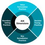
What is Data Monetization?
About the researchers.

Barbara H. Wixom, Principal Research Scientist, MIT Center for Information Systems Research (CISR)

Cynthia M. Beath, Professor Emerita, University of Texas and Academic Research Fellow, MIT CISR
Mit center for information systems research (cisr).
Founded in 1974 and grounded in MIT's tradition of combining academic knowledge and practical purpose, MIT CISR helps executives meet the challenge of leading increasingly digital and data-driven organizations. We work directly with digital leaders, executives, and boards to develop our insights. Our consortium forms a global community that comprises more than seventy-five organizations.
MIT CISR Associate Members
MIT CISR wishes to thank all of our associate members for their support and contributions.
MIT CISR's Mission Expand
MIT CISR helps executives meet the challenge of leading increasingly digital and data-driven organizations. We provide insights on how organizations effectively realize value from approaches such as digital business transformation, data monetization, business ecosystems, and the digital workplace. Founded in 1974 and grounded in MIT’s tradition of combining academic knowledge and practical purpose, we work directly with digital leaders, executives, and boards to develop our insights. Our consortium forms a global community that comprises more than seventy-five organizations.
- Opportunities
Center for Interdisciplinary Exploration and Research in Astrophysics (CIERA) logo
Presenting talks and visualizations at the 2024 codex symposium.
Posted April 25, 2024

During morning parallel sessions, CIERA Professor Wen-fai Fong presented her talk “ Following Data from Telescopes to Publication: Observing our Colorful and Transient Universe “. In it she outlined the ways in which the discoveries of cosmic transients are enabled by advances in detector technology and data processing techniques and the statistical challenges posed by expanding to all wavelengths on the electromagnetic spectrum. Prof Fong placed this challenge within the context of her research group’s work, outlining ways in which Northwestern’s computing resources have been particularly beneficial and areas where interdisciplinary collaboration would be an asset.
In a lightning talk CIERA graduate student Elizabeth Teng presented “ Emulating Stellar Evolution with Deep Learning: I Can’t Believe It’s Not Hydrostatic Equilibrium! ” A member of CIERA Director Vicky Kalogera ‘s research group, Teng focused on her research into the evolution of binary star systems, the “laboratories for testing theoretical models”. In particular, she spoke about the novel binary population synthesis code POSYDON and its ability to bypass the computational bottleneck to deliver detailed information about the diversity of binary stars.

Visualizations were evaluated by 5 judges, impartially including CIERA Professor Aaron Geller , based on presentation clarity and aesthetics, visualization method used, and accessibility.
Congratulations Nabeel, Fulya, Elizabeth, Wen-fai, and Aaron!
Elizabeth Teng photo by Michael Stroh , all others by Rob Hart
Categories: Achievement , Event , Interdisciplinary , Data Science & Computing

An official website of the United States government
The .gov means it’s official. Federal government websites often end in .gov or .mil. Before sharing sensitive information, make sure you’re on a federal government site.
The site is secure. The https:// ensures that you are connecting to the official website and that any information you provide is encrypted and transmitted securely.
- Publications
- Account settings
Preview improvements coming to the PMC website in October 2024. Learn More or Try it out now .
- Advanced Search
- Journal List
- Korean J Anesthesiol
- v.70(3); 2017 Jun
Statistical data presentation
1 Department of Anesthesiology and Pain Medicine, Dongguk University Ilsan Hospital, Goyang, Korea.
Sangseok Lee
2 Department of Anesthesiology and Pain Medicine, Sanggye Paik Hospital, Inje University College of Medicine, Seoul, Korea.
Data are usually collected in a raw format and thus the inherent information is difficult to understand. Therefore, raw data need to be summarized, processed, and analyzed. However, no matter how well manipulated, the information derived from the raw data should be presented in an effective format, otherwise, it would be a great loss for both authors and readers. In this article, the techniques of data and information presentation in textual, tabular, and graphical forms are introduced. Text is the principal method for explaining findings, outlining trends, and providing contextual information. A table is best suited for representing individual information and represents both quantitative and qualitative information. A graph is a very effective visual tool as it displays data at a glance, facilitates comparison, and can reveal trends and relationships within the data such as changes over time, frequency distribution, and correlation or relative share of a whole. Text, tables, and graphs for data and information presentation are very powerful communication tools. They can make an article easy to understand, attract and sustain the interest of readers, and efficiently present large amounts of complex information. Moreover, as journal editors and reviewers glance at these presentations before reading the whole article, their importance cannot be ignored.
Introduction
Data are a set of facts, and provide a partial picture of reality. Whether data are being collected with a certain purpose or collected data are being utilized, questions regarding what information the data are conveying, how the data can be used, and what must be done to include more useful information must constantly be kept in mind.
Since most data are available to researchers in a raw format, they must be summarized, organized, and analyzed to usefully derive information from them. Furthermore, each data set needs to be presented in a certain way depending on what it is used for. Planning how the data will be presented is essential before appropriately processing raw data.
First, a question for which an answer is desired must be clearly defined. The more detailed the question is, the more detailed and clearer the results are. A broad question results in vague answers and results that are hard to interpret. In other words, a well-defined question is crucial for the data to be well-understood later. Once a detailed question is ready, the raw data must be prepared before processing. These days, data are often summarized, organized, and analyzed with statistical packages or graphics software. Data must be prepared in such a way they are properly recognized by the program being used. The present study does not discuss this data preparation process, which involves creating a data frame, creating/changing rows and columns, changing the level of a factor, categorical variable, coding, dummy variables, variable transformation, data transformation, missing value, outlier treatment, and noise removal.
We describe the roles and appropriate use of text, tables, and graphs (graphs, plots, or charts), all of which are commonly used in reports, articles, posters, and presentations. Furthermore, we discuss the issues that must be addressed when presenting various kinds of information, and effective methods of presenting data, which are the end products of research, and of emphasizing specific information.
Data Presentation
Data can be presented in one of the three ways:
–as text;
–in tabular form; or
–in graphical form.
Methods of presentation must be determined according to the data format, the method of analysis to be used, and the information to be emphasized. Inappropriately presented data fail to clearly convey information to readers and reviewers. Even when the same information is being conveyed, different methods of presentation must be employed depending on what specific information is going to be emphasized. A method of presentation must be chosen after carefully weighing the advantages and disadvantages of different methods of presentation. For easy comparison of different methods of presentation, let us look at a table ( Table 1 ) and a line graph ( Fig. 1 ) that present the same information [ 1 ]. If one wishes to compare or introduce two values at a certain time point, it is appropriate to use text or the written language. However, a table is the most appropriate when all information requires equal attention, and it allows readers to selectively look at information of their own interest. Graphs allow readers to understand the overall trend in data, and intuitively understand the comparison results between two groups. One thing to always bear in mind regardless of what method is used, however, is the simplicity of presentation.

Values are expressed as mean ± SD. Group C: normal saline, Group D: dexmedetomidine. SBP: systolic blood pressure, DBP: diastolic blood pressure, MBP: mean blood pressure, HR: heart rate. * P < 0.05 indicates a significant increase in each group, compared with the baseline values. † P < 0.05 indicates a significant decrease noted in Group D, compared with the baseline values. ‡ P < 0.05 indicates a significant difference between the groups.
Text presentation
Text is the main method of conveying information as it is used to explain results and trends, and provide contextual information. Data are fundamentally presented in paragraphs or sentences. Text can be used to provide interpretation or emphasize certain data. If quantitative information to be conveyed consists of one or two numbers, it is more appropriate to use written language than tables or graphs. For instance, information about the incidence rates of delirium following anesthesia in 2016–2017 can be presented with the use of a few numbers: “The incidence rate of delirium following anesthesia was 11% in 2016 and 15% in 2017; no significant difference of incidence rates was found between the two years.” If this information were to be presented in a graph or a table, it would occupy an unnecessarily large space on the page, without enhancing the readers' understanding of the data. If more data are to be presented, or other information such as that regarding data trends are to be conveyed, a table or a graph would be more appropriate. By nature, data take longer to read when presented as texts and when the main text includes a long list of information, readers and reviewers may have difficulties in understanding the information.
Table presentation
Tables, which convey information that has been converted into words or numbers in rows and columns, have been used for nearly 2,000 years. Anyone with a sufficient level of literacy can easily understand the information presented in a table. Tables are the most appropriate for presenting individual information, and can present both quantitative and qualitative information. Examples of qualitative information are the level of sedation [ 2 ], statistical methods/functions [ 3 , 4 ], and intubation conditions [ 5 ].
The strength of tables is that they can accurately present information that cannot be presented with a graph. A number such as “132.145852” can be accurately expressed in a table. Another strength is that information with different units can be presented together. For instance, blood pressure, heart rate, number of drugs administered, and anesthesia time can be presented together in one table. Finally, tables are useful for summarizing and comparing quantitative information of different variables. However, the interpretation of information takes longer in tables than in graphs, and tables are not appropriate for studying data trends. Furthermore, since all data are of equal importance in a table, it is not easy to identify and selectively choose the information required.
For a general guideline for creating tables, refer to the journal submission requirements 1) .
Heat maps for better visualization of information than tables
Heat maps help to further visualize the information presented in a table by applying colors to the background of cells. By adjusting the colors or color saturation, information is conveyed in a more visible manner, and readers can quickly identify the information of interest ( Table 2 ). Software such as Excel (in Microsoft Office, Microsoft, WA, USA) have features that enable easy creation of heat maps through the options available on the “conditional formatting” menu.
All numbers were created by the author. SBP: systolic blood pressure, DBP: diastolic blood pressure, MBP: mean blood pressure, HR: heart rate.
Graph presentation
Whereas tables can be used for presenting all the information, graphs simplify complex information by using images and emphasizing data patterns or trends, and are useful for summarizing, explaining, or exploring quantitative data. While graphs are effective for presenting large amounts of data, they can be used in place of tables to present small sets of data. A graph format that best presents information must be chosen so that readers and reviewers can easily understand the information. In the following, we describe frequently used graph formats and the types of data that are appropriately presented with each format with examples.
Scatter plot
Scatter plots present data on the x - and y -axes and are used to investigate an association between two variables. A point represents each individual or object, and an association between two variables can be studied by analyzing patterns across multiple points. A regression line is added to a graph to determine whether the association between two variables can be explained or not. Fig. 2 illustrates correlations between pain scoring systems that are currently used (PSQ, Pain Sensitivity Questionnaire; PASS, Pain Anxiety Symptoms Scale; PCS, Pain Catastrophizing Scale) and Geop-Pain Questionnaire (GPQ) with the correlation coefficient, R, and regression line indicated on the scatter plot [ 6 ]. If multiple points exist at an identical location as in this example ( Fig. 2 ), the correlation level may not be clear. In this case, a correlation coefficient or regression line can be added to further elucidate the correlation.

Bar graph and histogram
A bar graph is used to indicate and compare values in a discrete category or group, and the frequency or other measurement parameters (i.e. mean). Depending on the number of categories, and the size or complexity of each category, bars may be created vertically or horizontally. The height (or length) of a bar represents the amount of information in a category. Bar graphs are flexible, and can be used in a grouped or subdivided bar format in cases of two or more data sets in each category. Fig. 3 is a representative example of a vertical bar graph, with the x -axis representing the length of recovery room stay and drug-treated group, and the y -axis representing the visual analog scale (VAS) score. The mean and standard deviation of the VAS scores are expressed as whiskers on the bars ( Fig. 3 ) [ 7 ].

By comparing the endpoints of bars, one can identify the largest and the smallest categories, and understand gradual differences between each category. It is advised to start the x - and y -axes from 0. Illustration of comparison results in the x - and y -axes that do not start from 0 can deceive readers' eyes and lead to overrepresentation of the results.
One form of vertical bar graph is the stacked vertical bar graph. A stack vertical bar graph is used to compare the sum of each category, and analyze parts of a category. While stacked vertical bar graphs are excellent from the aspect of visualization, they do not have a reference line, making comparison of parts of various categories challenging ( Fig. 4 ) [ 8 ].

A pie chart, which is used to represent nominal data (in other words, data classified in different categories), visually represents a distribution of categories. It is generally the most appropriate format for representing information grouped into a small number of categories. It is also used for data that have no other way of being represented aside from a table (i.e. frequency table). Fig. 5 illustrates the distribution of regular waste from operation rooms by their weight [ 8 ]. A pie chart is also commonly used to illustrate the number of votes each candidate won in an election.

Line plot with whiskers
A line plot is useful for representing time-series data such as monthly precipitation and yearly unemployment rates; in other words, it is used to study variables that are observed over time. Line graphs are especially useful for studying patterns and trends across data that include climatic influence, large changes or turning points, and are also appropriate for representing not only time-series data, but also data measured over the progression of a continuous variable such as distance. As can be seen in Fig. 1 , mean and standard deviation of systolic blood pressure are indicated for each time point, which enables readers to easily understand changes of systolic pressure over time [ 1 ]. If data are collected at a regular interval, values in between the measurements can be estimated. In a line graph, the x-axis represents the continuous variable, while the y-axis represents the scale and measurement values. It is also useful to represent multiple data sets on a single line graph to compare and analyze patterns across different data sets.
Box and whisker chart
A box and whisker chart does not make any assumptions about the underlying statistical distribution, and represents variations in samples of a population; therefore, it is appropriate for representing nonparametric data. AA box and whisker chart consists of boxes that represent interquartile range (one to three), the median and the mean of the data, and whiskers presented as lines outside of the boxes. Whiskers can be used to present the largest and smallest values in a set of data or only a part of the data (i.e. 95% of all the data). Data that are excluded from the data set are presented as individual points and are called outliers. The spacing at both ends of the box indicates dispersion in the data. The relative location of the median demonstrated within the box indicates skewness ( Fig. 6 ). The box and whisker chart provided as an example represents calculated volumes of an anesthetic, desflurane, consumed over the course of the observation period ( Fig. 7 ) [ 9 ].

Three-dimensional effects
Most of the recently introduced statistical packages and graphics software have the three-dimensional (3D) effect feature. The 3D effects can add depth and perspective to a graph. However, since they may make reading and interpreting data more difficult, they must only be used after careful consideration. The application of 3D effects on a pie chart makes distinguishing the size of each slice difficult. Even if slices are of similar sizes, slices farther from the front of the pie chart may appear smaller than the slices closer to the front ( Fig. 8 ).

Drawing a graph: example
Finally, we explain how to create a graph by using a line graph as an example ( Fig. 9 ). In Fig. 9 , the mean values of arterial pressure were randomly produced and assumed to have been measured on an hourly basis. In many graphs, the x- and y-axes meet at the zero point ( Fig. 9A ). In this case, information regarding the mean and standard deviation of mean arterial pressure measurements corresponding to t = 0 cannot be conveyed as the values overlap with the y-axis. The data can be clearly exposed by separating the zero point ( Fig. 9B ). In Fig. 9B , the mean and standard deviation of different groups overlap and cannot be clearly distinguished from each other. Separating the data sets and presenting standard deviations in a single direction prevents overlapping and, therefore, reduces the visual inconvenience. Doing so also reduces the excessive number of ticks on the y-axis, increasing the legibility of the graph ( Fig. 9C ). In the last graph, different shapes were used for the lines connecting different time points to further allow the data to be distinguished, and the y-axis was shortened to get rid of the unnecessary empty space present in the previous graphs ( Fig. 9D ). A graph can be made easier to interpret by assigning each group to a different color, changing the shape of a point, or including graphs of different formats [ 10 ]. The use of random settings for the scale in a graph may lead to inappropriate presentation or presentation of data that can deceive readers' eyes ( Fig. 10 ).

Owing to the lack of space, we could not discuss all types of graphs, but have focused on describing graphs that are frequently used in scholarly articles. We have summarized the commonly used types of graphs according to the method of data analysis in Table 3 . For general guidelines on graph designs, please refer to the journal submission requirements 2) .
Conclusions
Text, tables, and graphs are effective communication media that present and convey data and information. They aid readers in understanding the content of research, sustain their interest, and effectively present large quantities of complex information. As journal editors and reviewers will scan through these presentations before reading the entire text, their importance cannot be disregarded. For this reason, authors must pay as close attention to selecting appropriate methods of data presentation as when they were collecting data of good quality and analyzing them. In addition, having a well-established understanding of different methods of data presentation and their appropriate use will enable one to develop the ability to recognize and interpret inappropriately presented data or data presented in such a way that it deceives readers' eyes [ 11 ].
<Appendix>
Output for presentation.
Discovery and communication are the two objectives of data visualization. In the discovery phase, various types of graphs must be tried to understand the rough and overall information the data are conveying. The communication phase is focused on presenting the discovered information in a summarized form. During this phase, it is necessary to polish images including graphs, pictures, and videos, and consider the fact that the images may look different when printed than how appear on a computer screen. In this appendix, we discuss important concepts that one must be familiar with to print graphs appropriately.
The KJA asks that pictures and images meet the following requirement before submission 3)
“Figures and photographs should be submitted as ‘TIFF’ files. Submit files of figures and photographs separately from the text of the paper. Width of figure should be 84 mm (one column). Contrast of photos or graphs should be at least 600 dpi. Contrast of line drawings should be at least 1,200 dpi. The Powerpoint file (ppt, pptx) is also acceptable.”
Unfortunately, without sufficient knowledge of computer graphics, it is not easy to understand the submission requirement above. Therefore, it is necessary to develop an understanding of image resolution, image format (bitmap and vector images), and the corresponding file specifications.
Resolution is often mentioned to describe the quality of images containing graphs or CT/MRI scans, and video files. The higher the resolution, the clearer and closer to reality the image is, while the opposite is true for low resolutions. The most representative unit used to describe a resolution is “dpi” (dots per inch): this literally translates to the number of dots required to constitute 1 inch. The greater the number of dots, the higher the resolution. The KJA submission requirements recommend 600 dpi for images, and 1,200 dpi 4) for graphs. In other words, resolutions in which 600 or 1,200 dots constitute one inch are required for submission.
There are requirements for the horizontal length of an image in addition to the resolution requirements. While there are no requirements for the vertical length of an image, it must not exceed the vertical length of a page. The width of a column on one side of a printed page is 84 mm, or 3.3 inches (84/25.4 mm ≒ 3.3 inches). Therefore, a graph must have a resolution in which 1,200 dots constitute 1 inch, and have a width of 3.3 inches.
Bitmap and Vector
Methods of image construction are important. Bitmap images can be considered as images drawn on section paper. Enlarging the image will enlarge the picture along with the grid, resulting in a lower resolution; in other words, aliasing occurs. On the other hand, reducing the size of the image will reduce the size of the picture, while increasing the resolution. In other words, resolution and the size of an image are inversely proportionate to one another in bitmap images, and it is a drawback of bitmap images that resolution must be considered when adjusting the size of an image. To enlarge an image while maintaining the same resolution, the size and resolution of the image must be determined before saving the image. An image that has already been created cannot avoid changes to its resolution according to changes in size. Enlarging an image while maintaining the same resolution will increase the number of horizontal and vertical dots, ultimately increasing the number of pixels 5) of the image, and the file size. In other words, the file size of a bitmap image is affected by the size and resolution of the image (file extensions include JPG [JPEG] 6) , PNG 7) , GIF 8) , and TIF [TIFF] 9) . To avoid this complexity, the width of an image can be set to 4 inches and its resolution to 900 dpi to satisfy the submission requirements of most journals [ 12 ].
Vector images overcome the shortcomings of bitmap images. Vector images are created based on mathematical operations of line segments and areas between different points, and are not affected by aliasing or pixelation. Furthermore, they result in a smaller file size that is not affected by the size of the image. They are commonly used for drawings and illustrations (file extensions include EPS 10) , CGM 11) , and SVG 12) ).
Finally, the PDF 13) is a file format developed by Adobe Systems (Adobe Systems, CA, USA) for electronic documents, and can contain general documents, text, drawings, images, and fonts. They can also contain bitmap and vector images. While vector images are used by researchers when working in Powerpoint, they are saved as 960 × 720 dots when saved in TIFF format in Powerpoint. This results in a resolution that is inappropriate for printing on a paper medium. To save high-resolution bitmap images, the image must be saved as a PDF file instead of a TIFF, and the saved PDF file must be imported into an imaging processing program such as Photoshop™(Adobe Systems, CA, USA) to be saved in TIFF format [ 12 ].
1) Instructions to authors in KJA; section 5-(9) Table; https://ekja.org/index.php?body=instruction
2) Instructions to Authors in KJA; section 6-1)-(10) Figures and illustrations in Manuscript preparation; https://ekja.org/index.php?body=instruction
3) Instructions to Authors in KJA; section 6-1)-(10) Figures and illustrations in Manuscript preparation; https://ekja.org/index.php?body=instruction
4) Resolution; in KJA, it is represented by “contrast.”
5) Pixel is a minimum unit of an image and contains information of a dot and color. It is derived by multiplying the number of vertical and horizontal dots regardless of image size. For example, Full High Definition (FHD) monitor has 1920 × 1080 dots ≒ 2.07 million pixel.
6) Joint Photographic Experts Group.
7) Portable Network Graphics.
8) Graphics Interchange Format
9) Tagged Image File Format; TIFF
10) Encapsulated PostScript.
11) Computer Graphics Metafile.
12) Scalable Vector Graphics.
13) Portable Document Format.
IMAGES
VIDEO
COMMENTS
TheJoelTruth. While a good presentation has data, data alone doesn't guarantee a good presentation. It's all about how that data is presented. The quickest way to confuse your audience is by ...
One of the most important parts of writing about qualitative research is presenting the data in a way that makes its richness and value accessible to readers. As the discussion of analysis in the prior chapter suggests, there are a variety of ways to do this. Researchers may select key quotes or images to illustrate points, write up specific ...
Start with response rate and description of research participants (these information give the readers an idea of the representativeness of the research data), then the key findings and relevant statistical analyses. Data should answer the research questions identified earlier. Leave the process of data collection to the methods section.
When it comes to research, presenting data in a meaningful and accessible way is as important as gathering it. This is particularly true for qualitative research, where the richness and complexity of the data demand careful and thoughtful presentation. Poorly written research is taken less seriously and left undiscussed by the greater scholarly ...
The present review is the first in an ongoing guide to medical statistics, using specific examples from intensive care. The first step in any analysis is to describe and summarize the data. As well as becoming familiar with the data, this is also an opportunity to look for unusually high or low values (outliers), to check the assumptions ...
1. Choose the right format. 2. Follow the design principles. 3. Adapt to your audience. 4. Here's what else to consider. Data presentation is a crucial aspect of any research report, as it ...
Presenting qualitative data visually from one's research can transform the final output, and one does not have to spend enormous amount of time to accomplish this. Researchers who need to communicate quantitative data have several options to present it visually through bar graphs, pie charts, histograms and even infographics.
The results section is the core of a research paper where the study data and analyses are presented in an organized, uncluttered manner such that the reader can easily understand and interpret the findings. It is often embellished with self-explanatory tables and figures which assist in presenting data in addition to the text.
Overview. Data analysis is an ongoing process that should occur throughout your research project. Suitable data-analysis methods must be selected when you write your research proposal. The nature of your data (i.e. quantitative or qualitative) will be influenced by your research design and purpose. The data will also influence the analysis ...
Alternative formats. While most people wishing to present complex scientific data tend to think of charts, graphs, maps, and infographics, it is also possible to present information for perception by other senses such as through sound. Some researchers have been testing data sonification as an alternative to visual data representation.
All this gathered information represents the data of the research. For example, it is possible to determine the color of an individual's skin according to Fitzpatrick classification or quantify the number of times a person uses sunscreen during summer. 1,2 All the information collected during research is generically named "data." A set of ...
Turning a research paper into a visual presentation is difficult; there are pitfalls, and navigating the path to a brief, informative presentation takes time and practice. As a TA for GEO/WRI 201: Methods in Data Analysis & Scientific Writing this past fall, I saw how this process works from an instructor's standpoint.
Often, the background and theory for your research must be presented concisely so that you have time to present your study and findings. Ten minutes is not much time, so emphasize the main points so that your audience has a clear understanding of your take-home messages. When you start planning, writing out content on individual Post-it Notes ...
Step 1: Define Your Data Hierarchy. While presenting data on the budget allocation, start by outlining the hierarchical structure. The sequence will be like the overall budget at the top, followed by departments, projects within each department, and finally, individual cost categories for each project. Example:
Data Collection | Definition, Methods & Examples. Published on June 5, 2020 by Pritha Bhandari.Revised on June 21, 2023. Data collection is a systematic process of gathering observations or measurements. Whether you are performing research for business, governmental or academic purposes, data collection allows you to gain first-hand knowledge and original insights into your research problem.
In this paper, the authors chose the Long Data Excerpts approach for presenting information in qualitative research, in which conversational exchanges structure texts employing large text segments ...
The most common way of presentation of data is in the form of statements. This works best for simple observations, such as: "When viewed by light microscopy, all of the cells appeared dead." When data are more quantitative, such as- "7 out of 10 cells were dead", a table is the preferred form. Tables.
DATA PRESENTATION, ANALYSIS AND INTERPRETATION. 4.0 Introduction. This chapter is concerned with data pres entation, of the findings obtained through the study. The. findings are presented in ...
Histogram, Smoothed frequency graph, Pie diagram or Pie chart, Cumulative or ogive frequency graph, and Frequency Polygon. Tags: Types of Presentation. How to present the data in a way that even the clueless person in the room can understand? Check out our 10 methods of data presentation for a better idea.
The research results showed that affect was found in 11 data (25.0%), judgment in 17 data (38.6%), appreciation in 16 data (36.4%) The type attitude is dominated by judgment and appreciation with ...
This method of displaying data uses diagrams and images. It is the most visual type for presenting data and provides a quick glance at statistical data. There are four basic types of diagrams, including: Pictograms: This diagram uses images to represent data. For example, to show the number of books sold in the first release week, you may draw ...
The purpose of this paper is to help authors to think about ways to present qualitative research papers in the American Journal of Pharmaceutical Education. It also discusses methods for reviewers to assess the rigour, quality, and usefulness of qualitative research. Examples of different ways to present data from interviews, observations, and ...
Deborah Grayson Riegel is a professional speaker and facilitator, as well as a communication and presentation skills coach. She teaches leadership communication at Duke University's Fuqua School ...
Research to better utilize and augment data from registries through linkage [37,38,39,40] and to ensure presentation of hospital or service level data are understood by clinicians has ensured advancement in the field for the Australian Stroke LHS . Importantly, greater insights into whole patient journeys, before and after a stroke, can now ...
Chiesi USA, Inc. (key-A-zee), the U.S. affiliate of Chiesi Farmaceutici, an international research-focused healthcare Group (Chiesi Group), today announced the presentation of eight abstracts from Chiesi's global respiratory research portfolio at the American Thoracic Society (ATS) 2024 International Conference in San Diego from May 17-22, 2024.
Use Data Visualization in Your Presentation. Regardless of which type of topic you've chosen, there's likely some sort of data or information that would be better presented via visuals rather than written out numbers or text. Make sure you choose a presentation tool that makes it easy to visualize certain information.
The principles are supported by the MIT CISR data monetization research, and the briefing illustrates them using examples from the Australia Taxation Office and CarMax. The three principles apply to any kind of AI, defined as technology that performs human-like cognitive tasks; subsequent briefings will present management advice distinct to ...
In the end, this research assumes the greatest accuracy of results is associated with present-day data and those based on the 1985 time period or changes since then are less accurate. Fortunately, this gives policy makers, emergency planners, weather officials, and educators an accurate portrayal of present-day land cover, population, and ...
On April 2, 2024, Northwestern Information Technology (NUIT) held their annual CoDEx symposium, an all-day campus-wide showcase of computational and data-enabled research at Northwestern.Open to faculty, postdocs, students, researchers, and staff, the symposium is designed to foster connections and research collaborations.
In this article, the techniques of data and information presentation in textual, tabular, and graphical forms are introduced. Text is the principal method for explaining findings, outlining trends, and providing contextual information. A table is best suited for representing individual information and represents both quantitative and ...