What font should I choose for my thesis?
This post is by DrJanene Carey, a freelance writer and editor based in Armidale NSW. She occasionally teaches academic writing at the University of New England and often edits academic theses, articles and reports. Her website is http://www.janenecarey.com
Arguably, this question is a classic time waster and the student who poses it should be told to just get on with writing up their research. But as someone who edits theses for a living, I think a bit of time spent on fonts is part of the process of buffing and polishing what is, after all, one of the most important documents you will ever produce. Just bear in mind that there is no need to immerse yourself so deeply in the topic that you start quibbling about whether it’s a font or a typeface that you are choosing .
Times New Roman is the standard choice for academic documents, and the thesis preparation guidelines of some universities stipulate its use. For many years, it was the default body text for Microsoft Word. With the release of Office 2007, the default became a sans serif typeface called Calibri. Lacking the little projecting bits (serifs) at the end of characters makes Calibri and its many friends, such as Arial, Helvetica and Verdana, look smoother and clearer on a screen, but generally makes them less readable than a serif typeface when used for printed text . The other problem with choosing a sans serif for your body text is that if you want passages in italics (for example, lengthy participant quotes) often this will be displayed as slanted letters, rather than as a true italic font.
You would like your examiners to feel as comfortable as possible while their eyes are traversing the many, many pages of your thesis, so maximising legibility and readability is a good idea. Times New Roman is ubiquitous and familiar, which means it is probably the safest option, but it does have a couple of drawbacks. Originally designed for The Times in London, its characters are slightly narrowed, so that more of them can be squished into a newspaper column. Secondly, some people intensely dislike TNR because they think it has been overused, and regard it as the font you choose when you are not choosing a font .
If you do have the luxury of choice (your university doesn’t insist you use Times New Roman, and you have defined document styles that are easy to modify, and there’s enough time left before the submission deadline) then I think it is worth considering what other typefaces might work well with your thesis. I’m not a typographical expert, but I have the following suggestions.
- Don’t use Calibri, or any other sans serif font, for your body text, though it is fine for headings. Most people agree that dense chunks of printed text are easier to read if the font is serif, and examiners are likely to expect a typeface that doesn’t stray too far from the standard. To my eye, Calibri looks a little too casual for the body of a thesis.
- Typefaces like Garamond, Palatino, Century Schoolbook, Georgia, Minion Pro, Cambria and Constantia are all perfectly acceptable, and they come with Microsoft Word. However, some of them (Georgia and Constantia, for example) feature non-lining numerals, which means that instead of all sitting neatly on the base line, some will stand higher or lower than others, just like letters do. This looks nice when they are integrated with the text, but it is probably not what you want for a tabular display.
- Consider using a different typeface for your headings. It will make them more prominent, which enhances overall readability because the eye scanning the pages can quickly take in the hierarchy of ideas. The easiest way to get a good contrast with your serif body text is to have sans serif headings. Popular combinations are Garamond/Helvetica; Minion Pro/Myriad Pro; Times New Roman/Arial Narrow. But don’t create a dog’s breakfast by having more than two typefaces in your thesis – use point sizes, bold and italics for variety.
Of late, I’ve become quite fond of Constantia. It’s an attractive serif typeface that came out with Office 2007 at the same time as Calibri, and was specifically designed to look good in print and on screen. Increasingly, theses will be read in PDF rather than book format, so screen readability is an important consideration. Asked to review Microsoft’s six new ClearType fonts prior to their release, typographer Raph Levien said Constantia was likely to be everyone’s favourite, because ‘Even though it’s a highly readable Roman font departing only slightly from the classical model, it still manages to be fresh and new.’
By default, Constantia has non-lining numerals, but from Word 2010 onwards you can set them to be lining via the advanced font/number forms option, either throughout your document or in specific sections, such as within tables.
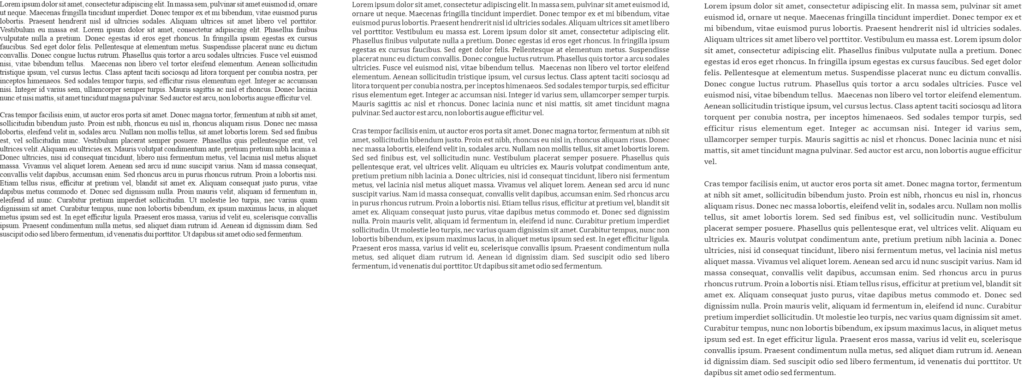
Here is an excerpt from a thesis, shown twice with different typefaces. The first excerpt features Calibri headings with Constantia body text, and the second has that old favourite, Times New Roman. As these examples have been rendered as screenshots, you will get a better idea of how the fonts actually look if you try them on your own computer and printer.

Related posts
Should I get an editor for my thesis?
Love the Thesis whisperer and want it to continue? Consider becoming a $1 a month Patreon and get special, Patreon only, extra Thesiswhisperer content every two weeks!

Share this:
The Thesis Whisperer is written by Professor Inger Mewburn, director of researcher development at The Australian National University . New posts on the first Wednesday of the month. Subscribe by email below. Visit the About page to find out more about me, my podcasts and books. I'm on most social media platforms as @thesiswhisperer. The best places to talk to me are LinkedIn , Mastodon and Threads.
- Post (606)
- Page (16)
- Product (6)
- Getting things done (258)
- On Writing (138)
- Miscellany (137)
- Your Career (113)
- You and your supervisor (66)
- Writing (48)
- productivity (23)
- consulting (13)
- TWC (13)
- supervision (12)
- 2024 (5)
- 2023 (12)
- 2022 (11)
- 2021 (15)
- 2020 (22)
Whisper to me....
Enter your email address to get posts by email.
Email Address
Sign me up!
- On the reg: a podcast with @jasondowns
- Thesis Whisperer on Facebook
- Thesis Whisperer on Instagram
- Thesis Whisperer on Soundcloud
- Thesis Whisperer on Youtube
- Thesiswhisperer on Mastodon
- Thesiswhisperer page on LinkedIn
- Thesiswhisperer Podcast
- 12,108,126 hits
Discover more from The Thesis Whisperer
Subscribe now to keep reading and get access to the full archive.
Type your email…
Continue reading
Thesis and Dissertation Guide
- « Thesis & Dissertation Resources
- The Graduate School Home
- Introduction
- Copyright Page
- Dedication, Acknowledgements, Preface (optional)
- Table of Contents
- List of Tables, Figures, and Illustrations
- List of Abbreviations
- List of Symbols
Non-Traditional Formats
Font type and size, spacing and indentation, tables, figures, and illustrations, formatting previously published work.
- Internet Distribution
- Open Access
- Registering Copyright
- Using Copyrighted Materials
- Use of Your Own Previously Published Materials
- Submission Steps
- Submission Checklist
- Sample Pages

II. Formatting Guidelines
All copies of a thesis or dissertation must have the following uniform margins throughout the entire document:
- Left: 1″ (or 1 1/4" to ensure sufficient room for binding the work if desired)
- Right: 1″
- Bottom: 1″ (with allowances for page numbers; see section on Pagination )
- Top: 1″
Exceptions : The first page of each chapter (including the introduction, if any) begins 2″ from the top of the page. Also, the headings on the title page, abstract, first page of the dedication/ acknowledgements/preface (if any), and first page of the table of contents begin 2″ from the top of the page.
Non-traditional theses or dissertations such as whole works comprised of digital, artistic, video, or performance materials (i.e., no written text, chapters, or articles) are acceptable if approved by your committee and graduate program. A PDF document with a title page, copyright page, and abstract at minimum are required to be submitted along with any relevant supplemental files.
Fonts must be 10, 11, or 12 points in size. Superscripts and subscripts (e.g., formulas, or footnote or endnote numbers) should be no more than 2 points smaller than the font size used for the body of the text.
Space and indent your thesis or dissertation following these guidelines:

- The text must appear in a single column on each page and be double-spaced throughout the document. Do not arrange chapter text in multiple columns.
- New paragraphs must be indicated by a consistent tab indentation throughout the entire document.
- The document text must be left-justified, not centered or right-justified.
- For blocked quotations, indent the entire text of the quotation consistently from the left margin.
- Ensure headings are not left hanging alone on the bottom of a prior page. The text following should be moved up or the heading should be moved down. This is something to check near the end of formatting, as other adjustments to text and spacing may change where headings appear on the page.
Exceptions : Blocked quotations, notes, captions, legends, and long headings must be single-spaced throughout the document and double-spaced between items.
Paginate your thesis or dissertation following these guidelines:
- Use lower case Roman numerals (ii, iii, iv, etc.) on all pages preceding the first page of chapter one. The title page counts as page i, but the number does not appear. Therefore, the first page showing a number will be the copyright page with ii at the bottom.
- Arabic numerals (beginning with 1, 2, 3, 4, etc.) start at chapter one or the introduction, if applicable. Arabic numbers must be included on all pages of the text, illustrations, notes, and any other materials that follow. Thus, the first page of chapter one will show an Arabic numeral 1, and numbering of all subsequent pages will follow in order.
- Do not use page numbers accompanied by letters, hyphens, periods, or parentheses (e.g., 1., 1-2, -1-, (1), or 1a).
- Center all page numbers at the bottom of the page, 1/2″ from the bottom edge.
- Pages must not contain running headers or footers, aside from page numbers.
- If your document contains landscape pages (pages in which the top of the page is the long side of a sheet of paper), make sure that your page numbers still appear in the same position and direction as they do on pages with standard portrait orientation for consistency. This likely means the page number will be centered on the short side of the paper and the number will be sideways relative to the landscape page text. See these additional instructions for assistance with pagination on landscape pages in Microsoft Word .

Format footnotes for your thesis or dissertation following these guidelines:

- Footnotes must be placed at the bottom of the page separated from the text by a solid line one to two inches long.
- Begin at the left page margin, directly below the solid line.
- Single-space footnotes that are more than one line long.
- Include one double-spaced line between each note.
- Most software packages automatically space footnotes at the bottom of the page depending on their length. It is acceptable if the note breaks within a sentence and carries the remainder into the footnote area of the next page. Do not indicate the continuation of a footnote.
- Number all footnotes with Arabic numerals. You may number notes consecutively within each chapter starting over with number 1 for the first note in each chapter, or you may number notes consecutively throughout the entire document.
- Footnote numbers must precede the note and be placed slightly above the line (superscripted). Leave no space between the number and the note.
- While footnotes should be located at the bottom of the page, do not place footnotes in a running page footer, as they must remain within the page margins.
Endnotes are an acceptable alternative to footnotes. Format endnotes for your thesis or dissertation following these guidelines:

- Always begin endnotes on a separate page either immediately following the end of each chapter, or at the end of your entire document. If you place all endnotes at the end of the entire document, they must appear after the appendices and before the references.
- Include the heading “ENDNOTES” in all capital letters, and center it 1″ below the top of the first page of your endnotes section(s).
- Single-space endnotes that are more than one line long.
- Number all endnotes with Arabic numerals. You may number notes consecutively within each chapter starting over with number 1 for the first note in each chapter, or you may number notes consecutively throughout the entire document.
- Endnote numbers must precede the note and be placed slightly above the line (superscripted). Leave no space between the number and the note.
Tables, figures, and illustrations vary widely by discipline. Therefore, formatting of these components is largely at the discretion of the author.
For example, headings and captions may appear above or below each of these components.
These components may each be placed within the main text of the document or grouped together in a separate section.
Space permitting, headings and captions for the associated table, figure, or illustration must be on the same page.
The use of color is permitted as long as it is consistently applied as part of the finished component (e.g., a color-coded pie chart) and not extraneous or unprofessional (e.g., highlighting intended solely to draw a reader's attention to a key phrase). The use of color should be reserved primarily for tables, figures, illustrations, and active website or document links throughout your thesis or dissertation.
The format you choose for these components must be consistent throughout the thesis or dissertation.
Ensure each component complies with margin and pagination requirements.
Refer to the List of Tables, Figures, and Illustrations section for additional information.
If your thesis or dissertation has appendices, they must be prepared following these guidelines:

- Appendices must appear at the end of the document (before references) and not the chapter to which they pertain.
- When there is more than one appendix, assign each appendix a number or a letter heading (e.g., “APPENDIX 1” or “APPENDIX A”) and a descriptive title. You may number consecutively throughout the entire work (e.g., 1, 2 or A, B), or you may assign a two-part Arabic numeral with the first number designating the chapter in which it appears, separated by a period, followed by a second number or letter to indicate its consecutive placement (e.g., “APPENDIX 3.2” is the second appendix referred to in Chapter Three).
- Include the chosen headings in all capital letters, and center them 1″ below the top of the page.
- All appendix headings and titles must be included in the table of contents.
- Page numbering must continue throughout your appendix or appendices. Ensure each appendix complies with margin and pagination requirements.
You are required to list all the references you consulted. For specific details on formatting your references, consult and follow a style manual or professional journal that is used for formatting publications and citations in your discipline.

Your reference pages must be prepared following these guidelines:
- If you place references after each chapter, the references for the last chapter must be placed immediately following the chapter and before the appendices.
- If you place all references at the end of the thesis or dissertation, they must appear after the appendices as the final component in the document.
- Select an appropriate heading for this section based on the style manual you are using (e.g., “REFERENCES”, “BIBLIOGRAPHY”, or “WORKS CITED”).
- Include the chosen heading in all capital letters, and center it 1″ below the top of the page.
- References must be single-spaced within each entry.
- Include one double-spaced line between each reference.
- Page numbering must continue throughout your references section. Ensure references comply with margin and pagination requirements.
In some cases, students gain approval from their academic program to include in their thesis or dissertation previously published (or submitted, in press, or under review) journal articles or similar materials that they have authored. For more information about including previously published works in your thesis or dissertation, see the section on Use of Your Own Previously Published Materials and the section on Copyrighting.
If your academic program has approved inclusion of such materials, please note that these materials must match the formatting guidelines set forth in this Guide regardless of how the material was formatted for publication.
Some specific formatting guidelines to consider include:

- Fonts, margins, chapter headings, citations, and references must all match the formatting and placement used within the rest of the thesis or dissertation.
- If appropriate, published articles can be included as separate individual chapters within the thesis or dissertation.
- A separate abstract to each chapter should not be included.
- The citation for previously published work must be included as the first footnote (or endnote) on the first page of the chapter.
- Do not include typesetting notations often used when submitting manuscripts to a publisher (i.e., insert table x here).
- The date on the title page should be the year in which your committee approves the thesis or dissertation, regardless of the date of completion or publication of individual chapters.
- If you would like to include additional details about the previously published work, this information can be included in the preface for the thesis or dissertation.
Previous: Order and Components
Next: Distribution
Great fonts for a PhD thesis – and terrible ones
There are thousands of fonts out there – which one should you choose for a great-looking PhD thesis? I will explain the differences between serif and sans-serif fonts, what ligatures are and why you shouldn’t use that fun free font you found on the internet.
Great fonts for a PhD thesis: Serif vs. sans-serif
As I explained in my Ultimate Guide to preparing a PhD thesis for printing , there are two basic kinds of fonts: Serif fonts and sans-serif fonts. Serif fonts have small lines – serifs – at the ends of all lines. Sans-serif fonts don’t have those lines. Compare these two, Palatino Linotype and Arial:

Serifs guide the reader’s eyes, making sure that they stay in the same line while reading a printed text. In turn, your reader’s brain won’t get tired so quickly and they can read for longer.
But there is another feature that many serif fonts have. Look at these three (which are all great fonts to use in your PhD thesis, btw):

If you look closely, you will see that serif fonts often have different stroke thicknesses within every letter. This is called “weight contrast”. A subtle weight contrast further improves legibility of a printed text. Hence, I recommend you use a serif font with a bit of a weight contrast for your main text.
Which serif font should you choose?
But whatever you do, this one thing is extremely important: Choose a font that offers all styles: regular, italics , bold , and bold italics . Since these four styles all need to be designed separately, many fonts don’t offer all of them. Especially bold italics is absent in most free internet fonts and even from many fonts that come with your operating system or word processor.
Also: In your bibliography and in-text citations (if you go with an author-year citation style) you will have to display author’s names from all over the world. Many of them will contain special letters. For example German umlauts (ä, ö, ü), accented letters used in lots of of languages, i.e. French or Spanish (à, é, ñ, etc.), and dozens of other special letters from all kinds of languages (ç, ı, ł, ø, etc.). Be aware that only a very limited number of fonts offer all of these!
If you have mathematical equations in your thesis that require more than +, – and =, your font choices are limited even further . After all, the vast majority of fonts do not offer special operators.
As you can see, these criteria severely limit your choice of font for the main text. Needless to say, they rule out free fonts you can download from dafont.com or 1001fonts.com . That is why I urge you to go with a classic font. To make things easier for you, here is a table with serif fonts that offer all the characters you could dream of:
Failsafe serif fonts for your PhD thesis
These fonts are heavily based on fonts that have been in use since the invention of the mechanical printing press in the 15th century. Hence, these types of fonts have been tried and tested for more than 500 years. Hard to argue with that!
But which of these fonts is The Best TM for a PhD thesis? That depends on how much text you have in your thesis vs. how many figures, tables, equations, etc. As I have noted in the table, fonts have different widths. Look at this image showing the same text in Times New Roman (TNR), Cambria, and Sitka Text; all at the same size:
Hence, setting entire pages of text in TNR will make the page look quite dense and dark. So, a thesis with a lot of text and few figures is best set in a wider font like Sitka Text. On the other hand, if you have a lot of figures, tables, etc., TNR is a good choice because it keeps paragraphs of text compact and therefore the page from looking too empty. Medium-width fonts like Cambria are a good compromise between the two.
To see some of these fonts in action, check out this example PhD thesis where I show all sorts of font combinations and page layouts.
When to use a sans-serif font in your PhD thesis
This covers serif fonts. But which sans-serif fonts are great for your PhD thesis? And when do you use them?
As mentioned above, serif fonts are good for the main text of your thesis. But titles and headings are a different story. There, a sans-serif font will look very nice. Plus, using a different font in your headings than in the main text will help the reader recognize when a new section begins.
Here are some examples for good sans-serif fonts:

Each of these fonts – Futura, Franklin Gothic Book, and Gill Sans – are wonderful for headings in a PhD thesis. Why? Because they are easily readable, well-balanced and don’t call undue attention to themselves. Also, they have many options: regular, light, medium, bold, extra bold, including italics for all of them. And most operating systems or word processors have them pre-installed.
The criteria for heading fonts are not nearly as strict as those for main text fonts. If you have Latin species names in your headings, make sure the font offers (bold) italics. If you need to display Greek letters in your headings, make sure the font offers those. Done.
However, there are some criteria for headings. Just for fun, let’s have a look at some sans-serif fonts that would be a bad choice for a thesis:

I’d like to explicitly state that these are wonderful, well-designed fonts – you just shouldn’t use them in a scientific document. Heattenschweiler is too narrow, Broadway has too much weight contrast and Aspergit Light is too thin. All of these things impair readability and might make your opponents squint at your headings. Of course, you will want to do everything in your power to make the experience of reading your thesis as pleasant a possible for your opponents!
How are these fonts great for my PhD thesis? They are boring!
Why yes, they are, thanks for noticing!
Seriously though, the fonts not being interesting is the point. Your PhD thesis is a scientific document showing your expertise in your field and your ability to do independent research. The content of your thesis, the science, should be the sole focus. A PhD thesis is not the place to show off your quirky personality by way of an illegible font.
However, you can infuse your personality into your thesis cover and chapter start pages. There, you can use a fun font, since you probably don’t have to display any special characters.
Choosing the right font is too much pressure? Contact me for help with your layout!
Don’t use fonts made for non-Latin alphabets (Cyrillic, Hanzi, etc.)
Every computer nowadays comes pre-installed with a number of fonts made for displaying languages that don’t use the Latin alphabet (Latin alphabet = The alphabet in which this very article is displayed). Prominent examples for languages that don’t use the Latin alphabet are Asian languages such as Chinese, Japanese, Korean, Thai, etc. Other examples include the Arabic, Brahmic, and Cyrillic script. But there are many more fonts for a myriad of non-Latin alphabets. These fonts were optimized to make the characters of their languages easily readable.
However (and this is why I’ve written this entire section) they usually also contain Latin characters to be able to display the occasional foreign word.
Hence, you might want to honour your roots by using a font in your thesis that was made for your native language, by someone from your home country. It is tempting, because all the Latin characters are there, right? I completely understand this wish, but I strongly advise against it since there are some serious drawbacks.
Don’t get me wrong, I’m not throwing shade on these fonts, they are fantastic at what they were made for. Displaying long stretches of text in the Latin alphabet, however, is not one of those things. Let me explain why.
They don’t offer all necessary characters
Firstly, fonts made to display languages with a non-Latin alphabet contain the bare minimum of Latin characters. That is, the basic letters and the most important punctuation marks. Hence, they don’t have all those math operators and special characters I talked about in the section about serif fonts.
Also, the Latin characters in these fonts are usually sans-serif, so less suitable for long text.
But let’s say the non-Latin alphabet font you chose does offer all special characters and has serifs. Unfortunately, they are still not suitable to use in your PhD thesis, for the following reasons:
They are often too small or large for use with greek letters
Do you mention β-Mercaptoethanol or α-Histidin antibodies in your Materials and Methods? Or any other Greek letter? Since Latin characters are scaled differently in fonts made for non-Latin alphabets, Greek letters will not be the same size as the rest of the text anymore. For example, look at this text, where I rendered everything (I swear!) in the specified font size:

In the first panel (Cambria), the Greek letters are the same size and weight as the main text. As I have said, Cambria is one of the fonts explicitly recommended for your thesis. If you look closely at the enlarged line on the bottom of the panel, you can see that the alpha is the same height as the lower-case letters, whereas the beta is the same height as the upper-case letters. It looks neat and tidy.
However, by using a non-Latin font for your PhD thesis, you are asking for trouble.
In the second panel, I show Cordia New, a font for Thai script. At 12 pt, it is way smaller than the Latin font. The Greek letters – which are also at 12 pt! – stand out awkwardly. Also, Cordia New produces a line distance that is larger than it should be when using it for a text in the Latin alphabet.
In the last panel I show Microsoft YaHei for displaying Hanzi characters. Here, the Latin characters are larger. This leads to the Greek letters being too small. And, as you can see in the second and third lines of the paragraph of text, the line distance is quite narrow. However, the Greek letter β requires a regular line distance. So, it pushes the following line down, making the paragraph look uneven.
They don’t offer ligatures
Now, what on earth are ligatures? I could dive into the history of book printing here but I’ll spare you those details. In essence, Ligatures are two or more letters that are printed as one single glyph. Let me show you:

In the top line, you can see that the characters inside the boxes “melt” into each other. This single shape made out of several letter is called a ligature. They are mostly common with the small letter f. If you take a magnifying glass and look at the pages of a novel, you will quickly find these same ligatures. E-readers also display ligatures. Heck, even WhatsApp does it!
Ligatures also make the text easier to read. However, in order to display them, a font actually has to have the glyphs for the ligatures. And many fonts don’t. In order to find out whether a font you chose offers them, go to the character map of that font. (In Windows 10, simply click the windows logo in the corner of your screen and start typing the word “character”.) Pick a font in the drop-down menu. Now, search for the word “ligature” in the character map. If the map is empty after this, the font has no ligature glyphs.
All that being said, ligatures are not super important. I just wanted to mention them.
You can still use fonts made for non-Latin alphabets
If you want to honour your roots by way of a font, you can still do this. For example in your thesis title and/or for the chapter start pages.
In a word: Don’t go crazy with those fonts! Let your science do the talking. If you want to see what your thesis could look like with some of the fonts I recommended, check out the example PhD thesis .
Do you want to see a font combination that’s not in the example thesis? Contact me and I’ll set a few pages in your desired font, free of charge!
Click here for help with your PhD thesis layout!
Bedrijvsgegevens | About
Privacyverklaring | Privacy Policy

- Langson Library
- Science Library
- Grunigen Medical Library
- Law Library
- Connect From Off-Campus
- Accessibility
- Gateway Study Center
Email this link
Thesis / dissertation formatting manual (2024).
- Filing Fees and Student Status
- Submission Process Overview
- Electronic Thesis Submission
- Paper Thesis Submission
- Formatting Overview
- Fonts/Typeface
- Pagination, Margins, Spacing
- Paper Thesis Formatting
- Preliminary Pages Overview
- Copyright Page
- Dedication Page
- Table of Contents
- List of Figures (etc.)
- Acknowledgements
- Text and References Overview
- Figures and Illustrations
- Using Your Own Previously Published Materials
- Using Copyrighted Materials by Another Author
- Open Access and Embargoes
- Copyright and Creative Commons
- Ordering Print (Bound) Copies
- Tutorials and Assistance
- FAQ This link opens in a new window
Selecting a Font (Typeface)
Be consistent in the use of font/typeface throughout your manuscript. All text material must be in the same font/typeface; all headings and figure/table titles/captions must be in a consistent typeface.
Please select a font and size that is highly legible and will reproduce clearly. Ornate or decorative fonts such as script, calligraphy, gothic, italics, or specialized art fonts are not acceptable. For electronic submissions, embedded fonts are required.
Any symbols, equations, figures, drawings, diacritical marks, or lines that cannot be typed, and therefore are drawn, must be added in permanent black ink.
Below are suggested fonts and sizes.

Establish and follow a consistent pattern for layout of all headings. All headings should use the same font size, font weight, typeface, etc.
For example: center all major headings; place secondary headings at least two lines below major headings.
Typeface/Printing Quality (Paper Submissions Only)
If you are submitting your manuscript on paper, printer quality is critical to produce a clean, clear image. You are strongly urged to use a laser printer, as ink jet and line printers generally do not produce fully clear, legible results. Dot matrix-type printers are not acceptable.
- << Previous: Formatting Overview
- Next: Pagination, Margins, Spacing >>
- Last Updated: Feb 20, 2024 2:09 PM
- URL: https://guides.lib.uci.edu/gradmanual
Off-campus? Please use the Software VPN and choose the group UCIFull to access licensed content. For more information, please Click here
Software VPN is not available for guests, so they may not have access to some content when connecting from off-campus.
- Color Palettes
- Superhero Fonts
- Gaming Fonts
- Brand Fonts
- Fonts from Movies
- Similar Fonts
- What’s That Font
- Photoshop Resources
- Slide Templates
- Fast Food Logos
- Superhero logos
- Tech company logos
- Shoe Brand Logos
- Motorcycle Logos
- Grocery Store Logos
- Beer Brand Ads
- Car Brand Ads
- Fashion Brand Ads
- Fast Food Brand Ads
- Shoe Brand Ads
- Tech Company Ads
- Web and mobile design
- Digital art
- Motion graphics
- Infographics
- Photography
- Interior design
- Design Roles
- Tools and apps
- CSS & HTML
- Program interfaces
- Drawing tutorials

The Benefits Of Print on Demand
Earthly Delight: Rich Brown Color Palettes

Designer Fonts: What Font Does Balenciaga
The Modelo Logo History, Colors, Font,
Design Your Way is a brand owned by SBC Design Net SRL Str. Caminului 30, Bl D3, Sc A Bucharest, Romania Registration number RO32743054 But you’ll also find us on Blvd. Ion Mihalache 15-17 at Mindspace Victoriei
Academic Appeal: The 11 Best Fonts for Academic Papers
- BY Bogdan Sandu
- 26 February 2024

Imagine settling into the rhythm of crafting your academic magnum opus—the words flow, ideas chime, yet it all hinges on how your prose meets the reader’s eye. You’re well aware that the best fonts for academic papers don’t just whisper to the intellect; they shout to the discerning critic in each evaluator. Here unfolds a narrative, not merely of typography but your academic saga’s silent ambassador.
In forging this guide, I’ve honed focus on one pivotal, often underestimated player in the academic arena: font selection .
Navigate through this roadmap and emerge with a treasure trove of legible typefaces and format tips that ensure your paper stands hallmark to clarity and professionalism.
Absorb insights—from the revered Times New Roman to the understated elegance of Arial —paired with indispensable formatting nuggets that transcend mere compliance with university guidelines .
Dive deep, and by article’s end, unlock a dossier of sage advice, setting your documents a class apart in the scrutinous world of academic scrutiny. Here’s to typography serving not just as a vessel but as your ally in the scholarly discourse.
The Best Fonts for Academic Papers
Traditional choices and their limitations, times new roman : ubiquity and readability vs. overuse.

The Pittsburgh Penguins Logo History, Colors, Font, And Meaning
The dallas stars logo history, colors, font, and meaning.

You may also like

Ad Impact: The 19 Best Fonts for Advertising
- Bogdan Sandu
- 20 December 2023

T-Shirt Typography: 30 Best Fonts for T-Shirts
- 21 December 2023
The Graduate College at the University of Illinois at Urbana-Champaign
Refer to either the Sample (Straight Numbering) or Sample (Decimal Numbering) pages as you read through the following section.
- For every page in the thesis, margins must be a minimum of (but may be greater than) 1 inch on all sides.
- Theses with any material (other than page numbers) extending into the 1-inch margin on one or more sides will not be accepted for deposit.
- Font size for body text may be from 10- to 12-point and should remain consistent throughout the front matter and main text and must be easily legible.
- Font size and type may differ for footnotes, figure captions, table data, references, and material in an appendix and may be as small as 7-point.
- Script and ornamental fonts will not be accepted.
Line Spacing
- Spacing of the body text may be from 1.5 lines to Double and must remain consistent throughout the main text.
- Single-spacing within the main text is allowed for titles, headings, footnotes, endnotes, references, lengthy quotations, bulleted or numbered lists, figure or table captions, or material in an appendix.
- All pages (other than title page and optional copyright page) must display page numbers.
- Pages prior to the main text should be numbered with Roman numerals (beginning with the abstract as page ii).
- Pages in the rest of the thesis should be numbered with Arabic numerals (beginning with 1 and continuing through the end of the document).
- Page numbers must be placed at least half an inch from the edge of the page.
- Each chapter or chapter equivalent must begin on a new page.
- There should be no completely blank pages in the text.
- KU Libraries
- Subject & Course Guides
- KU Thesis and Dissertation Formatting
- Fonts and Spacing
KU Thesis and Dissertation Formatting: Fonts and Spacing
- Formatting Specifics
- Title and Acceptance Pages
- Page Numbering
- Table of Contents
- List of Figures
- Rotating Charts or Tables
- Working with Footnotes
- Converting to PDF
- Embedding Fonts
- Completed KU Dissertations & Theses
- About: Survey of Earned Doctorates
- Copyright and ETD Release Form
- Resources for KUMC Students
- Thesis/Dissertation Filenames
- LaTeX/BibTeX Support
Office of Graduate Studies Thesis and Dissertation Formatting Guidelines
These rules are taken from the KU Office of Graduate Studies Thesis or Dissertation Formatting Guidelines. To see the full thesis or dissertation formatting requirements, visit https://graduate.ku.edu/submitting
- Students should use the same font size (11- or 12-point) and style (typically Times New Roman) through the thesis, including labels and references.
- Tables, captions, and footnotes should use the same font style but may be smaller in size (usually 10-point).
- Chapter and section headings may be bold and no more than 2 points larger than the text size.
- Non-standard typefaces, such as script, are generally not acceptable except for commonly used symbols.
- The Office of Graduate Studies recommends that students get their font choice approved by their department and their graduate division before the thesis defense.
- Lettering and symbols in tables and figures should be no less than 10 points.
- Normally theses and dissertations use double-spaced formatting.
- Single-spaced formatting is acceptable in the table of contents, footnotes, end notes, charts, graphs, tables, block quotations, captions, glossary, appendices and bibliography.
- Students may use singe- or one-and-a-half-spacing for the body of the text with prior written approval of their thesis committee and graduate division.
Subject Guide

- << Previous: Title and Acceptance Pages
- Next: Page Numbering >>
- Last Updated: May 9, 2024 9:48 AM
- URL: https://guides.lib.ku.edu/etd
- Graduate School
- Current Students
- Dissertation & Thesis Preparation
Formatting Requirements
Choice of font.
For most theses, the font should be one that is appropriate for an academic paper. Generally, the same font should be used throughout the thesis (dedication page and scholarship-appropriate alterations excepted).
Normally the font should be equivalent to 10 to 12 point font in Times New Roman or Arial for main text, and at least 2mm high in tables and figures.
Font colour should normally be black throughout, except for web links which should be blue.
- Why Grad School at UBC?
- Graduate Degree Programs
- Application & Admission
- Info Sessions
- Research Supervisors
- Research Projects
- Indigenous Students
- International Students
- Tuition, Fees & Cost of Living
- Newly Admitted
- Student Status & Classification
- Student Responsibilities
- Supervision & Advising
- Managing your Program
- Health, Wellbeing and Safety
- Professional Development
- Final Doctoral Exam
- Final Dissertation & Thesis Submission
- Life in Vancouver
- Vancouver Campus
- Graduate Student Spaces
- Graduate Life Centre
- Life as a Grad Student
- Graduate Student Ambassadors
- Meet our Students
- Award Opportunities
- Award Guidelines
- Minimum Funding Policy for PhD Students
- Killam Awards & Fellowships
- Policies & Procedures
- Information for Supervisors
- Dean's Message
- Leadership Team
- Strategic Plan & Priorities
- Vision & Mission
- Equity, Diversity & Inclusion
- Initiatives, Plans & Reports
- Graduate Education Analysis & Research
- Media Enquiries
- Newsletters
- Giving to Graduate Studies
Strategic Priorities
- Strategic Plan 2019-2024
- Improving Student Funding
- Promoting Excellence in Graduate Programs
- Enhancing Graduate Supervision
- Advancing Indigenous Inclusion
- Supporting Student Development and Success
- Reimagining Graduate Education
- Enriching the Student Experience
Initiatives
- Public Scholars Initiative
- 3 Minute Thesis (3MT)
- PhD Career Outcomes
- Great Supervisor Week
Formatting Your Dissertation (or Thesis): Font and Typography
- Table of Contents
- List of Figures and Tables
- Chapters and Sections
- References or Bibliography
- Font and Typography
- Margins and Page Layout
- Headings and Subheadings
- Pagination and Page Numbering
- Change page orientation
- Add a border to a page
- Insert page numbers
- Change margins
- Microsoft Word Tips and Tricks
- Managing Images and Graphics
- Collaboration Tools and Version Control
- Templates and Style Guides
- Checking for Consistency and Coherence
- Grammar and Spelling
- Formatting Checks
- Seeking Feedback and Peer Review
- Professional Editing Services
How to Install New Font Files to Word on Window
Microsoft Word comes with a long list of fonts to choose from.
But depending on what your goal with the document is, you may want to use a font that is not on the list.
Installing fonts is easy.
Steps to Install New Fonts
To use fonts and typography in Word, you can add new text fonts by downloading and installing them in Windows. Once installed, the font will become available to all Microsoft 365 applications.
Here are the steps to add a font to Word:
1. Download the font file. 2. Right-click the font file. 3. Click "Install" or "Install for All Users"
You can also change the font size, color, and style of your text in Word by using the Font dialog box. To open the Font dialog box, select the text you want to format and press Ctrl+D or right-click the selected text and choose Font.
Steps example

Image how to install Fonts for Mac
How to import fonts into word on mac.
To add fonts in Word on Mac, locate the font file and then double-click it.

- << Previous: Formatting Text and Visual Elements
- Next: Margins and Page Layout >>
- Last Updated: Jun 6, 2023 11:54 AM
- URL: https://libguides.unisa.ac.za/c.php?g=1324044
- Formatting Your Dissertation
- Introduction
Harvard Griffin GSAS strives to provide students with timely, accurate, and clear information. If you need help understanding a specific policy, please contact the office that administers that policy.
- Application for Degree
- Credit for Completed Graduate Work
- Ad Hoc Degree Programs
- Acknowledging the Work of Others
- Advanced Planning
- Dissertation Advisory Committee
- Dissertation Submission Checklist
- Publishing Options
- Submitting Your Dissertation
- English Language Proficiency
- PhD Program Requirements
- Secondary Fields
- Year of Graduate Study (G-Year)
- Master's Degrees
- Grade and Examination Requirements
- Conduct and Safety
- Financial Aid
- Non-Resident Students
- Registration
On this page:
Language of the Dissertation
Page and text requirements, body of text, tables, figures, and captions, dissertation acceptance certificate, copyright statement.
- Table of Contents
Front and Back Matter
Supplemental material, dissertations comprising previously published works, top ten formatting errors, further questions.
- Related Contacts and Forms
When preparing the dissertation for submission, students must follow strict formatting requirements. Any deviation from these requirements may lead to rejection of the dissertation and delay in the conferral of the degree.
The language of the dissertation is ordinarily English, although some departments whose subject matter involves foreign languages may accept a dissertation written in a language other than English.
Most dissertations are 100 to 300 pages in length. All dissertations should be divided into appropriate sections, and long dissertations may need chapters, main divisions, and subdivisions.
- 8½ x 11 inches, unless a musical score is included
- At least 1 inch for all margins
- Body of text: double spacing
- Block quotations, footnotes, and bibliographies: single spacing within each entry but double spacing between each entry
- Table of contents, list of tables, list of figures or illustrations, and lengthy tables: single spacing may be used
Fonts and Point Size
Use 10-12 point size. Fonts must be embedded in the PDF file to ensure all characters display correctly.
Recommended Fonts
If you are unsure whether your chosen font will display correctly, use one of the following fonts:
If fonts are not embedded, non-English characters may not appear as intended. Fonts embedded improperly will be published to DASH as-is. It is the student’s responsibility to make sure that fonts are embedded properly prior to submission.
Instructions for Embedding Fonts
To embed your fonts in recent versions of Word, follow these instructions from Microsoft:
- Click the File tab and then click Options .
- In the left column, select the Save tab.
- Clear the Do not embed common system fonts check box.
For reference, below are some instructions from ProQuest UMI for embedding fonts in older file formats:
To embed your fonts in Microsoft Word 2010:
- In the File pull-down menu click on Options .
- Choose Save on the left sidebar.
- Check the box next to Embed fonts in the file.
- Click the OK button.
- Save the document.
Note that when saving as a PDF, make sure to go to “more options” and save as “PDF/A compliant”
To embed your fonts in Microsoft Word 2007:
- Click the circular Office button in the upper left corner of Microsoft Word.
- A new window will display. In the bottom right corner select Word Options .
- Choose Save from the left sidebar.
Using Microsoft Word on a Mac:
Microsoft Word 2008 on a Mac OS X computer will automatically embed your fonts while converting your document to a PDF file.
If you are converting to PDF using Acrobat Professional (instructions courtesy of the Graduate Thesis Office at Iowa State University):
- Open your document in Microsoft Word.
- Click on the Adobe PDF tab at the top. Select "Change Conversion Settings."
- Click on Advanced Settings.
- Click on the Fonts folder on the left side of the new window. In the lower box on the right, delete any fonts that appear in the "Never Embed" box. Then click "OK."
- If prompted to save these new settings, save them as "Embed all fonts."
- Now the Change Conversion Settings window should show "embed all fonts" in the Conversion Settings drop-down list and it should be selected. Click "OK" again.
- Click on the Adobe PDF link at the top again. This time select Convert to Adobe PDF. Depending on the size of your document and the speed of your computer, this process can take 1-15 minutes.
- After your document is converted, select the "File" tab at the top of the page. Then select "Document Properties."
- Click on the "Fonts" tab. Carefully check all of your fonts. They should all show "(Embedded Subset)" after the font name.
- If you see "(Embedded Subset)" after all fonts, you have succeeded.
The font used in the body of the text must also be used in headers, page numbers, and footnotes. Exceptions are made only for tables and figures created with different software and inserted into the document.
Tables and figures must be placed as close as possible to their first mention in the text. They may be placed on a page with no text above or below, or they may be placed directly into the text. If a table or a figure is alone on a page (with no narrative), it should be centered within the margins on the page. Tables may take up more than one page as long as they obey all rules about margins. Tables and figures referred to in the text may not be placed at the end of the chapter or at the end of the dissertation.
- Given the standards of the discipline, dissertations in the Department of History of Art and Architecture and the Department of Architecture, Landscape Architecture, and Urban Planning often place illustrations at the end of the dissertation.
Figure and table numbering must be continuous throughout the dissertation or by chapter (e.g., 1.1, 1.2, 2.1, 2.2, etc.). Two figures or tables cannot be designated with the same number. If you have repeating images that you need to cite more than once, label them with their number and A, B, etc.
Headings should be placed at the top of tables. While no specific rules for the format of table headings and figure captions are required, a consistent format must be used throughout the dissertation (contact your department for style manuals appropriate to the field).
Captions should appear at the bottom of any figures. If the figure takes up the entire page, the caption should be placed alone on the preceding page, centered vertically and horizontally within the margins.
Each page receives a separate page number. When a figure or table title is on a preceding page, the second and subsequent pages of the figure or table should say, for example, “Figure 5 (Continued).” In such an instance, the list of figures or tables will list the page number containing the title. The word “figure” should be written in full (not abbreviated), and the “F” should be capitalized (e.g., Figure 5). In instances where the caption continues on a second page, the “(Continued)” notation should appear on the second and any subsequent page. The figure/table and the caption are viewed as one entity and the numbering should show correlation between all pages. Each page must include a header.
Landscape orientation figures and tables must be positioned correctly and bound at the top so that the top of the figure or table will be at the left margin. Figure and table headings/captions are placed with the same orientation as the figure or table when on the same page. When on a separate page, headings/captions are always placed in portrait orientation, regardless of the orientation of the figure or table. Page numbers are always placed as if the figure were vertical on the page.
If a graphic artist does the figures, Harvard Griffin GSAS will accept lettering done by the artist only within the figure. Figures done with software are acceptable if the figures are clear and legible. Legends and titles done by the same process as the figures will be accepted if they too are clear, legible, and run at least 10 or 12 characters per inch. Otherwise, legends and captions should be printed with the same font used in the text.
Original illustrations, photographs, and fine arts prints may be scanned and included, centered between the margins on a page with no text above or below.
Use of Third-Party Content
In addition to the student's own writing, dissertations often contain third-party content or in-copyright content owned by parties other than you, the student who authored the dissertation. The Office for Scholarly Communication recommends consulting the information below about fair use, which allows individuals to use in-copyright content, on a limited basis and for specific purposes, without seeking permission from copyright holders.
Because your dissertation will be made available for online distribution through DASH , Harvard's open-access repository, it is important that any third-party content in it may be made available in this way.
Fair Use and Copyright
What is fair use?
Fair use is a provision in copyright law that allows the use of a certain amount of copyrighted material without seeking permission. Fair use is format- and media-agnostic. This means fair use may apply to images (including photographs, illustrations, and paintings), quoting at length from literature, videos, and music regardless of the format.
How do I determine whether my use of an image or other third-party content in my dissertation is fair use?
There are four factors you will need to consider when making a fair use claim.
1) For what purpose is your work going to be used?
- Nonprofit, educational, scholarly, or research use favors fair use. Commercial, non-educational uses, often do not favor fair use.
- A transformative use (repurposing or recontextualizing the in-copyright material) favors fair use. Examining, analyzing, and explicating the material in a meaningful way, so as to enhance a reader's understanding, strengthens your fair use argument. In other words, can you make the point in the thesis without using, for instance, an in-copyright image? Is that image necessary to your dissertation? If not, perhaps, for copyright reasons, you should not include the image.
2) What is the nature of the work to be used?
- Published, fact-based content favors fair use and includes scholarly analysis in published academic venues.
- Creative works, including artistic images, are afforded more protection under copyright, and depending on your use in light of the other factors, may be less likely to favor fair use; however, this does not preclude considerations of fair use for creative content altogether.
3) How much of the work is going to be used?
- Small, or less significant, amounts favor fair use. A good rule of thumb is to use only as much of the in-copyright content as necessary to serve your purpose. Can you use a thumbnail rather than a full-resolution image? Can you use a black-and-white photo instead of color? Can you quote select passages instead of including several pages of the content? These simple changes bolster your fair use of the material.
4) What potential effect on the market for that work may your use have?
- If there is a market for licensing this exact use or type of educational material, then this weighs against fair use. If however, there would likely be no effect on the potential commercial market, or if it is not possible to obtain permission to use the work, then this favors fair use.
For further assistance with fair use, consult the Office for Scholarly Communication's guide, Fair Use: Made for the Harvard Community and the Office of the General Counsel's Copyright and Fair Use: A Guide for the Harvard Community .
What are my options if I don’t have a strong fair use claim?
Consider the following options if you find you cannot reasonably make a fair use claim for the content you wish to incorporate:
- Seek permission from the copyright holder.
- Use openly licensed content as an alternative to the original third-party content you intended to use. Openly-licensed content grants permission up-front for reuse of in-copyright content, provided your use meets the terms of the open license.
- Use content in the public domain, as this content is not in-copyright and is therefore free of all copyright restrictions. Whereas third-party content is owned by parties other than you, no one owns content in the public domain; everyone, therefore, has the right to use it.
For use of images in your dissertation, please consult this guide to Finding Public Domain & Creative Commons Media , which is a great resource for finding images without copyright restrictions.
Who can help me with questions about copyright and fair use?
Contact your Copyright First Responder . Please note, Copyright First Responders assist with questions concerning copyright and fair use, but do not assist with the process of obtaining permission from copyright holders.
Pages should be assigned a number except for the Dissertation Acceptance Certificate . Preliminary pages (abstract, table of contents, list of tables, graphs, illustrations, and preface) should use small Roman numerals (i, ii, iii, iv, v, etc.). All pages must contain text or images.
Count the title page as page i and the copyright page as page ii, but do not print page numbers on either page .
For the body of text, use Arabic numbers (1, 2, 3, 4, 5, etc.) starting with page 1 on the first page of text. Page numbers must be centered throughout the manuscript at the top or bottom. Every numbered page must be consecutively ordered, including tables, graphs, illustrations, and bibliography/index (if included); letter suffixes (such as 10a, 10b, etc.) are not allowed. It is customary not to have a page number on the page containing a chapter heading.
- Check pagination carefully. Account for all pages.
A copy of the Dissertation Acceptance Certificate (DAC) should appear as the first page. This page should not be counted or numbered. The DAC will appear in the online version of the published dissertation. The author name and date on the DAC and title page should be the same.
The dissertation begins with the title page; the title should be as concise as possible and should provide an accurate description of the dissertation. The author name and date on the DAC and title page should be the same.
- Do not print a page number on the title page. It is understood to be page i for counting purposes only.
A copyright notice should appear on a separate page immediately following the title page and include the copyright symbol ©, the year of first publication of the work, and the name of the author:
© [ year ] [ Author’s Name ] All rights reserved.
Alternatively, students may choose to license their work openly under a Creative Commons license. The author remains the copyright holder while at the same time granting up-front permission to others to read, share, and (depending on the license) adapt the work, so long as proper attribution is given. (By default, under copyright law, the author reserves all rights; under a Creative Commons license, the author reserves some rights.)
- Do not print a page number on the copyright page. It is understood to be page ii for counting purposes only.
An abstract, numbered as page iii , should immediately follow the copyright page and should state the problem, describe the methods and procedures used, and give the main results or conclusions of the research. The abstract will appear in the online and bound versions of the dissertation and will be published by ProQuest. There is no maximum word count for the abstract.
- double-spaced
- left-justified
- indented on the first line of each paragraph
- The author’s name, right justified
- The words “Dissertation Advisor:” followed by the advisor’s name, left-justified (a maximum of two advisors is allowed)
- Title of the dissertation, centered, several lines below author and advisor
Dissertations divided into sections must contain a table of contents that lists, at minimum, the major headings in the following order:
- Front Matter
- Body of Text
- Back Matter
Front matter includes (if applicable):
- acknowledgements of help or encouragement from individuals or institutions
- a dedication
- a list of illustrations or tables
- a glossary of terms
- one or more epigraphs.
Back matter includes (if applicable):
- bibliography
- supplemental materials, including figures and tables
- an index (in rare instances).
Supplemental figures and tables must be placed at the end of the dissertation in an appendix, not within or at the end of a chapter. If additional digital information (including audio, video, image, or datasets) will accompany the main body of the dissertation, it should be uploaded as a supplemental file through ProQuest ETD . Supplemental material will be available in DASH and ProQuest and preserved digitally in the Harvard University Archives.
As a matter of copyright, dissertations comprising the student's previously published works must be authorized for distribution from DASH. The guidelines in this section pertain to any previously published material that requires permission from publishers or other rightsholders before it may be distributed from DASH. Please note:
- Authors whose publishing agreements grant the publisher exclusive rights to display, distribute, and create derivative works will need to seek the publisher's permission for nonexclusive use of the underlying works before the dissertation may be distributed from DASH.
- Authors whose publishing agreements indicate the authors have retained the relevant nonexclusive rights to the original materials for display, distribution, and the creation of derivative works may distribute the dissertation as a whole from DASH without need for further permissions.
It is recommended that authors consult their publishing agreements directly to determine whether and to what extent they may have transferred exclusive rights under copyright. The Office for Scholarly Communication (OSC) is available to help the author determine whether she has retained the necessary rights or requires permission. Please note, however, the Office of Scholarly Communication is not able to assist with the permissions process itself.
- Missing Dissertation Acceptance Certificate. The first page of the PDF dissertation file should be a scanned copy of the Dissertation Acceptance Certificate (DAC). This page should not be counted or numbered as a part of the dissertation pagination.
- Conflicts Between the DAC and the Title Page. The DAC and the dissertation title page must match exactly, meaning that the author name and the title on the title page must match that on the DAC. If you use your full middle name or just an initial on one document, it must be the same on the other document.
- Abstract Formatting Errors. The advisor name should be left-justified, and the author's name should be right-justified. Up to two advisor names are allowed. The Abstract should be double spaced and include the page title “Abstract,” as well as the page number “iii.” There is no maximum word count for the abstract.
- The front matter should be numbered using Roman numerals (iii, iv, v, …). The title page and the copyright page should be counted but not numbered. The first printed page number should appear on the Abstract page (iii).
- The body of the dissertation should be numbered using Arabic numbers (1, 2, 3, …). The first page of the body of the text should begin with page 1. Pagination may not continue from the front matter.
- All page numbers should be centered either at the top or the bottom of the page.
- Figures and tables Figures and tables must be placed within the text, as close to their first mention as possible. Figures and tables that span more than one page must be labeled on each page. Any second and subsequent page of the figure/table must include the “(Continued)” notation. This applies to figure captions as well as images. Each page of a figure/table must be accounted for and appropriately labeled. All figures/tables must have a unique number. They may not repeat within the dissertation.
- Any figures/tables placed in a horizontal orientation must be placed with the top of the figure/ table on the left-hand side. The top of the figure/table should be aligned with the spine of the dissertation when it is bound.
- Page numbers must be placed in the same location on all pages of the dissertation, centered, at the bottom or top of the page. Page numbers may not appear under the table/ figure.
- Supplemental Figures and Tables. Supplemental figures and tables must be placed at the back of the dissertation in an appendix. They should not be placed at the back of the chapter.
- Permission Letters Copyright. permission letters must be uploaded as a supplemental file, titled ‘do_not_publish_permission_letters,” within the dissertation submission tool.
- DAC Attachment. The signed Dissertation Acceptance Certificate must additionally be uploaded as a document in the "Administrative Documents" section when submitting in Proquest ETD . Dissertation submission is not complete until all documents have been received and accepted.
- Overall Formatting. The entire document should be checked after all revisions, and before submitting online, to spot any inconsistencies or PDF conversion glitches.
- You can view dissertations successfully published from your department in DASH . This is a great place to check for specific formatting and area-specific conventions.
- Contact the Office of Student Affairs with further questions.
CONTACT INFO
Katie riggs, explore events.
+61 481607654
8 Best Fonts for Thesis Writing to Make It Presentable

Table Of Contents
How do font plays a critical role in thesis, 8 best fonts for thesis writing, tips to choose the best font for thesis, mistakes to avoid while choosing a font, how to format your thesis perfectly.
- Can’t Write a Thesis? Let Our Experts Do It for You
When your professor assigns you a thesis, he excepts it to be perfect at the time of submission. The textual content of the document is the utmost source of information. So, while creating content, you should take care of the font selection. Choosing the best font for the thesis provides an attractive appearance and preserves the aesthetic value of your document. Also, the font professionally presents information. Choosing font in both ways (either online or printed form) of the thesis is crucial. If you are submitting it online, then the font makes a difference in the readability. If you are providing it in the printed form, then the font reflects professionalism.
You May Like This: The Complete Guide to Breaking Down a 10000-Word Dissertation
Sometimes, it is questioned that why the font is necessary. Well, the font is as mandatory as the content. You should know that everything is in proper fonts for the thesis.
- To highlight headings, you can use bold and stylish fonts.
- To highlight the subheadings, you can use italic and cursive fonts.
- The information that you want to convey must be in a simple and decent font.
This particular formula will grab the reader’s attention to your document. If you don’t focus on the font, then your document will look imprudent. It can create a bad impact on your professor. If you don't show creativity while writing, then the reader will get bored and won’t show interest in your document. So, make sure to always use different fonts in the thesis according to the needs. Now, let’s talk about some of the most appropriate fonts included in the thesis.
This Might Be Helpful: A to Z of Assignment Writing: Everything You Need to Know About It
A thesis can look presentable if you include appropriate fonts in it. The following fonts will create a positive impression on your professor. Let’s take a look:
- Times New Roman Times New Roman was particularly designed for Times Newspaper for London. This font has a separate and different value in a formal style. Most of the universities and colleges suggest students use this font in a document.
- Georgia Georgia font was designed in 1883, especially for Microsoft Corporation. This is the best font for the students who want to submit the document online. It is preferred for the elegant and small appearance for low-resolution screens.
- Serif Serif is originated from Roman from a font written on a stone. Earlier, this font was not accepted universally. The specialty of this font is that every alphabet has a small line or stroke attached to the end of the larger stroke.
- Garamond Garamond is usually used for book printing and body text. If you want to write the main body or long paragraphs, then you can use this font. It is simple and easy to read.
- Cambria Cambria is founded by Microsoft and later distributed with Windows and Office. This font is the easiest to read in a hurry because it contains spaces and proportions between the alphabets. This is suitable for the body and the long sentence.
- Century Gothic Century Gothic is basically in the geometric style released in 1881. This font has a larger height instead of other fonts. If the university allows you to choose the font of your own choice, you can go for this one.
- Palatino Linotype Palatino Linotype font is highly legible for online documents. It enhances the quality of the letter when displayed on the screen. This font is majorly used for books, periodicals, and catalogs.
- Lucida Bright Lucida Bright has a unique quality that the text looks larger at smaller point sizes also. This font can fit words on a single line. To write a thesis, you can choose this font easily.
After getting brief knowledge about the fonts, let's now come to the tips to choose the best font for the thesis. Here are some major key points that you should follow while choosing a font.
- Make sure your font looks attractive.
- It should match your tone.
- Headings and subheadings must be highlighted.
- It should not look congested.
- Avoid choosing complicated or fancy fonts.
Take a Look: How to Write a Good Thesis Statement for an Essay? Best Tips & Examples
Students make some mistakes while choosing a font, which the professor dislikes the most. So, to avoid those, keep the below points in mind.
- Don’t choose fonts on your likes and dislikes.
- Put the reader's preference first and then choose the font.
- Avoid too many fonts as they make the work look unorganized.
- Make sure all fonts match your document instead of making it look like a disaster.
- Choose different fonts for titles, subtitles, paragraphs.
When preparing the thesis for submission, students must follow strict formatting requirements. Any deviations in these requirements may lead to the rejection of the thesis.
- The language should be perfect.
- The length of the thesis should be divided appropriately among the sections.
- The page size, margins, and spacing on the page should be correct.
- The font and point size should be displayed correctly.
Can't Write a Thesis? Let Our Experts Do It for You
The experts of Assignment Prime warmly welcome everyone who seeks help with thesis writing service . A thesis is one of the toughest academic papers to write for students. It takes a great amount of time, rigorous research, and perfect writing skills to complete it. To make this easy for you, the experts are here to help you write the thesis and the font selection for every section.
We are known for offering unmatched assistance with thesis and dissertation writing to students across the globe. Our professionals deliver a well-researched and informative academic paper before the deadline. We also provide help to students in research, topic selection, editing, proofreading, etc. So, stop searching for help and quickly start ordering without any delay to avail the best features of Assignment Prime . We are waiting to serve you with the best!
You may like this : How to write a discussion in dissertation

To Make Your Work Original
Check your work against paraphrasing & get a free Plagiarism report!
Check your work against plagiarism & get a free Plagiarism report!
Get citations & references in your document in the desired style!
Make your content free of errors in just a few clicks for free!
Generate plagiarism-free essays as per your topic’s requirement!
FREE Features
- Topic Creation USD 4.04 FREE
- Outline USD 9.75 FREE
- Unlimited Revisions USD 21.6 FREE
- Editing/Proofreading USD 29.26 FREE
- Formatting USD 8.36 FREE
- Bibliography USD 7.66 FREE
Get all these features for
USD 84.3 FREE

Thesis Statement Writing: How Crucial is it? How to Write? & More
![All About Short Essay Writing [Examples Included]](https://www.assignmentprime.com/images/AP_Blog_Image_How_to_Write_a_Short_Essay.jpg "thesis font text")
All About Short Essay Writing [Examples Included]

How to Write a Letter of Reference with Templates?

Experts' Guidance on How to Conduct Nike’s SWOT Analysis

Avail the Best Assignment Writing Services in Just One Tap!
Add "5% extra off on app"
We use cookies to ensure that we give you the best experience on our website. If you continue to use this site we will assume that you are happy with it. Know more

Please rotate your device
We don't support landscape mode yet. Please go back to portrait mode for the best experience
Disquisition Formatting Guidelines and Templates
Graduate school formatting guidelines.
Your disquisition must meet the Graduate School’s requirements for formatting and construction in order to obtain final approval. These requirements are intended to maintain a consistent standard of quality among all published NDSU disquisitions and to make sure that your disquisition reflects well upon your work as a student.
Our formatting guidelines are below and in a downloadable PDF. The PDF document is the most complete record of our policies and guidelines and should be referred to for examples and more information. We recommend that you review the disquisition formatting guidelines in either form before you format your disquisition.
- Download Formatting Guidelines
If you need information about general disquisition requirements, including the required order of elements and a submission checklist, visit the General Requirements page or the formatting guidelines download.
Note : The Graduate School does not edit, proofread, or otherwise review disquisitions for content. Ensure that you have proofread your text, images, and front and back matter prior to submitting your document to the Graduate School. Your disquisition content must be complete and approved by your committee before you begin the disquisition review process.
NDSU Disquisition Templates
NDSU’s Disquisition templates are designed to provide assistance in completing graduate dissertations, theses, and master’s papers. There is a template for numbered headings and a template for non-numbered headings. Each template provides the basic structure, styles, and automated Table of Contents and prefatory lists (based on styles) that will help you to quickly produce a document in keeping with our formatting guidelines.
We have a downloadable manual on using our templates (below) which explains the styles, the automations, and tips for further formatting. We strongly recommend that you consult this guide along with using our templates.
You can see a video demonstration of the templates and other matters of formatting with Word in our Word Crash Course video series . If you have any questions or would like further assistance with NDSU’s templates, please contact the Disquisition Processor or the LAIC .
Template Downloads (updated February 2023)
How to Use NDSU's Disquisition Templates
TEMPLATE - Non-Numbered Headings
TEMPLATE - Auto-Numbered Headings
A Quick Guide to the Templates: Annotated Table of Contents with Styles Pane
Guide to Page Number Problems and Landscape Page Numbering
For further templates and examples of disquisition pages, click to expand the sections of the guidelines below. You can find templates or examples for: Title Page , Disquisition Approval Page (several templates, for the different degree types and for co-chairs or single chair), Abstract , Acknowledgments, Dedication, Preface, Table of Contents, List of Tables/Figures/Schemes, List of Abbreviations/Symbols, Tables/Figures/Equations (under Equations). You can also find an example for the mandatory note for co-authored materials on our General Requirements page , under Copyright, Co-Authored Materials.
Disquisition Section Formatting
Below you can find explanations of the various sections and requirements of the disquisition. For specifications on file format, style manuals, copyright, and order of the sections of the document, see General Requirements . For formatting tutorials, see our video playlist . For Frequently Asked Questions about disquisitions, see Document Review .
Font, Line Spacing, Page Numbers, and Margins
- 10 point font : Arial, Courier New, Lucida Bright, Microsoft Sans Serif, Tahoma, Trebuchet MS, Verdana, and Computer Modern (for LaTex documents)
- 11 point font : Century, Georgia
- 12 point font : Garamond, Times New Roman
- Paragraphs and headings : Double spaced.
- Table of Contents and List entries : Single spaced with a single blank line between each entry.
- Block quotations : May be either single spaced or double spaced, but it should be applied consistently throughout all chapters.
- Table/Figure/Scheme titles and notes : Single spaced.
- Reference section entries : Follow the guidance of your style manual.
- Paragraphs - All body text paragraphs throughout the document (including in the Abstract) must be double spaced and have a 0.5 inch first line indent.
- Location : Center-aligned in the footer, at least .75 inch from the bottom of the page. Cannot be obscured by page content. Ensure that all page numbers throughout the document are at the same height and position.
- Style: Plain numbers (with no “Page” heading or other decoration).
- Prefatory/front matter: Lower-case Roman numerals, beginning with the Abstract, which should be on page iii.
- Body/chapters and end matter: Arabic numerals beginning with “1” on the first page following the prefatory material.
- Landscape-oriented pages : Page numbers must appear in the left margin of the landscape page, rotated 90 degrees, so it appears in the same location and orientation as the portrait pages when the document is printed.
- One inch top, bottom, left, and right margins should be set for all pages.
- No content may extend into these margins (except page numbers, which may be set at .75 inch). Check that tables and figures do not extend into the margins. Check that page content starts at the top 1” margin with no blank lines of space above the start of the content.
The Title page must appear on the first page of the document.
Download the Title page template file and type your information into the appropriate fields. Then, you can copy and paste the file into your disquisition.
Additional requirements :
- Alignment – All content on the Title page must be center-aligned. Do not indent the center alignment.
- Font – You may set the font to be up to four points larger than the text in the body paragraphs.
- Page numbers – Do not include a page number on the Title page
- Title of disquisition – Centered at the top of the page,double-spaced (line spacing 2.0), and in ALL CAPS. Do not force a line break in the title, but allow it to naturally extend to the margins.
- Type of disquisition – Identify whether it is a thesis, a paper, or a dissertation.
- Your full name – Include your middle name(s). No abbreviations or initials. This is for identification purposes and should be consistent with your name as given in NDSU's records (i.e., as it appears in Campus Connection).
- Type of degree – Such as “Master of Arts”, “Master of Science”, “Doctor of Philosophy”, and so on. Written in ALL CAPS.
- Major department or program – Use “Major Department:” or “Major Program:”, then identify your department or program on the line underneath the label. Only include a degree option if you have an official degree option granted by your department. Graduate Program and Department information can be found in the Graduate Bulletin.
- Month and year of final examination .
Disquisition Approval Page
You must submit two separate copies of the Disquisition Approval page. Copy 1 is kept in the Graduate School files, and Copy 2 is included in the disquisition.
Copy 1 (for Graduate School files)
Copy 1 of the Disquisition Approval Page requires the original signatures of your committee and the chairperson of your department, and your student ID number. Copy 1 must be submitted to the Graduate School before you submit your disquisition for review.
After you have completed all of the revisions that are required for your Final Examination, complete the following steps:
- Signature Page (DocuSign)
- Type the required information into the appropriate fields, and then collect the signatures of your committee members and department chair.
- Submit Copy 1 of the Disquisition Approval Page to the Graduate School.
Copy 2 (within disquisition)
Copy 2 of the Disquisition Approval Page contains the same information as Copy 1, but do not include signatures or your student ID number on Copy 2. Instead, you must type the names of your committee members, the name of the department chairperson, and the date of approval in the appropriate fields. The Copy 2 page (within the disquisition) should not be a scanned image of the Copy 1 page.
The NDSU template includes a Copy 2 Disquisition Approval page. If you are not using a template:
- Ph.D. with co-chairs
- M.S. with co-chairs
- M.A. with co-chair
- Type the required information into the appropriate fields, including the names of your committee members, the name of your department chair, and the date of approval.
- Insert Copy 2 of the Disquisition Approval page into your disquisition as the second page, immediately after the Title page. Do not include a page number on the Disquisition Approval page.
The Abstract is a brief summary of the content of your disquisition, including your research question or argument and your conclusions. It should be written with brevity and clarity in mind.
Your abstract could be read by people who are both inside and outside of your field of specialty, and they will use the abstract to determine if the rest of your disquisition is beneficial to them. Therefore, you should write the Abstract with a general audience in mind and use plain language (without jargon or unnecessary technical terms). It should summarize the main points of your disquisition, including the primary arguments that are made and the conclusions that are reached.
For more information about how to write an abstract, refer to the style manual of your discipline, or contact the Center for Writers.
- Word length – Abstracts for dissertations must use 350 words or less. Abstracts for papers or theses must use 150 words or less.
- Example – Download an example abstract in the correct format.
Acknowledgements
This is an optional section.
The Acknowledgements section can give thanks to people who provided assistance or support while you researched or wrote the disquisition. If you received funding from an outside source, you can use this section to give credit to that source (when such a statement is required by the funding source).
- Example – Download example acknowledgments in the correct format.
The Dedication usually gives a brief statement that dedicates the disquisition to a few significant people.
- Alignment and spacing – The Dedication text should be center-aligned and double spaced. Do not vertically center the dedication text.
- Example – Download an example dedication in the correct format.
The Preface can provide an autobiographical account of how the disquisition came to be, or include a significant quote that drove your research.
If you quote or refer to an outside source in the Preface, you must provide citations for those sources. For more information about citations, see References/Works Cited on this page.
- Example – Download an example preface in the correct format.
Table of Contents
The Table of Contents lists the major headings that appear in the disquisition and may also outline the hierarchy of subheadings that appear in the text.
All major headings that appear in the disquisition must be included in the Table of Contents, except for the Title page, the Disquisition Approval page, and the Table of Contents. You are not required to list subheadings in the Table of Contents; however, once you include one subheading of a particular level, then you must include all subheadings of that same level.
- Alignment and Indentation – All major headings must be aligned flush against the left margin. Subsequent levels of headings must be indented beneath the major heading that precedes them. Alignment and indentation must be consistent for all subheadings of the same level. To avoid awkward gaps between words, do not justify the alignment.
- Dot leaders – Use dot leaders to connect the last word of each heading with the page number where that heading appears.
- Entries – The headings that are included in the Table of Contents must be identical to the headings that appear in the text. This includes wording, punctuation, and capitalization. If you use numbered headings in the text, the headings must also be numbered in the Table of Contents. Do not allow headings to extend into the page number column. You might need to force a line break.
The Table of Contents should not have an entry for itself.
- Spacing – Entries longer than one line should be single spaced, and there should be one consistent line of space between each entry.
- Automated Table of Contents – Microsoft Word can create an automated Table of Contents. If you do use an automated Table of Contents, make sure that you follow the guidelines that are listed here. For more information about how to create an automated Table of Contents, contact the Disquisition Processor or Learning and Applied Innovation Center (LAIC).
- Example – Download an example Table of Contents in the correct format.
List of Tables, Figures, Schemes, etc.
If you use tables, figures, schemes, or other non-text items in the chapters of your disquisition, then you must also include a list of those items in the prefatory material. Other non-text items for which a list could be created include (but are not limited to) maps, musical examples, etc. Tables, figures, schemes, and other non-text items should be integrated into the text of your disquisition. For more information, see Tables, Figures, Schemes, etc. on this page.
For more information about how to create lists for non-text elements, refer to the style manual that is used in your discipline. In many style manuals, content arranged in rows and columns is considered a table, while other visual content is considered a figure.
All tables, figures, schemes, and non-text elements that appear in the text must be included in the prefatory lists.
Do not combine multiple types of items into the same list. For example, if you use both tables and figures in your disquisition, then you must include a List of Tables and a List of Figures.
If you use tables, figures, schemes, and non-text elements in the appendix or appendices, then you must create a List of Appendix Tables, Figures, Schemes, Etc. as well, which identifies those items that appear in your appendices. Do not include appendix items in the normal Lists of Tables, Figures, Schemes, etc.
If you use equations in the disquisition, you may want to include a List of Equations in your prefatory material (this is optional). For more information, see Equations on this page.
Example – Download an example List of Tables, List of Figures, and List of Schemes in the correct formats.
- Alignment – Item numbers must be aligned flush against the left margin. Page numbers must be aligned flush with the right margin. To avoid awkward gaps between words, do not justify the alignment.
- Dot leaders – Use dot leaders to connect the last word of each title with the page number where that item appears.
- Do not allow headings to extend into the page number column. You might need to force a line break. If the title for an entry is longer than one line, indent the subsequent lines to align with the first word of the title. Subsequent lines for an entry should not align with the number for that entry.
- Font and Margins – The font must be the same size and type as the rest of your disquisition. The margins must also be the same size as the rest of your disquisition.
- Numbering – Items must be numbered sequentially based on the type of item, following the same numbering used by the items in the document.
- Order – The lists should appear after the Table of Contents. The List of Tables should appear before the List of Figures. For more information, see Required Order of Elements.
- Page numbers – Page numbers must be consistent with the rest of the disquisition. This is considered part of the prefatory material and must use lower-case Roman numerals.
- Spacing – If an entry is longer than one line it should be single spaced, and there should be one consistent line of space between each entry.
- Automated Lists – Microsoft Word can create automated lists. If you do use automated lists, make sure that you follow the guidelines that are listed here. For more information about how to create automated lists, contact the Disquisition Processor or the Learning and Applied Innovation Center (LAIC) .
List of Abbreviations/Symbols/Definitions
If you use a large number of abbreviations, symbols, or defined terms, you may include a List of Abbreviations, List of Symbols, or List of Definitions. This type of list identifies the abbreviations, symbols, or glossary terms that are used in the body of the disquisition, and provides a definition for each item. This allows you to define all terms in one location for the benefit of your readers.
Ensure that the appropriate list is used for each item. For example, abbreviations or symbols that are used in the text and appendices should be included in either the List of Abbreviations or List of Symbols. Do not include both abbreviations and symbols in a combined list.
The List of Abbreviations/Symbols/Definitions must appear after the List of Tables, Figures, Schemes, etc. For more information, see Required Order of Elements.
- When the definition of an item is longer than one line, subsequent lines should be aligned with the first word in the definition.
- To avoid awkward gaps between words, do not justify the alignment.
- Dot leaders – Use dot leaders to connect the abbreviation or symbol with its definition.
- Order – The List of Abbreviations/Symbols/Definitions appears after the List of Tables, Figures, Schemes, etc. For more information, see Required Order of Elements.
- Example – Download an example List of Abbreviations/Symbols in the correct format.
List of Appendix Tables, Figures, Schemes, etc.
If you include tables, figures, schemes, or other non-text items in your appendix (or appendices), then you must create a List of Appendix Tables, Figures, Schemes, etc. Other non-text items for which a list could be created include (but are not limited to) maps, musical examples, etc.
The Lists of Appendix Tables, Figures, Schemes, etc. appear in the prefatory material, after the List of Tables and List of Figures (which identify the non-text items that appear in the disquisition chapters), and also after the List of Abbreviations, List of Symbols, or List of Definitions (if they are included). All tables, figures, schemes, and non-text elements that appear in the appendices must be included in the prefatory lists.
Do not combine multiple types of items into the same list. For example, if you use both tables and figures in the appendices of your disquisition, then you must include a List of Appendix Tables and a List of Appendix Figures.
Do not combine the appendix items into the Lists of Tables, Figures, Schemes, etc. For more information about how to format tables, figures, schemes, and non-text items in the entire disquisition, see Tables, Figures, Schemes, etc.
- Column headings – Each prefatory list must include two column headings that appear under the major heading and above the entries in the List: the name of the items being listed (like “Table” or “Figure”), and the page numbers on which the items appear (“Page”). The item column must be flush against the left margin, and the “Page” column must be flush against the right margin of the page. Do not add “Appendix” to the column headings, as the major heading of the List is descriptive enough.
- Alignment – Item numbers must be aligned flush against the left margin. Page numbers must be aligned flush with the right margin. To avoid awkward gaps between words, do not justify the alignment in the entries.
- Do not allow headings to extend into the page number column. You might need to force a line break.
- If the title for an entry is longer than one line, indent the subsequent lines to align with the first word of the title. Subsequent lines for an entry should not align with the number for that entry.
- If you use only one appendix, then non-text items should be numbered sequentially within the appendix, and distinguished with the letter “A” that precedes the number (such as A1, A2, A3, and so on). For more information about using non-text item in an appendix, see Appendix/Appendices.
- If you use multiple appendices, then use letters that correspond with the letter of the appendix where the item appears. For example, the first table that appears in Appendix B would be numbered “Table B1”. For more information about using non-text items in appendices, see Appendix/Appendices.
- Order – The lists of appendix material appears after the List of Tables, Figures, Schemes, etc. For more information, see Required Order of Elements.
- Page numbers – Page numbers must be consistent with the rest of the disquisition. This is considered part of the prefatory material, and must use lower-case Roman numerals.
- Automated Lists – Microsoft Word can create automated lists. If you do use automated lists, make sure that you follow the guidelines that are listed here. For more information about how to create automated lists, contact the Disquisition Processor or Learning and Applied Innovation Center (LAIC) .
The chapters contain the main content of your disquisition.
You are not required to use the label “Chapter” in the title of each chapter. However, each chapter must begin with a major heading and appear at the top of a new page.
You are not required to number each chapter unless you use numbered subheadings. For more information about numbered headings, see Headings.
Tables, figures, schemes, and non-text items should be integrated into the text of your disquisition (not bundled at the end of a chapter). For more information, see Tables, Figures, Schemes, etc.
- If each chapter is an individual paper, study, or experiment, only the title of the paper or study can appear as a major heading (such as “PAPER 1. THE EFFECT OF RAINFALL ON SUGARBEET PRODUCTION”). The section headings within the paper (such as “Abstract”, “Introduction”, “Literature Review” and so on) must appear as subheadings under the major title heading.
- Naming – You are not required to use “Chapter” in the name of each chapter. If you use individual papers, studies, or experiments for each chapter, then you can name the chapters “Paper 1”, “Study 1”, “Experiment 1”, and so on. However, the naming must be consistent for all chapters of such content.
- Numbering – If you use numbered subheadings, then the heading number must precede the chapter title (such as “1. INTRODUCTION”). You may include a non-numbered introductory chapter ahead of the numbered chapters, as long as there are no subheadings or tables/figures in this non-numbered chapter.
- The first page of your first chapter must be numbered as page 1.
All elements of the disquisition must appear in the same font. Exceptions include the font that is used within figures, illustrations, equations, or other special elements. (Tables are not included as special elements.)
All font in the disquisition must be the same color.
Do not use italic font for the title of the thesis or dissertation.
To ensure proper conversion to .pdf format, disquisitions must use one of the following fonts:
- Arial (size 10)
- Century (size 11)
- Courier New (size 10)
- Garamond (size 12)
- Georgia (size 11)
- Lucida Bright (size 10)
- Microsoft Sans Serif (size 10)
- Tahoma (size 10)
- Times New Roman (size 12)
- Trebuchet MS (size 10)
- Verdana (size 10)
If you are writing a doctoral dissertation or a master’s thesis, you must embed all fonts when you convert your disquisition to a .pdf file. For more information about how to embed fonts, see Creating PDFs on the UMI ETD Administrator site.
All pages of the disquisition must use the following margins:
- For all text, images, figures, tables, and other elements, the margins must be at least 1 inch from all edges of the page. This means that all text must appear at least 1 inch away from the edge of the paper.
- For page numbers, the margins must be at least 0.75 inches from the bottom edge of the page.
For information about how to set up margins, contact the Technology Learning & Media Center (TLMC) .
All paragraphs in the disquisition must meet the following requirements.
- Alignment – All paragraphs in the disquisition must be aligned along the left margin of the page, except on the Dedication page. Do not justify the text alignment.
- When you insert a table or figure into the text, make sure to minimize the amount of space that appears above and below the item. Do not leave large amounts of space on the bottom of a page when a table, figure, or non-text item appears on the next page. You might need to shift some lines of text in order to accommodate non-text items. For more information, see Tables, Figures, Schemes, etc..
- Indents – Make sure that the first lines of all paragraphs in the disquisition are indented .5 inch.
- Spacing – Use double-spacing throughout all body paragraphs.
- Widowed and Orphaned Text – Avoid separating the first or last line of a paragraph from the rest of the paragraph because of a page break. These separated lines are called orphans and widows. In Microsoft Word, you can turn on “Widow/Orphan Control” to automatically prevent this from occurring in your document.
- Example – Download an example of paragraphs formatted in the correct style.
Headings identify new sections of your disquisition and must be easy to distinguish from the paragraph text. If you use several levels of headings, the different levels must be easily identifiable from both the text and from the various heading levels.
- Orphaned text - Make sure that headings are not orphaned at the bottom of a page, and separated from the first paragraph of content. For more information about orphans, see Paragraphs.
- Running headers – Do not use running headers at the top of each page in the disquisition. Headings should appear only at the beginning of each section.
- For more information about heading styles, refer to the style manual of your discipline (such as MLA, APA, Chicago, etc.).
Major Headings
Major headings are used at the beginning of the main sections of the disquisition, such as the prefatory material (like the Abstract, Acknowledgements, Table of Contents, etc.), the first page of each chapter, and the appendix (or appendices).
Major headings must use the following format:
- Appear at the top of the first page of a major section.
- Use center alignment.
- Use ALL CAPS in the same font type as the rest of the disquisition.
- Use a font size no larger than four points larger than the paragraph text of the disquisition.
- Must be included in the Table of Contents.
Subheadings
Subheadings appear between paragraphs of text and do not use the same formatting that is used for the major headings. If you use several levels of subheadings, the different levels of subheadings must be easily identifiable.
You can distinguish subheadings through the use of italics, underlining, bold font, and the use of title case (capitalize all major words in the subheading) or sentence-case (capitalize only the first word in the subheading).
You do not have to include every level of subheading in the Table of Contents. However, if you include one subheading of a particular level, you must include all subheadings that appear in the disquisition that are of the same level. For more information and examples of subheadings, see Table of Contents.
Subheadings must meet the following requirements:
- Not begin a new page, unless the heading appears at a natural page break.
- Not use identical formatting as major headings. Only major headings can use all capital letters.
- Not be orphaned from the first paragraph in the section.
Numbered Headings vs. Non-numbered Headings
Heading numbers are optional. However, when you use heading numbers for one level of heading, all headings in the disquisition must be numbered.
If you use heading numbers, a period must follow the numbers in the text and in the Table of Contents. For example, the first subheading in the second chapter would be numbered “2.1. Subheading”.
Download examples of numbered headings .
Download examples of headings without numbers .
When you use several equations in your disquisition, you might want to number the equations within the text. However, if you number one equation in the text, then you should number all of the equations that appear in the disquisition.
You can number the equations sequentially according to the chapter in which they appear (such as 1.1, 1.2, 1.3, 2.1, 2.2, 2.3, and so on), or you can number them in order of appearance, regardless of chapter or section (such as 1, 2, 3, 4, and so on). However, you cannot have two equations labeled as “Equation 1”, for example.
To number an equation, include the equation number in parentheses and place it to the right of the equation. For an example of how to insert an equation into the text, and how to number equations, download this example document of non-text items .
If you use a large number of equations in your disquisition, you may choose to include a List of Equations in the prefatory material. For information about how to format lists, see List of Tables, Figures, Schemes, Etc.
Tables, Figures, Schemes, etc.
Tables, figures, schemes, and other non-text items should be integrated into the text of your disquisition (not grouped at the end of a chapter). Ideally, a non-text item should be inserted on the same page where the item is first referenced in the text, or as close as possible to the first in-text reference.
For information about how to format tables, figures, schemes, and non-text items, refer to the style manual of your discipline (APA, MLA, Chicago, etc.).
- If you have adapted the design of a figure or non-text item from another source’s original design, then you must include the citation of the original source in the title or caption of the image. You must also state that your figure or image has been adapted from the original source.
- Within tables, the font must be the same type as the rest of your disquisition. The size can be smaller if required to fit the table in the page margins.
- Within figures, schemes, and other non-text items, the font can be different than the rest of your disquisition, although the item title must be in the same font type as the rest of the document.
- You can number the items sequentially according to the chapter in which they appear (such as 1.1, 1.2, 1.3, 2.1, 2.2, 2.3, and so on). Alternatively, you can number the items in the order that they appear, regardless of chapter or section (such as 1, 2, 3, 4, 5, and so on).
- If you have tables, figures, schemes, etc. in your appendix or appendices, then the item number must begin with the letter of the appendix, and the numbering should begin from the start of each appendix. For example, the first table in Appendix A would be numbered as "Table A1". For more information about numbering appendix items, see the "List of Appendix Figures, Schemes, etc."
- Try to insert an item as close to its first in-text reference as possible (but not before). Items should be included at a natural break on the page (at the top or bottom of a page, or between paragraphs).
- Titles – All tables, figures, schemes, and non-text items must have a title and a number (such as “Figure 1”), and must be included in the appropriate lists in the prefatory material. For information about how to format titles for non-text items, including punctuation and location of titles, refer to the style manual of your discipline.
References/Works Cited and Academic Honesty
Academic honesty is essential in all disquisitions. Whenever you use information from another source or refer to data that you did not create or discover, you must cite the original source of the data. This includes, but is not limited to, text, tables, figures, and other forms of data or intellectual property.
If you want to reproduce someone else’s content in your disquisition (for example, a table, figure, or model), you may be required to obtain a letter of permission from the copyright holder. Sometimes you may need permission from a publisher to reprint your own previously-published work. Make sure you understand what is and is not fair use and public domain for the materials you use, and that you understand the copyright agreement from your publications. For more information, see the Copyright section in General Requirements (I recommend reading the Kenneth Crews article under “Use of Copyrighted Material”), and review the NDSU policies on Intellectual Property (especially section 6) and Academic Responsibility and Conduct .
- Copyright permission letters – If you have copyright letters or permission letters, you may include them in an appendix of the disquisition. There is also a place to file these alongside your disquisition in ProQuest (Supplemental Files). In either case, be sure to redact any personal information such as phone numbers, addresses, and email addresses.
- Co-authored materials acknowledgment – If you are including co-authored materials in your disquisition, a clear and complete description of your contribution must be included as a footnote to the chapter heading in which the co-authored material appears. No co-authored materials can be included in the disquisition if your contribution is modest. For more information and an example of the mandatory note, see the Copyright > Co-Authored Materials section in General Requirements .
- If you are using a citation generator or manager, be sure to double-check automatically-generated citations for accuracy and completeness, paying special attention to capitalization, punctuation, author(s) names, font style (italics, for example), consistency in journal titles (full names vs. abbreviations, for example), and accordance with the citation style manual you are using.
- Citations – For in-text citations, footnotes, endnotes, or other citation types, refer to the style manual of your discipline (such as MLA, APA, Chicago, IEEE, and so on). Use one style guide throughout the disquisition—do not change from chapter to chapter, even if you had previously published the material in a different format.
- Reference or Works Cited sections – There are two ways to place your Reference or Works Cited sections: 1) at the end of each chapter (if each chapter is a self-contained study, experiment, or article) or 2) at the end of the body of the disquisition (after the chapters but before any appendices). For reference sections within a chapter, format the section heading as a subheading of the chapter; for reference sections at the end of the disquisition, give the section a major heading, but do not number it like a chapter. Consult your discipline’s style manual for the formatting of entries in your reference section.
- Spacing in entries – The line spacing in Reference sections should follow the directions of the style manual that is used in your discipline. They do not have to be double-spaced like paragraphs—for example, they can be single spaced with a space between each entry, they can be numbered, and/or they can have hanging indents. Follow the guidance of your style manual, and keep readability in mind. The spacing and alignment must be consistent throughout the References or Works Cited section(s).
- Hyperlink formatting – When you include a URL in a citation, endnote, footnote, or reference entry (such as citations for internet sources or DOI), make sure that the URL is not underlined, nor in a different color, nor otherwise appearing as a hyperlink. The text can be linked, but the text should appear in standard, black (Automatic) font, with no underlining.
Resources available to you:
- For more information about how to use the style manual most commonly used in your discipline, contact your advisor or the NDSU Center for Writers to meet with a writing consultant. The Center for Writers also maintains a resource page on citing sources .
- You may contact the Dissertation and Thesis Coordinator with citation questions regarding our guidelines, templates, and format review, but note that we do not advise students on which citation style to use nor how to cite sources.
- For technical issues of formatting citations in Word, you can contact the LAIC .
An appendix (or appendices, if you have more than one) is used to include additional material that is not integral to the body of the disquisition. Although an appendix contains supplementary material and must be numbered differently from the normal chapters, it should be considered similar to the chapters of the disquisition.
An appendix (or appendices) is an optional section.
- Citations – If you use or reference material that is not your own, use scholarly citation practices that are consistent with the rest of the disquisition and with the style manual of your discipline. For more information, see References/Works Cited and Style manuals.
- Font and margins – The font of the paragraph text in the appendix must be the same size and type as the rest of your disquisition. The margins must also be the same size as the rest of your disquisition.
- Headings – Headings in the appendices must use the same formatting, style, and size as the equivalent headings in the disquisition chapters. If headings are numbered in the disquisition chapters, then appendix headings must be numbered as well, where the letter of the appendix is used instead of the chapter number (like B.1. for the first first-level subheading in the second appendix).
- Major headings for each appendix - The first page of each appendix must include a major heading prefaced with “APPENDIX” and be formatted like other major headings in the disquisition. If you have one appendix, do not add a letter to the appendix. If you have multiple appendices, each appendix must be labeled with a capital letter (see the section below about multiple appendices).
- Subheadings – Subheadings in the appendices must share the same formatting as equivalent subheadings in the disquisition chapters, including numbering, font size, and additional formatting. If you use numbered headings in the disquisition, then use the letter of the appendix in place of the chapter number (for example, the first first-level subheading in Appendix B would be numbered as B.1.).
- Entries in the Table of Contents – Each appendix must be included in the Table of Contents as a major heading, just like the disquisition chapters. If you include chapter subheadings in the Table of Contents, then you must also include the subheadings that appear in the appendices. Do not identify your appendices in a list that is separate from the Table of Contents.
- Page numbers – Page numbers must be consistent with the rest of the disquisition. This is considered part of the body of your disquisition and must use Arabic numbers (1, 2, 3, and so on). Page numbers should be continuous from the preceding chapters; do not restart page numbers at the beginning of each appendix.
- Spacing – The line spacing and indentation of paragraphs must be consistent with the rest of the disquisition.
If you have one appendix
- The appendix must be labeled – The major heading on the first page of the appendix can consist of simply “APPENDIX”, or can have an additional title (like “APPENDIX. SUPPLEMENTARY TABLES”). Do not include an additional letter for the appendix (like “APPENDIX A” – that method is for multiple appendices, as mentioned in the next subsection).
- Tables, figures, non-text items – If you include multiple non-text item in the appendix, the number of each item must begin with “A” to indicate that it is an appendix item. Do not continue item numbering from the chapters (see the section below). You must also include a List of Appendix Tables, Figures, Schemes, etc. For more information about non-text items in the appendix, see the related section below.
If you have multiple appendices
- Note : When you have multiple appendices, highly consider adding a title to each appendix that describes the content of that appendix. Then, the corresponding entries in the Table of Contents provide more information to your reader about your appendix material. For more information about labeling and titling multiple appendices, refer to the style guide of your discipline.
- Tables, figures, non-text items – If you include multiple non-text items in an appendix, the number of each item must begin with the letter of the appendix to indicate which appendix it appears in. Do not continue item numbering from the chapters (see the related section below). You must also include a List of Appendix Tables, Figures, Schemes, etc. For more information about non-text items in the appendix, see the related section below.
Tables, figures, schemes, and non-text items in appendix material
- For example, the first table in the first (or only) appendix would be entitled “Table A1”. The first table in the second appendix would be labeled as “Table B1”, and so on.
- The appendix contains a single non-text item – If a particular appendix consists of only a single non-text item, then you can integrate the title of the item into the major heading for that appendix and the item does not require an additional item title (if the style manual of your discipline allows). For example, if Appendix B consists of a single table about crop blight, then the appendix heading would read as “APPENDIX B. FREQUENCY OF CROP BLIGHT IN NORTH DAKOTA FIELDS”. If an appendix consists of a single non-text item and the item title is integrated into the title of the appendix, then the item should not be included in the appropriate List of Appendix items.
- List of Appendix Tables, Figures, Schemes, etc. – If you include tables, figures, schemes, or other non-text items in an appendix (or appendices), then you must include a List of Appendix Tables, Figures, Schemes, etc. in the prefatory material, after the normal List of Tables, List of Figures, List of Schemes, etc. These lists of appendix items must contain information only about the non-text items that appear in the appendices. For more information about how to organize the prefatory material, see General Requirements .
The Thesis Project
The Thesis superfamily was first published in 1994 as part of the FontFont collection, and became part of the LucasFonts type library in 2000. The family was conceived as a versatile typographic system of ambitious scope. It grew out of a dissatisfaction with the limited range of good typefaces available for corporate identity projects. Thesis aims to fill that gap by providing the user with three compatible styles – TheSans , TheMix and TheSerif – in an optically harmonious range of eight weights, including real italics for each weight.
Thesis pioneered the concept of the all-purpose type system or superfamily which has since become such an important tool for the discerning typographer.
The Thesis family has been expanded over the years. TheSans and TheMix are now available in three widths: Normal, Condensed and SemiCondensed. In addition, three ultra-narrow widths for TheSans are available on demand.

TheSans offers several sub-families for specialized uses:
- TheSans Mono A monospaced series for computer coding and similar uses.
- TheSans Hair A carefully balanced series of seven hairline weights for ultralight magazine and advertising headlines.
- TheSans Typewriter A set of four typewriter-like fonts.
- TheSans Arabic The Arabic-speaking version of TheSans.

- Central and Eastern European
- Cyrillic (including Bulgarian Cyrilic)
- Latin Extended (including Vietnamese)

We use cookies to ensure you get the best experience on our website. Read our Privacy Policy .
Adobe Fonts (2024) review
We delved into the 20,000+ typefaces in the adobe fonts library.

TechRadar Verdict
Adobe Fonts is a great service that’s bundled with most of Adobe’s subscription packages. It grants you access to a wealth of typefaces, and is tightly integrated with all of its apps. If you already subscribe to Creative Cloud, think of it as a cool bonus feature.
Large library
Included in most subscriptions
Works extremely well
Some fonts are even free
Must use both a web browser and an organizing app
You lose your rights to the fonts when you unsubscribe
Why you can trust TechRadar We spend hours testing every product or service we review, so you can be sure you’re buying the best. Find out more about how we test.
- Pricing & plans
- The website
- Rights & licensing
Should I buy?
Fonts! We all love fonts. Whether it’s to write a letter with something more unique than Helvetica, Arial or Times New Roman, or you’re looking for a defining new brand identity, fonts are crucial to our designing lives.
We’ve tried out many of the best font resources free and paid, reviewed the best fonts for websites . Can’t get enough of ‘em. Even Google has its own selection of fonts, easily accessible and usable - so it’s little surprise Adobe would also have a selection available to its subscribers. But how does it compare? We put Adobe Fonts to the test.
Adobe Fonts: Pricing & plans
- Over 20,000 typefaces are bundled with most Adobe subscription packages, but there’s also a free option to gain access to around 1,500 fonts
As with most Adobe products, you’ll need a subscription to use Fonts - if you’re already a subscriber, there’s a good chance you already have access to it, as it’s included in many of Creative Cloud packages. As a rule of thumb, as long as you subscribe to at least one app (not a collection of models or stock for instance), you should have Fonts bundled in. You can check this by clicking on the subscription’s ‘see plan & pricing details’ link.
However, there is a free option. By signing in with an Adobe ID (if you haven’t already), you gain access to 1,500 of Adobe’s fonts at no extra charge. Yes, that’s around 7.5% of the entire collection, but it’s certainly better than nothing.
- Pricing & plans: 4/5
Adobe Fonts: The website

- A busy interface with many ways to find the exact font you’re after, either following the latest trends, using keywords, searching through specific foundries, the choice is vast
Adobe Fonts have their own dedicated website - you can check it out by clicking here .
The home page displays the latest releases, along with a list of currently popular fonts, other interesting categories, and of course, a blog. There’s also a menu tab at the top and a search field. Everything you need to find the right typeface you’re looking for.
If you have a subscription, the process is very simple: browse, look for what you like, then click on the font’s ‘add family’ button. This will make the font available in the Creative Cloud (CC) app.
Without a subscription, you can still browse through Adobe’s collection but you might get frustrated seeing rows after rows of fonts which are ‘available in CC’, so make sure you untick ‘Show fonts available with Creative Cloud’, top left of the interface, to only be shown what’s free.
In either situation, once you’ve added the font, it’s yours to use in any Adobe app you have installed on your computer instantly. However, if you need to make it available to all software you use, there’s one more step that’s needed. It’s time to venture to the Creative Cloud app.
- The website: 4/5
Adobe Fonts: The app

- Creative Cloud is the hub of everything Adobe on your computer, including its fonts; you can uninstall them from there and make them available to all software, not just the Adobe titles
The Creative Cloud app is the control center for all of Adobe’s apps installed on your computer. You can check which ones you have from there, uninstall those you no longer need, install new ones, update others, and of course, as is the focus of this review, this is where you get to see all the Adobe fonts you have on your machine.
All those you’ve added from the website are instantly shown here, but as mentioned above, can only be used with Adobe apps - for now. Click on each font’s download button to install it in such a way that other apps can now take advantage of them.
There is however a major difference between these fonts and those you might get from elsewhere: take the Mac as an example. All fonts usually get installed and managed via the Font Book app, except for the Adobe ones. These reside elsewhere, likely due to their permanent link to your subscription status, so a little trip to Font Book would not reveal those newly installed fonts, even though other apps can use them as expected. If you like to know where everything goes on your machine, that can be a bit frustrating, but on the plus side, the system works, and it works well: all fonts are instantly available, and you don’t even need to restart the apps you use to take advantage of them.
- The app: 4/5
Adobe Fonts: Rights & licensing

- You can use Adobe Fonts for personal and commercial projects - as long as you keep your subscription active
So, now that you’ve got Adobe Fonts installed on your computer, what can you do with them? Put simply, as long as your subscription is still active, you can use them in as many personal and commercial projects as you please. Cancel your subscription however, and as you’d expect, those rights go away.
If you download a lot of fonts and use them in non-Adobe apps, it’s also worth checking Creative Cloud every now and then to see if they’re still installed: every few months the app runs checks on your installed fonts, and if it decides they haven’t been used in a while, they’re quietly uninstalled during the background clean up process. So, if all of a sudden your favorite font no longer works in third party apps, that will probably be the reason why.
If that sounds like a bit of a pain, that’s because it is, but shrinking your font collection is done to optimize performance. Plus, you don’t need to venture back to the website to get them again: just take a look in Creative Clouds’ ‘Previously Added’ tab, where all uninstalled fonts will be. Adobe Fonts cannot be shared between users, unless of course those users have their own Adobe subscription.
- Rights & licensing: 4/5
Adobe Fonts: Scorecard

Buy it if...
You’re looking for new and original fonts curated by Adobe, through a well designed system that hasn’t glitched on us once. Don't buy it if...
You don’t use Adobe apps and would rather get your fonts from other companies, likely those that don’t force you to subscribe to use their typefaces.
- Not sure if Adobe's for you? We tested out the best Adobe Lightroom alternatives and the best alternatives to Adobe Photoshop

Steve has been writing about technology since 2003. Starting with Digital Creative Arts, he's since added his tech expertise at titles such as iCreate, MacFormat, MacWorld, MacLife, and TechRadar. His focus is on the creative arts, like website builders, image manipulation, and filmmaking software, but he hasn’t shied away from more business-oriented software either. He uses many of the apps he writes about in his personal and professional life. Steve loves how computers have enabled everyone to delve into creative possibilities, and is always delighted to share his knowledge, expertise, and experience with readers.
Adobe Fill & Sign (2024) review
Grab the entire Adobe Creative Cloud bundle for 40% off
Ads in Windows 11 are becoming the new normal and look like they’re headed for your Settings home page
Most Popular
- KRDO 13 Home
- Live Newscasts
- 13 Investigates
- Absolutely Colorado
- On the Lookout
- School Buzz
- Colorado Springs News
- Pueblo News
- Illicit Spas: Hiding In Plain Sight
- Funeral Home Investigation
- Closures & Delays
- Weather Maps and Forecasts
- Live HD Doppler
- Neighborhood Weather Network
- Viaero Wireless Network Cameras
- Weather Video
- Weather Photo Galleries
- Friday Night Blitz
- Livestream Special Coverage
- Body of Lies
- Identity Crisis: Olympic City USA
- Club Q: One Year Later
- Immigration in Colorado
- Black Forest Fire: 10 Years Later
- Colorado Springs Sesquicentennial
- Waldo’s Inferno: 10 Years Later
- KRDO NewsRadio Traffic
- Listen Live
- Pikes Peak Hill Climb ’23
- Radio Program Guide
- Radio Contests
- Pet of the Week
- Traffic Tracker
- Road Warrior
- Breast Cancer Awareness
- Healthy Colorado
- Telemundo Programacion
- Cooking Tips
- Next Chapter
- The Military Family
- Your House & Home
- Southern Colorado Jobs
- Wear Red Friday’s
- 2024 March Primary Election Results
- Broadcast Contests
- Entertainment
- Advertise with Us
- Contact KRDO
- Meet the Team
- Closed Captioning
- Download our Apps
- EEO Public Filing
- FCC Public File
- Newsletters/Alerts
- TV Listings
Fountain- Fort Carson reaches state title match
The Fountain- Fort Carson Trojans made a terrific run to the volleyball state championship game.
While the match ended in a 3-1 loss to Mountain Vista, it was an impressive effort by the Trojans.
Jump to comments ↓

Danny Mata is a sports anchor/reporter for KRDO. Learn more about Danny here.
KRDO NewsChannel 13 is committed to providing a forum for civil and constructive conversation.
Please keep your comments respectful and relevant. You can review our Community Guidelines by clicking here
If you would like to share a story idea, please submit it here .
- Alaska Insight
- Watch KAKM Live
- Indie Alaska
- Ways to Watch
- There is Hope
- AK Passport
- In My Family
- KSKA Schedule
- Hometown, Alaska
- Listen to KSKA Live
- All Radio Programs
- Outdoor Explorer
- Addressing Alaskans
- State of Art
- Alaska Economic Report
- Hear me now
- Military Voices
- One Small Step
- Alaska Morning News
- Talk of Alaska
- Alaska News Nightly
- Traveling Music
- Black History in the Last Frontier
- Latest News
- Environment
- Mental Health
- Rural Health
- Alaska Legislature
- Washington, D.C.
- Public Safety
- ANCSA, 50th Anniversary
- Midnight Oil
- Daily Digest
- AKPM Community Education Engagement
- Race Matters
- Ready to Learn
- Library Explorers
- Molly of Denali
- Learning Media
- Parent Resources
- Watch PBS KIDS
- Workforce Development
- Ways to Give
- Benefits of Membership
- Together We Are Stronger
- AKPM Merchandise
- E-Newsletters
- Organization
- Public Documents
- Public Meetings
- Accessibility Commitment
- Donor Portal
Anchorage police fatally shoot armed man after Sand Lake domestic dispute

Anchorage police responding to a domestic dispute early Monday shot and killed a man after they say he raised a gun at them.
No one else was injured, according to an Anchorage Police Department statement .
Police say officers were called to the Sand Lake area around 2:15 a.m. for reports of a disturbance between a man and a woman in an apartment on the 7100 block of Bearfoot Drive. As officers headed to the scene, dispatchers received word that the man had left the apartment complex carrying a long gun, according to the police statement.
“Several officers arrived and formed two approach teams,” the statement said. “As they advanced towards the apartment complex on foot, the adult male raised a long gun towards the officers. Four officers discharged their weapons, striking the adult male at least once in the upper body.”
Police say officers immediately provided first aid, with medics taking over when they arrived, but the man died at the scene. His name was not immediately available as police notify his family.
Several APD vehicles were still outside the apartment complex at midday Monday, including the department’s crime-scene RV. Police tape marked off the carport and parking area in front of the complex, with a few evidence markers on parked police vehicles and on the ground just outside the tape.

Police said in their statement that the state Office of Special Prosecutions is reviewing the shooting to determine whether officers’ use of force was justified. APD Internal Affairs will then review the shooting for any violations of police policy.
At a brief news conference Monday morning, APD Chief Bianca Cross said officers at the scene were wearing body cameras, but the footage from them will not be publicly available until the investigation is completed. She said other details, including the relationship between the man and woman in the dispute and any prior police contacts with the man, were still under investigation.
This is the first time Anchorage officers who have shot and killed a person during a police response were wearing body cameras under a new department policy . Voters approved the purchase of the cameras in spring 2021, but it took more than two years for the police department to implement a policy and start outfitting officers with them .
The four officers who fired on the man have been placed on administrative leave for four days, in accordance with APD policy. They will be identified in three days.

Chris Klint, Alaska Public Media - Anchorage
Chris Klint is a web producer and breaking news reporter at Alaska Public Media. Reach him at [email protected] . Read more about Chris here.
RELATED ARTICLES MORE FROM AUTHOR
Alaska legislature pushes through flurry of bills as session gets down to the wire, anchorage residents turn in 51k ballots ahead of mayoral runoff election deadline, anchorage mayoral runoff election: q&as with dave bronson and suzanne lafrance.
COMMENTS
Times New Roman is the standard choice for academic documents, and the thesis preparation guidelines of some universities stipulate its use. For many years, it was the default body text for Microsoft Word. With the release of Office 2007, the default became a sans serif typeface called Calibri. Lacking the little projecting bits (serifs) at the ...
Fonts, margins, chapter headings, citations, and references must all match the formatting and placement used within the rest of the thesis or dissertation. If appropriate, published articles can be included as separate individual chapters within the thesis or dissertation. A separate abstract to each chapter should not be included.
So, a thesis with a lot of text and few figures is best set in a wider font like Sitka Text. On the other hand, if you have a lot of figures, tables, etc., TNR is a good choice because it keeps paragraphs of text compact and therefore the page from looking too empty.
All text material must be in the same font/typeface; all headings and figure/table titles/captions must be in a consistent typeface. Please select a font and size that is highly legible and will reproduce clearly. Ornate or decorative fonts such as script, calligraphy, gothic, italics, or specialized art fonts are not acceptable.
Because, let's face it, nobody wants to squint or get lost in a sea of text. Standard Font Sizes for Academic Papers Recommended sizes for essays and theses. Rule of thumb: 12 or 14 points. ... When you're knee-deep in thesis writing or scientific research, your font choice is like picking the right tool for a delicate job. It's not just ...
For every page in the thesis, margins must be a minimum of (but may be greater than) 1 inch on all sides. ... Fonts. Font size for body text may be from 10- to 12-point and should remain consistent throughout the front matter and main text and must be easily legible. Font size and type may differ for footnotes, figure captions, table data ...
Some examples include Verdana, Times New Roman, and Calibri (which is the default font in Microsoft Word). Font size is best set to 10 or 11. In scientific articles and theses, a line spacing of 1.15 or 1.5 is generally preferred, as it makes the document more readable and enables your supervisor to post comments between the lines of text.
Students should use the same font size (11- or 12-point) and style (typically Times New Roman) through the thesis, including labels and references. Tables, captions, and footnotes should use the same font style but may be smaller in size (usually 10-point). Chapter and section headings may be bold and no more than 2 points larger than the text ...
3. University ETD Formatting Requirements. University formatting guidelines apply to the font type and size, page margins, page numbering, page order, line spacing for the entire document and the content and formatting for the front pages. ETD Style Guides for the front pages are available by school or college on the ETD website.
Generally, the same font should be used throughout the thesis (dedication page and scholarship-appropriate alterations excepted). Size. Normally the font should be equivalent to 10 to 12 point font in Times New Roman or Arial for main text, and at least 2mm high in tables and figures. Colour. Font colour should normally be black throughout ...
1. Download the font file. 2. Right-click the font file. 3. Click "Install" or "Install for All Users" You can also change the font size, color, and style of your text in Word by using the Font dialog box. To open the Font dialog box, select the text you want to format and press Ctrl+D or right-click the selected text and choose Font.
Make the formatting changes in the Formatting area [1]: Click on the Format button [2], and select the Paragraph option from the list. 2. Apply paragraph 'Spacing' [3] to your headings using the arrow buttons to increase/decrease, or type directly into the 'Before' and/or 'After' boxes. 3.
To embed your fonts in recent versions of Word, follow these instructions from Microsoft: Click the File tab and then click Options. In the left column, select the Save tab. At the bottom, under Preserve fidelity when sharing this document, select the Embed fonts in the file check box. Clear the Do not embed common system fonts check box. Click OK.
Thesis is a large typeface family designed by Luc(as) de Groot.The typefaces were designed between 1994 and 1999 to provide a modern humanist family. Each typeface is available in a variety of weights as well as in italic.Originally released by FontFont in 1994, it has been sold by de Groot through his imprint LucasFonts since 2000.. Thesis fonts have become popular and can be seen in various ...
So far this is the formatting I used: main title "Thesis of ...": Arial 16pt. Abstract subtitle: Times New Roman 12pt. Abstract content: Times New Roman 11pt, justified. Heading 1 (main sections of the paper): Arial 14 bold. Heading 2 (sections of the paper, corresponding to Headings 1): Arial 12 bold. Content of each sections (Headings 2 ...
Georgia. Georgia font was designed in 1883, especially for Microsoft Corporation. This is the best font for the students who want to submit the document online. It is preferred for the elegant and small appearance for low-resolution screens. Serif. Serif is originated from Roman from a font written on a stone.
It formats the text you see - the font, size, colour, etc. - according to how the style has been defined. You can modify this normal style to suit the needs of your thesis. For example, the University of Cumbria PgR Assessment Regulations specifies 1.5 or double line
Font - All text in the document (e.g. body text, headings, page numbers, text within tables, etc.) should be in the same font type, with the exception of content within figures and equations.All text in the document should be in the font size directed in the guidelines, with exceptions listed in the individual sections below. Our template is in 12-point Times New Roman.
Choose one of the standard fonts Times New Roman or Arial in case you work with Word, and Computer Modern in case you work with LaTeX. Use font size 11 in general, for footnotes 8, headings minimum 14 and 1.5 line spacing. Margins should be at least 2.5 cm at the top, at the bottom, on the right and left hand side. Page numbers may consist
Explore thesis fonts at MyFonts. Discover a world of captivating typography for your creative projects. Unleash your design potential today!
The Thesis superfamily was first published in 1994 as part of the FontFont collection, and became part of the LucasFonts type library in 2000. The family was conceived as a versatile typographic system of ambitious scope. It grew out of a dissatisfaction with the limited range of good typefaces available for corporate identity projects.
0. This is from the "some kind of manual" that comes with classicthesis (LyX version): XeLaTeX and LuaLaTeX make the use of Unicode fonts possible through the package fontspec. The global font options set by classicthesis.sty are: \setmainfont{TeX Gyre Pagella} \setmathfont{TeX Gyre Pagella Math} \setmonofont{Liberation Mono}
What font setup (math/text) would you recommend to spice a document up a little (it is still a academic thesis). It will be written in German and will contain a fair amount of math and listings too. It should look good on a screen too. I once read that Lucida Bright is a great font regarding my demands.
Adobe Fonts is a great service that's bundled with most of Adobe's subscription packages. It grants you access to a wealth of typefaces, and is tightly integrated with all of its apps.
Police say the shooting, in an apartment on East 15th Avenue, is currently considered an isolated incident with no charges filed so far.
Speaker of the House Cathy Tilton, R-Wasilla, talks to fellow lawmakers about rules for debate on House Bill 183 on Saturday, May 11, 2024. (Photo by James Brooks/Alaska Beacon)
Two people died Sunday afternoon in a fire that destroyed a home in Anchorage's Russian Jack area, according to firefighters. In a Monday statement, the Anchorage Fire Department said crews ...
The Fountain- Fort Carson Trojans made a terrific run to the volleyball state championship game. While the match ended in a 3-1 loss to Mountain Vista, it was an impressive effort by the Trojans.
Four officers opened fire on the man outside a Bearfoot Drive apartment complex after police say he raised a long gun at them.