- Ebooks & Courses
- Practice Tests

How To Write an IELTS Bar Chart Essay
There are 5 steps to writing a good IELTS bar chart essay:
1) Analyse the question
2) Identify the main features
3) Write an introduction
4) Write an overview
5) Write the details paragraphs
Use this simple planning process as you practice writing IELTS bar chart essays and you’ll have no problem remembering it in the exam.
Steps 1 and 2 of the planning process should take around 5 minutes. It is essential that you don’t miss these out as they are the key to writing a high-scoring essay.
On this page, I’m going to take you through the whole planning process step-by-step as we work on a practice question.
Before we begin, here’s a model essay structure that you can use as a guideline for all IELTS Academic Task 1 questions.
Ideally, your essay should have 4 paragraphs:
Paragraph 1 – Introduction
Paragraph 2 – Overview
Paragraph 3 – 1 st main feature
Paragraph 4 – 2 nd main feature
Now that we have all these tools we need, we’re ready to begin planning and writing our IELTS bar chart essay.
Here’s our practice question:
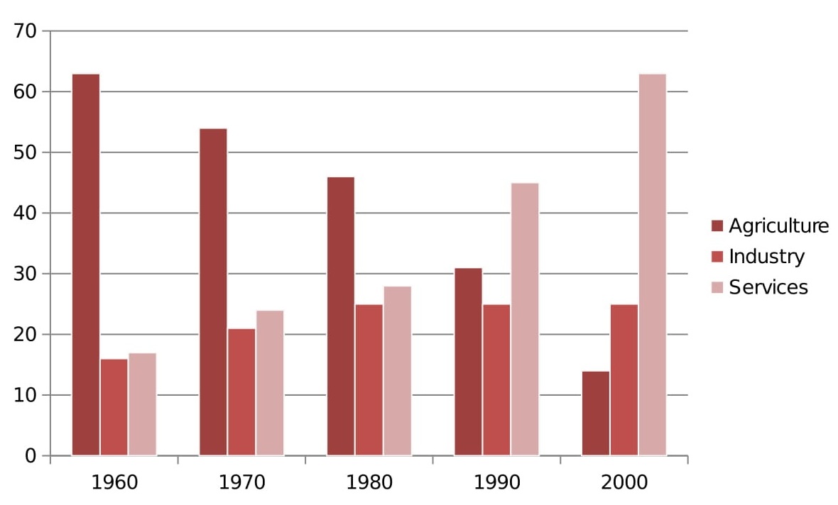
The bar chart below shows the sector contributions to India’s gross domestic product from 1960 to 2000.
Summarise the information by selecting and reporting the main features, and make comparisons where relevant.
Write at least 150 words.
Contribution as % of India's GDP
Source: EPW Research Foundation
Step 1 – Analyse the question
The format of every Academic Task 1 question is the same. Here is our practice question again with the words that will be included in all questions highlighted .
The bar chart below shows the sector contributions to India’s gross domestic product from 1960 to 2000.
Every question consists of:
- Sentence 1 – A brief description of the graphic
- Sentence 2 – The instructions
- The graphic – chart, graph, table, etc.
Sentence 2 tells you what you have to do.
You must do 3 things:
1. Select the main features.
2. Write about the main features.
3. Compare the main features.
All three tasks refer to the ‘ main features ’ of the graphic. You do not have to write about everything. Just pick out 2 or 3 key features and you’ll have plenty to write about.
Our practice graphic is a dynamic bar chart. That is, it includes a timeline giving data from several different points in time.
So, for this question, we need to identify the main trends (that is, the general developments or changes in situation) in the three key sectors of the Indian economy – agriculture, industry and service – between 1960 and 2000.
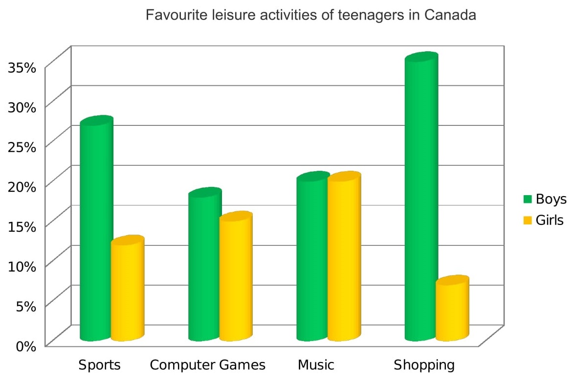
Alternatively, a bar chart may be static with the data coming from one point in time, as in the example below. For this graphic, we would need to compare the different variables, that is, the different leisure activities favoured by Canadian boys and girls.
Step 2 – Identify the Main Features
The graphic in IELTS bar chart questions should not be difficult to interpret. Each question has been created to test your language skills, not your mathematics ability.
All you are looking for are the main features. These will usually be the easiest things to spot. As we’ve just seen, the type of key features will depend on whether the bar chart is dynamic or static.
There will be lots of information in the graphic to help you identify them. Here are some useful questions to ask?
- What information do the 2 axes give?
- Is it dynamic or static?
- What are the units of measurements?
- What are the time periods?
- What can you learn from the title and any labels?
- What is the most obvious trend?
- Are there any notable similarities?
(I give more detail on how to use these questions, plus downloadable checklists for identifying the main features of all 7 different types of IELTS Academic Writing Task 1 questions, in the lesson on How To Understand & Analyse Task 1 Questions .)
So, what main features stand out in our practice graphic?
Here's our practice IELTS bar chart again.

There are 3 main features/trends in this IELTS bar chart:
Main feature 1: The contribution of the agricultural sector dropped steadily.
Main feature 2: The contribution of the service sector increased each decade.
Main feature 3: Industry remained static from 1980 to 2000.
The general trends you select will be the starting point for your essay. You will then go on to add more detail.
With just 20 minutes allowed for Task 1, and a requirement of only 150 words, you won't be able to include many details.
We’re now ready to begin writing our essay. Here’s a reminder of the 4 part structure we’re going to use.
Step 3 – Write an Introduction
In the introduction, you should simply paraphrase the question, that is, say the same thing in a different way. You can do this by using synonyms and changing the sentence structure. For example:
Introduction (Paragraph 1):
The bar graph illustrates the relative percentage contributions made by the agricultural, industrial and service sectors to the Indian economy between 1960 and 2000.
This is all you need to do for the introduction.
Ideally, key words such as ‘sector’ and ‘contributions’ should be replaced by synonyms but there aren’t any obvious words that could be used instead so it’s fine to repeat them. It’s important that your language sounds natural so never try to force in synonyms that don’t quite fit.
Step 4 – Write an Overview (Paragraph 2)
In the second paragraph, you should report the main features you can see in the graph, giving only general information. The detail comes later in the essay. You should also make any clear comparisons you spot.
This is where we write about the general trends. Here are the ones we picked out above.
Now form these ideas into two or three sentences with a total of around 40 words. State the information simply using synonyms where possible. No elaborate vocabulary or grammar structures are required, just the appropriate words and correct verb tenses.
For example:
Overview (Paragraph 2) :
Over the whole time period, the significance of agriculture declined steadily while services grew in importance decade by decade. A different patterned emerged for industry, which initially showed a slowly increasing percentage but then plateaued from 1980 onwards.
Step 5 – Write the 1st Detail Paragraph
Paragraphs 3 and 4 of your IELTS bar chart essay are where you include more detailed information about the data in the graphic. In paragraph 3, you should give evidence to support your first 1 or 2 key features. Don’t forget to make comparisons when relevant.
Here are our first 2 main features again:
And this is an example of what you could write:
Paragraph 3 :
In 1960, agriculture contributed by far the highest percentage of GDP, peaking at 62%, but it then dropped in steady increments to a low of 12% in 2000. The service sector, on the other hand, had a relatively minor impact on the economy in 1960. This situation changed gradually at first, then its percentage contribution jumped from 28% to 43% between 1980 and 1990. By 2000 it matched the high point reached by agriculture in 1960, showing a reversal in the overall trend.
Step 6 – Write the 2nd Detail Paragraph
For the fourth and final paragraph, you do the same thing for your remaining feature/s. We have one main feature left to write about.
Here’s an example of what you could write:
Paragraph 4 :
Industry remained a steady contributor to India’s wealth throughout the period. As a sector, it grew marginally from 16% in 1960 to exactly a quarter in 1980 then remained static for the next two decades, maintaining a constant share of the overall GDP.
Here are the four paragraphs brought together to create our finished essay.
Finished IELTS Bar Chart Essay
(188 words)
This sample IELTS bar chart essay is well over the minimum word limit so you can see that you don’t have space to include very much detail at all. That’s why it is essential to select just a couple of main features to write about.
Now use what you’ve learnt in this lesson to practice answering other IELTS bar chart questions. Start slowly at first and keep practicing until you can plan and write a complete essay in around 20 minutes.
Want to watch and listen to this lesson?
Click on this video.
Would you prefer to share this page with others by linking to it?
- Click on the HTML link code below.
- Copy and paste it, adding a note of your own, into your blog, a Web page, forums, a blog comment, your Facebook account, or anywhere that someone would find this page valuable.
Like this page?
Ielts academic writing task 1 – all lessons.
IELTS Academic Writing – A summary of the test including important facts, test format & assessment.
Academic Writing Task 1 – The format, the 7 question types & sample questions, assessment & marking criteria. All the key information you need to know.
Understanding Task 1 Questions – How to quickly and easily analyse and understand IELTS Writing Task 2 questions.
How To Plan a Task 1 Essay – Discover 3 reasons why you must plan, the 4 simple steps of essay planning and learn a simple 4 part essay structure.
Vocabulary for Task 1 Essays – Learn key vocabulary for a high-scoring essay. Word lists & a downloadable PDF.
Grammar for Task 1 Essays – Essential grammar for Task 1 Academic essays including, verb tenses, key sentence structures, articles & prepositions.
The 7 Question Types:
Click the links below for a step-by-step lesson on each type of Task 1 question.
- Table Chart
- Process Diagram
- Multiple Graphs
- IELTS Writing
- IELTS Bar Chart
- Back To Top
* New * Grammar For IELTS Ebooks
$9.99 each Full Set Just $ 23.97
Find Out More >>
IELTS Courses

Full details...

IELTS Writing Ebook
Discount Offer
$7 each Full Set Just $ 21

Find out more >>
Testimonials
“I am very excited to have found such fabulous and detailed content. I commend your good work.” Jose M.
“Thanks for the amazing videos. These are ‘to the point’, short videos, beautifully explained with practical examples." Adari J.
"Hi Jacky, I bought a listening book from you this morning. You know what? I’m 100% satisfied. It’s super helpful. If I’d had the chance to read this book 7 years ago, my job would be very different now." Loi H.
"Hi Jacky, I recently got my IELTS results and I was pleased to discover that I got an 8.5 score. I'm firmly convinced your website and your videos played a strategic role in my preparation. I was able to improve my writing skills thanks to the effective method you provide. I also only relied on your tips regarding the reading section and I was able to get a 9! Thank you very much." Giano
“After listening to your videos, I knew I had to ditch every other IELTS tutor I'd been listening to. Your explanations are clear and easy to understand. Anyways, I took the test a few weeks ago and my result came back: Speaking 7, listening 9, Reading 8.5 and Writing 7 with an average band score of 8. Thanks, IELTS Jacky." Laide Z.
Contact
About Me
Site Map
Privacy Policy
Disclaimer
IELTS changes lives.
Let's work together so it changes yours too.
Copyright © 2024 IELT Jacky
All Right Reserved
IELTS is a registered trademark of the University of Cambridge, the British Council, and IDP Education Australia. This site and its owners are not affiliated, approved or endorsed by the University of Cambridge ESOL, the British Council, and IDP Education Australia.
- Skip to main content
IELTS Podcast
Pass IELTS with expert help.
How to score high on a bar graph question in writing task 1
The bar graph task 1 essay accounts for a third of your marks in the writing test so we recommend spending around 20 minutes on it, as this is a third of your time. There are a couple of different structures you can follow when describing an IELTS bar chart .
A strategy for bar graph questions
Essay structure, or how you organise your answer, is very important in academic writing. Today we will teach you a new method – a structure where you assign each sentence of your text to a topic – kind of the opposite of what you usually do when writing task 2 . It may look a little confusing, but this method really works! Just follow our lead for IELTS task 1.
Remember that bar chart and bar graph are synonyms and you can use the phrases interchangeably. Although each bar graph will be different, you are not required to be an expert on the information it shows, just to summarise the information, identify trends and make comparisons. Each bar graph IELTS question is different, so look at as many bar graph examples as you can and practice this strategy until you feel really confident.
How to choose information from the bar graph?
Assuming one sentence contains around 10 to 15 words, we can estimate that your description of the bar chart will consist of about 10 to 12 sentences. Now we can assign each sentence a specific task:
- One sentence for the introduction.
- Two sentences using superlatives.
- A sentence with a comparison. Make comparisons where relevant.
- A sentence grouping two data points to show similarity (for example, you might include a brief description showing a gradual decrease in two different areas).
- A sentence noting an exception to an overall trend.
- A sentence describing some data in an advanced manner, using complex sentence structure.
- A sentence describing relevant data using a simple structure.
- Two sentences for summary and conclusion.
Note that this method is quite flexible and these sentences don’t necessarily need to go in this particular order. You must write them in a way that makes your bar chart description flow naturally. Think about which sentences go together in each body paragraph as well as the introduction paragraph and conclusion. You may also have to repeat a few sentences using different data if you find your graphic contains more information or find a way to mention different groups in one sentence. The structure above is a rough guide to get you started. Once you have looked at the example and are comfortable with this structure, you can use this example as a model to describe different bar charts and answer as many bar graph questions as you can. Just remember to get feedback while you are testing your ideas otherwise, it’s quite difficult to improve.
A bar graph sample question and answer
Now that we have figured out what we want to write about in the description of the bar graph, it’s time to put our data selection skills to use and make comparisons where relevant. It is easy to get lost in all of the information provided by a bar chart as there can be so much data. That’s why it’s important to keep in mind what you are looking for when you are analyzing the chart.
The task achievement score for task 1 makes it clear that you need to answer all parts of the question – in other words, describe the main features AND compare them, in order to get a good score. Task achievement is 25% of your total marks so don’t forget to make comparisons! The first thing you should do is identify key features. Once you have decided on the main points, make note of any secondary features that will support the main features.
Ready for a high-level bar chart task 1 answer? Let’s begin with the analysis of this bar chart, and pick out the information that is relevant to our structure. See the model answer of a bar chart below.
Sample Answer Bar Graph Essay
The bar chart shows the caloric intake of UK males in three distinct age groups of 0-24, 25-49, and over 50 years old. The data is shown as percentages. Dairy for the 0-24 age group was the highest source of calories, whilst the other categories each represented about 20% each. In the next age group dairy fell to around a quarter, and meat became the main source of calories, reaching half of the total intake. Pulses and vegetables reached 10% and 15% respectively. Pulses in the final age group increased sixfold to over 60%, whereas calories obtained from vegetables was 10%, half that of meat (20%), and even slightly less than dairy (15%). The 50+ group shows the most marked preference out of all the groups. It also confirms the gradual decline in vegetable consumption as males become older. Overall it is clear that each age group has a clear favourite which varies depending on age. However, vegetables are consistently amongst the least popular, regardless of age.
Sample Answer Analysis
In this essay, the introduction paragraph restates the writing prompt. It is not the overview paragraph, which can be either the first or the last paragraph. In this case, the overview appears at the end in which the writer states the overall trends of the bar graph. While the horizontal axis contains information relating to the question keywords, it’s important not to overlook the vertical axis and state clearly how the data is given (for example, is it as percentages, in kilos, or tonnes, or hours?) Make sure you have included this information in the first part of the essay.
You will also notice that the body paragraphs consist of a breakdown of the main features in order of age group to show and compare the difference in amounts of each food category consumed as people grew older, placing the final age group into its own body paragraph. This is because the data showed that there was a fairly significant upward trend in one food type (pulses) that the writer wanted to highlight. And finally, as previously mentioned, the conclusion part of this essay includes the overview, which should consist of a sentence or two about general trends.
Some notes on structure
Notice how the sentence is structured. How many complex sentences can you identify? When preparing for your IELTS academic writing task, you will want to show some sophisticated writing. When you sit for your IELTS writing test, you might feel pressured for time and it may be a bit difficult to think of complex sentence structures while considering the main features. Take note on the following important tips on structure:
- Make sure you have mentioned all the categories in your answer – in this example, there are four categories.
- Make sure you have also included the correct values when you summarise the data, in this case, percentages.
- It is often tempting to write too much for a task 1 essay but by following the method shown you will stay focused. Concentrate on the most important information.
- Compare the highest and lowest values, for example, rather than all the differences.
- Write what comes naturally at first, even if you write in correct simple sentences.
- Allow yourself some time at the end to go back and adjust some of your structures to complex sentences.
- If you are aiming for a high score on the IELTS test, you should aim for structures that are complex and accurate.
- It is important to be sure of the tense you are using. This example requires the present tense but many bar charts illustrate data from the past. In that case, you need to write the introduction in the present tense (the bar chart illustrates…) and then switch to writing mostly in the past tense (the number of people choosing this option dropped after the first year).
Click here for more free IELTS bar chart sample essays . You can also find sample IELTS task 1 questions here .
Tips on describing a bar graph in IELTS
- Avoid listing every single data point; instead, use your own words to describe the key information from the chart/graph.
- Avoid mixing formats: for example, don’t mix decimals with estimations in the same sentence.
- Check whether there is a date on the bar chart – you may need to use the past tense.
- Make note of general trends, particularly upward or downward trends that can be highlighted in your own words.
- After you have successfully written out your description with all of the information you want to include, go over it and replace some simpler words with more academic vocabulary – this will help you achieve a high score . For example, try replacing “big” with “most significant”.
- Check that your text is error-free. Review carefully to see if all your sentences are grammatically correct.
- Make sure that the data you have described is correct – that you have not made a mistake with a category or labels.
- Review for the correct use of connectors and linking words .
- Practise with different bar graphs/pie charts to improve especially with a range of values (percentages, kilos, miles, dollars).
- Review the superlatives – highest, lowest, most expensive, biggest difference – these are essential if you want to effectively describe bar charts.
- The fastest way to improve is to get feedback on your work. You can also check another model bar graph answer for comparison.
- Don’t forget to check your word count. Make sure your piece is another too brief nor too wordy and detailed. Most model answers come in at around 200 words. You’ll use a similar writing model for pie charts and tables so you don’t need to memorise completely different models for each.
Bonus tips to score high on IELTS Bar Graph Questions
- To improve your task 1 bar graph skills try copying out a sample bar graph with pen and paper. You will start to understand how to locate key points and choose the most relevant information. It doesn’t matter what the topic is, remember it could be anything from the gross domestic product of different countries to comparing the highest expenditure on housing. You don’t need to be an expert on gross domestic product or the Japanese rental market, you just describe the data and make comparisons.
- Practice describing a bar chart out loud. It will help you remember vocabulary to describe data under pressure, decide point by point what to include in your answer and make sure you have mentioned every category at least once. Your confidence will improve when it comes to your next IELTS writing task.
- Make sure you practice ‘two type’ questions – you might see an IELTS question with one bar chart or two so it is a good idea to look at a model answer for each type. You might see one bar chart and a table, or other types of graphs such as line graphs. Some questions might have a mix, for example, one or more pie charts and a bar chart. However the data is displayed, it’s important to stay calm and focus on finding the major differences and similarities, compare categories and identify trends. Describing a table or line graph is very similar to describing bar charts and the more you practice the more confident you will feel.
Check out one of our free lessons here by clicking on the following link !
Video: How to describe a bar graph
Click here to subscribe to the Youtube channel.
Frequently Asked Questions (FAQs)
How to describe bar graph in ielts task 1.
Divide the information into two or three groups, focus on trends and exceptions to help you. You don’t need to describe everything. Think of synonyms for key words and most important numbers – for example, 52% is just over half.
How to write task 1 bar graph?
Follow a model, the 4 paragraph diagram model is easiest. That’s rephrasing the question, one main trend, another main trend and an overview. Overall have 10 sentences with specific tasks as we explain in this article.
How do you write a description of a bar graph?
Remember that the important thing is to describe the main features AND make comparisons. Use superlatives and the phrase ‘which means that…’ to help you. For example, Portugal’s spending was between 20 and 27% which means that it had the highest spending of all 4 countries studied.
Audio tutorial: How to describe a bar chart for the IELTS exam
| Download | Stitcher | iTunes | Android | RSS
Podcast: Play in new window
Sample Bar Chart Questions and Model Answers
Take a look at these bar chart model answers to help you prepare
- Bar chart of international student enrolment in British universities 2009-2014
- Bar chart of average monthly revenue from retail telecommunication subscribers
- Bar chart of increase in total consumption
- Bar chart of life expectancy (2006)
- Bar chart of percentage of eligible voters registered for each race by state and year
- Bar chart of average weekly attacks
- Bar chart of pet Owners
- IELTS Task 1 Sample Answer 2 Double Graph Pie Chart and Bar Chart
Podcast: Play in new window | Download

- Skip to primary navigation
- Skip to main content
- Skip to primary sidebar
- Skip to footer

IELTS Advantage
IELTS Preparation Courses
IELTS Bar Chart Sample Essay
Static or Dynamic?
Before writing an IELTS task 1 bar chart or line graph answer it is important that we analyse the question correctly. Taking a few minutes to do this will help us write a clear answer that fully responds to the question. Just what the examiner wants us to do.
The first thing we need to do is decide if the bar chart is static or dynamic. Static means that the data comes from one point in time. Dynamic means the data comes from more than one point in time.
Whether a chart is static or dynamic will affect the information we choose to include in our answer and the kind of language (tense, grammar etc.) we use.
If it is dynamic we will have to compare the different times and comment on the general trends over the time period.
If it is static we will have to compare the different variables, in this case countries, car price, GDP and time it takes for one person to buy a car.
Main Features
Every IELTS academic task 1 question asks us to ‘select and report the main features’.
This means that we have to not only pick the most significant information from the graph and include it in our essay, but also decide which information is not important and should therefore not be included in our essay. One of the biggest mistakes you can make in task 1 is including all the information you see.
So which information should you choose?
You should look for:
- highest/lowest values
- biggest differences
- similarities
- significant exceptions
- anything else that really stands out
There are 3 main features in this graph
1) It takes over 26 years for a Vietnamese person to buy a car.
2) Vietnam has the second highest average costs but the second lowest wages.
3) Cost of a car in Singapore is nearly 3 times the next most expensive.
I advise my students to follow a basic four paragraph structure for these kinds of questions.
Paragraph 1
Paraphrase the question using synonyms.
Paragraph 2
Provide an overview of the main features. No need to include any data in this paragraph, just tell the examiner what is happening in general terms. If you had to describe the main features in two sentences, what would you say?
Paragraph 3
This is where we get more specific and use data. Take 2 of the main features (from your overview) and describe them in detail using data from the chart.
Paragraph 4
Simply do the same thing as you did in paragraph 3, but with two other main features (from your overview).
Sample Answer
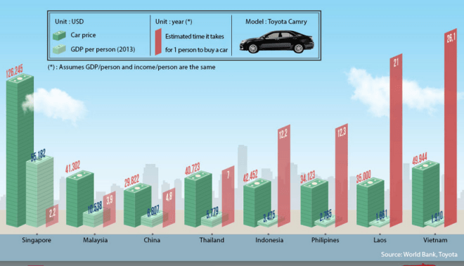
The graph compares the GDP per capita, cost of a Toyota Camry and approximate length of time it takes for 1 citizen to purchase that mode of transport in eight Asian countries.
Despite having the second lowest average yearly income, it costs more to buy this car in Vietnam than in all but one other Asian nation. It also takes significantly longer for a standard person to buy an automobile in Vietnam than in any other state in Asia. On the other end of the scale, Singaporeans have to pay nearly three times more for their cars than the Vietnamese and it takes them the least amount of time to afford a motor vehicle.
It costs $49,944 to buy a Toyota Camry in Vietnam, but this dwarfs the average yearly income per person at just $1,910. It would therefore take a normal man or woman 26.1 years to save up for that particular car.
This is in contrast to Singapore where it costs $126,245 for that model of motorcar, however the average salary is much greater at $55,182. This means that it generally takes just over 2 years for a typical individual from Singapore to acquire this vehicle.
(200 words) Band 9.
It should be noted that this is not a real IELTS task 1 question. This is just a chart that I saw on the internet, but it allowed me to make a very important point- you don’t have to mention everything on the graph. I only talked about 2 out of the 8 countries and I still wrote 200 words and answer the question fully. The key is finding the most significant data and not talking about anything else. Don’t worry, you won’t lose marks for not talking about everything, quite the opposite.
This graph is also good for demonstrating how important it is to vary your vocabulary. There were four words that could have been overused in this essay- car, average, country and people. Instead of repeating them over and over again I used synonyms to show the examiner I have a wide vocabulary and gain extra marks. Here are the synonyms:
Car- Toyota Camry- automobile- vehicle- motor vehicle- motorcar
Average- approximate- normal- typical- standard
Country- countries- nation- state
People- citizen- man or woman- individual
Next time you see a chart or graph in a newspaper, in a textbook or on the internet, think about what the main features are and what common words would you have to vary with synonyms.
I hope you have found these tips useful. If you have any questions, let me know below.
For more band 9 sample essays check out our task 1 sample essay page.
About Christopher Pell
My name is Christopher Pell and I'm the Managing Director of IELTS Advantage.
I started IELTS Advantage as a simple blog to help 16 students in my class. Several years later, I am very humbled that my VIP Course has been able to help thousands of people around the world to score a Band 7+ in their IELTS tests.
If you need my help with your IELTS preparation, you can send me an email using the contact us page.
Describing a bar chart

Learn how to write about trends in a bar chart.
Do the preparation task first. Then read the text and tips and do the exercises.
Preparation
Grouping_MjI3NTc=

The chart shows the sales revenue of a selection of home video entertainment formats in the USA in 2017. It also shows the percentage change from the previous year.
Online video streaming was the most popular format in 2017. US consumers spent $9.8 billion on services such as Netflix, which was a rise of 32 per cent from the previous year. For the average American, this accounted for nearly half of their spending on video entertainment at home.
At the same time, customers were moving away from the three physical formats in the chart. DVD and Blu-ray sales dropped by 14 per cent over the twelve-month period to $4.5 billion in 2017, and rent-by-post revenues went down by 20 per cent to $0.5 billion. DVD rental shops saw the largest decline, as spending fell by 21 per cent to just $0.4 billion.
Overall, there was a clear downward trend in spending on physical video formats, as they all showed relatively low sales and they were all in decline. However, there was an upward trend in paying for streaming.
Please note: This page was designed for writing practice only. Information in the chart may not be accurate.
- In the first paragraph, give basic details about the chart including what it shows, where it refers to and when.
- When you describe chart data, be specific. Mention the category and figure, e.g. Online video streaming was the most popular format in 2017. US consumers spent $9.8 billion ...
- A trend is a change over time. To describe trends, focus on what is increasing or decreasing compared to some time in the past, e.g. ... which was a rise of 32 per cent from the previous year .
- If several categories show the same trend, talk about them together, e.g. customers were moving away from the three physical formats in the chart.
- State the units of measurement, e.g. US consumers spent $ 9.8 billion .
- Many of the verbs for up and down trends can also be used as nouns, e.g. Spending fell by 21 per cent = There was a 21 per cent fall in spending . (You can write % or per cent, but be consistent.)
- Write a conclusion. Say what we learn from the data overall.
What trends do you notice in the way people spend their money in your country?
Language level
I notice that people in my country love try something new. We have trend with cafe or restaurant,so when new cafe open people go because everyone want describe own position about this.
- Log in or register to post comments
As Argentina is experiencing a significant increase in inflation rates in recent years, I see how consumers are drastically changing their spending behavior, moving from high-cost and leisure goods to short-term goods and services to satisfy their basic needs. such as food, electricity, mobility, health and education. However, as the value of the peso falls every day, there are people who decide to spend it as soon as possible on long-lasting goods such as cars or on small pleasures such as a meal at a restaurant. In the end, all of us who have experienced other inflationary processes in recent decades know that unfortunately the most likely thing is that the next step for our economy will be a severe crisis that will lead to spending and consumption falling practically to zero.
to tell the truth, because I mind on my own. I haven't paid attention to this matter . It's a comprehensive question that needs statistical review. For example, On the one hand, How can I guess a woman who is buying three shoes whether she is wasting her money or doing something reasonable? The correctness of her action depends on her revenue and financial situation. On the other hand, I know people who have good financial situations but they just buy gold, and their appearance has nothing to do with their bank account! Overall, what I see is my society is getting better in all fields. the variety of goods and as a result the right of choice for customers has increased. I think the variety has increased the desire to buy.
Many supply chains in Mexico have been taken a dicrease in their revenues since the pandemic of COVID 19 in 2020. The charts showed that in big chains like walmart those years looked down their retail sales. Despite of, Walmart, Amazon, eg, had seen necessary to change their strategies, so they decided apply online buys for customers over the world. The sales since 2021 has increased up to 12% according the charts. Overall, revenues still increasing because all those strategies from companies are succesfull and constantly marketing and sales strategies are changing. It is stimated that in 2030 these companies will have the majority of profits inside global market.
Given the fact that Pandemic isn't over yet, it has a negative impact all over the world. In my country we saw a rise in prices of food and oil due to disruption in supply and strong dollar which is a dominant reserve currency. Import goods are usually sold and bought in dollar, strong dollar exported inflation in my country as the Peso gets weaker. There was a decline in demand for trendy clothing. I noticed people do away with shopping and spend their money for necessities. The economy has been crippled and struggling to meet its annual growth target. Businesses are shut down. The trickle effects of these inevitable societal and economic uncertainty are felt by ordinary citizen in my country affecting their livelihood and struggling to make ends meet. Essential shopping is now a most prevalent trend.
In my country, Overall, the trend declined, and all business revenues drop up, the demand is decreasing for all wanted, and luxury staff. People only buy the thing which is essential for daily life and to survive. The human traffic business grows up, and people spend numerous amounts to be fled from the country due to life threatening. This is the economic story of my country.
People in Hong Kong spend a lot of money on NB shoes, and their prices have risen quickly for some special categories of shoes. Worldwide shoes speculation. Some people need to spend more than that to obtain what they want.
I noticed that here in China-the country where I live, people spend their money on retail sales. They are willing to spend their money online.
In 2021, the total digital sales revenue grew by 12.5 % from the previous year to XX billion dollars, accounting for 52% of the country’s retail sales, up from 44.8% a year prior. Thanks to e-commerce marketing developing, customers can shop almost all kinds of goods online and their favorite place to buy is Taobao, Tmall, and JD. In Tmall Double 11—11 November each year shopping festival, it achieved a new record of US$84.54 billion in gross merchandise volume
Overall, there is clear upward trend that retail sales of an entire country and it is transacting online.
In my country, everyone has usually spent money on fashion, traveling, or spent a lot of money on a nice restaurant to selfie.
The trend I noticed in my country is about invest in cryptocurrency. It's a new way of increase money in bank account. The last two years about 3 million people invested their money in cryptocurrency to buy bitcoin and ethercoin. This two cryptocurrency is famous in my country. I'm also planning to invest my money in this.
Online courses

Group and one-to-one classes with expert teachers.

Learn English in your own time, at your own pace.

One-to-one sessions focused on a personal plan.

Get the score you need with private and group classes.
- A Beginner’s Guide to IELTS
- Common Grammar Mistakes [for IELTS Writing Candidates]
Writing Correction Service
- Free IELTS Resources
- Practice Speaking Test
Select Page
How to Describe a Bar Chart [IELTS Writing Task 1]
Posted by David S. Wills | Apr 13, 2020 | IELTS Tips , Writing | 5
There are various kinds of diagrams and charts that you may be asked to describe in the IELTS writing test, and one of those is the bar chart . In today’s lesson, I want to share some important advice that can help you improve your writing performance in your next IELTS test.
Describing data for task 1 of the IELTS writing exam is quite difficult and it will vary according to what you actually see. In other words, it is hard to simply teach some language for describing bar charts… Instead, your language will vary according to what the bar chart shows.
However, in this article I am going to break the process down and show you some examples so that you can understand it fully. At the end, I will give you a sample band 9 answer for a really difficult bar chart about people’s weight.
What are Bar Charts?
First of all, let’s start with the most basic question. You can feel free to skip this if you are already totally familiar with it. 😁 What is a bar chart? Basically, it is a visual representation of data using bars, like these:
Bar charts are used to show the difference between volumes or quantities of things because it is easy for the human eye to interpret. Let’s take a look at this example bar chart. I just found it on Google and will use it because it is simple. This is not a real IELTS chart. 🤪
You can easily see what this means. The most common excuse is “I forgot to set my alarm” and the least common is “It was still too dark; I thought it was still night-time.”
That is the purpose of a bar chart. It shows data in a way that is really easy for people to understand. As such, you may encounter it in your IELTS test. In that case, you will have to pick out the most important data and describe it.
Bar Charts for IELTS Writing
As we have seen, a bar chart is just another way of expressing data. For task 1 of the IELTS writing test, you may be asked to write about a bar chart. You will have to write more than 150 words and it is recommended that you do this in 20 minutes or less. (You will have a total of 1 hour for 2 tasks.)
It is important to note that you do not have to describe everything in the chart . Part of the task is picking out and describing only the relevant details. That usually means:
- The highest
- Major differences
- Anything interesting
What does that mean? This is very subjective, and so it is certainly open to debate. Let’s look at an example in order to understand it better:
In this bar chart, our eyes are naturally drawn towards the highest and lowest figures. The highest was in Sweden in 2012 and the lowest was in Finland in 2012. Therefore, both the highest and lowest figures occurred in the same year. That’s interesting!😅
Another interesting factor is that, in every year except one, Sweden had a higher divorce rate than Finland. It was only in 2015 that Finland’s divorce rate was higher than Sweden’s.
The Process
When you need to describe a bar chart for IELTS, you should take the same basic process as for describing anything else:
- Take time to read the question carefully.
- Look at the data and make sure you understand it.
- Find important data to describe.
- Plan your essay structure.
- Write your essay carefully.
- Check your answer for mistakes.
If you follow this basic routine, you will have a good chance of providing a strong answer to the question.
Language for Describing Bar Charts
In the past, I have talked about the language required to describe the following IELTS writing task 1 assignments:
- Process diagram
Bar charts are a little different because the language you would use depends on what is being described and there is no common set language that you would use just to talk about bar charts in general.
In the previous example, we can see that the bar chart features changing data over time. In such cases, we can use relatively similar language to that which we used for line graphs. You could say, for example:
Divorce rates in Sweden peaked in 2012 at a little under 50%, but fell in each of the subsequent years.
However, you can see that in the first bar chart there was no progression of time, so you cannot use language that shows changes in data. This brings us to the next stage…
Common Problems in Describing Bar Charts for IELTS
I used to teach writing skills at a university in China, and one of the most common problems I would have was teaching my students to write about bar charts. They could describe line graphs really easily, but the problem was that they would use the same expressions and structures for bar charts, when in fact something different was needed. Let’s look at two example charts. These contain similar data but there is an essential difference:
You can see that the line graph talks about changing phone prices over time, whereas the bar chart shows the different prices of phones. These prices are all taken from the same point in time .
Therefore, in order to adequately describe these, you must show that you understand the data.
For the line graph, you can say:
The price of Phone A rose from £380 to £410 between December and January.
However, you cannot use this language for the bar chart:
INCORRECT: The price rose from £380 for Phone B to £410 for Phone C. CORRECT: Phone C cost £30 more than Phone B, which cost £380.
This may seem easy to some people, but it is an important distinction and a common mistake. You should practice often to make sure that you know the difference.
Task 1 Essay Structure
There is no single perfect essay structure for IELTS, but there are some that are better than others. For task 1, I generally recommend writing an essay like this:
Let me explain what I mean by that.
It is really important to group your data appropriately. This can be quite difficult, so you should read this article first.
Essentially, you need to choose how to put groups of data together. Let’s take another example:
The chart below shows the total number of minutes (in billions) of telephone call in the UK, divided into three categories, from 1995-2002. Summarise the information by selecting a reporting the main features, and make comparisons where relevant.
For this sort of bar chart, you might choose to write two or three body paragraphs. Perhaps you would describe local fixed line phones first, then start a new paragraph for national and international ones, with another paragraph for mobiles.
Another way would be to break the data in half – one paragraph for 1995 to 1998 and another paragraph for 1999 to 2002.
There are lots of different ways. The only really important thing is that you make it clear to your reader why you have chosen to group the data this way. In other words, it must be logical .
Sample Answer
My answer to this question would look something like this:
The bar chart shows the time spent on three different kinds of phone calls in the United Kingdom over a period of eight years, starting in 1995 and ending in 2002. Local calls were the most common type of phone call made during the entire period, although both national/international and mobile calls grew in popularity to narrow the gap between these three types of call by 2002. In 1995, local calls were by far the most common type of phone call in the UK, with more than 70 billion minutes recorded on this chart. This is about double the amount of time spent on national and international calls, and more than ten times as much as was spent on mobile phone calls. All three types of phone calls grew in popularity until 1999, after which local calls decreased year-on-year until they ended the period at around the same figure as they began it – 70 billion minutes. National and international calls grew steadily over the recorded eight years, from about half the popularity of local calls to only slightly less in 2002. Mobile phone calls, however, grew ten-fold from about four billion minutes to more than forty billion.
A Really Difficult Bar Chart
Finally, let’s look at a difficult bar chart in order to show how we can tackle challenging problems.
As you can see, the first problem is that there are two charts! Already, that will prove more difficult than describing just one chart.
Another issue is that these bars look strange. They are all the same size… Why? Well, these represent the population. Each one is 100%, with the colours making up the different weight categories. The total can never be more than 100% because that it is the full population.
Now, you should try to interpret the data. What are the main changes?
- In 1955, there are lots of people at an ideal weight and very few people are obese.
- In 2015, many older people are obese. Fewer people are at an ideal weight.
- The weight distribution was similar regardless of age in 1955, but in 2015 it is very different.
Once you have picked out the important data, you should figure out how to structure your answer. I will use this structure:
However, I will make sure that there are clear comparisons between the 1955 and 2015 data. It is not enough to describe them in isolation.
Language for Talking about Age and Weight
To be honest, the hardest part of this bar chart is not that data but the terminology around age and weight. You can see from the chart that were are looking at age groups and weight groups. Many native speakers find this really difficult to talk about.
When we talk about age and weight, we usually say some form of “to be” rather than “to have.” For example:
- INCORRECT: In 2015, a higher percentage of people had overweight or obesity than in any other group.
- CORRECT: In 2015, a higher percentage of people were overweight or obese than in any other group.
- INCORRECT: In both years, the people who were most likely to be an ideal weight had 20 to 29 years.
- CORRECT: In both years, the people who were most likely to be an ideal weight were aged 20 to 29 years.
You can see how I explained this to one of the students on my writing correction service :
There are also problems with grouping people according to age. We can just say “people in the ___ age group/category” but this becomes repetitive after a while, so we need to use different language.
Talking about age is difficult, especially when describing groups of people who fall into different age categories. One thing to know is that, when you say use numbers, it is a sort of adjective and thus you need a noun to follow it or else it is meaningless:
- The criminals arrested were all 16 to 25 years old.
- I saw a 15-year-old boy running away.
You can turn the “old” into a noun by adding an “-s”:
- There was an increase of 25% in the unemployment rate for 20-29-year olds.
You can also put “aged” before the numbers:
- Most of the recipients were aged 18-22.
Sample Band 9 Answer
Here is my description of the bar chart above:
There are two bar charts showing the distribution of weight categories for people living in Charlestown. The first one is from 1955 and the second is from 2015. It is clear that vast changes have occurred in people’s health during this sixty year period. In 1955, very few people were overweight or obese, and most were healthy or even underweight. In each of the age groups, at least half of people were classified as in the ideal weight range, but towards the ends of the spectrum – the youngest and the oldest people – there were more people who fell into the underweight bracket. Being overweight or obese was a problem primarily affecting middle aged people, but not the most elderly ones. However, this distribution had completely changed by 2015. Although some young adults and elderly people remained underweight, a very slim number in the middle of the age groups did. Being overweight had become increasingly common, and obesity had become a huge issue, affecting people more and more as they got older. For people aged fifty and older, more than half suffered from obesity, and very few fell into a healthy weight range.
Useful Language
I will excerpt some of the useful phrases that appeared in this answer so that you can see how I have managed to describe ages and weights:
- very few people were overweight or obese
- most were healthy or even underweight
- at least half of people were classified as in the ideal weight range
- people who fell into the underweight bracket
- Being overweight or obese was a problem
- elderly people remained underweight
- Being overweight had become increasingly common
- obesity had become a huge issue
- more than half suffered from obesity
- very few fell into a healthy weight range
This was a really difficult bar chart to describe, but using this language I have managed to do it accurately and comprehensively.
Improve your Writing
If you want to get better at IELTS writing, the only way to ensure constant progress is by having an expert give you feedback. Most of the writing correction services that you find online are rubbish. They are run by people do not speak much English or do not understand IELTS. My writing correction service is one of the few that is truly worthwhile. I can tell you all your problems and help you to fix them.
Here is my feedback to someone who wrote an essay about the Charlestown weight distribution bar charts:
Let me know in the comment section if you have any questions. 🙂
About The Author
David S. Wills
David S. Wills is the author of Scientologist! William S. Burroughs and the 'Weird Cult' and the founder/editor of Beatdom literary journal. He lives and works in rural Cambodia and loves to travel. He has worked as an IELTS tutor since 2010, has completed both TEFL and CELTA courses, and has a certificate from Cambridge for Teaching Writing. David has worked in many different countries, and for several years designed a writing course for the University of Worcester. In 2018, he wrote the popular IELTS handbook, Grammar for IELTS Writing and he has since written two other books about IELTS. His other IELTS website is called IELTS Teaching.
Related Posts
How to Describe a Photo (IELTS Speaking)
September 4, 2017
Formal and Informal Vocabulary for IELTS
September 28, 2020
How to Use More Advanced Vocabulary for Task 1 [IELTS Writing]
October 11, 2017
Describe a Tradition [IELTS Cue Cards]
November 23, 2020
Hi, David. I noticed that you didn’t include any figures at all in your sample answer for the weight assessment. Is that acceptable? This is because I have seen some IETLS teacher who taught us to include most of important figures. Thank you.
The important thing about IELTS is that it is an English test, so you should use your language to describe the data. Most candidates attempt to cram lots of numbers in so that they can use fewer words. The fewer numbers you use, the better. Sure, you can have one or two, but if you are able to use words to describe trends, reflect important data, or make comparisons, then it is much better. If you read my essay carefully, you will notice that I said things like “at least half of people” rather than just repeating numbers. This is a good strategy, although you can certainly put in a few numbers if you want.
Hi David. Thank you for your explanation. I have a question! for describing a chart what verb tens we should use? It depends on something or it has a rule! Thank you.
It depends on the situation. Pay attention to any time frame that is given or the origin of the data. If none is given, then present simple is fine.
Asalam O Alakum David
Can we explain only things in overview except figures, percentage and time trend? I mean only what they have mentioned in the picture.
Secondly, in last 2 paragraphs only should we write those things which they have showed in the graph, chart or map in a simple way.\
Please, confirm me.
With regards
Leave a reply Cancel reply
Your email address will not be published. Required fields are marked *
This site uses Akismet to reduce spam. Learn how your comment data is processed .
Download my IELTS Books
Recent Posts
- British vs American Spelling
- How to Improve your IELTS Writing Score
- Past Simple vs Past Perfect
- Complex Sentences
- How to Score Band 9 [Video Lesson]
Recent Comments
- Francisca on Adverb Clauses: A Comprehensive Guide
- Mariam on IELTS Writing Task 2: Two-Part Questions
- abdelhadi skini on Subordinating Conjunction vs Conjunctive Adverb
- David S. Wills on How to Describe Tables for IELTS Writing Task 1
- anonymous on How to Describe Tables for IELTS Writing Task 1
- Lesson Plans
- Model Essays
- TED Video Lessons
- Weekly Roundup

How to Write IELTS Bar Chart Essay?-Step-By-Step Guide
An IELTS writing task 1 is about writing a report. As it is known that various Types of illustrations are asked in task one. So in this article, a detailed explanation of writing a bar chart essay will be discussed.
What is a Bar Chart?
A bar chart is a type of illustration in which the data is represented in the form of rectangular horizontal and vertical bars on the X-axis and Y-axis. One variable is shown on the X axis and another one is on Y-axis. The data can be of two or more components over some years or in some quantity etc.
How to Write a Bar Chart Essay?
There are particularly three stages in writing a bar chart:-
- Planning stage
- Writing stage
- Re-reading stage
Stage 1 ( Take 2 to 3 minutes)
Planning stage.
Two tasks have to be done in the planning stage. As we know, a report of 150 words is to be written in approximately a time period of 20 minutes and it should not take more than 20 minutes. The planning stage requires at least two to three minutes of planning. One work that has to be done in the planning stage is analyzing the question and the other work is to identify the main features .
- Analyzing the question -It means the question has to be read and it should be understood. Analyze the two components given which can be anything like years or sales, companies or sales, etc.
For example-
The graph below shows the percentage of part-time workers in each country of the United Kingdom in 1980 and 2010.
Summarise the information by selecting and reporting the main features, and make comparisons where relevant.

So here, in this question, two components are percentages and countries. The data is represented for two years. The green-colored bars are for 1980 and a blue one for 2010.
The percentage is of part-time workers. (Part-time workers can also be written as spare time workers)
- Identifying the key features- Key means important or regarding majors or minors of the graph. After reading and understanding the question, recognize the special characteristics of the components. For example- in the above graph
1. Wales had the highest count of part-time workers in both years.
2. The proportion of part-time workers in Scotland almost doubled over the time period of 3 decades.
3. The rate of working capital as part-time in the UK increased over the period except for the country of Northern Ireland.
Stage 2 (Take 15 to 16 minutes)
Writing stage.
The writing part is divided into paragraphs which are an introduction, overview, Body paragraphs 1 and 2.
- Introduction- The question is to be rewritten in starting of the report but in a rephrased manner using synonyms. It is highly required to write
Name of the illustration that is, a bar graph or bar chart
What it shows , is, the percentage of workers
Years that is, 1980 and 2010
- Overview- The overview is a conclusion paragraph which can be after the introduction or at the end of the report. It should include one key feature of the whole report. For example- in the above graph, Wales had the highest count of part-time workers in both years.
The rate of working capital as part-time in the UK increased over the period except for the country of Northern Ireland.
- Body paragraphs 1 and 2- These paragraphs from the body of the report. Each and every figure is needed to be presented here along with the mentioned years and countries. All the identified key features are to be explained here, depending upon the need of the paragraphs. It can be one or two but not more than two.
1. Remember that it is not essential to write about each and every bar. You can just write it by mentioning the key features only.
2. Don’t forget to mention the percentages which is an important variable of the graph here.
3. Take care of the years mentioned and write the correct one against the correct country name.
Final Sample Answer of Above Example
The bar chart shows the percentage of people who have part-time jobs in the countries of the United Kingdom, both in 1980 and in 2010.
Overall, The rate of working capital as part-time in the UK increased over the period except for the country of Northern Ireland.
In 1980, 25% of people in England worked part-time. The only country with a greater percentage of part-time workers was Wales, with around 33% working part-time. Both countries saw an increase in the percentage of people working part-time in 2010. In England, the percentage rose to over 30%, and in Wales, the percentage rose to just over 35%.
Scotland had the smallest percentage of part-time workers in 1980, with just over ten percent. However, this rose to almost 20% in 2010 which is a large increase. Lastly, Northern Ireland was the only country that had a decreasing percentage of part-time workers. In 1980, it had around 15% of people in part-time work. This decreased by a couple of percent in 2010.
Stage 3 (Take 2 minutes)
Rereading stage.
The proof Reading stage is a very crucial stage and it should take two minutes at least after your writing. In this stage, you have to read and take out the mistakes if any, about what you have written above.
- Take out any of the mistakes In grammar parts or spelling.
- Take out the mistake of tenses if any verb is written in the wrong tense.
- Ensure that all the key features have been responded to and the task is complete.
- Check out the word limit also which is 150 words.
So in the above discussion, it is clear that identification of the key features is very important here. Once you have identified what you have to write, it makes it easier for you to write. The writing of the overview part and the body paragraphs get simpler after this recognition of the important key features. Following are some example questions in which the key features are mentioned for your reference.
The chart shows components of GDP in the UK from 1992 to 2000.
Summarize the information by selecting and reporting the main features and making comparisons where relevant.

Key features
- Overall, the GDP rate of the service industry Escalated throughout the time whereas it showed fluctuations for the IT industry..
- The GDP rate from the IT industry had always been more than the GDP rate of the service industry.
- The GDP contribution of the IT industry escalated at a higher rate than an increase in the GDP rates of the service industry.
- Both the industries showed a peak GDP rate in the year 2000.
The graph gives information about the age of the population of Iceland between 1990 and 2020.

- The percentage of the young population aged 25 to 54 is highest And increasing in all the years.
- The population aged 0 to 24 had Declined over the period of three decades.
- The middle-aged population of Iceland has remained constant in all the years, that is, approximately 10% to 13%.
The chart below shows the proportion of male and female students studying six art-related subjects at a UK university in 2011.

- Interest in the subject of English language and literature was highest among both genders in the year 2011.
- The least count of Females had opted for philosophy subject whereas, among males, history and archaeology subject was least likable.
- A high difference in the count of boys and girls can be seen in philosophy subject.
- Approximately the same count of men and women opted for communication and media subjects.
The chart below gives the distribution of worldwide car sharing schemes (%) in 2008 and 2016.
Summarise the information by selecting and reporting the main features, and make comparisons where necessary.

Here, for different years, two different Body paragraphs can be formed.
- The highest percentage of Europeans opted for the worldwide car-sharing scheme in the year 2008 whereas South Americans showed the least interest which was almost negligible.
- After a period of 8 years, North America had the highest count of people opting for a worldwide car-sharing scheme.
- But the situation was constant in the case of South America which had the least percentage of car sharers in 2016 too.
I hope the above article brings the clarity of identification of the key features in detail and it makes you feel confident of writing bar graph in an appropriate manner.
Dr. Roma Online Complete IELTS Training Course
Students can also enroll now in BDS Online IELTS Preparation Course today where you will get access to anytime/anywhere IELTS classes, with 400+ detailed video lectures, sample papers, and live classes by Dr. Roma. Candidates can also sign up for IELTS Dr. Roma Writing Templates + Cue Cards Course to get ready essay templates and solutions latest IELTS essay topics. So let's get started with IELTS writing practice.
Features of Complete IELTS Training Course
- All 4 Modules Covered- Speaking, Reading, Writing & Listening
- 400+ Recorded Video Lectures
- 70+ Hours Content
- Daily Live Classes & Doubt Sessions by Dr. Roma
- Practice Test and Mock Test Included
- Regular WhatsApp Group Updates regarding Latest exams Topics
- One Time Payment-No Monthly Fees
- One Year Validity
- Anytime Anywhere Classes
- All PDFs, Notes & Practices Material are provided
- Affordable Course Fees
Content Writer
Sign Up Complete your profile
Must contain atleast 1 uppercase, 1 lowercase and 1 numeric characters. Minimum 8 characters.
You may also be interested in
Free IELTS lessons signup

- Academic practice
- General practice
- Task 1 Academic
- Task 1 General
- Task 2 (essay)
Answering IELTS writing task 1: bar chart
In this lesson we’re going to learn how to tackle bar charts in IELTS Writing task 1 questions to get the highest score. To get a band 9 in IELTS Writing task 1, you should follow this answer structure :
- Introduction
- General overview
- Specific features
Let’s look in detail how to apply this structure to an IELTS bar chart question .
IELTS bar chart Question :
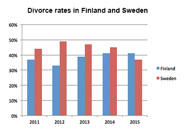
The bar chart shows the divorce rates in two European countries from 2011 to 2015. Summarise the information by selecting and reporting the main features, and make comparisons where relevant.
You can watch a video tutorial on how to describe bar charts in IELTS Academic Writing task 1:
And now let's learn how to answer IELTS bar chart questions .
IELTS bar chart answering strategy :
1. Introduction
You should start your answer by writing an introduction . The introduction is 1 or 2 sentences, where you paraphrase the information from your question. You should mention two things in your introduction:
- what your graph shows
- for what period of time
In our example, the introduction can look like this:
The bar chart provides information about the percentages of divorces in Finland and Sweden between 2011 and 2015.
See how I used synonyms to paraphrase the question :
shows → provides information about divorce rates → percentages of divorces two European countries → Finland and Sweden (it’s good to be more specific) from 2011 to 2015 → between 2011 and 2015.
2. General Overview
The second paragraph of your answer is a general overview , where you briefly describe major trends on your graph. Ideally, you should describe 2-4 key features.
To make major trends easier to notice, you can outline Sweden’s bars and Finland’s bars like this:
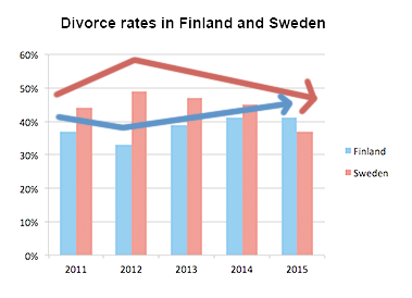
Now it’s obvious that:
- Sweden experienced a downward trend
- Finland experienced an upward trend
- both countries showed fluctuations
- Initially Finland had a lower rate, but in 2015 Finland outraced Sweden
Use word overall to start your general overview. In our case, the overview may look as follows:
Overall, Sweden experienced a downward trend, while Finland showed an upward trend throughout the period. Both countries’ divorce rates had some fluctuations. Although Finland initially had a lower rate, it outraced Sweden at the end of the period.
3. Specific details
After we’ve written the introduction and general overview, it’s time to give the specific details . You should describe the specific features in 2 or 3 (sometimes more) paragraphs.
You can group data in such way :
- Details about Sweden
- Details about Finland
When you have two countries (or two cities or any other two things depicted on the graph), the simplest way of grouping data - is to describe each country’s trend in a separate paragraph.
When giving specific features, you have to write exact numbers/percentages and include as much details as you can .
In our case, the specific details may look as follows:
Sweden’s divorce rate was about 45% in 2011, being higher than Finland’s rate by approximately 8%. Then, it rose to almost fifty percent in 2012. However, the figure showed a gradual decrease to about 47% in 2013, and continued to decline steadily to the end of the period, reaching around 45% in 2014 and hitting a low-point of about 37% in 2015. Percentage of divorces in Finland was less than 40% in 2011, and it decreased in 2012, when about one third of marriages in Finland ended with a divorce (as opposed to almost a half in Sweden). However, the figure experienced a steady growth during the next two years. It rose to approximately 39% in 2013, then increased by around 3% in 2014, and remained steady for the next year, outracing the rate of Sweden.
- When analyzing a bar-chart, we cannot always give exact details (due to inaccuracies of the chart), so use words around , about and approximately when giving inexact data.
- Give data for each year shown on the chart
The full answer + Practice
It’s the end, we have finally written the answer for IELTS bar chart question. And now, let’s practice: fill in the gaps in this answer with appropriate words .
The provides about the percentages of divorces in Finland and Sweden between 2011 and 2015.
, Sweden experienced a downward trend, while Finland showed an trend throughout the period. Both countries’ divorce rates had some fluctuations. Although Finland initially had a lower rate, it Sweden at the end of the period.
Sweden’s divorce rate was about 45% in 2011, being higher than Finland’s rate by approximately 8%. Then, it rose to fifty percent in 2012. However, the figure showed a gradual decrease to about 47% in 2013, and continued to decline steadily to the end of the period, reaching around 45% in 2014 and hitting a of about 37% in 2015.
Percentage of divorces in Finland was than 40% in 2011, and it decreased in 2012, when about one third of marriages in Finland ended with a divorce (as to almost a half in Sweden). However, the figure experienced a steady growth during the next two years. It rose to approximately 39% in 2013, then increased by around 3% in 2014, and remained steady for the next year, outracing the rate of Sweden.
(190 words)
IELTS Exam Preparation: Free IELTS Tips, 2024
- IELTS writing
It is common in the IELTS Writing paper to be asked to describe a bar graph. Bar graphs, also known as bar charts, are similar to line graphs in that they have two axes and are useful for showing how something has changed over a given period of time, especially when there are significant changes. Bar graphs consist of rectangular bars, which can be orientated horizontally or vertically, with the lengths proportional to the data values that they represent. They are typically used for comparing two or more values.
Sample Questions
The age of the population of iceland between 1990 and 2020.
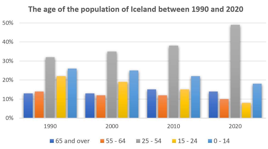
The graph gives information about the age of the population of Iceland between 1990 and 2020.
Summarise the information by selecting and reporting the main features, and make comparisons where relevant.
The percentage of women going into higher education in five countries
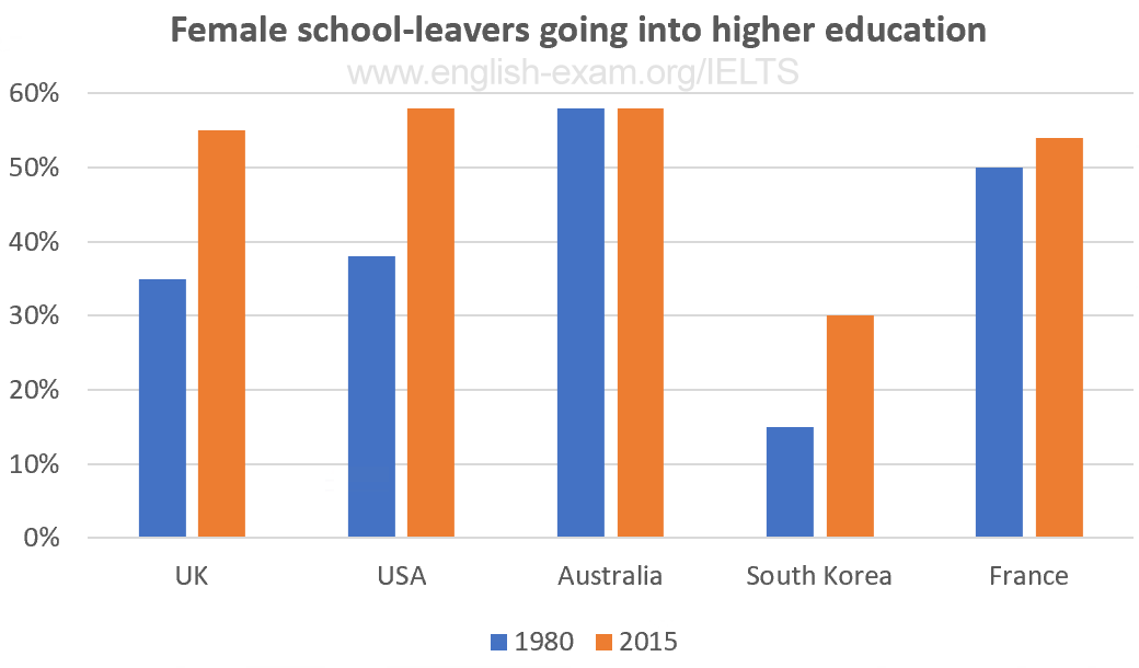
The chart gives information on the percentage of women going into higher education in five countries for the years 1980 and 2015.
Participants who have entered the Olympics since it began
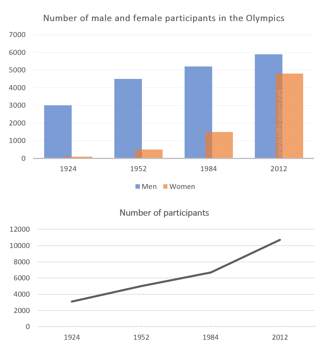
The chart and graph below give information about participants who have entered the Olympics since it began.
Road transport in a number of European countries
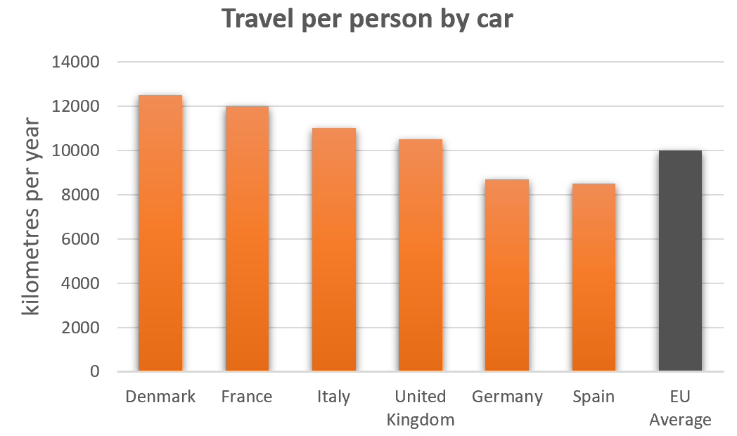
The bar charts below give information on road transport in a number of European countries.
The percentage of part-time workers in each country of the United Kingdom
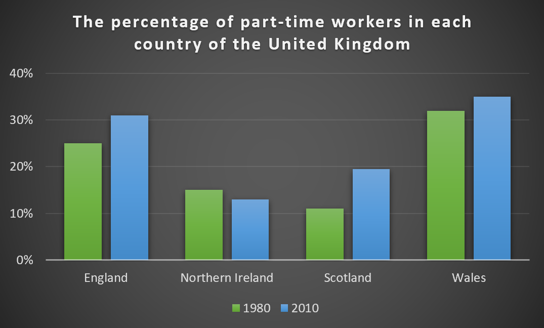
The graph below shows the percentage of part-time workers in each country of the United Kingdom in 1980 and 2010.
Industries’ percentage share of Brazil’s economy
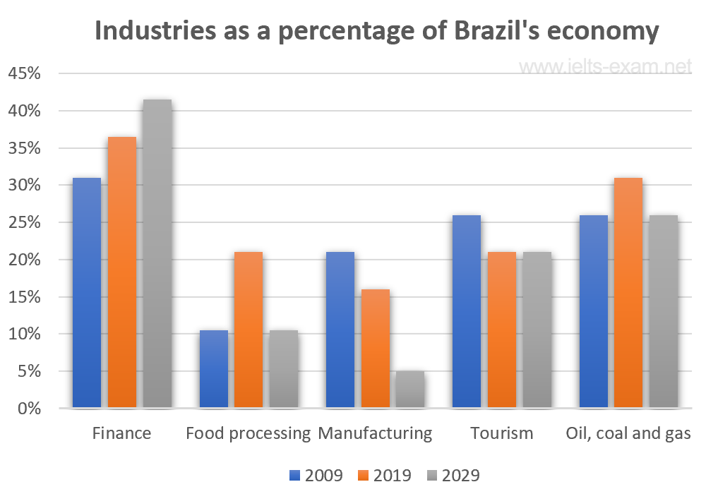
The bar chart below illustrates five different industries’ percentage share of Brazil’s economy in 2009 and 2019 with a forecast for 2029.
The percentages of men and women in employment
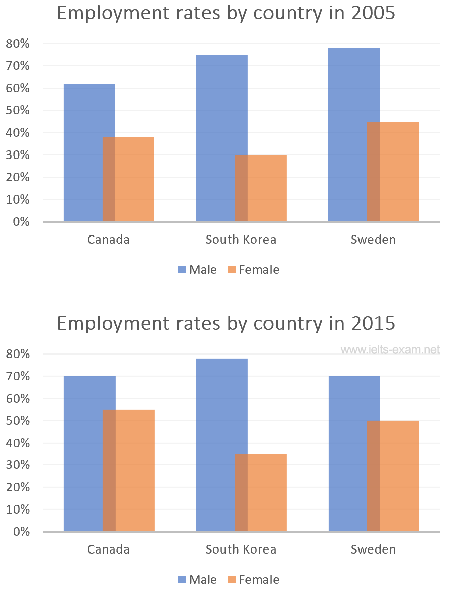
The bar charts below show the percentages of men and women in employment in three countries in 2005 and 2015.
The number of medals won by the top five countries in the summer and winter Olympics
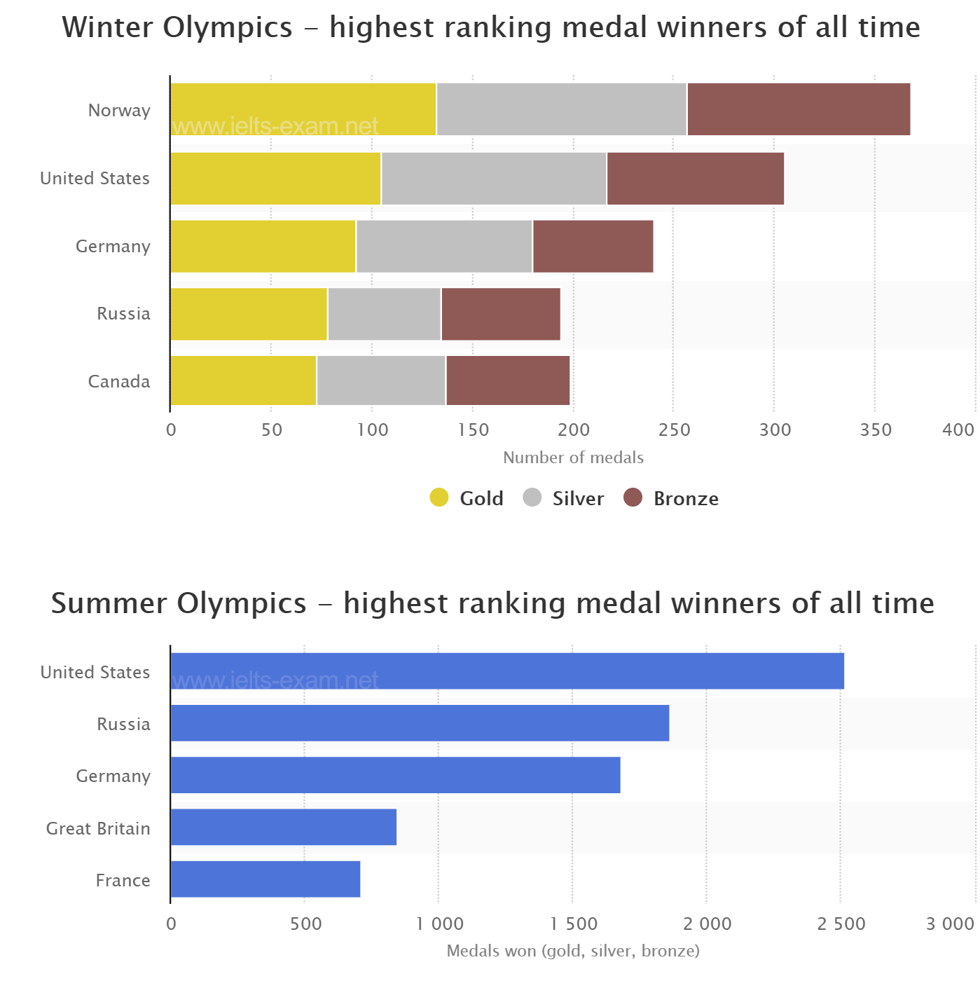
The graphs below show the number of medals won by the top five countries in the summer and winter Olympics.
Global population percentages and distribution of wealth by region
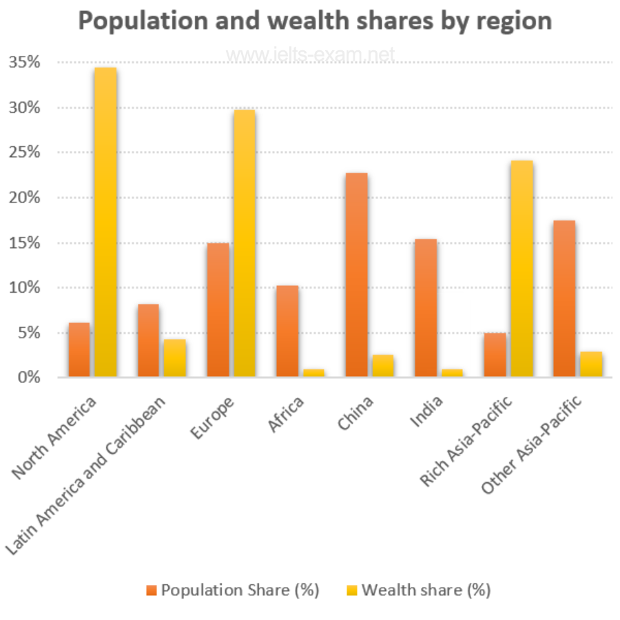
The chart below gives information about global population percentages and distribution of wealth by region.
Percentage of Canadians gave money to charitable organisations
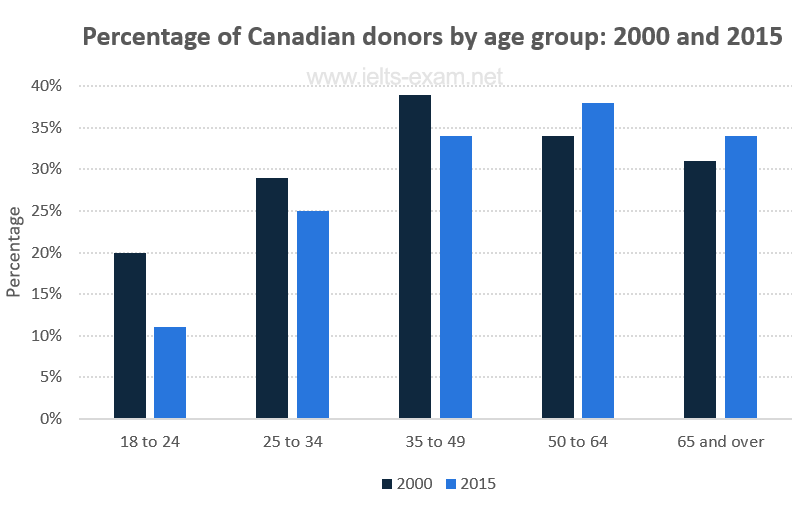
The chart below gives information on the percentage of Canadians gave money to charitable organisations by age range for the years 2000 and 2015.
Employment figures in different tourism-related industries
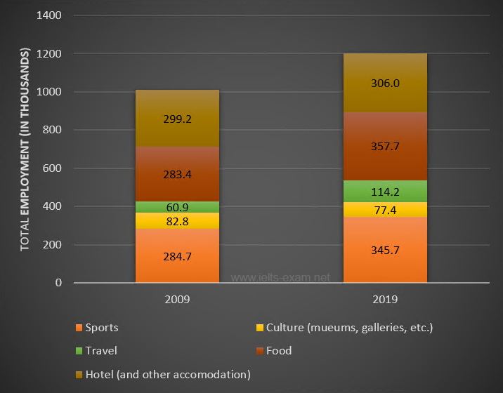
The bar chart below shows employment figures in different tourism-related industries between 2009 and 2019.
The main reasons workers chose to work from home
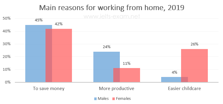
The diagrams below show the main reasons workers chose to work from home and the hours males and females worked at home for the year 2019.
Percentage of the population living in urban areas
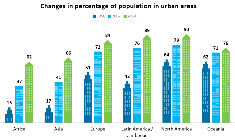
The bar chart below gives information about the percentage of the population living in urban areas in different parts of the world.
Car journeys into the city centre
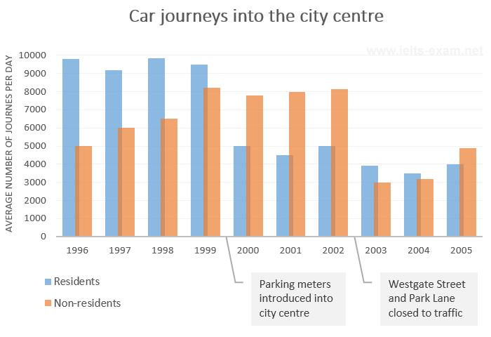
The bar chart gives information about the number of car journeys into the city centre made by residents and non-residents.
The places visited by different people living in Canada
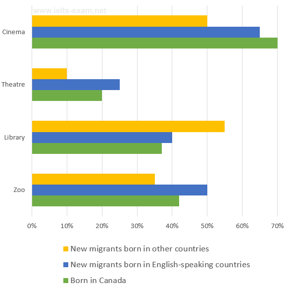
The chart below shows the places visited by different people living in Canada.
Percentage of people using multiple social networking sites
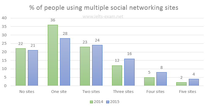
The chart below gives information about the number of social networking sites people used in Canada in 2014 and 2015.
Weight assessment of inhabitants of Charlestown 2015
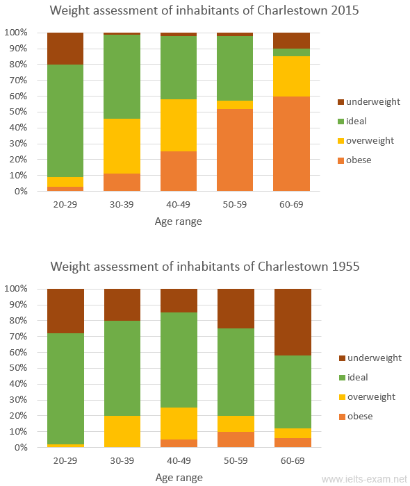
The charts summarise the weight measurements of people living in Charlestown in 1955 and 2015.
Someland's main exports
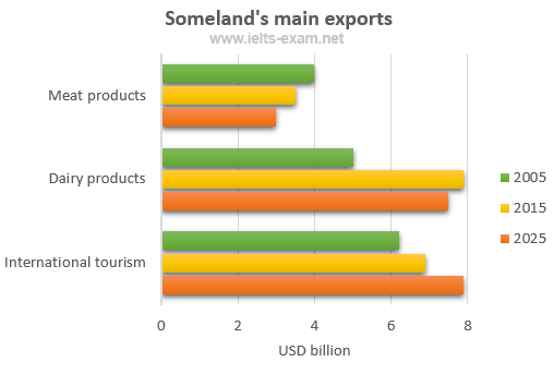
The chart below gives information about Someland's main exports in 2005, 2015, and future projections for 2025.
Sports played in New Zealand in 2002
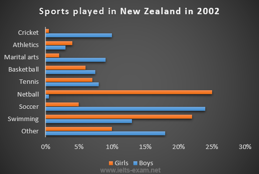
The chart below gives information about the most common sports played in New Zealand in 2002.
Science qualifications in two countries
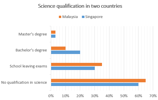
The chart below gives information about science qualifications held by people in two countries.

Students passing high school competency exams, by subject and gender
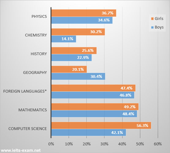
The bar chart shows the percentage of students who passed their high school competency exams, by subject and gender, during the period 2010-2011.
Female unemployment rates in the United Kingdom in 2013 and 2014
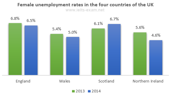
The graph shows female unemployment rates in each country of the United Kingdom in 2013 and 2014.
Percentage who watch reality shows and game shows
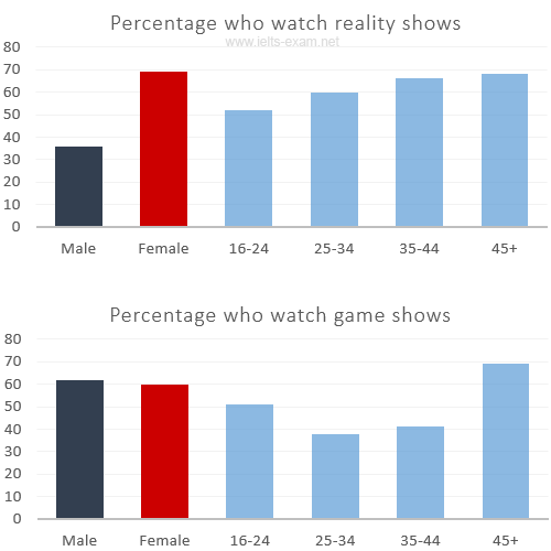
The charts show the number and genres of TV programmes watched by men and women and four different age groups in Australia.
Shares of expenditures for selected categories
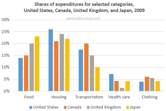
The bar chart shows shares of expenditures for five major categories in the United States, Canada, the United Kingdom, and Japan in the year 2009.
International graduates, Canadian universities, 2001 and 2006
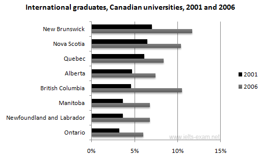
The chart shows the percentage change in the share of international students among university graduates in different Canadian provinces between 2001 and 2006.
Percentage of population aged 65 and over
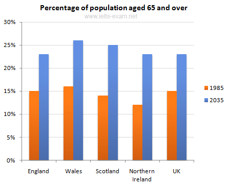
The chart gives information about the UK's ageing population in 1985 and makes predictions for 2035.
Percentage of pupulation in urban areas
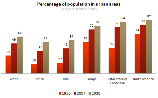
The bar chart gives information about the percentage of the population living in urban areas in the world and in different continents.
Urban populations in different world regions
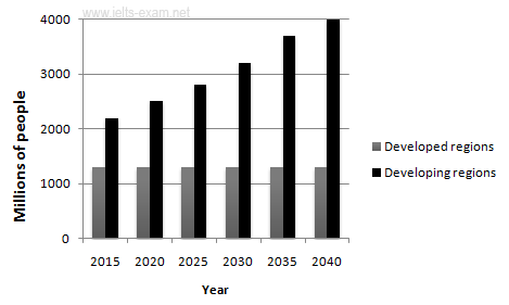
The graphs provide information on global population figures and figures for urban populations in different world regions.
The percentage of male and female teachers
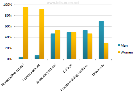
The chart shows the percentage of male and female teachers in six different types of educational setting in the UK in 2010.
Home and International Students
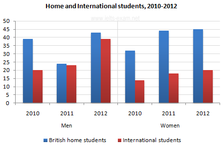
The bar chart gives information about the number of students studying Computer Science at a UK university between 2010 and 2012.
Finland's telephone calls, by category, 1995-2004
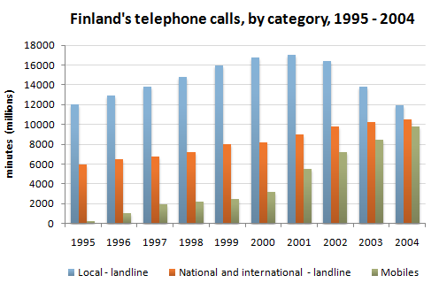
The chart shows the total number of minutes (in millions) of telephone calls in Finland, divided into three categories, from 1995 - 2004.
Related topics
- Writing task one: bar graphs
- Writing Introduction
- IELTS Writing strategies
- Next Page »
SHARE THIS PAGE
The reading, writing and listening practice tests on this website have been designed to resemble the format of the IELTS test as closely as possible. They are not, however, real IELTS tests; they are designed to practise exam technique to help students to face the IELTS test with confidence and to perform to the best of their ability.
While using this site, you agree to have read and accepted our terms of use, cookie and privacy policy.
Dear readers,
This is to inform you that we have moved to a new domain, https://www.ielts-writing.info/EXAM/ .
Our old domain, https://www.ielts-exam.net/ will remain active till the time we migrate all our content to the new domain.
We look forward to your continuing support.
IELTS Preparation with Liz: Free IELTS Tips and Lessons, 2024
- Test Information FAQ
- Band Scores
- IELTS Candidate Success Tips
- Computer IELTS: Pros & Cons
- How to Prepare
- Useful Links & Resources
- Recommended Books
- Writing Task 1
- Writing Task 2
- Speaking Part 1 Topics
- Speaking Part 2 Topics
- Speaking Part 3 Topics
- 100 Essay Questions
- On The Day Tips
- Top Results
- Advanced IELTS
IELTS Bar Chart Sample Answer
Below is a band score 9 sample answer for an IELTS bar chart in writing task 1. Below the model is a link to a video lesson about how to describe an IELTS bar chart. Watch the video to learn essential tips for each paragraph for a high score bar chart.
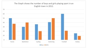
The bar chart illustrates how many children, divided by gender, played six kinds of sports (tennis, badminton, cycling, swimming, football and hockey) in a town in England in 2012. Overall, the number of boys playing sport exceeded that of girls in the given period and the sport with the most significant difference between the genders was football. Football was also the most popular sport for boys while the majority of girls preferred swimming. Furthermore, both males and females least preferred playing hockey. There were four sports in which boys participated more than girls. While 60 boys played football, the number of girls playing that sport was considerably lower (around 20). With regards to tennis, the figure for boys who played that sport was 50 as opposed to just under 40 for girls. Similarly, more boys cycled than girls (approximately 35and 20 respectively). The difference, in terms of hockey, was minimal with only about 5 more boys playing that sport than girls. On the other hand, more girls took part in the two remaining sports which both showed a difference of about 10 between the genders. As many as 50 girls preferred swimming in comparison to 40 girls for badminton.
Recommended Lessons
- IELTS Bar Chart Essential Tips: Free Video Tutorial
- Pie Chart Model Band Score 9
- Line Graph Model
The graph illustrates the amount of boys and girls that played 6 sports (tennis, badminton , cycling, swimming, football and hockey ) in an English town in 2012. Overall, we can see in the graph that boys participated the most in all sports compared to girls,nevertheless girls had an active participation. We can see a considerable peak of participation of boys in football with 60, while the girls had over 20 players. On the other hand the sport that was less choosen it is hockey were boys and girls participated ( around 15 and 9 respectively). Swimming it is the sport that girls played the most with 50 players whereas the boys had just over 40. Another sport that has a femenine participation was Badminton with 40 participants.However tennis, cycling, hockey and tennis are the sports where boys participated the most (50, around 38, about 12 respectively)
Don’t forget that the most important paragraph is the overview. Make sure to put all key features in. This overview isn’t sufficient for a high score.
The bar graph elucidates the proportion of boys and girl’s players among the vivid sports namely, Tennis, Badminton, Cycling, Swimming, Football and Hockey in town of England in year 2012. Overall, the young boys can be seen adequately playing all sports than girls, whereas girls were excessively high as compared to the opponent in badminton and swimming. Although the highest difference is in football where the 60 boys played, it is also the highest number among other sports. Hockey is the least playing game among all the players, considerably 15 for boys and 8 for girls. It is the one of the sports with less player from both groups. Football played among 60 boys as compared to 20 girls, this is the one athlete game with a difference of 40. The two sports where the numbers of girls players were exceeding was badminton and swimming with 40 and 50 respectively. Among all sports girls high attended swimming with a total of 50 players. The average of 12 players differences between tennis and cycling where boys lead by 50 and considerably 35 respectively.
The given bar graph illustrates that a collective amount of boys and girls playing different kinds of games (Tennis, Badminton, Cycling, Swimming, Football, and Hockey) in the English belonging area in 2012.
Overall, the strength of boys are pretty enough compares to girls in the sports. It seems Football and Tennis are very much popular among the boys in against to girls. While huge number of girls love to play Badminton and doing Swimming than boys.
In Tennis exactly 50 boys love to play tennis while ratio of girls is below 40. In Football ratio of boys is higher than girls (60 and slightly above 20 respectively). Hockey is also popular in boys where there are around 15 boys playing compared to girls where there are below 10 girls are playing. We cannot forget the Cycling sport where the strength of boys are considerably higher than girls (35 and 20 respectively).
Badminton and Swimming are the two sport where girls are in lead compares to boys. In Badminton sport is played by girls are exactly 40 than 30 boys. On the other hand, in swimming the amount of girls are 50 compare to boys which is slightly above than 40.
The bar graph illustrates the number of children from both gender who played the six kinds of sports in an English town in 2012.
Overall, majority of boys played tennis, cycling, football and hockey. Whereas, badminton and swimming were the sports English girls took part the most.
Generally, footwall was the favorite sport among boys with 60 players as compared to girls which was overwhelmingly low at around 20. Other sports as tennis, cycling and hockey were also dominated by males. In detail, there were 50 boys in tennis, while only more than a quarter in girls. Moreover, there were roughly about 38 and 15 boys played cycling and hockey respectively.
Conversely, girls on the other hand, engaged most in swimming with 50 participants which was over 5% than boys. Whereas, 40 preferred badminton that made it as the second most played sport among this group.
The bar chart illustrates the number of children, divided by gender played six different sports games (tennis, badminton, cycling, swimming football and hockey) in the town of English in 2012. Overall, the participation of male students in sports seems higher than girls, especially in tennis, cycling and football. While girls show enthusiasm for badminton and swimming. Further, both were less active in hockey with the least participation. Football was the most popular sport for boys, as 60 boys participate as opposed to around 20 girls. With regards to tennis, less than 40 girls played as compared to boys (50). Similarly, more boys cycled than girls (approximately 35 and 20 respectively). Both were less active in hockey and there is a minor difference between around 15 and 20 (boys and girls respectively). On the other hand, considerably more girls took part in Badminton and Swimming than boys, which both showed a difference of about 10. As 50 girls preferred swimming, whereas 40 girls for badminton.
The bar chart given displays the statistics of male and female practicing six different types of sports (tennis, badminton, cycling, swimming, football and hockey) in a random English city in 2012. Overall, the number of boys playing sports has outnumbered the quota of girls in multiple disciplines and shows a significant exceed in football. On the other hand, the majority of girls were interested in swimming, while Hockey had the least percentage of participants from both genders.
Football has the highest number of players with 60 participants for boys compared to around 20 for girls, followed by tennis where boys accounted for 50 and girls for approximately 38 players. Swimming and badminton were the only two types of sport where girls took over the count against boys with a total of 50 and 41 swimmers respectively. Moreover, badminton players amounted to 40 for girls and 30 for boys.
In Cycling activity, the proportion of boy candidates has almost doubled those of girls with 38 players in opposition to 20, while hockey recorded the least figure of players for both boys and girls at 24 participants collectively.
Hello Liz, I would like to ask you a question, hope it’s not silly. Can we skip some information on task 1? For example, what if we never talk we never talk about badminton? Thank you.
You can’t skip information. But you can group categories together based on similarities or differences.
hlo mm, can we use moreover and furthermore in academic task 1??
Yes, sure. They are completely normal linking words to use.
This report will sum up the chart which shows the number of boys and girls playing sport un an English town in 2012. It is readily apparent from the data provided, overall, boys played far more sport than girls, with the exception two sports, namely: badminton and swimming.
Looking at the information in greater detail, it can be seen that the highest number of boys, or rather, 60, plays football, and hockey was by far the fewest. If we also consider tennis, the figures show that 50 males decided to play this sport, and 20 fewer played badminton.
As far as girls are concerned, we can observe that the most, that is to say, 50, chose to swim, whereas the lowest number of female children played hockey. 40 girls played badminton, which is twice as many numbers as cycling, and more or less 20 played football. Turning finally to tennis, about 38 chose to play this type of sport.
Why 1st letters of nouns tennis badminton cycling swimming and hockey are not upper case??
Because this follows English grammar rules. Names of sports do not require capital letters. Headings for charts use capital letters, but you must ensure that you use them in a grammatically correct way in your writing.
Thank you soo much liz.. I really wish to meet you in person and say thank you.. I’m soley studying your materials and i think it’s more than enough to get the band I’m aiming for.. Thank you once again.. Love from 🇮🇳India
Good luck! However, please make sure you also complete real IELTS tests at home. You can find a free test on the IELTS BC website and paid tests in the IELTS Cambridge test books. Do some for practice and others under exam conditions at home.
Hi Liz, I’ve a query about number of words used.. in this we have 200, isn’t that a big number…170-190 is fine, right?
The advice is always not to go over 190 words. This is because most candidates are not band 9 English speakers and some struggle with Task Achievement. TA is also about not going into too much detail. Most Writing Task 1 are suitable for keeping words under 200. However, if you hit 200 or just above, you won’t be penalised. But your writing may contain more mistakes which will lower your score.
Ok Liz, thanks for the answer and for the amazing tutorials too!!
very informative.
Thank you Liz for your help and informative lessons which make our learning process easier.
thanks for the tips! Godbless
Hi liz. First of all I would like to thank you for all your tips, I fell I am improving a lot with your help. I have a question, in writing task 1 can I divide paragraphs by using linkers such as firstly, secondly, thirdly or is it better to avoid this vocabulary since it is not an essay?
Linking words are a must. It is part of the marking criteria that you show the use of linking words. However, using “first, secondly, thirdly” in that way is mechanical – “like a machine” and this will limit your score. Be natural and flexible with your use of linking words. Not all paragraphs need to start with one. Review my model answers and note all linking words: https://ieltsliz.com/ielts-writing-task-1-lessons-and-tips/
in this you did not even mention about badminton..lol
Badminton was given in the second body paragraph: On the other hand, more girls took part in the two remaining sports which both showed a difference of about 10 between the genders. As many as 50 girls preferred swimming in comparison to 40 girls for badminton.
You are a true daughter of God. Your ❤ is so big (generous) enough for others to see and experience AGAPE, the love of Jesus Christ through you. May God bless you abundantly my dear sister in Jesus Christ. God bless …
Hi liz. I would like to have an independent conversation with you….
Sorry, I do not offer that.
Hi Liz, First of all I would like to thank you for your great lessons. I wish all the best for you. I also have a question. If in a task 1 writing topic we have “per month” like in the following sentence. The chart shows the amount of time teenagers watch television per week or in week. Can I paraphrase it with montly? I am not sure if monthly is formal enough to be used here?
Yes, definitely. Per month = monthly = each month
Hi Liz, Your lessons are clear and concise.You are amazing !
Hi Liz, Thanks for your help so far ,your teachings has been of tremendously assisted. Please,does task one has conclusion?
See this page: https://ieltsliz.com/ielts-writing-task-1-lessons-and-tips/
hi liz i have a querry related this graph’s introduction in the question it is not described that the boys and girls are children,adults or teens then how can we say them children ? and thanxx a lot for all your very beneficial lessons
The word “boy” means a male who is a child. The word “man” means a male who is an adult. Please review your basic English vocabulary.
Hi Liz, can we use word leapfrog for comparison or is it informal?
If you are asking me, it is because you have a doubt. If you have a doubt, don’t use it.
Hi liz.. how r u ? Some authortities claim that the phrase ” on the other hand”is informal. Glad to see you using this phrase. Kindly clarify afformentioned misconception. Thanks in anticipation.
It is 100% fine to use. It is not informal at all.
hi Liz I’m so happy cuz I’ve found the right person for my Ielts preparation…though this is the first time just about a week that I m taking classes..but following u is just great.. now I have improved many more seeing your ielts related post… thanks once again..😃😃😃😃
I’m glad my lessons are helping you 🙂
Thank you so much. You are doing a splendid job. I have been searched for many good videos regarding IELTS, than i came to know about your’s, it will help me to get a good band score for sure.
Hello Liz, thanks a lot for your effort with us and I hope u recover from your health problems and get well soon, if u please can I organize my body paragraphs for this topic as one for girls and another for boys after stating the comparisons in the overview of that will be lacking enough comparisons for my task achievement.
Bar charts are used in order to show comparisons – that is the purpose of a bar chart.
in a “road to ielts” they say that the “overall” part of an essay should be put in the end of an essay. you always put it in a second paragraph. Is there a right way to do it?
The examiner will looking for a logical order of paragraphing. The overview contains the key features which are more important than the smaller detail and for this reason it is recommended to put the overview before the body paragraphs. However, it is still possible to put it at the end. Always remember that it is the most important part of your writing task 1.
Hi Liz, I want to thank you for your absolutely great help, I have used your website specially for some help with the writing section and I have earned 7.5 for writing in my IELTS just a couple of weeks ago thanks to you! many greetings from Palestine! Gabi
Well done, Gabi 🙂 I’m really pleased for you 🙂
Hi Liz could you let me know with the percentages( should I use singular verb or Plural verb).For example, 60% percentage of expenditure (it should followed by singular or plural verb).
Why are you repeating the symbol and the word? If you use the symbol, don’t use the word.
in the overview , can I take some words from the phrase provided and use it ? like in this case boys and girls
You don’t need to paraphrase all words. Just paraphrase some and change the order of the words as well.
Dear Liz Your amazing in lots of way, thanks for couching.
one of the scholars (he got band score 8.5) in Cambodia suggested your website, and I’ve been browsing through and find it very helpful. Thank you Liz.
This post is very helpful, many of my friends score low in writing as opposed to other skills. I also find writing hard for me.
You’ll find information, tips and practice lessons on this site to help you. Also follow my facebook page.
How to tackle if we are given two line charts for Task 1? For example, one chart shows the comparison of tuition fee for different fields of study in three different countries and second chart gives information on hostel charges in these countries. Should the overview be based on the combined theme or separate?
The introduction and overview are for both. Then give the details of each in separate body paragraphs. See this model: https://ieltsliz.com/ielts-line-graph-and-bar-chart-model-answer-band-9/
I got it Thanks alot teacher ^_^
https://ieltsliz.com/ielts-writing-task-1-lessons-and-tips/
Thanks for your tips, I got an Ielts exam next month. Hope it goes well.
Speak Your Mind Cancel reply
Notify me of new posts by email.
Advanced IELTS Lessons & E-books
Click Below to Learn:
- IELTS Test Information
Copyright Notice
Copyright © Elizabeth Ferguson, 2014 – 2024
All rights reserved.
Privacy Policy & Disclaimer
- Click here: Privacy Policy
- Click here: Disclaimer
Return to top of page
Copyright © 2024 · Prose on Genesis Framework · WordPress · Log in
Search form
Describing a bar chart.
Look at the bar chart, exam question and sample answer and do the exercises to improve your writing skills.
Instructions
Do the preparation exercise first. Then read the exam question and sample answer and do the other exercises.
Preparation

Check your understanding: multiple choice
Check your writing: matching, check your writing: gap fill typing, check your writing: gap fill drag and drop, worksheets and downloads.
How often do you buy a new computer or smartphone?

Sign up to our newsletter for LearnEnglish Teens
We will process your data to send you our newsletter and updates based on your consent. You can unsubscribe at any time by clicking the "unsubscribe" link at the bottom of every email. Read our privacy policy for more information.
- TOEFL Writing Correction Topics
- OET Mock Tests
- Writing Correction
- Speaking Mock Test
- Reading Course
- Listening Practice Tests
- FREE Practice Tests
- OET Writing Correction
- OET Reading Course
- OET Speaking Mock Test
- TOEFL Writing Correction
- PTE Writing Correction
- OET Listening Practice Tests
- OET (Occupational English Test)
- PTE (Pearson Test of English)
- Academic Task 1
Bar Charts IELTS Writing Task 1 Guide & Practice
- Task 1 Guide
- Table & Bar
- Bar & Pie
- Table & Pie
- Compare Contrast
- Identifying Trends

Bar charts are a very common type of question on the IELTS writing task 1 academic paper. Read below for helpful tips and tricks, as well as example questions and a model answer.
Table of Contents
1.1 objective, 1.2 skills used, 2.1 sample question 1- horizontal bar chart, 2.2 sample question 2- vertical bar chart, 2.3 sample question 3- two bar charts presented, 3.1 introduction, 3.2 overview, 3.3 main body paragraphs.
- 4.1 Task Achievement
- 4.2 Coherence and Cohesion
- 4.3 Lexical Resource
- 4.4 Grammatical Range and Accuracy
5.1 Vocabulary for Accuracy
5.2 linking devices, 5.3 language for reference, 6.1 comparatives.
- 6.2 Advanced Comparative Forms
7.1 Model Answer Commentary
8.1 problem 1, 8.2 problem 2.
- Quiz- Check Your Understanding of IELTS Bar Charts
1. Question Overview
An IELTS writing bar chart, also known as a bar graph, is something you may encounter in writing task 1 of the IELTS academic exam . The writing section of the test lasts for 60 minutes in total, and you should dedicate 20 minutes of your time to task 1 . Writing task 1 is worth 40% of your overall score for the writing component.
IELTS External links
Also, read the following IELTS Report Writing Guides
- IELTS Bar Chart
- Line Graph IELTS
- Pie Chart for IELTS
- IELTS Academic Table
- IELTS Academic Process Diagram
- Maps for IELTS
- Combined - Table and Bar Chart
- Combined - Bar Chart and Pie Chart
- Combined - Table and Pie Chart
- IELTS Writing Task 1 Guide

The main aim of this task is to produce a minimum of 150-word report that interprets the data presented in a given chart. You need to summarise the main features of the chart, add relevant data/figures and make valid comparisons where relevant.
This part of this exam will test your ability to:
- Select and summarise the key features of a chart
- Identify trends in information
- Describe and compare data
- Produce a report using a formal register
2. IELTS Bar Chart Sample Questions
A bar chart presents data visually using rectangular bars. These bars can either occur horizontally or vertically. You may also be given two charts to summarise and contrast in one task. In writing task 1 of the IELTS academic exam, you will always be given a description of the chart as well as key information you need to understand the chart such as:
- A title and/or statement explaining the chart
- A key/legend that explains the colour coding of the chart
- A labelled vertical Y axis
- A labelled horizontal X axis
You should spend about 20 minutes on this task.
The graph below shows the number of international graduates from UK universities in 2000 and 2015.
Summarise the information by selecting and reporting the main features and make comparisons where relevant.
Write at least 150 words.
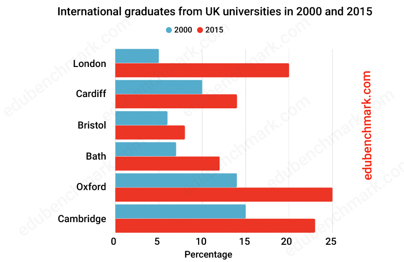
The graph below shows the changes in the maximum number of gorillas in the wild between 1990 and 2015.
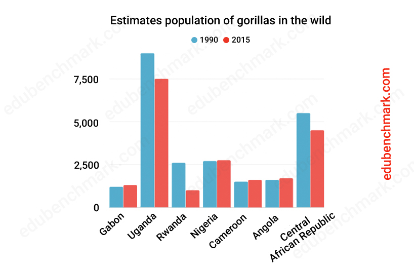
You should spend 20 minutes on this task.
The graphs below give information about computer ownership as a percentage of the population between 2000 and 2010, and by level of education for the years 2000 and 2010.
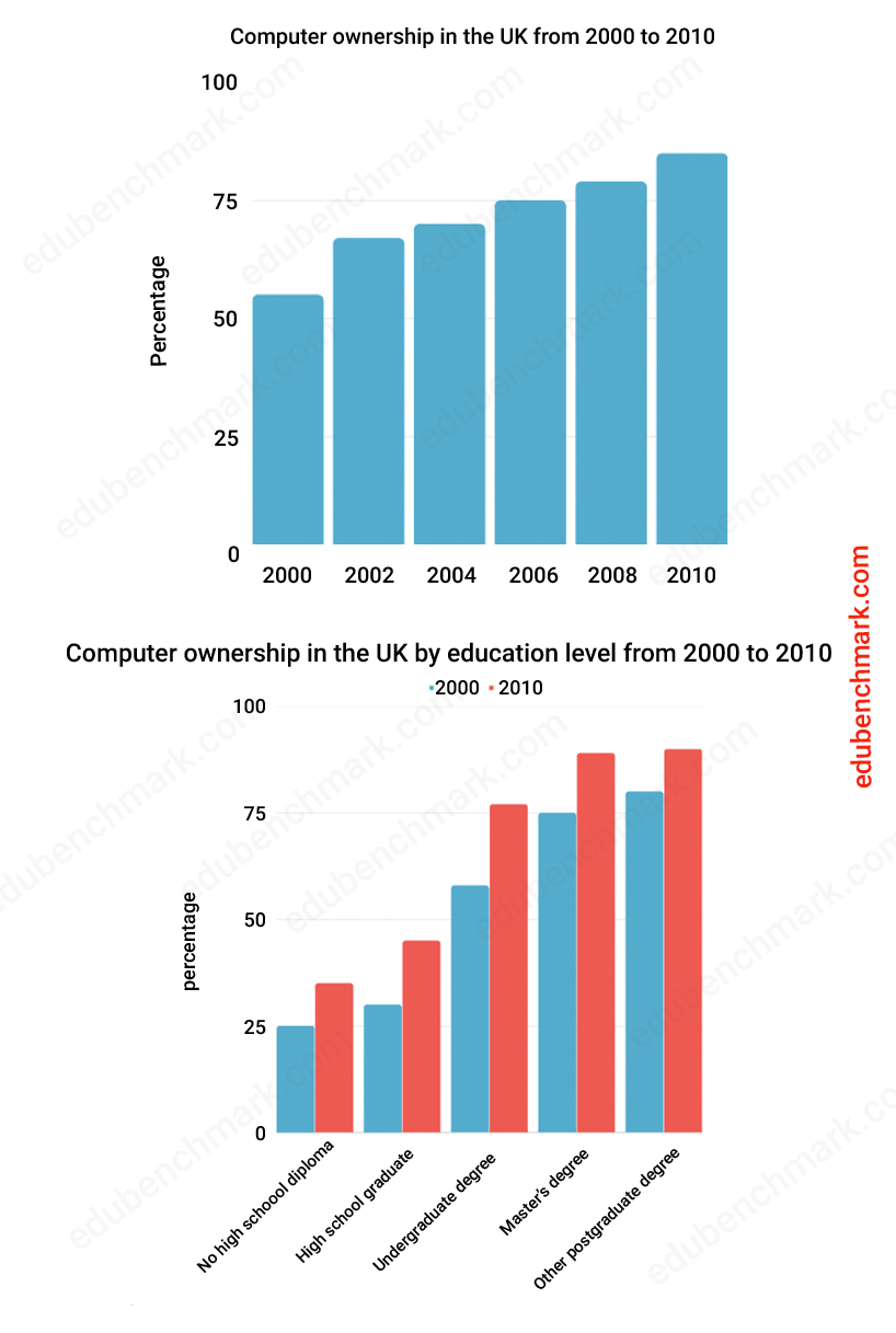
3. Structure for Bar Chart Reports
A good writing task 1 report will follow a very clear and logical structure with an introduction, an overview, and two main body paragraphs. Even though writing a conclusion is a good idea, it’s acceptable if you do not include a conclusion as the overview paragraph should suffice.
You can follow the same structure each time you practise writing reports. Follow the advice below for each paragraph below to start writing successful reports!
Your introduction should always paraphrase the given statement, meaning you should write it again in your own words. Memorising some good phrases to start a bar graph should help as well, but make sure the phrase you use is relevant to the given IELTS bar graph in the real exam. Let’s have a look at some examples below:
- The bar chart shows / presents
- The bar graph compares
Paraphrasing demonstrates to the examiner that you have fully understood the meaning of the writing task 1 statement and that you have the knowledge and understanding to be flexible with the language. The aim is to change the words and structure of the original statement whilst maintaining the meaning of the text. Successful paraphrasing may involve some of the following:
- Using synonyms/parallel expressions
- Changing the word order of the sentence
- Changing the phrase from active to passive
- Changing the form of words (e.g., noun to verb)
Example of paraphrasing
Original statement: The chart shows consumer spending on luxury goods in the UK in 2010 and 2020.
Paraphrased statement: The chart illustrates the amount of money spent on luxury goods (foreign holidays, high-end vehicles, designer clothes and spa services) by consumers in the United Kingdom in the years 2010 and 2020. Other things to consider when writing your introduction of a bar chart:
- You do not need to change every word to paraphrase a text successfully
- You may list given categories ( if the list is not too long). Use the word For instance, The bar graph presents wine production data in liters in three countries, namely Australia, New Zealand and Canada.
- Include any dates as this is important for tense
- Use brackets to put data and information inside
- Write 1-2 sentences maximum
- Look at the chart itself to see if there is any additional information to introduce not given in the statement
- This should be your most straightforward paragraph to write. Don’t spend too much time here and move onto your overview and main body paragraphs
Your aim in academic writing task 1 is to produce a ‘clear overview’ where you select and describe the main features/ trends from the bar chart. It is very important to include an overview paragraph for your writing task 1 response. The examiner will be looking for this and candidates who do not include an overview paragraph will be extremely difficult to score above a band score 5.0 in task achievement. More on IELTS Writing Band descriptors here.
You do not need to write a conclusion for task 1. A conclusion summarises the main ideas of a text. Your report is too short to do this, and you will end up repeating yourself which is something you want to avoid.
Typically, your overview should come directly after your introduction (recommended). However, you may find some sample reports where the overview comes at the end of the report.
Here are some key things to consider when writing your overview:
- Start your overview with ‘Overall’ to make it easy for the examiner to locate your overview paragraph. Other possible words / phrases are:
- It is clear from the graph that….
- Broadly, it can be seen that..
- There could be 2, 3, 4 or even 5 key features in your chart (we recommend you focus on 2-3)
- Your key features should stand out as the highest or overall figures in some way
- Make sure to use
- You should not give precise figures for your overview, save this for your main body paragraphs
You should have two main body paragraphs in your report to meet coherence and cohesion. Besides, this approach is logical and easy to follow for the reader.
There are different ways you could choose to organise your paragraphs depending on the data. For example:
Main Body Paragraph 1 – Compare the highest and lowest categories in the dataset
Main body paragraph 2 – Summarise and compare the other categories
The content of your body paragraphs will depend on the chart, but here are some general points to consider:
- Make sure to use the correct tense (look carefully at the given dates, are they in the past, present, future, or perhaps they range from the past to the predicted future)
- Determine if the chart is comparative or
- Always provide data and support your sentences with numbers
- Do not just provide a long list of numbers; the examiner will check every number and they need to be accurate and clear for the reader
- Use symbols given to you on the axis for currency, percentage etc. (e.g., £, $, %)
- Avoid repetition
4. IELTS Writing Task 1 Band Descriptors Explained
4.1 task achievement (25%).
To achieve a high band score in task achievement, you must:
- Produce a factual report (use a formal register; do not give your opinion; avoid the first person ‘I’)
- Write at least 150 words (you need to be able to sufficiently develop your ideas)
- Report and compare the key features of the chart (do not try to describe every detail of the chart)
- Provide an overview that clearly highlights the key features of the chart (this is essential to scoring above a band score 5 in task achievement)
- Accurately describe the data
4.2 Coherence and Cohesion (25%)
To achieve a high band score in Coherence and Cohesion of your bar chart task 1, you must:
- Organise your report logically
- Use paragraphs (include an introduction, an overview, and two main body paragraphs)
- Use a range of linking devices accurately and appropriately
- Use referencing effectively to avoid repetition (e.g., using ‘this’ to refer to refer back in your text to a noun/noun phrase)
4.3 Lexical Resource (25%)
To achieve a high band score in Lexical Resource of task 1 bar graph, you must:
- Use a range of vocabulary appropriate to describe data from bar charts
- Show understanding of collocations
- Avoid making spelling mistakes
- Use an appropriate register throughout the report (e.g., avoid slang/ phrasal verbs/ idioms)
4.4 Grammatical Range and Accuracy (25%)
To achieve a high band score in Grammatical Range and Accuracy, you must:
- Use the correct tense according to your data set (confirm if your data is taken from the past, present, future, or a combination, and use the corresponding tense in your report)
- Use a range of simple and complex sentences (e.g., compound, relative, or subordinate sentences)
- Avoid grammatical errors
- Use punctuation accurately
5. Vocabulary for IELTS Bar Charts
When describing bar graph IELTS task 1, you will often find that a figure cannot be precisely determined and you have to estimate the number. To show flexibility with your language, you can use words and phrases to estimate the figures. Here is some useful language to help you write about numbers that are above, below or approximate figures:
In order to create cohesion throughout your report, you should use a range of linking devices appropriately. Here are some useful linkers to create contrast when writing about bar charts:
- as opposed to
- compared to
Examples 80% of people owned a computer in 1990, whereas/while only 30% owned one in 1980.
Only 30% of people owned a computer in 1980 as opposed to/compared to 80% in 1990.
Using the words ‘ respectively ’ or ‘ in turn ’ is an efficient and accurate way to refer back to specific figures in your writing task 1 report. It will also help to avoid unnecessary repetition and improve your lexical resource score.
When using these terms, the order of the numbers follows the order in the sentence. You can also use brackets to contain the figures.
Examples The price of oil and gas in 1990 was almost the same (about $100 and $110, respectively ).
Espressos were considerably less popular than espressos , at 4 and 8 sales per week in turn .
6. Grammar for Bar Charts IELTS Task 1
You can use comparative structures to improve your range of grammar and compare the data in the bar chart/s. For example:
You can also use words together with comparative forms to indicate a small or a big difference:
- considerably
Examples: Americanos were considerably more popular than espressos.
Cappuccinos were slightly more popular than caramel lattes.
6.2 Superlatives
Superlatives are a useful way to rank or order information.
- Travelling by plane is the most expensive way to travel, at an average of £100 per ticket.
- The second most expensive is by train, where it costs around £30.
- The least expensive form of transport is by bus, coming in at £20 per ticket.
6.3 Advanced Comparisons
- X is not as + adjective + as y e.g., Coffee in Brazil is not as expensive as in America.
- Not + verb + as + noun phrase + as e.g., Coffee in Brazil does not cost as much as in America, at $2 and $2.90, respectively.
- Three times/ half/ twice as much/less as e.g., Coffee in America costs twice as much as in Brazil.
- The number of X is ___ times higher than Y e.g., The number of people buying coffee in Brazil is three times higher than in America.
7. IELTS Bar Graph Sample Answer
The chart shows data about the average weekly sales of two coffee shops in New York in 2015.
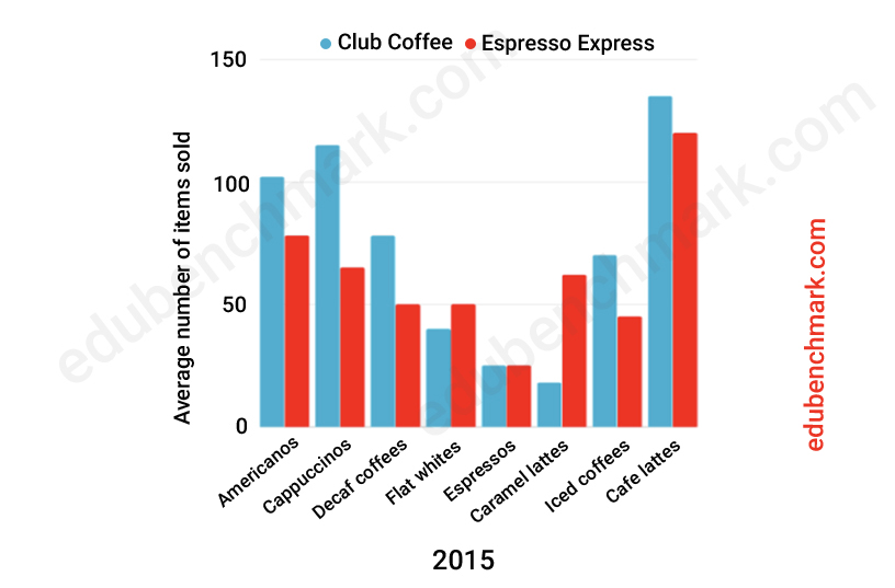
The bar chart compares the most popular types of coffee sold by two coffee shops in New York in a typical week in 2015. The chart shows average sales of eight items, including iced coffees, Americanos and espressos, in Club Coffee and Espresso Express.
Overall , it can be seen that Club Coffee is generally the busiest coffee shop, outselling Espresso Express in six out of eight coffee items. On the whole , stronger coffees such as espressos and flat whites were not as popular as weaker coffees like café lattes or cappuccinos.
In terms of sales at Club Coffee, café lattes came top of the list, with an average of around 135 sold each week. Cappuccinos and Americanos were the next best sellers, with around 115 and 100 of these drinks sold respectively. Club coffee sold slightly more decaf coffees than iced coffees, with roughly 75 of each in total being sold per week on average. Espressos and caramel lattes were not nearly as popular, with just 25 and 18 sold in turn.
Café lattes were also the number-one purchase in Espresso Express, with just over 120 average items sold in a week. Cappuccinos were third, at around 65 sales. Caramel lattes came next, with just over 60, three times as many as are sold in Club Coffee. Decaf coffees and flat whites were joint fifth, with 50 sales apiece, followed by iced coffees at approximately 45 sales a week. The least popular item in Espresso Express was espressos with around 25 sales.
The report above would receive an estimated 9.0 overall in the IELTS writing task 1 Academic paper.
It has been organised into four logical paragraphs that are clearly divided into an introduction, overview, and two separate body paragraphs.
The overview paragraph has been clearly signposted using ‘overall’ and a further linker ‘on the whole’. These key features have been compared concisely using phrases such as ‘stronger coffees… were not as popular as weaker coffees…’.
Further details have been given in the main body paragraphs. The data has been presented accurately using vocabulary to express when the figure cannot be exactly determined, such as ‘around’, ‘just over’ and ‘roughly’.
Comparative language has been used throughout the report through the use of comparatives and superlatives, for example, ‘the least popular item…’
Reference has been employed to reduce repetition , for instance ‘with just 25 and 18 sold in turn’ and ‘with around 115 and 100 of these drinks sold respectively’.
8. Common Errors and How to Avoid Them
Not understanding what information to include in your bar chart report.
Solution 1 Take a short amount of time, before you even start writing, to identify the key features of the chart. It will be worth investing this time in finding the highest, lowest or most interesting key features instead of wasting time trying to write about every detail
It is not common that you will be asked to describe a bar chart with a trend, this is more common with a line graph . Candidates often use language to describe trends when it is not appropriate. For example, the sentence ‘the price of X rose from £ ______ to £______ between 2000 and 2010’ is more suitable for a line graph with a trend, not a bar chart.
Solution 2 Ensure you understand the data clearly so you can use the appropriate grammar and vocabulary.
It is likely that a comparative form would be more appropriate instead of describing a change (rise/fall).
Incorrect for bar chart: The price of X rose from £ ______ to £______ between 2000 and 2010.
Correct for bar chart: X cost £____ more than Y, which cost £_____.
9. Quiz- Check Your Understanding
Take this short quiz to test your understanding of writing task 1 and bar charts:
Bar Charts- IELTS Writing Task 1
- The key/legend
- The IELTS statement
- The horizontal and vertical axis
- All of the above Answer: D.
Explanation: You must include an overview paragraph if you want to score higher than a band 5.0 in task achievement.
Explanation: You may see a vertical horizontal bar chart, or even two types of bar chart may be presented. You are likely to see a comparative bar chart, but occasionally IELTS do set bar charts that ask you to describe a trend (as you would with a line graph).
Explanation: To create a well organised report you should use four paragraphs: an introduction, an overview, and two main body paragraphs
Explanation: True, each section of the marking criteria is work 25% of your overall score
Explanation: Using the words ‘respectively’ or ‘in turn’ is an efficient and accurate way to refer back to specific figures in your report in the order they are mentioned. It will also help to avoid unnecessary repetition and improve your lexical resource score.
- The price of oil and gas in 1990 was almost the same ($100 and $110)
Explanation: Superlatives can help to create order, for example, travelling by plane is the most expensive way to travel, at an average of £100 per ticket. The second most expensive is by train, where it costs around £30.
- Comparatives
- Referring expressions
- Coffee in Brazil as expensive as in America.
- Coffee in Brazil is not expensive as in America.
Explanation: ‘not as _____ as ____’ is a useful comparative sentence that can broaden your grammatical range.
One thought on “Bar Charts IELTS Writing Task 1 Guide & Practice”
Leave a reply cancel reply.
Your email address will not be published. Required fields are marked *

- ielts writing
- ielts listening
- ielts speaking
- ielts reading
- ielts practice test
- IELTS Sample Reports
- IELTS Sample Essays
- IELTS Sample Letters
- IELTS Vocabulary
- IELTS Score Calculator
- IELTS Mock test
Exam Updates & Tips!
Signup for preparation and special offers!
You have successfully joined our subscriber list.
Useful Vocabulary for Writing an IELTS Graph Essay

When it comes to IELTS writing task 1, 25% of your marks are for the range of words you use. That means IELTS graph vocabulary is a very important component to review as you prepare for the Writing Task 1. You can start by checking out this IELTS writing task 1 vocabulary guide . And below, I’ll provide an overview of words and useful phrases to incorporate into your writing so that you can get top marks on the lexical resource category and a high band score overall. Basically, the better your IELTS writing chart vocabulary, the higher score you’ll get. It’s not hard, but there is a clear formula to doing well.
How to Use IELTS Graph Vocabulary in Writing Task 1
Because IELTS writing task 1 involves describing a graph or chart of some type, it will help to have a handle on IELTS writing chart vocabulary — words and phrases that help you write about the information on the chart or graph.
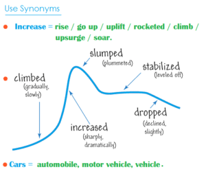
How are graphs described in IELTS? Let’s walk through the best vocabulary for the task, step by step.
1. Start With Introduction Phrases
Often ESL students start their essay with ‘The graph shows…’. While this is fine, the verb ‘shows’ could be replaced by a more exciting and high-level vocabulary word. Here are four different prompts to start your essay:

- The graph illustrates the trends in…
- The graph reveals information about the changes in…
- The graph provides the differences between…
- The graph presents how X has changed over a period of…
- DO NOT write the word below or above in your introduction. i.e. The graph above/below shows…
2. Add Suitable Adverbs
Adverbs help express a relation of place, time, circumstance, manner, cause, and degree, and can greatly add some color and interest to your writing as well as show off your range of vocabulary. Unlike adjectives (which describe nouns), adverbs describe verbs, or actions. Here’s a great list of adverbs to use:
3. Use Appropriate Synonyms
Again using a variety of nouns and verbs for words like rise and fall will help increase your overall score. Here are some suggestions:
4. Add Time Phrases
Below are some excellent time phrases with sentence examples:
Using IELTS Graph Vocabulary in a Model Essay
Look at the sample IELTS writing Task 1 graphs on the British Council website . Below is my model answer with useful words in bold:
The bar charts illustrate the trends in computer ownership, with a further classification by level of education, from 2002 to 2010.
Over the period, it can be observed that there was a significant surge in the percentage of the population that owned a computer. In the year 2002, only about 58% of the population owned a computer, whereas by 2010 , this gradually increased to where over three-quarters of individuals had a home computer.
Looking at the information by level of education reveals that higher levels of education correspond to higher levels of computer ownership in both of those years. In 2002, a significantly low percentage of the population who did not finish high school had a computer, but this figure skyrocketed by 2010, going from 15% to over 40%. There were also dramatic climbs , of approximately 30 percentage points, for those with a high school diploma or an unfinished college education (reaching 65% and 85%, respectively, in 2010).
To conclude, during the last decade, there has been a substantial growth in computer ownership across all educational levels.
Other IELTS Graph Vocabulary Resources
Keep in mind that IELTS writing task 1 may contain one of several different types of infographic: a bar chart, pie chart, line graph, diagram, etc. Regardless of the type, you’ll want to have a good handle on IELTS writing chart vocabulary.
For more specific guides to the different kinds of graphs, charts, and graphics you may find on IELTS writing task 1, check out the following resources:
- How to Describe a Bar Chart
- How to Describe a Pie Chart
- How to Describe a Map
- How to Describe a Process Diagram
You can also check out Magoosh’s IELTS linking words PDF for transitions between ideas. Hopefully you’ll start to incorporate some of these key words and phrases, as well as the above suggestions, in your IELTS Task 1 Writing. If you still don’t feel comfortable doing so, consider dedicating more time to your IELTS studies with Magoosh’s fun, engaging IELTS prep for extra practice.

Eliot Friesen-Meyers is the Senior Curriculum Manager for Magoosh IELTS and TOEFL. He attended Goshen College (B.A.), New York University (M.A.), and Harvard University (M.T.S.), gaining experience and skills in curriculum development, ESOL instruction, online teaching and learning, and IELTS and TOEFL test prep education. Eliot’s teaching career started with Literacy Americorps in Pittsburgh, Pennsylvania, and later, taught ESL programs at Northeastern University, University of California-Irvine, and Harold Washington College. Eliot was also a speaker at the 2019 TESOL International Conference . With over 10 years of experience, he understands the challenges students face and loves helping them overcome those challenges. Come join Eliot on Youtube , Facebook , and Instagram . Recent blog posts Complete Guide to IELTS Writing Task 1 Complete Guide to IELTS Writing Task 2
View all posts
More from Magoosh

11 responses to “Useful Vocabulary for Writing an IELTS Graph Essay”
I would like to get sample of all types of graph eassy
IELTS Liz offers a pretty good range of graphs and charts for IELTS Writing Task 1 (Academic) . You can also get a nice selection of these on the official IELTS websites . And last but not least, Magoosh offers a good selection of these types of questions with a Magoosh IELTS Premium subscription. 🙂
Thank you Magoosh for the comprehensive guide. I’m a subscriber to you GMAT course and is now checking out IELTS.
Wanna ask, I read and watched many other sources that says we should not write a conclusion. However, yours did.
So, is it permissible or not permissible?
The concluding sentence is optional–if you have time to write a concluding sentence after writing and reviewing your essay, then it looks good to have a concluding sentence. If you don’t have time to write a concluding essay or you’d rather focus on other parts of your essay, then it’s totally fine to leave it out. You can read more about this in our Complete Guide to IELTS Academic Writing Task 1.
“Growth” is not an noun? Because in the board it’s saying that it is a verb
Thanks for pointing this out! It seems like a mistake on our part. We should probably change that to “grow”. I’ll make a note for our writing team to make this change 🙂
I appreciate you very much. Your blog on Useful Words for Writing an IELTS Graph Essay was the outstanding blog ever. You have given so much good information about the new english words & grammar in your post, which will help me in future. Always keep data like this on your website
I have two significant questions. The first one is related to the unit of measurement in over view. Is it academic? And the second one is of conclusion. Do we need to write conclusion?
Hi Aakash, I’m afraid I don’t understand your first question. Can you please provide some more information? For your second question: a conclusion is not necessary. You can add one if you’d like, but it’s more important to spend time analyzing the graph.
This is one of the best among the essay I’ve read recently.
Thanks for the feedback! 🙂
Leave a Reply Cancel reply
Your email address will not be published. Required fields are marked *
IELTS Writing Task 1 – Bar Chart Example Essay – 2
In this post, we will look at a Writing Task 1 Academic bar chart essay example from the IELTS writing task 1 Academic Test. Students often ask if the questions are repeated year after year and the answer is no, but the type of chart or graph can be.
There are so many questions written each year, you may find you practice answering various questions on different topics. It is best practice to learn how to answer each one of the various types of writing task 1 questions , from bar charts, line graphs, maps, process etc.
If you would like to learn how to structure a charts and graphs essay please click the button below >
Take a look at the IELTS Writing Task 1 Academic essay example below >>
*This chart question and answer were provided by a student. IELTS Achieve did not design this bar chart question*
The bar chart illustrates comparative statistics on the number of males and females who underwent further education, studying in full time and in part-time education in Britain in the years; 1970-1971, 1980-1981 and 1990-1991. The number of students was measured in thousands.
Overall, part-time education had the highest number of enrollees in all three periods from both men and women while in full-time education, the highest number of students can be seen in the time period of 1990-1991 where both sexes had an equal amount of enrollees.
On the one hand, the graph shows that part-time education was consistently high, never below the 800 thousand mark in males and 600 thousand marks in females, even though the trend differs from both genders. According to the data, males had the highest part-time enrollees in 1970-1971 (1000 thousand) then the trend fluctuated and rose again over the next three year period 1980-81 (900 thousand) and 1990-91 (950 thousand), while in the female part-time enrollees they had an upward trend as the years went by with 750 thousand in 1970-71, 800 thousand students in 1980-81 and the highest peak of almost 1150 thousand students by the period of 1990-91.
On the other hand, the bar chart reveals that both genders in full-time education experienced an increasing number of students within the three time periods. Male students started at below 200 thousand in 1970-71 and rose steadily until they reached 200 thousand in 1990-91, the same can be said in the number of females enrolled, they started from 50 thousand in 1970-1971 and gradually rose as the years passed by until reaching 200 thousand female students in 1990-1991.
Word count – 274 / Band score – 8

- Task Achievement – The answer provides a paraphrased question, to begin with, followed by an overview that gives the reader key information.
- Coherence and Cohesion – The answer has been divided into clear logical paragraphs.
- Lexical Resource – There is evidence of paraphrasing, synonyms and some less common words.
- Grammatical Range and Accuracy – The answer has no grammatical errors. The sentences are mainly made up of multiple clauses and have a variety of structures.
We hope you found this post useful in helping you to study for the IELTS Test . If you have any questions please let us know in the comments below or on the Facebook page.
The best way to keep up to date with posts like this is to like us on Facebook , then follow us on Instagram and Pinterest . If you need help preparing for the IELTS Test, join the IELTS Achieve Academy and see how we can assist you to achieve your desired band score. We offer an essay correction service, mock exams and online courses.
Related Posts
IELTS Writing Task 1 Academic Multiple Charts Essay Examples
IELTS Writing Task 1 Academic Multiple Charts Essay Examples. View High Band Score Examples Of…

IELTS Writing Task 1 – Table Essay Example 3
IELTS Writing Task 1 Academic table essay example that is a band score 8. The question…
Leave a Comment Cancel Reply
Your email address will not be published. Required fields are marked *
Save my name, email, and website in this browser for the next time I comment.
IELTS Mentor "IELTS Preparation & Sample Answer"
- Skip to content
- Jump to main navigation and login
Nav view search
- IELTS Sample
20 Recent IELTS Graph samples with answers
The chart below shows how much money is spent in the budget on different sectors by the uae government in 2000..
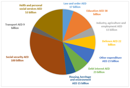
The charts below show the growth in the population in some of the world’s largest cities as well as the population distribution in urban and rural areas.
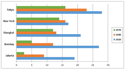
The average prices per kilometre of clothing imported into the European Union from six different countries in 1993 and 2003 are shown in the bar chart below.
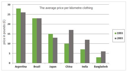
The bar charts below show the number of hours each teacher spent teaching in different schools in four different countries in 2001.
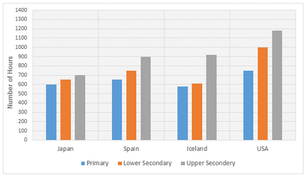
The line graphs below show the production and demand for steel in million tonnes and the number of workers employed in the steel industry in the UK in 2010.
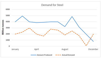
The bar charts and line graph below show the results of a survey conducted over a three-year period to discover what people who live in London think of the city.
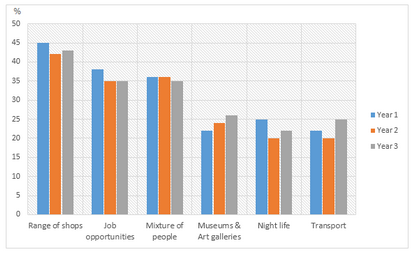
The pie charts below show the online sales for retail sectors in New Zealand in 2003 and 2013.
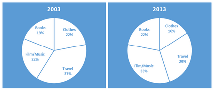
The number of tourists visiting Malaysia and Dubai from 1995 to 2003 is presented below.
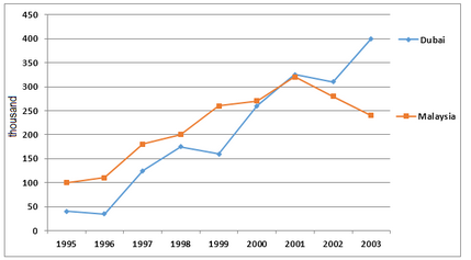
The bar chart below shows the estimated sales of jeans for two companies next year in Turkey. The pie chart shows the projected market share of the two companies in jeans at the end of next year.
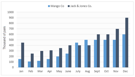
The graph below shows a survey result of 4000 participants who expressed what important aspects they have learned from the internship they have completed.
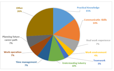
The graph below shows the top priorities by business companies in the USA in 2016.
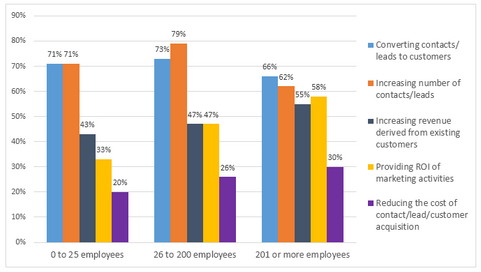
The graphs below show the average monthly expenditure on children’s sports and participation in different sports in the UK from 2008 to 2014.
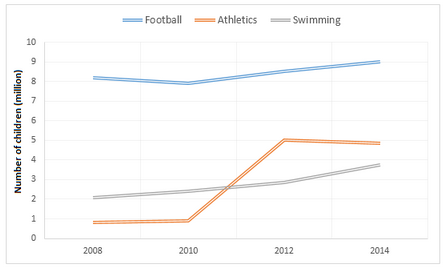
The pie charts below show the online shopping sales for retail sectors in Australia in 2010 and 2015.

The bar chart below shows Scotland’s exports to the rest of the UK and the rest of the world for the year 2014.
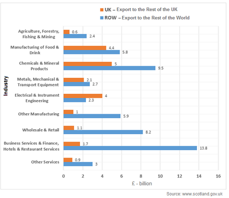
The chart below shows the changes in sales of four different types of books from 2002 to 2012.
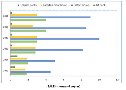
The diagram shows the procedure for university entry for high school graduates.
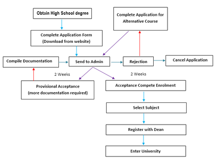
The chart below shows Morocco’s income from different economic sectors in 2003 as well as its income from fishing from 1982 to 2003.
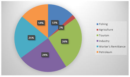
The bar chart below shows the proportions of English men and women of different ages who were living alone in 2011. The pie chart compares the numbers of bedrooms in these one-person households.
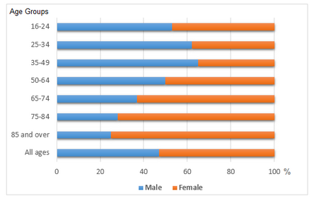
The diagram below shows the life cycle of a salmon, from egg to adult fish.
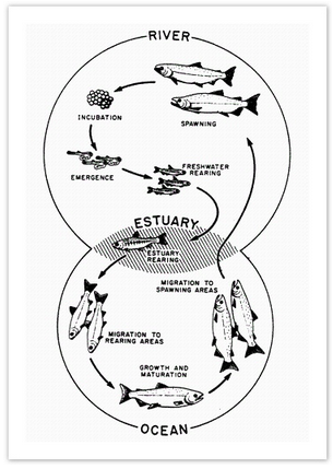
The table below shows the worldwide market share of the notebook computer market for manufacturers in the years 2006, 2007 and 2014.
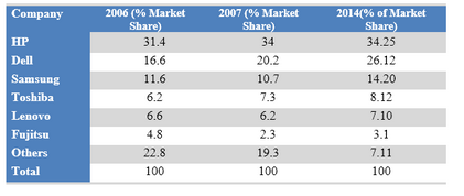
- Academic Writing Task 1
IELTS Materials
- IELTS Bar Graph
- IELTS Line Graph
- IELTS Table Chart
- IELTS Flow Chart
- IELTS Pie Chart
- IELTS Letter Writing
- IELTS Essay
- Academic Reading
Useful Links
- IELTS Secrets
- Band Score Calculator
- Exam Specific Tips
- Useful Websites
- IELTS Preparation Tips
- Academic Reading Tips
- Academic Writing Tips
- GT Writing Tips
- Listening Tips
- Speaking Tips
- IELTS Grammar Review
- IELTS Vocabulary
- IELTS Cue Cards
- IELTS Life Skills
- Letter Types

- Privacy Policy
- Cookie Policy
- Copyright Notice
- HTML Sitemap
Sample details
- Mathematics
- Cartesian coordinate system
- Views: 1,191
Related Topics
- Surveillance
- Isaac Newton
- Criminology
- Materials science
- Ethnography
- Carbon footprint
- Plate tectonics
- Galileo Galilei
- Social Science
- Focus group
Bar Graph Analysis
Bar graphs best illustrate results that are gathered at one given time and are independent of each other. Results of surveys, then, are best captured in bar graphs. The bar graph below was used by Soraya J. NetoAlvarez to summarize the chances of projects of different sizes – as expressed in terms of total project costs – to be successful.
As shown in the bar graph, the x- axis or the abscissa presents the percentages of success achieved by projects while the y-axis or the ordinate presents the different scales or sizes of projects. The bar graph’s x-axis is divided into equal intervals of 10 percent, from 0 percent at the meeting point of x- and y-axes to 60 percent going to the right. Its y-axis, meanwhile, scales the sizes of the project from the same zero-point of x-axis to less than $750k as the smallest size in terms of project cost to the designated biggest size, over $10 million, as the highest point.
ready to help you now
Without paying upfront
The highest points of both x- and y-axes are set based on the given data to be plotted in the bar graph. In the case of the subject data, the highest percentage of success attained is 55 percent. As to the project sizes, the group that conducted this particular survey formed the scale of sizes and since all the companies that participated in the survey have total project costs that did not go beyond $10 million, then the highest point in the y-axis has been set at over $10 million.
With the x- and y-axes accordingly labeled, the percentages of success of each of the identified project sizes are next plotted as horizontal bars spanning the space from the point that represents 0 percent to the point that represents the exact percentages in the x-axis. Once all the data have formed part of the bar graph, the result is an illustration that gives at one glance the general picture of the details gathered in the course of the survey.
Thus, the bar graph effectively conveys that based on the survey conducted, the small-sized projects turned out to be more successful, while the big-sized projects were the ones with lower chances of success. These same information bits are included in the written lines, but it cannot be argued that the inclusion of the bar graph in the final output serves to provide a good grasp of the data.
- NetoAlvarez, S. (2003). Project Management Failure: Main Causes. Retrieved January 24, 2009 from http://faculty.ed.umuc.edu/~meinkej/inss690/netoalvarez.pdf.
Cite this page
https://graduateway.com/bar-graph-analysis/
You can get a custom paper by one of our expert writers
- Equilibrium
- Archaeology
- Probability
- Forensic science
- Computer Science
- Oceanography
- Fossil fuel
Check more samples on your topics
Nora’s secession in a doll’s house: the transformation graph.
Summary This paper studies Henrik Ibsen’s three-act play “A Doll’s House” – a commentary of sorts on the position of women in the late 19th century. The paper focuses on the female protagonist, Nora Helmer, dissects Nora’s relationship to her husband, and proceeds to understand when and why the final moment of truth dawned on the
The Work Relates to Graph Embedding Methods
FoodKG is a unique software in its type and purpose. There are no other systems or tools that have the same features. Our main work falls under graph embedding techniques. Embedded vectors learn the distributional semantics of words and can be used in different applications such as Named Entity Recognition (NER), question answering, document classification,
Analysis of place and promotion-the Hershey’s Candy Bar
Part one we’ve learned and talked about so much as it pertains to product placement. Its simple definition is, the appearance of products in television programs or movies paid for by the manufacturer or a company. In other words to place a product in a market setting, you must undertake a series of processes e.g.
Analysis on Colour Bar Poem
The poem ‘Colour Bar’, by Oodgeroo Noonuccal, explores her downright disgust towards racial prejudice. As a former Aboriginal rights activist, she evidently displays her hatred and dislike towards racism and prejudice through her descriptive poem. The use of poetic techniques assists in conveying her message. Visual imagery and metaphorical language conveys Oodegeroo’s judgment that racial
The Energy Bar Industry Analysis
1. Conduct a thorough analysis of this category’s customer, competitors, market, and environment from the perspective of PowerBar. What are the key strategic questions? What additional information would you like to obtain? How would you obtain it? What are the threats and opportunities? In particular address the following issues: a. How is the market segmented?
Launching a Karaoke Bar in Bangladesh Analysis
INTRODUCTION KARAOKE AVENUE is set to be the inaugural karaoke bar in Bangladesh. This establishment provides a space for individuals to mingle with friends while indulging in the karaoke experience and delectable cuisine. To foster and delight young singers, we will host regular live performances. Our aim is to inaugurate the bar in Dhanmondi, a renowned
Edouard Manets Bar at the Folies Bergere Analysis
Impressionism
Edouard Manets Bar at the Folies Bergere was completed in 1882. This was to be the last major work Manet would complete before his death. The painting was intended for the Salon, and because of his recently awarded Legion of Honor, Manet could be sure this piece would be accepted. This painting would be considered
Bar council of India
Sessions Court appointed Shri S. V. Ardhapurkar, Advocate as amicus curiae to defend the complainant Session Court after trial found the complainants guilty of the offence charged with and awarded them death penalty by an order dated 30th August, 1991. The same date the appellant contacted the complainants in Yervada Central Prison where they were
The Effects of Sin Tax Law to the Bar Owners
Pros and Cons of Sin Tax Sin tax is a tax that is applied to a product that has been deemed undesirable in the general society. An example is a tax that is applied to beer or cigarettes. These tax can be placed to raise money for a certain public amenity like a stadium, when

Hi, my name is Amy 👋
In case you can't find a relevant example, our professional writers are ready to help you write a unique paper. Just talk to our smart assistant Amy and she'll connect you with the best match.

IMAGES
VIDEO
COMMENTS
There are 5 steps to writing a good IELTS bar chart essay: 1) Analyse the question. 2) Identify the main features. 3) Write an introduction. 4) Write an overview. 5) Write the details paragraphs. Use this simple planning process as you practice writing IELTS bar chart essays and you'll have no problem remembering it in the exam.
Ready for a high-level bar chart task 1 answer? Let's begin with the analysis of this bar chart, and pick out the information that is relevant to our structure. See the model answer of a bar chart below. Sample Answer Bar Graph Essay. The bar chart shows the caloric intake of UK males in three distinct age groups of 0-24, 25-49, and over 50 ...
significant exceptions. anything else that really stands out. There are 3 main features in this graph. 1) It takes over 26 years for a Vietnamese person to buy a car. 2) Vietnam has the second highest average costs but the second lowest wages. 3) Cost of a car in Singapore is nearly 3 times the next most expensive.
I like using charts and graphs in certain situations only, like in math, geography or economy. They are a lot less overwhelming than raw numbers. However, they can be confusing when used incorrectly. Plus, graphs and charts can be made to be misleading: a pie chart can say 40% when the actual percentage is 20%. This is, unfortunately, used a ...
Bar Charts: Using, Examples, and Interpreting. By Jim Frost 4 Comments. Use bar charts to compare categories when you have at least one categorical or discrete variable. Each bar represents a summary value for one discrete level, where longer bars indicate higher values. Types of summary values include counts, sums, means, and standard deviations.
The chart shows the sales revenue of a selection of home video entertainment formats in the USA in 2017. It also shows the percentage change from the previous year. Online video streaming was the most popular format in 2017. US consumers spent $9.8 billion on services such as Netflix, which was a rise of 32 per cent from the previous year.
To effectively write about an IELTS Writing Task 1 bar chart, follow these tips. 1. Start by Reading the Title. First and foremost, you should read the title. Often, I have students report on the essay in an inverted order because they didn't read the bar chart title. For example, an IELTS Writing Task 1 bar chart that I give students has the ...
For task 1 of the IELTS writing test, you may be asked to write about a bar chart. You will have to write more than 150 words and it is recommended that you do this in 20 minutes or less. (You will have a total of 1 hour for 2 tasks.) It is important to note that you do not have to describe everything in the chart.
Remember that it is not essential to write about each and every bar. You can just write it by mentioning the key features only. 2. Don't forget to mention the percentages which is an important variable of the graph here. 3. Take care of the years mentioned and write the correct one against the correct country name.
The best way is from model answers: IELTS Writing Task 1 Model Answers. 6. Linking devices. You should use a range of linking devices. For example, while / whereas / as opposed to / compared to / in comparison with. All these will help you get a higher score in Coherence and Cohesion which is 25% of your marks.
IELTS bar chart answering strategy: 1. Introduction. You should start your answer by writing an introduction. The introduction is 1 or 2 sentences, where you paraphrase the information from your question. You should mention two things in your introduction: what your graph shows. for what period of time.
Home; IELTS writing; Bar Chart; Bar Chart. It is common in the IELTS Writing paper to be asked to describe a bar graph. Bar graphs, also known as bar charts, are similar to line graphs in that they have two axes and are useful for showing how something has changed over a given period of time, especially when there are significant changes. Bar graphs consist of rectangular bars, which can be ...
Below is a band score 9 sample answer for an IELTS bar chart in writing task 1. Below the model is a link to a video lesson about how to describe an IELTS bar chart. Watch the video to learn essential tips for each paragraph for a high score bar chart. The bar chart illustrates how many children, divided by gender, played six kinds of sports ...
Worksheets and downloads. Describing a bar chart - exercises 1.13 MB. Describing a bar chart - answers 271.97 KB. Describing a bar chart - text 1.06 MB. Describing a bar chart - writing practice 437.66 KB.
An IELTS writing bar chart, also known as a bar graph, is something you may encounter in writing task 1 of the IELTS academic exam. The writing section of the test lasts for 60 minutes in total, and you should dedicate. 20 minutes of your time to task 1. Writing task 1 is worth 40% of your overall score for the writing component.
IELTS Academic writing task 1 - Bar Graph. A bar graph (also known as the bar chart) is a graph that contains either horizontal or vertical bars to present data comparison or contrast among categories or variables. In your IELTS Academic task 1, you might get a bar graph that will have numerical values of different variables shown by the length and height of lines or rectangular shapes or ...
Using IELTS Graph Vocabulary in a Model Essay. Look at the sample IELTS writing Task 1 graphs on the British Council website. Below is my model answer with useful words in bold: The bar charts illustrate the trends in computer ownership, with a further classification by level of education, from 2002 to 2010.
Here's my full essay for last week's question: The bar chart compares the turnover in dollars from sales of video games for four different platforms, namely mobile phones, online, consoles and handheld devices, from 2000 to 2006. It is clear that sales of games for three out of the four platforms rose each year, leading to a significant rise in total global turnover over the 7-year period.
IELTS Writing Task 1 - Bar Chart Example Essay 3. In this post, we will look at a Writing Task 1 Academic bar chart essay example from the IELTS writing task 1 Academic Test. Students often ask if the questions are repeated year after year and the answer is no, but the type of chart or graph can be. There are so many questions written each ...
IELTS Writing Task 1 Academic bar chart essay example that is a band score 8. The question is > The chart below shows the number of men and women in further education in Britain in three periods and whether they were studying full time or part time. ... The bar chart illustrates comparative statistics on the number of males and females who ...
Bar Graph Task 1. The Chart Below Shows the Number of Households in the US by Their Annual Income. READ MORE >>. The Charts Below Show the Main Reasons for Study Among Students. READ MORE >>. The Chart Below Gives Information About How Families in One Country. READ MORE >>. The Chart Below Shows Information About Changes in Average House Prices.
Recent IELTS Graph 20: The table below shows the worldwide market share of the notebook computer market for manufacturers in the years 2006, 2007 and 2014. Summarise the information by selecting and reporting the main features and make comparisons where relevant. Answer: The table gives information about the percentages of international market shares of different notebook computer brands in ...
Bar Graph Analysis. Bar graphs best illustrate results that are gathered at one given time and are independent of each other. Results of surveys, then, are best captured in bar graphs. The bar graph below was used by Soraya J. NetoAlvarez to summarize the chances of projects of different sizes - as expressed in terms of total project costs ...