Architecture


What Are Presentation Drawings In Architecture
Making a building look amazing is not something that should be taken lightly. And for that reason, architects have to make use of something called presentation drawings. This form of drawing has been used for centuries, and it still holds a very important place in the profession today. But what exactly are presentation drawings, and why are they so important?
Presentation drawings are the drawings that architects make to show the client their ideas for a building. Usually this includes the exterior design of the building, as well as details such as the materials used, the layout of the interior space, and sometimes even the furniture that will be used inside. Presentation drawings are usually produced in a very high level of detail, with fine lines and textures that capture the architect’s vision of the final product.
These drawings are important because they serve as a way for the architect to demonstrate to the client what they have in mind. They allow the client to get a feel for the building and to get a better understanding of the design process. For architects, presentation drawings are also an opportunity to showcase their creative abilities and to show off their skills. The more effective the drawings are, the more likely it is that the client will be impressed.

When making presentation drawings, it is essential that the architect pays close attention to detail. Every little nuance must be captured accurately, from the way the light hits the building to the way the windows are situated. It is also important that the drawings are easy to understand and non-technical, as they will be presented to a client who may not have a lot of knowledge in the field.
At the same time, presentation drawings should also be aesthetically pleasing. By using colors and styles that are pleasing to the eye, the architect can help boost the credibility of their project and make it more attractive to potential customers. It is also important to make sure that the drawings accurately reflect the architect’s vision for the project, as it will give potential customers a better understanding of what the project is all about.
Documentation
Presentation drawings are also important for documentation purposes. Architects must keep records of their projects so that they can refer back to them if needed. The drawings serve as a record of what was done and make it easier to review the project in the future. In addition, the drawings can also be used to prove that certain regulations were followed and to determine if certain elements of the design were successful.
Presentation drawings also provide evidence that the architect has done their job properly. They demonstrate the level of detail and care that went into the project and show that the architect took all the necessary steps to ensure that the project was done right. In addition, they can be used in court to prove that the architect was responsible for any mistakes or issues that may have occurred during the construction process.

Lastly, presentation drawings can be great for marketing the project. By displaying the drawings to potential customers, the architect can show potential customers what the building will look like, and this can be a great way to attract interest in the project. Having high-quality presentation drawings can be a great way to drum up business for an architect, as potential customers are more likely to be interested in projects with exceptional visuals.
Time and Money Saving
Presentation drawings can be a great way to save time and money on projects. By providing clients with detailed and accurate drawings, architects can avoid costly mistakes in the construction process and ensure that the project is completed on time and on budget. By providing clients with a realistic representation of what their project will ultimately look like, architects can help to ensure that the project goes as smoothly as possible.
Presentation drawings can also help architects to identify potential problems with the project before they occur. By analyzing the presentation drawings, architects can spot potential problems with the project and address them before they become costly issues. This can help to save time and money during the construction process, as any issues can be dealt with more quickly and efficiently.
Technological Advancement
In recent years, the technology available for making presentation drawings has advanced considerably. With the advent of computer-aided design software, architects can now produce highly detailed and sophisticated presentation drawings in a fraction of the time. This makes it much easier for architects to create complex and visually appealing drawings without having to spend hours manually drawing them.

In addition, the use of 3D printing has revolutionized the presentation drawing process. By using 3D printers, architects can quickly and accurately produce presentations that are as close to the actual project as possible. This can be especially helpful when creating drawings of complex structures that would otherwise be difficult to accurately depict.
Presentation Drawing Generators
In addition to the advances in technology, there are also many tools available to help architects create presentation drawings. In particular, presentation drawing generators are a great way to quickly and easily create drawings that are higher in quality than traditional drawing methods. These generators can help cut out a lot of the time and effort associated with producing high-quality presentation drawings.
These generators also make it easier for an architect to make modifications to the presentation, which can be very useful if the client has special requests or changes that need to be made to the project. In addition, some generators can even help to create an entire presentation from scratch, which can make the process much faster and easier for the architect.
Impact on the Overall Project
Presentation drawings are one of the most important tools available to an architect, and they can have a huge impact on the success of a project. From allowing the client to get a better understanding of the project to helping to identify potential problems in the construction process, presentation drawings can make a huge difference in the overall outcome of the project.

For this reason, it is important for architects to take their time and effort in creating presentation drawings that accurately reflect their vision. Not only will this ensure that the drawings are effective and appealing, but it will also help the project be completed to the highest standard possible.

Anita Johnson
Anita Johnson is an award-winning author and editor with over 15 years of experience in the fields of architecture, design, and urbanism. She has contributed articles and reviews to a variety of print and online publications on topics related to culture, art, architecture, and design from the late 19th century to the present day. Johnson's deep interest in these topics has informed both her writing and curatorial practice as she seeks to connect readers to the built environment around them.
Leave a Comment Cancel reply

Breadcrumbs
Architectural presentation and rendering, architectural presentation and rendering: learning the creative methods of rendering and presenting..
Architectural Presentation and Rendering! In this comprehensive course, you'll explore a variety of creative methods for presenting and rendering architectural designs. We'll start by covering the importance of visual communication skills and the fundamentals of architectural presentation. From there, we'll dive into topics such as digital rendering techniques, 3D modeling, and the use of software tools like Autodesk 3ds Max, Autodesk Maya, and Blender. Throughout the course, you'll learn how to effectively communicate your design ideas through compelling visual presentations, mastering techniques such as shading, texture mapping, and composition. By the end of the course, you'll have the skills and knowledge to create stunning architectural presentations that will impress clients and colleagues alike.
Course Overview: Architectural Presentation and Rendering
- Importance of visual communication skills
- Fundamentals of architectural presentation
- Digital rendering techniques
- 3D modeling software: Autodesk 3ds Max, Autodesk Maya, Blender
- Shading, texture mapping, and composition techniques
Importance of Visual Communication Skills
Your skills as an architect in producing graphic documents or visual communication are crucial for effectively presenting architectural designs to clients.
Architectural Presentation & Rendering Curriculum Essentials
This course covers all essentials about visual communication and architectural presentation skills expected of new architects.
This course will be sufficient to teach all the essentials about visual communication and architectural presentation skills expected of new architects. The architectural presentation is a required course within the architectural education architectural education curriculum.
Goals of the Course
The primary goal is to develop visual communication skills required to present architectural projects effectively.
The most important goal of the course is develop, through extensive practice, the visual communication skills required to effectively present a graphic model of a final project or to highlight specific details of a project. Architectural presentation is also important as a way of studying architectural problems in order to produce solutions.
Architectural Presentation & Rendering Focus Areas
Emphasis is on digital presentation tools like 3D rendering, alongside the importance of freehand lettering.
The focus of this course is not on the use of monochrome media such as pencils, pens, and ink; instead, the focus is on digital architectural presentation tools such as 3D presentation. However, you should study and understand the importance of neat and legible freehand lettering before focusing on the development of 2-D and 3-D sketching skills.
Learning Objectives
Understanding drawing types.
Differentiate between Architectural/Engineering Presentation Drawings and Working Drawings.
Planning and Sketching
Learn the importance of planning, organizing, and sketching before starting computer-aided drafting.
By the time you finish studying this course, you should be able to:
- Explain the difference between Architectural/Engineering Presentation Drawings and Architectural/Engineering Working Drawings.
- Understand the importance of planning, organizing, and sketching, prior to starting a computer aided drafting data input.
Digital Presentation Skills
Produce digital drawings that effectively communicate dimensions, materials, and textures.
- Produce architectural digital presentation drawings that effectively communicate the depth or 3rd dimension of an object, as well as material finishes and textures.
Architectural Presentation & Rendering Techniques and Methods
Master shading, stippling, cross-hatching, and other methods to enhance object form and project impressions.
- Use the techniques of shading, stippling, and cross-hatching, as well as being able to provide value, tone and contrast, as well as shade and shadow to enhance the geometric form of an object and the overall sense or impression of a project.
Drawing Generation
Generate 2-D orthographic views and 3-D pictorial views of architectural structures.
- Generate the 2-D orthographic views such as floor plans, elevations, and cross sections, and generate 3-D pictorial views such as perspective, axonometric and oblique of a straightforward and simple architectural structure.
- Describe how and where to effectively place the representation of trees (and other vegetation), people and vehicles, and explain their role or value within an architectural presentation drawing.
Composition and Layout
Understand the importance of composition and consistency in architectural drawings.
- Describe the importance of composition within a drawing and the consistency and continuity of composition within a set of drawings.
Final Presentation
Produce a complete set of Architectural Presentation Drawings for a structure.
- Generate a final set of Architectural Presentation Drawings for a structure including floor plan with landscaping, elevations, and a 3-D view.
Graphical Concepts
Exploring tone and value.
Understanding and applying tone and value in architectural rendering.
The following graphical concepts will be explained mostly through extensive practice of 3D presentation and architectural rendering:
- Tone and value:
Architectural Entourage
- Incorporating scale figures, vehicles, vegetation, and other elements to enhance architectural presentations.
Shade, Shadow, Texture, and Material
Mastering representation techniques for shade, shadow, texture, and materials in architectural rendering.
- Shade and shadow
- Texture and material representations
Software Usage
Architectural rendering software:, autodesk 3ds max:.
Autodesk 3ds Max is a powerful 3D modeling, animation, and rendering software widely used in the architecture industry. It offers a comprehensive set of tools for creating photorealistic architectural renderings, including advanced lighting, materials, and texture mapping features. Architects use 3ds Max to visualize and communicate their design concepts effectively.
Autodesk Maya:
Autodesk Maya is another popular 3D modeling and animation software commonly used in architectural rendering. It offers a wide range of tools for creating detailed 3D models, animations, and visual effects. Architects utilize Maya's advanced features to produce high-quality architectural renderings and walkthrough animations.
Blender is a free and open-source 3D creation suite that includes modeling, animation, rendering, and compositing capabilities. While initially developed for animation and filmmaking, Blender has gained popularity in the architecture industry due to its robust feature set and accessibility. Architects use Blender to create architectural models, renderings, and visualizations, leveraging its powerful tools and community-driven support.
Presentation Software:
Autodesk revit:.
Autodesk Revit is a Building Information Modeling (BIM) software widely used by architects for design, documentation, and collaboration. In addition to its modeling and drafting capabilities, Revit offers presentation tools for creating architectural drawings, diagrams, and visualizations. Architects use Revit to produce professional-looking presentation documents and project documentation.
SketchUp is a user-friendly 3D modeling software commonly used by architects for conceptual design and visualization. It offers intuitive tools for creating 3D models, including buildings, landscapes, and interior spaces. Architects use SketchUp to generate quick, sketch-like renderings and presentations, allowing them to communicate design ideas effectively to clients and stakeholders.
Adobe Creative Suite:
Adobe Creative Suite, including software such as Photoshop, Illustrator, and InDesign, is widely used by architects for graphic design and presentation purposes. Architects utilize Adobe software to enhance architectural renderings, create presentation boards, and produce marketing materials. With its extensive range of tools and capabilities, Adobe Creative Suite allows architects to create visually stunning presentations that showcase their design concepts effectively.
Course Conclusion
Upon completion of this course, students will possess a deeper understanding of architectural presentation requirements and software usage, better preparing them for the demands of the architecture industry. By exploring and utilizing software tools such as Autodesk 3ds Max, Autodesk Maya, Blender, Autodesk Revit, SketchUp, and Adobe Creative Suite, students will gain valuable skills for creating compelling architectural renderings and presentations. With this knowledge and expertise, students will be equipped to communicate their design ideas effectively and excel in their professional careers as architects.
Mastering 3D Architectural Rendering: The Ultimate Checklist for Stunning Results!
Mastering the art of 3D architectural rendering is essential for architects looking to showcase their designs in the most compelling and visually stunning way possible. Whether you're presenting to clients, collaborating with colleagues, or showcasing your portfolio, following a comprehensive checklist can ensure that your 3D renderings leave a lasting impression. Let's explore the ultimate checklist for achieving jaw-dropping 3D architectural rendering results:
Clear Design Brief : Begin by understanding the project requirements and objectives. Clarify the scope, style preferences, and desired outcomes with your clients or stakeholders to ensure alignment from the outset.
High-Quality 3D Models : Invest time in creating or obtaining high-quality 3D models of the architectural design. Pay attention to detail, accuracy, and scale to achieve realistic and lifelike renderings.
Optimized Geometry : Ensure that your 3D models have optimized geometry for efficient rendering. Minimize unnecessary complexity and polygon counts to improve rendering performance and reduce file sizes.
Texture Mapping : Apply high-resolution textures and materials to your 3D models to enhance realism and visual appeal. Use texture mapping techniques such as UV mapping and procedural textures to achieve realistic surface finishes.
Lighting Setup : Experiment with different lighting setups to achieve the desired mood and ambiance in your renderings. Consider natural lighting, artificial lighting, and environmental effects to create dynamic and immersive scenes.
Camera Composition : Pay attention to camera composition and framing to create visually engaging renderings. Experiment with different camera angles, perspectives, and focal lengths to highlight key design features and evoke emotion.
Attention to Detail : Add intricate details and embellishments to your 3D models to enrich the visual storytelling. Incorporate elements such as furniture, fixtures, landscaping, and decor to bring your renderings to life.
Realistic Materials : Use physically accurate materials and shaders to achieve realistic material effects in your renderings. Experiment with reflective surfaces, roughness values, and transparency settings to mimic real-world materials accurately.
Post-Processing Effects : Apply post-processing effects such as depth of field, motion blur, and color correction to enhance the final look of your renderings. Experiment with different effects to achieve the desired aesthetic and mood.
Feedback and Iteration : Seek feedback from colleagues, peers, or clients throughout the rendering process. Iterate on your renderings based on feedback to refine and improve the final results.
By following this comprehensive checklist, architects can ensure that their 3D architectural renderings stand out for their realism, visual impact, and ability to communicate design intent effectively. Whether you're aiming to impress clients, win competitions, or simply showcase your design prowess, mastering the art of 3D rendering is key to achieving jaw-dropping results.
Architectural Presentation and Rendering Questions and Answers
What is meant by architectural rendering.
Architectural rendering refers to the process of creating visual representations of architectural designs using computer software or traditional rendering techniques. These renderings are used to communicate the design intent and aesthetic qualities of a building or space to clients, stakeholders, and other interested parties. Architectural renderings can range from simple sketches to photorealistic images or animations, depending on the level of detail required and the intended purpose of the presentation.
Architectural rendering plays a crucial role in the design process by allowing architects to visualize and communicate their ideas effectively. It helps clients and stakeholders better understand the proposed design, enabling them to provide feedback and make informed decisions. Additionally, architectural renderings can be used for marketing and promotional purposes, helping to attract potential clients and investors.
What is architectural presentation?
Architectural presentation refers to the act of presenting architectural designs, concepts, and ideas to clients, stakeholders, or the public. It involves communicating the vision, functionality, and aesthetic qualities of a building or space through various means, such as drawings, renderings, models, and verbal explanations. Architectural presentations aim to convey the design intent, highlight key features, and address any concerns or questions raised by the audience.
Architectural presentations can take place at different stages of the design process, from initial concept presentations to final design reviews. They may be delivered in formal settings such as meetings or presentations, or informally through informal discussions or walkthroughs. Regardless of the format, effective architectural presentations require clear communication, visual clarity, and engaging storytelling to captivate the audience and convey the design vision effectively.
What do you say in an architectural presentation?
In an architectural presentation, it is essential to convey key information about the design, including its purpose, functionality, aesthetic qualities, and any unique features or innovations. Here are some key points to cover:
Introduction: Begin by introducing yourself, your role in the project, and the purpose of the presentation.
Project Overview: Provide a brief overview of the project, including its location, client, and scope.
Design Concept: Explain the underlying design concept or vision behind the project and how it addresses the client's needs and objectives.
Design Features: Highlight key design features, such as the building's form, layout, materials, and sustainability initiatives.
Visualization: Use architectural renderings, drawings, or models to illustrate the design concept and showcase the proposed building or space from different perspectives.
Functionality: Discuss how the design meets functional requirements, such as space planning, circulation, accessibility, and environmental comfort.
Innovation: If applicable, discuss any innovative or unique aspects of the design, such as new construction methods, sustainable technologies, or cultural considerations.
Conclusion: Summarize the key points of the presentation and invite feedback or questions from the audience.
How do you structure an architecture presentation?
Structuring an architectural presentation involves organizing the content in a logical and engaging manner to effectively communicate the design vision. Here's a suggested structure:
Introduction:
- Introduce yourself and your role in the project.
- Briefly explain the purpose and objectives of the presentation.
Project Overview:
- Provide background information about the project, including its location, client, and scope.
- Highlight any key challenges or constraints that influenced the design.
Design Concept:
- Explain the overarching design concept or vision behind the project.
- Discuss how the design concept addresses the client's needs, site context, and project goals.
Design Features:
- Present the key design features of the project, such as the building's form, materials, and spatial organization.
- Use visual aids such as renderings, drawings, or models to illustrate the design features.
Functionality:
- Discuss how the design meets functional requirements, such as programmatic needs, circulation, and accessibility.
- Highlight any innovative solutions or sustainable design strategies incorporated into the project.
Visualization:
- Showcase architectural renderings, drawings, or models to provide a visual representation of the proposed design.
- Use a combination of floor plans, elevations, sections, and perspectives to illustrate different aspects of the design.
Conclusion:
- Summarize the key points of the presentation.
- Invite feedback, questions, and discussion from the audience.
- Thank the audience for their time and participation.
How do you incorporate client feedback into an architectural presentation?
Incorporating client feedback into an architectural presentation is crucial for ensuring that the final design meets the client's expectations and requirements. Here's how you can do it:
Active Listening : Start by actively listening to the client's feedback during meetings, presentations, or design reviews. Take notes and ask clarifying questions to ensure that you fully understand their concerns and preferences.
Identify Key Points : Identify the key points of feedback raised by the client, focusing on both positive aspects of the design that they appreciate and areas that require improvement or revision.
Address Concerns : Address each of the client's concerns or suggestions in the presentation. Clearly explain how you have addressed or incorporated their feedback into the design, whether it's through revisions to the floor plan, material selection, or design details.
Visual Demonstrations : Use visual aids such as renderings, drawings, or models to demonstrate how specific changes or modifications will impact the design. Visual representations can help clients better understand proposed solutions and make informed decisions.
Provide Options : Present alternative design options or solutions based on the client's feedback, if applicable. Discuss the pros and cons of each option and guide the client in making informed decisions that align with their vision and project goals.
Iterative Process : Approach client feedback as part of an iterative design process. Be open to revising and refining the design based on ongoing feedback and collaboration with the client, ensuring that their needs and preferences are fully addressed.
Document Changes : Document any changes or revisions made to the design based on client feedback. Clearly communicate the rationale behind each change and ensure that the client is kept informed throughout the process.
By incorporating client feedback into the architectural presentation in a proactive and collaborative manner, you can build trust, foster positive relationships, and ultimately deliver a design solution that meets the client's expectations and exceeds their aspirations.
What role does storytelling play in an architecture presentation?
Storytelling plays a vital role in an architecture presentation as it helps to engage the audience, convey the design narrative, and create an emotional connection with the project. Here's how storytelling contributes to an architecture presentation:
Contextualization : Storytelling provides context for the project by explaining its background, inspirations, and objectives. It helps the audience understand the project's significance within its broader social, cultural, and environmental context.
Engagement : A well-crafted story captures the audience's attention and keeps them engaged throughout the presentation. By weaving together narrative elements such as anecdotes, personal experiences, or historical references, you can create a compelling narrative that resonates with the audience.
Emotional Connection : Storytelling creates an emotional connection with the audience by appealing to their emotions, values, and aspirations. By highlighting the human aspect of the project and its impact on people's lives, you can evoke empathy, curiosity, and excitement among the audience.
Visualization : Storytelling helps the audience visualize the design concept and imagine themselves experiencing the space. By describing the project in vivid detail and painting a picture with words, you can bring the design to life in the minds of the audience.
Memorability : A well-told story is memorable and leaves a lasting impression on the audience. By crafting a narrative that resonates with the audience's values and interests, you can ensure that the project is remembered long after the presentation is over.
In summary, storytelling is a powerful tool in an architecture presentation, helping to engage the audience, convey the design narrative, and create an emotional connection that enhances the overall impact and effectiveness of the presentation.
How do you ensure clarity and coherence in an architectural presentation?
Ensuring clarity and coherence in an architectural presentation is essential for effectively communicating the design vision and engaging the audience. Here are some strategies to achieve this:
Clear Structure : Organize the presentation in a logical and coherent manner, with clear sections and transitions between topics. Clearly define the purpose and objectives of the presentation at the outset.
Consistent Visual Language : Maintain a consistent visual language throughout the presentation, including fonts, colors, and graphic styles. This helps to create a cohesive and professional-looking presentation that is easy to follow.
Visual Hierarchy : Use visual hierarchy to prioritize information and guide the audience's attention to key points. Highlight important information using visual cues such as bold text, color accents, or larger font sizes.
Succinct Messaging : Keep your messaging clear, concise, and to the point. Avoid jargon or technical language that may confuse or alienate the audience. Use plain language that is accessible to a non-expert audience.
Engaging Visuals : Use high-quality visuals such as renderings, drawings, or photographs to illustrate key points and concepts. Ensure that visuals are relevant, impactful, and support the narrative of the presentation.
Practice Delivery : Rehearse your presentation multiple times to ensure smooth delivery and confident communication. Practice pacing, tone of voice, and body language to engage the audience and maintain their interest throughout the presentation.
Feedback and Iteration : Seek feedback from colleagues or peers to identify areas for improvement and refine your presentation. Be open to constructive criticism and willing to make adjustments to enhance clarity and coherence.
By following these strategies, you can create an architectural presentation that is clear, coherent, and effectively communicates the design vision to the audience.
What are some common pitfalls to avoid in architectural presentations?
While conducting architectural presentations, several common pitfalls should be avoided to ensure their success:
Overcomplicated Language : Avoid using overly technical or complex language that may confuse or alienate the audience. Use clear and concise language that is accessible to all participants.
Lack of Preparation : Failure to adequately prepare for the presentation can lead to disorganization, stumbling over key points, or missing important details. Prepare thoroughly and rehearse your presentation multiple times to ensure smooth delivery.
Poor Visuals : Low-quality or irrelevant visuals can detract from the presentation and fail to effectively convey the design concept. Use high-quality visuals that are relevant, impactful, and support the narrative of the presentation.
Ignoring Time Constraints : Going over the allotted time for the presentation can lead to frustration among the audience and may result in important points being rushed or overlooked. Practice pacing and time management to ensure that your presentation fits within the allocated time frame.
Lack of Audience Engagement : Failure to engage the audience can result in disinterest or distraction during the presentation. Use storytelling, interactive elements, and opportunities for audience participation to keep the audience engaged and invested in the presentation.
Ignoring Feedback : Disregarding feedback from clients, stakeholders, or colleagues can lead to missed opportunities for improvement and may result in misunderstandings or misaligned expectations. Actively listen to feedback and be willing to make adjustments to enhance the presentation.
Failure to Follow Up : Neglecting to follow up with the audience after the presentation can result in missed opportunities for further discussion, clarification, or action. Follow up with attendees to address any lingering questions or concerns and to reinforce key points from the presentation.
By avoiding these common pitfalls and implementing best practices, you can deliver an effective and engaging architectural presentation that effectively communicates the design vision and resonates with the audience.
Explore Further
Learn more about architecture with these additional topics:
3D Architecture Presentation Techniques
Utilizing 3D architecture presentation techniques enhances the visual communication of architectural designs. By employing 3D modeling software, architects can create immersive and realistic representations of their projects. These techniques allow for dynamic visualization of spatial relationships, material finishes, and lighting effects, providing clients and stakeholders with a clearer understanding of the proposed design.
Architectural Rendering Examples
Architectural rendering examples showcase the application of rendering techniques to depict architectural designs. These examples encompass a variety of styles, from photorealistic renderings to conceptual sketches. By studying architectural rendering examples, architects can gain inspiration and insight into different rendering approaches and styles. Analyzing these examples also helps architects understand how to effectively convey design concepts and narratives through visual representation.
Architectural Rendering Drawing
Architectural rendering drawing involves the creation of detailed illustrations or visualizations of architectural designs. These drawings can range from hand-drawn sketches to digital renderings produced using specialized software. Architectural rendering drawings serve as valuable tools for communicating design intent, capturing spatial qualities, and conveying the aesthetic vision of a project. Architects use rendering drawings to present their ideas to clients, collaborators, and regulatory authorities, facilitating discussions and decision-making throughout the design process.
Architectural Rendering Services
Architectural rendering services offer specialized expertise in creating high-quality renderings for architectural projects. These services may include 3D modeling, rendering, animation, and visualization capabilities. Architects often collaborate with rendering services to produce photorealistic renderings and visualizations that effectively communicate design concepts to clients and stakeholders. Rendering services employ advanced software and rendering techniques to create compelling visual representations of architectural designs, helping architects bring their ideas to life.
Early Renaissance Architecture
Early Renaissance architecture refers to the architectural style that emerged in Italy during the 15th century. Characterized by a revival of classical elements and a focus on symmetry, proportion, and harmony, early Renaissance architecture marked a departure from the Gothic style that preceded it. Architects such as Filippo Brunelleschi and Leon Battista Alberti played key roles in shaping the early Renaissance architectural aesthetic, which laid the foundation for the Renaissance architecture that followed.
History of Islamic Architecture
The history of Islamic architecture spans centuries and encompasses a diverse range of architectural styles and traditions. Influenced by Islamic principles and cultural practices, Islamic architecture is characterized by elements such as geometric patterns, arabesques, and ornate decoration. From the grand mosques of Andalusia to the intricate palaces of Persia, Islamic architecture reflects the rich cultural heritage and architectural achievements of Islamic civilizations throughout history.
Gothic vs Renaissance Architecture
Gothic and Renaissance architecture represent two distinct architectural styles that emerged during different periods in history. Gothic architecture, which flourished in Europe during the Middle Ages, is characterized by its pointed arches, ribbed vaults, and soaring cathedrals. In contrast, Renaissance architecture, which emerged in Italy during the 15th century, is characterized by a return to classical forms and a focus on symmetry, proportion, and humanism. While Gothic architecture evokes a sense of grandeur and verticality, Renaissance architecture embodies ideals of balance, harmony, and classical beauty.
Recent Courses
- 15 Must-Have Gadgets for Cool Architects and Designers 22 minutes 8 seconds ago
- Single Floor House Design 34 minutes 53 seconds ago
- Architect's Guide to Laser Tape Measures 41 minutes 40 seconds ago
- Small House Designs 1 hour ago
- House Ideas 1 hour ago
- Engineered Wood 1 hour ago
- Introduction to Interior Design 1 hour ago
- Diana Thompson 1 hour ago
- Building a Sustainable House 4 hours ago
- Renewable and Clean Energy for Homes 2 days ago
- Sustainable Building Design 2 days ago
- Renewable Energy 2 days ago
Free Site Analysis Checklist
Every design project begins with site analysis … start it with confidence for free!
How to Create a Successful Architecture Presentation Board
- Updated: December 31, 2023

Architecture is as much about effective communication as it is about innovative design. At the heart of this communicative process lies the architecture presentation board, a tool quintessential for architects to convey their vision, ideas, and concepts.
These boards are more than mere visual aids; they are the narrative bridge between an architect’s imaginative conception and the practical world where these ideas may take shape. They are not just a requirement for academic submissions or professional proposals but are a fundamental aspect of the architectural design process.
They serve as a canvas where ideas are visualized, concepts are explained, and designs are brought to life for various audiences, be it clients, peers, competition judges, or the general public.
Understanding how to effectively create and present these boards is crucial, as a well-crafted presentation not only showcases a finished scheme but also reflects the thought process, attention to detail, and the authors ability to communicate complex ideas succinctly and visually.
What are architecture presentation boards used for?
Architecture presentation boards serve several different purposes:
- Students use them to present work to their professors and peers.
- Professionals use them to present designs to clients, committees, shareholders, and exhibitions.
- They may be a means to win a commission, or they may help to take a project into the next stage.
What is the purpose of an architecture presentation board?
Architecture presentation boards are a tool to showcase your work. They are a way to draw your viewers into your design process and methods, providing an overall summary and vision for the project. You are communicating your design and showcasing your artistic skills, and your sense as a designer.
Every successful project has a central concept, a “big picture” theme that gives it purpose. When you look at your project, what is that big idea?
As it is central to your whole project, this will guide you as you prioritize your work and determine the flow of your ideas. The primary purpose of your project is to communicate this central concept in the best way possible.

AutoCAD Template Kit
Format your drawings with the correct set of tools. This CAD template enables you as a designer to spend your time on what matters – the design!

Stop searching for CAD blocks!
How do you layout an architecture presentation board, 01 – structure/order.
Before you begin laying out your presentation board, think about the main points you want to convey. From there, determine what images and graphics will best represent those ideas. Gather all of the information you will need, making a note of what graphics and text you will need to communicate your ideas.
Remember, you are essentially telling a story, so pay close attention to the flow of the narrative as you arrange your elements. Consider the beginning, middle, and end of the story you want to tell.
Depending on the guidelines you are given, you may present your boards side-by-side, as separate boards presented in a sequence, or as one big poster. If no strict parameters are in place, figure out what structure and layout will tell your story the best. While a series of boards will logically convey your story, one big board is often the easiest option.

02 – Orientation
Will your presentation board be oriented in portrait or landscape? Sometimes you will get to make that call, but many times it will be determined for you by your director, client, or professor. Make sure you know beforehand what the parameters are.
If you get to choose, give it some careful thought. Which orientation will give your graphics the room they need to be the most impactful? Which orientation gives your whole project a natural flow for your narrative?
03 – Size
Much like orientation, you may or may not get to decide what size your presentation boards will be. You will often have restrictions that limit you to a specific board size and a certain number of boards.
Make sure you know your limitations before you start working on your layout. Your boards should all be the same size to achieve continuity.
You can use a combination of different sizes to produce a board of equivalent size. For example, a combination of two A1 boards will add up to an A0 board.

04 – Layout
The most common way to organize your layout is by using a grid. Using a grid will help keep the boards in your project consistent.
If you are using InDesign , you can achieve this uniformity by creating a master page that acts as a template for your whole project.
Templates are useful because they can save you a great deal of time, and they ensure uniformity throughout your project. Your grid should include spaces for titles, numbering, your name, and any other information that will repeat on each board.
Before you start laying out your actual boards, sketch out various configurations so you can determine what will work best. You can do a small-scale sketch to get the basic idea of the flow of each board. This allows you to change the arrangement of the elements before you commit to anything on your boards.
You can do this initial phase using software or sketching it out on paper.
After you have determined what type of layout you want to use, estimate how much space you will need for each element on the page. Each graphic needs to be large enough to have an impact. Determine how much space you would like to leave in between each graphic.
Use equal spacing throughout your project to create continuity. Here is an excellent tutorial on planning your layout using Indesign:
The layout of each board should show the relationship between all of the elements. It should be clear to read and follow a logical left-to-right and top-to-bottom progression.
Imagine a viewer looking at your presentation. What do you want them to see first? What is the best way to make them understand your project? Does your layout achieve this?
You should also pay attention to the relationship between each board. Is there a logical progression from one board to the next? Does the sequence make sense? If you will not display the boards in a configuration that makes them all visible at once, make sure you number them, so your viewers follow the correct sequence.
Don’t feel the need to fill every square inch of your presentation board. Leave enough space so that it doesn’t look too busy or cluttered. On the other hand, don’t leave too much space either, or it will look like you didn’t finish the board, didn’t have enough material for the board, or that you didn’t work very hard.
05 – Visual Hierarchy
Some of your images need to garner more attention than others. Consider all of the graphics and text you will be using. Which images are central to your main idea?
The images that are essential for communicating your vision should take up more space in the grid. You should have an image that people can see from a distance and other images that they can see from up close. This creates a visual hierarchy.
What is the most important aspect of your project? Make that the element people can see from a distance. There are ways to accomplish this in addition to making it the largest element on the board. For example, you can use color to draw the viewer’s eye to a particular graphic, especially if the rest of the board is monochromatic.

06 – Background
The background of your presentation board should be simple. This allows the viewer to see all of the elements without the distraction of a busy background. You don’t want anything to detract from the critical details of the board. Your graphics and text should be the primary focus; don’t use bold colors or textures that will detract from that.
A white, or even light gray, background will make your graphics and text stand out. It will give your presentation a professional look that isn’t too busy. You can use other colors if they help convey your central concept; just make sure the background is plain enough that the viewer focuses on the design, not the background.
Be very selective when using a black background, as it may make the text harder to read, and your graphics may not stand out as much as you would like them to.
Whatever color you choose for your background, use it to your advantage. Effective use of negative space can make your design look clean and professional.

07 – Color Scheme
Many professionals and students stick with black, white, and gray for presentation boards. While this can give your boards a professional look, don’t be afraid to add a pop of color. While sticking with greyscale may seem like a safe choice, there is a risk of blacks and greys making your design seem cold and lifeless.
Think about ways you can use color to bring life to your design. You may opt to add just one color, such as green for landscaping, to provide contrast to an otherwise monochromatic presentation. You could also bring in an additional color to represent a particular building material (brick, glass, wood, etc.).
You can also choose a brighter, more eye-catching color, such as yellow or orange, as a feature in your diagrams . Whatever you choose, use the same color across all of your boards to maintain a consistent flow.
If color is one of the main focuses of your project, or if there are details that you cannot adequately represent in greyscale, then you should feel free to delve deeper into the world of color. Don’t limit yourself to merely an accent color in this case, but don’t take it too far and make the mistake of overusing color to the point where it is a distraction.
08 – Font
All of the text throughout your project should be in one font. Don’t use font style as an avenue for creativity; it is more important to make sure the font style and size produce a readable, consistent product.
Sans serif fonts, such as Helvetica or Futura, will give your presentation a clean, minimalist look.
Avoid script or handwriting fonts, as they will not give your boards a clean, professional look. Keep the color of your font dark (black or dark grey work well) to provide contrast to a light background.
Whichever font you select, make sure the style and size are readable for your viewers before you finalize your boards. The best way to do this is to print out your text on an A3 paper, pin it up somewhere, and stand back to see how it will look when it is displayed.

A full breakdown, list, and description of the most popular fonts for architecture can be found here .
09 – Title
The most common placement for a title bar is the top left since your board will most likely follow a left-to-right and top-to-bottom progression. Many successful and professional-looking boards have titles at the top right, at the bottom, or somewhere in the middle.
Choose the position that makes the most sense for your project. As with other design decisions, make sure it does not distract the viewer from seeing the big picture.
Make sure the title placement is consistent from board to board. This consistency will be both visually appealing and professional.
10 – Text
Keep your explanations concise. People are not going to spend much time reading lengthy descriptions, so only include relevant information and keep it short. Remember that your text boxes are part of your visual hierarchy, so utilize the size and alignment to complement your graphics. Consider the various ways you can align the text within the text box. What flows best? What is pleasing to the eye?
Aside from your title, do not use all capitals in your text. Your work will look more professional and be easier to read if you stick with the standard rules of capitalization.
Whenever possible, use a graphic or a sketch, rather than an explanation, to portray an idea. Since this is a graphic presentation, you want your graphics to tell the story, not your text. Include a concise statement that highlights the features of your design. This is basically your sales pitch; lengthy explanations will make you lose your audience.
11 – Image Selection
The selection of images is a critical part of putting your presentation board together. The graphics you choose can make or break your entire design presentation.
You want to select the images that best convey the important details of your project. If you use too many images, your presentation may appear cluttered and confusing. If you use too few images, it may look like you did not put much effort into your presentation.
Over the course of your project, you have generated countless sketches, renderings, models, and drawings. Resist the temptation to include everything just to show how hard you worked. Keep your big picture in mind and determine which images will directly show or best support that idea.

12 – Models
On occasion, a physical model, or even several models showing different aspects of your design, may be required for your presentation board. This is an additional means of communicating your vision to your viewers.
There are several materials you can choose for your model. Card and cardboard are inexpensive and come in various weights, finishes, and colors.
Foam board is also available in various widths and thicknesses. It is generally white, but it also comes in other colors. It is very lightweight and sturdy, making it an ideal material for your presentation board.
Balsawood is another good option. It is easy to work with and comes in varying weights. The material you choose will depend on the look you are trying to achieve as well as how much weight you can adhere to your presentation board.
Your model pieces can be cut by hand with tools such as an X-Acto knife or a scalpel. If you have access to a laser cutter, it will save you some time and give you more precision.

13 – Time Constraints
Give yourself enough time to produce a well-thought-out, effective, visually appealing presentation. You spent a considerable amount of time on your design; it would be a shame to rush through your presentation boards. Give each part of the process enough attention so that your final product really showcases and highlights your talent and hard work.
Time management is critical when working on a big project like this. It can seem overwhelming at first, so split the project into smaller sub-tasks to make it more manageable. Give yourself a deadline for each of those smaller tasks. Make a schedule that shows which tasks you will accomplish each day. Make sure you leave yourself a little wiggle room in case anything unexpected comes up.
What should be included in an architecture presentation board?
Unless you receive explicit instructions regarding what to include in your presentation boards, it is up to you which elements make the cut. When you are deciding what elements to incorporate into your project, reflect on what will best explain your design.
When someone completely unfamiliar with your project is looking at your boards, what do you want them to see?
When deciding what text to include in your project, make sure you include an introduction, your design brief, and any applicable precedents. In addition, you will want to include concise textual explanations as needed throughout your presentation.
For your graphic representations, you want to include the basics: elevations, floor plans, and sections. You can represent these with 3d drawings, perspectives, or renders. You may also include some key features of your design that make it unique, and in addition to highlighting the finished product, select elements that show your concept and design development.
Some additional tips:
- When choosing a perspective view, select one that highlights the best aspects of your design. This graphic is usually the most prominent picture on the presentation board. The hero image!
- You will want to include at least two different elevation views so your viewers can get a sense of the bigger picture.
- Don’t be afraid to include sketches. If you include some sketches that show the progression from a simple idea to the final product, you can communicate your vision as well as your process.
When you are adding all of these elements to your presentation board, make sure each graphic representation of the plan has the same orientation. If one picture has north pointed in one direction and another picture has north pointed in a different direction, it can be disorienting for the viewer.
Likewise, each graphic should use the same scale unless there is one picture that is bigger than the others for the purpose of visual hierarchy.
There is one obvious detail that you may inadvertently overlook. Make sure your name is on your presentation board. If you have more than one board, put your name on each one. The name is in the bottom right-hand corner, but it can also appear in the title bar.

Types of Architectural Presentation Boards
Organizing your architectural presentation sheets into specific categories can be a very effective way to present your projects. There are several types of architectural presentation boards, and the following tips can help you present your project at different stages:
C onceptual board
Concept sheets are a type of presentation board that showcase your initial ideas and approach to a project. They typically include information about the concept behind the project and how design decisions were made. It is important to submit concept sheets before presenting your architectural drawings and renderings.
When creating concept sheets, you may want to include conceptual collages and diagrams to help explain your ideas to the audience. These can be created using 3D modeling software or programs like Adobe Photoshop or Illustrator. The goal of concept sheets is to clearly and simply present the various stages of your project to the review panel.
Site a nalysis board
Before beginning a project, architects perform thorough analyses to determine the needs, conditions, and limitations of the site. This analysis serves as the foundation for the concept development. Site analysis boards may include site analysis, urban scale analysis, sociocultural analysis, analysis of physical conditions, and environmental analysis.
It is important to conduct extensive research and present your findings in a clear and organized way, as analysis boards can help reinforce the concepts presented in your architectural drawings.
It is also important to keep in mind that the jury members may have difficulty understanding analysis presented alongside the architectural drawings.
Technical / Detail Board
Technical drawings are a crucial aspect of architectural projects, as they help to depict the structural elements of a design and guide the construction process. It is important to present technical drawings in a clear and organized manner, particularly in application projects and student projects.
Technical drawing boards should typically include a master plan at a scale of 1/5000 or 1/1000, as well as site plans and floor plans at a scale of 1/500, and sections and elevations at a scale of 1/200. Detail drawings, including system sections and details at scales of 1/20, 1/10, and 1/5, should also be included on the technical drawing boards.
These drawings will help to provide a more complete understanding of the project to the review panel.

Professional Boards
While student projects and competition entries are evaluated by a panel of judges, in professional practice, the client serves as the “jury” for your work. Instead of preparing presentation boards in the same way you would for school or competition projects, it is important to create presentations that will appeal to clients.
The most important factor for most clients is the design of the living space, so it can be helpful to focus on renderings and plain plans rather than technical drawings. The visual appeal of your presentation boards, including the color scheme and atmosphere in the renderings, as well as your ability to effectively present and explain your ideas to the client, will also be important factors in their evaluation of your work.
Programs, Software, and Tools
There are several software applications you can use to build your presentation board. Choose one that you are already familiar with, so you aren’t trying to learn new software while you are doing your layout. That is an added stressor that you just don’t need!
InDesign, Illustrator, and Photoshop are excellent programs, but if you need something a bit more simple, Microsoft Word, Pages, Powerpoint, or Keynote will also work.
InDesign was designed for making presentations. AutoCAD was designed for constructing plans. Photoshop was designed for editing raster images. Illustrator was designed for creating vector art. While some people are able to make their whole presentation using Illustrator, Photoshop, or even PowerPoint, it makes more sense to use each piece of software in a way that takes advantage of its strengths.
You can import files from AutoCAD, Photoshop, and Illustrator into InDesign and take advantage of the strengths of each application.
Before you delve into your own presentation board, do some research. Look online for examples and make a note of the elements you like. Combine that inspiration with your creativity to produce a stunning presentation.
Here are some websites you can use for inspiration:
The President’s Medals Winners
Pinterest – Architectural Presentation Boards
World Architecture Students Community – Presentation Boards
FAQ’s about architecture presentation boards
How do you present an architecture presentation.
Here are some general guidelines for presenting an architecture presentation:
- Define your objective : Clearly define the purpose of your presentation and the main ideas or arguments you want to convey.
- Organize your material : Gather and organize your material in a logical and coherent manner that supports your objectives. This may include drawings, images, models, diagrams, and text.
- Create a clear and visually appealing layout : Use a layout that is easy to follow and that effectively presents your material. Consider using contrast, hierarchy, and balance to guide the viewer’s eye.
- Practice your presentation : Practice your presentation to ensure that you are comfortable with your material and can deliver it in a clear and confident manner.
- Use visual aids effectively : Use visual aids such as slides, drawings, and models to supplement your presentation and help illustrate your points. Avoid overloading the viewer with too much information and focus on presenting the most important ideas.
- Engage your audience : Engage your audience by using a variety of presentation techniques, such as asking questions, using storytelling, and using interactive elements.
- Conclude with a summary : Recap the main points of your presentation and conclude with a clear and concise summary.
Why do architects use presentation boards?
As explained above, architecture presentation boards are commonly used by architects and designers to visually communicate their ideas and designs.
Presentation boards typically consist of a series of large format panels that can be mounted on a wall or a stand. These panels can be used to display a variety of materials, such as drawings, images, models, diagrams, and text.
Presentation boards are an effective way to present a comprehensive overview of a project or design concept, and they can be used to showcase the key features and characteristics of a project.
They are often used in design reviews, presentations, exhibitions, and competitions , and can be a useful tool for architects and designers to communicate their ideas to a variety of audiences, including clients, stakeholders, and reviewers.
Presentation boards can be customized to suit the specific needs of the project and can be designed to effectively convey the key ideas and concepts of the design, enabling architects and designers to effectively present and showcase their work in a clear and visually appealing manner.
To Sum Up…
Even the most exceptional design concept can appear uninspired if you do not present it well.
You have spent weeks, maybe even months, on your design. Don’t sell yourself short by not communicating your vision well. The professional, creative, and aesthetic quality of your presentation will affect how your work is received.

Every design project begins with site analysis … start it with confidence for free!.
Leave a Reply Cancel reply
You must be logged in to post a comment.
As seen on:

Unlock access to all our new and current products for life .
Providing a general introduction and overview into the subject, and life as a student and professional.
Study aid for both students and young architects, offering tutorials, tips, guides and resources.
Information and resources addressing the professional architectural environment and industry.
- Concept Design Skills
- Portfolio Creation
- Meet The Team
Where can we send the Checklist?
By entering your email address, you agree to receive emails from archisoup. We’ll respect your privacy, and you can unsubscribe anytime.
Four Choices in Architectural Presentation Drawings
Winning a project bid requires architectural presentation drawings that demonstrate to the potential client the merits of the structure’s design concept and is a direct indication of an architectural firm’s skill in creativity and technical ability. Poorly drafted presentation drawings can result in losing great projects to other firms. We offer four different avenues to presenting your architectural concept which are highly illustrative and demonstrate professionalism to your clients:
2D Elevations and Sections Simple projects such as warehouses and small office complexes may only require 2D elevations of the building facade and cross-sections that illustrate interior area functions. Overall dimensions and floor heights of the building are detailed along with the proper tones and hatching applied to the exterior surfaces to emphasize different materials can supply ample information and clearly illustrate simpler structures. These drawings are best printed in high resolution color on heavy board surfaces to enhance the presentation.
Isometric and Perspectives Drawings A better visual solution for non-technical clients is given with an isometric or perspective view of the structure which emulates a three-dimensional view and shows the relationship between multiple sides of the building. Color and texture rendering of these drawings along with landscaping features will offer clients a greater representation of the proposed structure. The ability to alter view orientation in real-time can help create an exciting presentation as the building is tilted and rotated to different angles.
3D Wire Frame Models As the pre-cursor to rendered models, wire frame 3D models are often employed to allow simultaneous viewing of underlying facets of the structure, such as beams, floors and walls. When the structural solution to a project outweighs the building appearance, wire frame models are the perfect solution. With the application of automatic hidden line removal, the model easily converts to a vector line exterior view of the structure.
3D Rendered Models Fully rendered 3D models of the proposed structure is an optimum solution and well worth the investment for projects that are high-end or have great public interest. Surface textures can nearly replicate real world materials and give your clients a glimpse of what the new building will look like in the real world. The ability to simulate an actual building walk-through is an added benefit to solids models.
Contact us to learn more details on the process and pricing of each of these architectural presentation drawing options.
Related links: Creative 3D Interior Modeling Design, Plan and Construct Using Building Information Modeling Give Clients a Virtual Tour Using Architectural Walkthroughs Curtain Wall Shop Drawings – Add Creativity, Beauty, and Function to Any Building Design Improve Your Presentations with Photorealistic Architectural Rendering BIM Advantages for HVAC Drafting Businesses Advanced Technology for 3D Architectural Design Three Business Development Strategies with Architectural CAD Drafting Services Choosing the Right Architectural Rendering Firm Can Make All the Difference BIM for mechanical, electrical, and plumbing services
Related Articles
Accurate structural steel fabrication drawings central to successful steel construction projects, the benefits of virtual reality in architecture, 5 trends reshaping the building information modeling process.
10 Tips for Creating Stunning Architecture Project Presentation
Architectural design projects are the life and soul of architecture school . As a student, you are always working on one, and somehow it becomes what your life is revolving around.
You would give it every possible effort and believe you have done your best, but on jury day, when you see everyone else’s project you could lose a bit of your confidence, not because your project is any less, but because your presentation is lacking.
The architecture project presentation might not be the core of the project, but it surely influences the viewer. It can also be considered an indicator of your artistic skills and sense as a designer.

[irp posts=’151929′]
While you shouldn’t be completely dependable on positive results from a merely eye-catching architecture project presentation, you still need to give an adequate amount of time to properly plan it in a way that communicates your idea best. Your architecture professor might credit you for a creative design regardless of the presentation, but your future client might only see the presentation, so make it a habit, to involve your design skills in all aspects of your project, starting now.
Besides the essential tips and tutorials for photoshop architectural rendering that will definitely improve your board, here, we will give you some basic tips on how to create a Stunning Architecture Project Presentation . So, let’s get started.
Architecture Project Presentation Board Tips
1) size and orientation.

Most of the time your professors restrict you to specific board sizes and the number of boards. If that is the case then you need to confirm if your boards should be presented in Landscape or Portrait orientation. You, also, need to decide if you will be presenting your board side by side as one big board, one poster of equivalent size, or as separate boards that come in sequence.

Now, that you have a base to work on you need to start planning the layout of your boards or poster:
- If you are presenting hand drawings then you can do prior planning on one or more A4 paper sheets for example. Try to make an accurate estimation of the space needed per each drawing and the buffering space you would like to leave around each.

- If you will be presenting CAD drawings, then this might be easier. You can experiment with the actual drawings on CAD Layout or Photoshop if you will be rendering your project digitally.
- You can use a grid system to organize your drawings. Decide on a unit width, for example, 6cm, then use its multiples to create unit areas to contain your drawings, like for instance, 12cm for outer frame buffering, 36cm for main drawings and so.
Do This Or that! Here is an example!
3) placement and zoning.

Think of the way you would like the viewers to circulate through your presentation, what you would like them to see first, how they would best understand your project. For example, you may start by brief site analysis, then move to the concept statement and its illustrative sketches if needed.
- If your concept is form-based you may need to show the form first, before the plan, then move to the plan to reveal how the form has functionally worked out.
- If your concept is in the plan itself, then you may move directly to the plan and conclude with the rendered exterior form as usual.
Drawing and Rendering Tips
4) background.

Dark Background
It is called “background” for a reason. It should be a platform to feature your drawings as the main focus, clear of any distractions. Some students use faded renderings of their own projects as background, but this can be seriously diverting. White backgrounds are best, as they show the true colors of your project.
Some opt to use a black background to stand out, however, that doesn’t usually turn out so well. It may cause halation and strain for sensitive eyes.

Black and white presentation
There are many ways you can render your projects, choose the one you excel at and shows your project best.
- There is the Black & White or Greyscale presentation where you only show lines with various thicknesses, in addition to shade and shadow.
- There is the greyscale presentation with an element of color where you would choose one bright color, for example, green for landscape and greenery, to contrast with the, generally, achromatic drawings.
- One color might become two colors revealing different materials like wood or bricks and glass for example.

Presentation with a Color Scheme on Greyscale
All, these previous techniques would work out fine if colors are not the main focus in your project, however, if there is an idea behind your color scheme or the used materials, or there are many details that will go lost in greyscale, then there is no way out.
You need to fully color or at least broaden the color palette for your presentation.

Colored Presentation
The manual achromatic presentation can be via graphic pencils and ink, and the colored elements can be executed using watercolor, markers, brush pens, or pastels. For digital presentations, you can use Adobe Photoshop as the most commonly used tool. You can even mimic the aesthetic of the manual presentation in Photoshop using downloadable brushes and a mix of effects.
6) Visual Hierarchy

Black and White Contrast Color
What is your strongest point, the highlight of your project? Grab the attention from far away with that. There are many ways to grab the attention of a specific drawing, using color or size. For example, if the main idea is in your cross-section, you can present it on large scale with full-hue colors, against black and white plan drawings. That is mixing between two of the color presentation techniques mentioned in the previous point to get emphasis by contrast.
General Tips
7) Minimize text on your presentation board. Write a short and concise concept statement and add a very brief explanation, if needed. Don’t waste your time composing elongated descriptive text because no one will read it.
8) Replace words, whenever possible, with simple illustrative sketches and figures. After all, a picture is worth a thousand words. You may use colors and keys to further clarify your illustrations.

9) Use a suitable font for your title and text and, preferably, don’t use more than one font type per project. You can vary between the title, the concept statement, and the labeling by size. Sans Serif fonts like Century Gothic and Helvetica may be good for headlines; their slick minimalism befits modern high-tech designs.

10) Finally, don’t overdo it.
- Don’t pack your boards with drawings and text at every corner. Leave some breathing space but not too much, that it would look like a) you couldn’t finish your work, b) you didn’t well plan your boards or c) you haven’t worked hard enough.
- Don’t overuse colors to the extent that they would become a distraction but also don’t make your presentation too light and faded, or it might exhaust the eyes of the viewer and give an impression of weak effort.

Tags: Architecture Drawing Architecture presentation Architecture Project Presentation Presentation Presentation Tutorials Project Presentation Simple Projects Architecture

PK House | 8X8 Design Studio Co

Liander Westpoort | De Zwarte Hond

Dongguan Central Area Slow-Traffic System | eLandscript Studio

Encore Cremorne Office Building | Fieldwork
- News & Events
- Architecture & Interiors
- Fashion & Lifestyle
- Interviews/Features
Color Blocking – Using colors for dominance
A very elegant example of how colors can be used in architectural presentation styles to make elements stand out. Mostly used to denote massing in a 2d drawing, the color blocking technique is very obvious, but very attractive. Designers can chose colors depending on the number of elements, or based on the heirarchy of masses. So, the colors can be a variation of shades, for eg. one color used in different hues, or the same color tone, for eg. neutral or earthy shades, or bright colors used in the background with the drawing in plain white in the foreground etc. etc. There are n number of permutations and combinations which can be tried in this style and each would give an interesting result.

Axonometric Style – All in one drawing style
One of my favourite techniques for presentation, the axonometric or simply axo style is according to me the easiest to read. Using an axo view, the designer can very well explain the concept and the inter-relationship between various stories, the play of levels or heights, as well as function of every space of the project. An all in one technique, this one diagram is enough to explain the plan, the facade, the inner details, sections and view of a single building. The axo can also be drawn in a variety of ways like sectional axo or floor plan axo etc. to explain further details. This technique is especially useful when the floor plate needs to be explained in minute detail, whereas the facade is a continuous element on all sides. It also conveys the process of design, for instance the steps in the making of the building. What’s more is, this style is the easiest to achieve on software, making it a go-to for students and small firms.

Perspective Drawing – 3D visualization
A 3D render is the best way to express what a designer has in his/her mind. The client understands the atmosphere of a space more than a 2D drawing. The sense of scale, colors, textures and feel of a space is best conveyed in this technique. There are a lot of ways to achieve 3D renders, especially with the tools available nowadays. It can be a photo-realistic render or a photoshop collage or a wireframe or white render. However a perspective drawing, where one has the sense of actually being in the space is my top pick. The angle or the camera placed is the most important thing in this style. Where the view gets cut and the kind of textures and colors one uses, with the correct light and shadow setting is also very essential.

Info-graphic – Minimalist drawing style
The single line drawing presentation styles is used extensively these days, where the presentation appears to be more an info-graphic than an architectural drawing. This style is used mostly when the 3D view expresses the major portion of the design and the elevation and section drawings are merely present for further understanding. Often, drawings are not even part of the scheme, only a few details or plans are expressed, in single line for conveying the volumes. This style is perfect for architectural portfolios, where one project is to be displayed on one sheet, where there isn’t much scope for a lot of drawings.

Geometric Style – Clean lines and shapes
Sometimes, the drawing or the main focus of the project is lost in context with too many shapes on the sheet. The geometric style expresses everything in sharp straight lines. The absense of organic drawings in the form of trees, cars, etc. or expressing them in lines makes it more interesting to look at and doesn’t distract from the main project. This style is very eye-catching and extremely easy to achieve. Another way to add to this style, is by playing with the opacity of elements. For example, elements which have a more complex shape, like humans or trees, can have a very low opacity as opposed to the main components of the sheet like the facade etc. In this way, the project is highlighted and other elements, while present, do not overpower the sheet.

LEAVE A REPLY Cancel reply
Save my name, email, and website in this browser for the next time I comment.
Cindrebay Locations
- Interior Design College in Bangalore
- Interior Design College in Coimbatore
- Interior Design College in Indore
- Interior Design College in Nagpur
- Interior Design College in Kochi
- Interior Design College in Calicut
- Interior Design College in Kannur
- Interior Design College in Trivandrum
- Interior Design College in Thodupuzha
- Interior Design College in Kollam
- Interior Design College in Mangalore
- Interior Design College in Thrissur
- Interior Design College in Malappuram
- Interior Design College in Chennai
Stay in Touch
Please subscribe to our newsletter to get the latest news in your domain of interest. Don't forget to follow us on social networks!
How Parametric Architecture is Reinterpreting Building Design
Top 10 interior designers in bangalore, how to get the best bollywood looks, graphic design – expressing through design and imagery, interior design – premium potential career for aspiring students, all about columns – interior column treatments, the future of interior design, career options after fashion design, creating boundaries – fences, compound and border walls, residential architecture in south india – 5 best contemporary houses, italy – art and architecture, the right & wrong reasons to choose architecture, visual communication for designers, sensory design: architecture for the senses, top 15 architectural marvels of modern india: from tradition to tech, our courses.
- BSc Interior Design
- Diploma in Interior Design
- BSc Fashion Design
- BSc Animation & VFX
- BDes – Interior Design
- MDes – Furniture & Interior design
© Cindrebay | All rights reserved
Academia.edu no longer supports Internet Explorer.
To browse Academia.edu and the wider internet faster and more securely, please take a few seconds to upgrade your browser .
Enter the email address you signed up with and we'll email you a reset link.
- We're Hiring!
- Help Center
Chapter 41 Presentation Drawings

Related Papers
Md Suzanul Islam Suzan
hrishikesh hkp
khalid mirza
Eric Mallari
Proceedings of the Annual International Conference Syiah Kuala University Life Sciences Engineering Chapter
Adrian Maulana
Nuclear Instruments and Methods in Physics Research Section B: Beam Interactions with Materials and Atoms
Lorenzo Torrisi
Frontiers in Management Research
Prof. Md. Mamun Habib. Ph.D., FCILT, SMIEEE
ACHIEVEMENTS OF UKRAINE AND EU COUNTRIES IN TECHNOLOGICAL INNOVATIONS AND INVENTION
Ihor Yakovenko
Nauka, bezbednost, policija
Vojislav Djurdjic
IMPACT: Studies in Language and Society
Anna Maria Escobar
This article investigates data from the early stages of the development of Andean Spanish, focusing on bilingual documents written between 1595 and 1746. Given that Andean Spanish emerged initially in a context of language contact between the native Spanish community and the indigenous Amerindian bilingual community, it would seem reasonable to assume that early documents would provide evidence of contact-induced change in the developing Spanish of the community. This evidence could be apparent in patterns of variation that such documents would provide. However, after careful analysis, the bilingual documents written between 1595 and 1746 are discounted as evidence of early stages in the formation of the Andean Spanish dialect for various reasons. For such change to occur, extensive face-to-face interaction among communities, not merely select individuals, has to occur, but this in fact did not happen. Thus, a close variationist analysis of bilingual documents contributes to the social history of early Andean Spanish as well as models of language contact and dialect birth. In short, a study of the linguistic features of texts is transformed into social history.
RELATED PAPERS
Myslym Osmani
steven turbian
Acta Cirurgica Brasileira
Sergio Santiago
Nordic Journal of Comparative and International Education
Sharon Stein , Bill Calhoun
Epidemiologia e Serviços de Saúde
Angelica Miranda
Essex文凭证书 埃塞克斯大学毕业证
Microbiology Spectrum
Luana Assis Serra
Tracy Nelson
哪里卖俄亥俄大学毕业证 ohio毕业证学历证书学费单原版一模一样
Chemical Senses
Christopher Simons
Ana Cristina Raimundo
Alexcomein Alexcomein
bioRxiv (Cold Spring Harbor Laboratory)
Rahel Feleke
Diego Moretti
- We're Hiring!
- Help Center
- Find new research papers in:
- Health Sciences
- Earth Sciences
- Cognitive Science
- Mathematics
- Computer Science
- Academia ©2024
- PRO Courses Guides New Tech Help Pro Expert Videos About wikiHow Pro Upgrade Sign In
- EDIT Edit this Article
- EXPLORE Tech Help Pro About Us Random Article Quizzes Request a New Article Community Dashboard This Or That Game Popular Categories Arts and Entertainment Artwork Books Movies Computers and Electronics Computers Phone Skills Technology Hacks Health Men's Health Mental Health Women's Health Relationships Dating Love Relationship Issues Hobbies and Crafts Crafts Drawing Games Education & Communication Communication Skills Personal Development Studying Personal Care and Style Fashion Hair Care Personal Hygiene Youth Personal Care School Stuff Dating All Categories Arts and Entertainment Finance and Business Home and Garden Relationship Quizzes Cars & Other Vehicles Food and Entertaining Personal Care and Style Sports and Fitness Computers and Electronics Health Pets and Animals Travel Education & Communication Hobbies and Crafts Philosophy and Religion Work World Family Life Holidays and Traditions Relationships Youth
- Browse Articles
- Learn Something New
- Quizzes Hot
- This Or That Game
- Train Your Brain
- Explore More
- Support wikiHow
- About wikiHow
- Log in / Sign up
- Computers and Electronics
- Presentation Software
How to Draw Using PowerPoint
Last Updated: September 20, 2021 Tested
This article was co-authored by wikiHow Staff . Our trained team of editors and researchers validate articles for accuracy and comprehensiveness. wikiHow's Content Management Team carefully monitors the work from our editorial staff to ensure that each article is backed by trusted research and meets our high quality standards. The wikiHow Tech Team also followed the article's instructions and verified that they work. This article has been viewed 373,261 times. Learn more...
This wikiHow teaches you how to use your touchscreen, mouse, trackpad, or digital tablet to draw on PowerPoint slides. If you're using PowerPoint 2019 or later, you have a variety of drawing tools you can use while creating the slides, as well as during your presentation.
Drawing While Presenting (PowerPoint 2019 and Later)

- If you're using Windows, make sure the box next to "Use Presenter View" in the toolbar is checked. [1] X Trustworthy Source Microsoft Support Technical support and product information from Microsoft. Go to source

- If you'd rather use a translucent drawing tool, go for Highlighter instead.

- You'll be asked if you want to save your markings after the slide show is finished.
Drawing While Creating (PowerPoint 2019 and Later)

- Click the File menu at the top-left and choose Options .
- Click Customize Ribbon .
- Click Draw .

- If you're using a trackpad on a Mac, you may find it helpful to turn on the "Draw with Trackpad" feature, which allows you to draw without having to hold down the mouse button at the same time. Click its switch on the Draw tab to toggle the feature on or off.
- You can switch between tools, colors, and sizes as you continue working on your illustration.
- If something didn't come out as you intended, click the down-arrow next to the eraser on the toolbar to find a variety of eraser tools.
- You can also use the Undo keyboard shortcut to undo your last stroke—just press Cmd + Z (Mac) or Ctrl + Z (Windows) to do so.
Drawing While Creating (PowerPoint 2016 and 2013)

- If your PC doesn't have a touchscreen or a compatible drawing tablet connected to the system, these tools will not work.

- If the optioned is grayed-out, this won't work on your computer.

- You can use your touchscreen, touchpad, digital tablet, or mouse to draw with any of these tools.

- Click the down arrow on the “Eraser” icon in the toolbar to select an eraser thickness.

- You can also select color/thickness presets from the menu to the left of the “Color” and “Thickness” dropdowns.

- The feature will also approximate a shape based on the number of lines drawn (square, hexagon, etc.). [4] X Research source

Community Q&A
You Might Also Like

- ↑ https://support.microsoft.com/en-us/office/draw-on-slides-during-a-presentation-80a78a11-cb5d-4dfc-a1ad-a26e877da770#OfficeVersion=Windows
- ↑ https://support.microsoft.com/en-us/topic/draw-and-write-with-ink-in-office-6d76c674-7f4b-414d-b67f-b3ffef6ccf53#OfficeVersion=Windows
- ↑ https://support.office.com/en-us/article/Use-a-pen-to-draw-write-or-highlight-text-on-a-Windows-tablet-6d76c674-7f4b-414d-b67f-b3ffef6ccf53
About This Article

PowerPoint's freehand drawing tools allow you to draw shapes on a slide as though you were using a pen or pencil. First, open your presentation in PowerPoint and select the slide you want to draw on. Click the "Insert" tab and select "Shapes" on the toolbar. To start drawing, you'll want to select the Freehand Scribble tool, which is the squiggly line in the "Lines" section of the menu. This expands the Format toolbar, which is where you'll find your drawing tools. To change the color and size of your drawing tool, scroll through the Shape Styles menu and select an option. Now you're ready to draw. Click and drag the mouse to draw the image. When you lift your finger from the mouse button, the object will be selected—you can adjust the size of the drawing by dragging any of the edges inward or outward. To fill in the drawn area, click the "Shape Fill" menu in the toolbar—you can fill it with a solid color, picture, gradient, or texture. You can also adjust the outline of your drawing using the "Shape Outline" menu—this lets you choose a custom color and line thickness, as well as change your line to one that's dotted, dashed, or arrowed. The Shape Effects menu contains 3D and other effects to add depth to your illustration—these effects look especially good when you're drawing solid, filled-in shapes. To draw another shape, click back to the "Insert" tab, return to the Shapes menu, and select the Freehand Scribble tool once more. Did this summary help you? Yes No
- Send fan mail to authors
Is this article up to date?

Featured Articles

Trending Articles

Watch Articles

- Terms of Use
- Privacy Policy
- Do Not Sell or Share My Info
- Not Selling Info
wikiHow Tech Help Pro:
Level up your tech skills and stay ahead of the curve
10 Benefits Of Live Drawing For Presentations- No Artistic Skills Required
Hrideep barot.
- Presentation

Drawing for presentations is more than just doodles on a page—it’s the art of transforming ideas into visuals that captivate and communicate. As Picasso once said, “Every child is an artist; the problem is staying an artist when you grow up.” So, let’s unleash our inner Picasso and master the art of presentation drawing!
What Is Live Drawing for Presentations?
Live drawing in presentations, also known as real-time or interactive drawing, is a dynamic and engaging technique where an artist or presenter creates visuals on a digital or physical canvas during a live event.
This approach adds an element of excitement and interactivity to presentations, making them more memorable and impactful. It can involve sketching, diagramming, or illustrating ideas on the spot, helping to clarify complex concepts and capture the audience’s attention in real-time.
Live drawing can be a powerful tool for educators, speakers, and businesses looking to enhance their communication and storytelling abilities.
What Is The Art Of Presentation Skills?
The art of presentation skills is a multifaceted craft that involves the ability to communicate, captivate, and persuade an audience effectively. It’s not just about conveying information; it’s about creating an experience that leaves a lasting impact. Effective presenters master the art of connecting with their audience, conveying their message clearly, and engaging their listeners on both intellectual and emotional levels.
Presentations, whether they’re in a business, educational, or public speaking context, require a delicate balance of several key elements. These elements include content organization, body language, vocal tone, and the use of visual aids. Presentation skills encompass the art of storytelling, the power of persuasion, and the ability to adapt to the needs and preferences of your audience.
Now, let’s introduce Drawing as one of the essential skills within the Art of Presentation:
Drawing, as an integral part of presentation skills , brings a unique dimension to the craft. It allows presenters to visually illustrate their ideas, clarify complex concepts, and create a stronger connection with the audience. Whether it’s through live drawing during the presentation or integrating pre-made visuals, drawing adds a creative and engaging element that can leave a lasting impression.
Drawing can be used to create diagrams, charts, and illustrations that simplify complex data, making it more accessible and relatable to the audience. Visual metaphors, sketches, and illustrations can be powerful tools to reinforce your message, evoke emotions, and enhance the overall storytelling experience.
Moreover, drawing doesn’t require advanced artistic skills. Even simple sketches can effectively convey ideas and make your presentation more engaging. Whether you’re presenting in a boardroom, classroom, or on a stage, the ability to incorporate drawing into your presentation skills toolkit can set you apart as a more dynamic and compelling communicator.
In the art of presentation skills, drawing is a creative tool that transforms presentations into Visual stories , making them more memorable and impactful. It’s a skill that, when mastered, can take your presentations to a whole new level, making your messages not only heard but also seen and felt by your audience.
10 Benefits Of Live Drawing For Presentations
Live drawing in presentations is not just about putting pen to paper; it’s a dynamic and captivating technique that can transform your communication. Let us explore ten compelling benefits of incorporating live drawing into your presentations:
1. Drawing Improves Memory and Recall
Drawing engages both the visual and motor cortex of the brain, which enhances memory retention. When you draw during a presentation, you create a visual memory for yourself and your audience, making the information more memorable.
A study published in the “Quarterly Journal of Experimental Psychology” found that drawing information led to significantly better recall compared to writing or visualizing alone.
2. Greater Understanding and Clarity:
Live drawing helps in breaking down complex concepts into simple, visually digestible elements. Visual representations can make abstract or intricate ideas more accessible, reducing cognitive load for the audience and increasing comprehension and clarity. This simplification aids in greater understanding and clarity, making it easier for the audience to grasp the content.
“When information is presented pictorially, it is often easier to understand and recall than when it is presented verbally.” – Barbara Tversky, Professor of Psychology at Stanford University.
3. Picturization of Content:
By translating information into visual form, live drawing allows you to represent data and ideas as images, making them more relatable. It allows you to transform abstract ideas and data into tangible images. This approach aligns with the brain’s preference for processing information visually, with up to 90% of the information transmitted to the brain being visual. This makes the content more relatable and accessible for the audience, as they can connect with the visuals on a deeper level.
The brain processes visual information 60,000 times faster than text, and 90 percent of information transmitted to the brain is visual.
4. Enhanced Engagement and Interactivity:
Live drawing is inherently engaging as the audience witnesses the creation of visuals in real-time. It adds an element of interactivity, as viewers can ask questions or provide input, fostering a more dynamic and participative environment.
A study in “The Journal of Educational Psychology” showed that interactive learning methods, like live drawing, can lead to significantly improved learning outcomes and engagement.
5. Storytelling Amplification:
Visuals created through live drawing enhance storytelling by adding depth and emotional resonance to the narrative. Visual metaphors and illustrations can convey complex emotions and ideas more effectively. This is supported by research indicating that stories are far more memorable than facts alone, and visuals enhance the emotional impact of a narrative.
“Stories are remembered up to 22 times more than facts alone.” – Jennifer Aaker, Professor of Marketing at Stanford Graduate School of Business.
6. Customization for Specific Audiences:
Live drawing enables presenters to adapt their visuals in real-time, catering to the specific needs and preferences of the audience. This customization fosters a more personalized and impactful presentation.
“Audience engagement increases by 18% when content is personalized.” – Demand Metric Research Corporation.
7. Improved Information Processing:
The combination of spoken words and live visuals creates dual coding, reinforcing the message in the audience’s memory. This leads to higher information processing rates.
The Cognitive Load Theory suggests that the use of visual aids, such as live drawing, can significantly reduce cognitive load, making it easier for the brain to process and retain information.
8. Overcoming Language Barriers:
Live drawing transcends language barriers, making it an effective tool for international or diverse audiences. Visuals can convey universal concepts, ensuring a broader reach and understanding.
“Visual language is a global medium for communication.” – Keith Williams, Professor of Visual Communication at Yale University.
9. Demonstration of Creative Thinking:
Live drawing showcases creativity and problem-solving skills, which can enhance the presenter’s credibility and engage the audience on a deeper level.
Studies have shown that creative demonstrations can lead to increased trust and positive perception of the presenter.
10. Enhanced Emotional Connection:
Visuals created through live drawing have the power to evoke emotions and create a stronger connection between the audience and the content, leaving a lasting impact.
“The more emotional the content, the more likely it is to be shared and remembered.” – Jonah Berger, Professor at the Wharton School of the University of Pennsylvania.
Incorporating live drawing into presentations can yield numerous cognitive, emotional, and practical benefits, enhancing the overall impact and effectiveness of your communication.
How Drawing Helps You To Think Better?
Drawing is a powerful tool that can enhance your thinking processes, fostering creativity, problem-solving, and communication. This TEDxTalk offers valuable insights into how drawing can contribute to improved thinking. Let’s explore each of the five points that are mentioned:
1. Intuition
Drawing can help tap into your intuition by allowing you to express ideas, feelings, and concepts that might be difficult to articulate with words alone. Through the act of drawing, you can access your inner thoughts and emotions, enabling a more intuitive understanding of complex issues.
In the video, the speaker discusses how drawing can help individuals connect with their inner selves and harness their intuition as a valuable source of insight.
Drawing, whether it’s creating art or diagrams, can elevate the aesthetics of your thoughts and ideas. Visualizing concepts in a visually appealing way can make them more attractive and engaging, enhancing the overall quality of your thinking.
The video emphasizes the importance of incorporating aesthetics into your work and how visual beauty can be a driving force in creative thinking.
3. Reflection:
Drawing provides an opportunity for reflection. When you put your thoughts on paper or canvas, it becomes easier to evaluate, analyze, and refine your ideas. You can step back and critically assess your work, facilitating deeper thinking and self-reflection.
The video highlights the role of drawing as a tool for self-reflection, helping individuals gain clarity and insight into their thoughts and emotions.
4. Imagination:
Drawing is a medium that encourages imagination and creativity. It allows you to explore possibilities, experiment with ideas, and push the boundaries of your thinking. By sketching and visualizing your imagination, you can discover new perspectives and solutions.
The video underscores the role of drawing in unlocking one’s imagination, enabling a free flow of creative ideas and solutions to problems.
5. Communication:
Drawing is a universal language that transcends barriers. It enables effective communication by simplifying complex concepts and making them accessible to a wide audience. Whether you’re explaining a complex scientific theory or a new product design, visuals created through drawing can convey your message with clarity.
The video emphasizes the role of drawing as a means of communication, highlighting its power in connecting with and compellingly engaging others.
In summary, drawing can be a transformative tool for thinking. It engages intuition, enhances beauty, promotes reflection, fuels imagination, and facilitates effective communication. The video offers further insights and inspiration on how drawing can be harnessed to improve your thinking processes.
What Are The Requirements Of Presentation Drawing?
Creating effective presentation drawings requires a combination of skills, tools, and considerations to ensure that your visuals are engaging and communicate your message effectively. Here are the 7 key requirements for presentation drawing:
1. Clear Message and Objective:
The foundation of a successful presentation drawing is a well-defined message and objective. Your drawing should align with the core message you want to convey. Before you begin drawing, clarify what you want your audience to take away from your visual.
2. Understanding Your Audience:
Understanding your audience is crucial to creating effective presentation drawings. Consider their knowledge level, interests, and preferences. Tailor your visuals to resonate with your specific audience, making the content more relatable and engaging for them.
3. Storyboard or Plan:
Planning your drawing in advance is essential. Create a rough outline or storyboard to map out the structure and sequence of your drawing. This helps ensure a logical flow and consistency in your visuals, allowing for a smooth and coherent narrative.
4. Basic Drawing Skills:
While you don’t need to be an expert artist, having basic drawing skills is important. This includes the ability to create simple shapes, lines, and symbols that effectively convey your ideas. Practice and hone your skills to become more confident in your drawing abilities.
5. Visual Hierarchy and Consistency:
Establish a visual hierarchy to emphasize key points in your drawing. This can be achieved through the size, color, or positioning of elements. Consistency in style and formatting across all your drawings within a presentation is crucial for creating a cohesive look and maintaining audience engagement.
6. Simplicity and Relevance:
Keep your drawings simple and relevant. Avoid clutter and unnecessary details that could distract from your message. Each element in your drawing should directly relate to the content you’re presenting. Simplicity enhances clarity and helps the audience focus on what’s important.
7. Choice of Medium:
Your choice of drawing medium, whether traditional or digital, depends on your comfort and available resources. Traditional tools, like markers and paper, offer a tactile experience, while digital tools provide flexibility and ease of editing. Choose the medium that suits your style and resources.
A. Drawing In PowerPoint Presentation
PowerPoint allows for in-slide drawing, which is particularly useful for digital presentations. It offers basic drawing tools, shapes, and the ability to annotate slides directly. It’s an excellent option for enhancing visuals during virtual or in-person presentations.
Drawing in PowerPoint is effective for real-time, digital presentations. You can highlight key points, underline text, add arrows, or create simple illustrations on your slides. It’s a versatile tool that integrates seamlessly with your presentation, making it interactive and engaging.
Basic Guide:
– Open your PowerPoint presentation.
– Select the slide where you want to add a drawing.
– Go to the “Insert” tab and choose “Shapes” or “Scribble” from the “Illustrations” group.
– Use the drawing tools to create your visual elements.
– Customize colors, line thickness, and style.
– Annotate your slides as needed.
B. Drawing In Canva
Canva is a graphic design tool known for its user-friendly interface and extensive library of templates and elements. It offers a wide range of drawing and illustration options, making it ideal for creating visually stunning graphics, infographics, and presentations.
Canva’s design features are highly effective for creating professional and aesthetically pleasing visuals. You can choose from a wide variety of templates, graphics, and drawing tools to make your presentations visually compelling. Canva’s collaborative features also make it a great choice for team projects.
Basic Guide:
– Sign in to your Canva account or create one.
– Start a new presentation project or select an existing one.
– Use the “Elements” tab to access various drawing tools and shapes.
– Drag and drop elements onto your canvas.
– Customize colors, size, and position.
– Save your work and download it for use in your presentation.
C. Live Drawing On Board
Live drawing on a board, whether physical or digital, provides a dynamic and engaging experience during presentations. It allows presenters to illustrate concepts in real time, fostering a direct connection with the audience.
Live drawing on a board is highly effective for face-to-face presentations or virtual events with a shared whiteboard. It enables real-time interaction, allowing presenters to respond to audience questions and ideas immediately. This technique adds a personal touch and can make complex concepts more accessible.
D. White Chart Paper
Using white chart paper is a traditional, low-tech method for drawing and presenting. It’s often used in classrooms and brainstorming sessions. It’s unique for its simplicity and accessibility.
White chart paper is effective for interactive group discussions and brainstorming sessions. It allows participants to collaborate and visualize their ideas collectively. It’s particularly useful in settings where technology is limited or when a tactile, hands-on approach is desired.
In summary, the choice of drawing tools and methods depends on the context and your specific presentation needs. PowerPoint and Canva offer digital options with various features and templates, while live drawing on a board and using white chart paper provide a more hands-on, interactive approach. Choose the method that best suits your presentation style and objectives.
Do I Need To Be Good At Drawing To Add It To My Presentations?
No, you don’t need to be exceptionally skilled at drawing to incorporate it into your presentations effectively. While having advanced drawing skills can be an asset, there are various ways to add drawing elements to your presentations, even if you consider yourself a novice artist.

Let me give you an example, I very well remember some memories of my dad drawing funny figures on paper as he narrated captivating tales. It was all about the sheer joy of the moment, not the perfection of the artwork. I mean, the dog hardly ever resembled a real dog, and the human figure was nothing more than a basic stick figure, but those drawings added a touch of whimsy that made the stories unforgettable and incredibly engaging.
Drawing in presentations can be a lot like that. You don’t need to be a professional artist. Here’s why:
1. Expression over Perfection:
Presentations are about conveying ideas and engaging your audience, not showcasing your artistic skills. Simple drawings or sketches can effectively express your message, and sometimes, the authenticity of a less-than-perfect drawing can be endearing and relatable.
2. Digital Tools:
With modern presentation software and graphic design tools, you can leverage pre-made shapes, icons, and templates. These tools make it easy to create professional-looking visuals without needing advanced drawing skills.
3. Concept Clarity:
The primary goal of adding drawings to your presentation is to enhance conceptual clarity. Even basic illustrations can serve this purpose by simplifying complex ideas, making them more understandable to your audience.
4. Audience Engagement:
Drawing can enhance audience engagement. It adds a personal touch to your presentation and can spark curiosity. When your audience sees that you’ve put effort into creating visuals, it can leave a positive impression.
5. Practice and Improvement:
If you’re interested in enhancing your drawing skills, presentations are a perfect platform to practice. As you use drawing more frequently, you’ll likely see improvement over time.
6. Uniqueness:
Hand-drawn visuals can set your presentations apart. They give your content a distinct, human touch that can make it more memorable and relatable.
In a nutshell, the key is not your artistic prowess but the effectiveness of your visuals in conveying your message. Simple drawings and graphics can work wonders in making your presentations engaging and memorable. So, go ahead and have some fun with your drawings in your presentations. Who knows, just like those funny stories stuck in my head that my dad used to tell, your presentation drawings might become unforgettable for your audience!
In conclusion, drawing for presentations is a versatile and powerful tool that doesn’t require advanced artistic skills. Whether you’re using basic shapes, templates, or digital tools, the goal is to enhance the clarity and impact of your message. The authenticity and simplicity of drawings often resonate with audiences, making your content more engaging and memorable.
With a bit of practice and the right tools, you can unleash the creative potential of drawing and take your presentations to a whole new level. So, don’t hesitate to add a personal touch to your presentations through the art of drawing!
To Know more about Presentation Skills and Communication you can reach out to us here.

Enroll in our transformative 1:1 Coaching Program
Schedule a call with our expert communication coach to know if this program would be the right fit for you

Lost Voice? Here’s How to Recover Sore Throat and Speak Again

7 Keys to Emcee Like a Pro: Unlock Your Hosting Potential

8 Ways to Rise Above the Noise to Communicate Better
- [email protected]
- +91 98203 57888
Get our latest tips and tricks in your inbox always
Copyright © 2023 Frantically Speaking All rights reserved
Kindly drop your contact details so that we can arrange call back
Select Country Afghanistan Albania Algeria AmericanSamoa Andorra Angola Anguilla Antigua and Barbuda Argentina Armenia Aruba Australia Austria Azerbaijan Bahamas Bahrain Bangladesh Barbados Belarus Belgium Belize Benin Bermuda Bhutan Bosnia and Herzegovina Botswana Brazil British Indian Ocean Territory Bulgaria Burkina Faso Burundi Cambodia Cameroon Canada Cape Verde Cayman Islands Central African Republic Chad Chile China Christmas Island Colombia Comoros Congo Cook Islands Costa Rica Croatia Cuba Cyprus Czech Republic Denmark Djibouti Dominica Dominican Republic Ecuador Egypt El Salvador Equatorial Guinea Eritrea Estonia Ethiopia Faroe Islands Fiji Finland France French Guiana French Polynesia Gabon Gambia Georgia Germany Ghana Gibraltar Greece Greenland Grenada Guadeloupe Guam Guatemala Guinea Guinea-Bissau Guyana Haiti Honduras Hungary Iceland India Indonesia Iraq Ireland Israel Italy Jamaica Japan Jordan Kazakhstan Kenya Kiribati Kuwait Kyrgyzstan Latvia Lebanon Lesotho Liberia Liechtenstein Lithuania Luxembourg Madagascar Malawi Malaysia Maldives Mali Malta Marshall Islands Martinique Mauritania Mauritius Mayotte Mexico Monaco Mongolia Montenegro Montserrat Morocco Myanmar Namibia Nauru Nepal Netherlands Netherlands Antilles New Caledonia New Zealand Nicaragua Niger Nigeria Niue Norfolk Island Northern Mariana Islands Norway Oman Pakistan Palau Panama Papua New Guinea Paraguay Peru Philippines Poland Portugal Puerto Rico Qatar Romania Rwanda Samoa San Marino Saudi Arabia Senegal Serbia Seychelles Sierra Leone Singapore Slovakia Slovenia Solomon Islands South Africa South Georgia and the South Sandwich Islands Spain Sri Lanka Sudan Suriname Swaziland Sweden Switzerland Tajikistan Thailand Togo Tokelau Tonga Trinidad and Tobago Tunisia Turkey Turkmenistan Turks and Caicos Islands Tuvalu Uganda Ukraine United Arab Emirates United Kingdom United States Uruguay Uzbekistan Vanuatu Wallis and Futuna Yemen Zambia Zimbabwe land Islands Antarctica Bolivia, Plurinational State of Brunei Darussalam Cocos (Keeling) Islands Congo, The Democratic Republic of the Cote d'Ivoire Falkland Islands (Malvinas) Guernsey Holy See (Vatican City State) Hong Kong Iran, Islamic Republic of Isle of Man Jersey Korea, Democratic People's Republic of Korea, Republic of Lao People's Democratic Republic Libyan Arab Jamahiriya Macao Macedonia, The Former Yugoslav Republic of Micronesia, Federated States of Moldova, Republic of Mozambique Palestinian Territory, Occupied Pitcairn Réunion Russia Saint Barthélemy Saint Helena, Ascension and Tristan Da Cunha Saint Kitts and Nevis Saint Lucia Saint Martin Saint Pierre and Miquelon Saint Vincent and the Grenadines Sao Tome and Principe Somalia Svalbard and Jan Mayen Syrian Arab Republic Taiwan, Province of China Tanzania, United Republic of Timor-Leste Venezuela, Bolivarian Republic of Viet Nam Virgin Islands, British Virgin Islands, U.S.


Draw on slides during a presentation
When you're showing a presentation, you can draw onscreen with a digital pen to emphasize a point or show connections.
(For details about drawing with ink when creating a presentation, switch to the article Draw and write with ink .)
Turn on the pen and draw in Slide Show
On the Slide Show tab, ensure that Use Presenter View is turned on.
On the Slide Show tab, click either From Beginning or From Current Slide to start your slide show.

Click that Pen button, and then choose Pen from the pop-up menu:

Click and drag the mouse to draw on the slide.
(Optional) To turn off the pen, right-click the slide, point to Pointer Options , and then click Arrow Options and choose the option you prefer.
Change the color of the pen
By default, the color of the pen is red, but several colors available. To change the color of the pen:
In Presenter View, click the Pen icon at the lower left portion of the slide:

On the pop-up menu, point to Ink Color , and then select the color you want.

Keep or discard ink annotations
At the end of your slide show, when you're about to return to Normal (editing) view, PowerPoint gives you the opportunity to save your ink annotations. Choose Discard to get rid of the annotations. Choose Keep to save the ink-pen annotations on the slides.
Erase ink that you've draw on slides
To remove some or all of what you’ve written or drawn, right-click the slide, point to Pointer Options , and then do one of the following:
Click Eraser , and then hold down the left mouse button and drag the eraser over what you want to erase.
Click Erase All Ink on Slide to erase everything you’ve written or drawn on the slide.
On the Slide Show tab, click either Play from Start or Play from Current Slide to start your slide show.

In Slide Show view, four helper buttons appear at the lower left corner of your slide. The second one determines how the mouse pointer appears to viewers:

In PowerPoint for Microsoft 365 for Mac , your pointer continues to be a pen until you turn the feature off, even as you move from one slide to the next. (This feature requires version 16.27.19071500.)
In earlier versions of PowerPoint for macOS , your pointer ceases to be a pen when you navigate to a different slide. You must repeat step 2 above to turn the pen on again.
In Slide Show mode, click the Pen icon at the lower left portion of the slide:
On the pop-up menu, point to Pen Color , and then select the color you want.

(If you've turned off the Simplified Ribbon, you don't have a Slide Show tab; instead use the View tab to start the slide show.)
When you reach the slide where you want to draw something, simply put your digital pen to the screen, and then draw. If you don't have a digital pen you can use your mouse by moving your cursor to the lower left corner of the window, selecting the ink button, and choosing the pen or highlighter.
PowerPoint for the web doesn't have the ability to save the onscreen annotations you draw.
Change the pen, or erase your ink
To change the color of your ink, or switch from pen to highlighter or eraser, move your cursor to the lower left corner of the window to expose the presentation toolbar. Then click the Ink button to pop up the ink menu.

This feature is supported on the latest version of these web browsers:
Microsoft Edge
This feature isn't supported on Internet Explorer.
Tip: If you prefer to use keyboard shortcuts rather than your mouse when delivering your presentation, see Use keyboard shortcuts to deliver your presentation .
Highlight text while creating slides

Need more help?
Want more options.
Explore subscription benefits, browse training courses, learn how to secure your device, and more.

Microsoft 365 subscription benefits

Microsoft 365 training

Microsoft security

Accessibility center
Communities help you ask and answer questions, give feedback, and hear from experts with rich knowledge.

Ask the Microsoft Community

Microsoft Tech Community

Windows Insiders
Microsoft 365 Insiders
Was this information helpful?
Thank you for your feedback.
We use essential cookies to make Venngage work. By clicking “Accept All Cookies”, you agree to the storing of cookies on your device to enhance site navigation, analyze site usage, and assist in our marketing efforts.
Manage Cookies
Cookies and similar technologies collect certain information about how you’re using our website. Some of them are essential, and without them you wouldn’t be able to use Venngage. But others are optional, and you get to choose whether we use them or not.
Strictly Necessary Cookies
These cookies are always on, as they’re essential for making Venngage work, and making it safe. Without these cookies, services you’ve asked for can’t be provided.
Show cookie providers
- Google Login
Functionality Cookies
These cookies help us provide enhanced functionality and personalisation, and remember your settings. They may be set by us or by third party providers.
Performance Cookies
These cookies help us analyze how many people are using Venngage, where they come from and how they're using it. If you opt out of these cookies, we can’t get feedback to make Venngage better for you and all our users.
- Google Analytics
Targeting Cookies
These cookies are set by our advertising partners to track your activity and show you relevant Venngage ads on other sites as you browse the internet.
- Google Tag Manager
- Infographics
- Daily Infographics
- Popular Templates
- Accessibility
- Graphic Design
- Graphs and Charts
- Data Visualization
- Human Resources
- Beginner Guides
Blog Data Visualization 18 Presentation Design Tips For Success
18 Presentation Design Tips For Success
Written by: Midori Nediger May 15, 2023

Bad presentations. We’ve all had to sit through them. Heck, we’ve probably all given one or two. I know I have.
You know the type: twice as long as they need to be, slides chock-full of text, no visuals in sight.
How can you ensure you don’t fall victim to these presentation faux-pas when designing your next presentation for your team, class, or clients?
In this blog, I’ll walk you through tips on how to design an impactful presentation along with presentation templates that can help you deliver it with style to leave a lasting impression.
Tips for designing and delivering an impactful presentation
What makes a presentation memorable?
It usually comes down to three things:
- The main idea.
- The presenter.
- The visuals.
All three elements work together to create a successful presentation. Just like how different presentation styles serve different purposes, having a good presentation idea will give the audience a purpose for listening.
Here are some top tips to consider to help you design and deliver an impactful presentation:
- Include less text and more visuals in your presentation design
- Identify one core message to center your presentation design around
- Eliminate any information that doesn’t immediately support the core message
- Create a strong presentation outline to keep you focused
- Use text to reinforce, not repeat, what you’re saying
- Design your presentation with one major takeaway per slide
- Use visuals to highlight the key message on each slide
- Use scaffolding slides to orient your audience and keep them engaged
- Use text size, weight, and color for emphasis
- Apply design choices consistently to avoid distraction
- Split a group presentation by topic
- Use a variety of page layouts to maintain your audience’s interest
- Use presentation templates to help you get started
- Include examples of inspiring people
- Dedicate slides to poignant questions
- Find quotes that will inspire your audience
- Emphasize key points with text and images
- Label your slides to prompt your memory
1. Include less text and more visuals in your presentation design
According to David Paradi’s annual presentation survey , the 3 things that annoy audiences most about presentations are:
- Speakers reading their slides
- Slides that include full sentences of text
- Text that is too small to read
The common thread that ties all of these presentation annoyances is text. Audiences are very picky about the text found in presentation slide decks .
In my experiences speaking at conferences and in webinars over the past few years, audiences respond much more positively to presentations that use visuals in place of text.
Audiences are more engaged, ask more questions, and find my talks more memorable when I include lots of visual examples in my slide decks.
I’m not the only one who has found this. We recently surveyed nearly 400 conference speakers about their presentation designs and found that 84.3% create presentations that are highly visual.
A great example of a high visual presentation is the iconic AirBnB pitch deck design , which includes no more than 40 words per slide. Instead of repeating the speaker’s script on the slides, it makes an impact with keywords, large numbers, and icons:

Learn how to customize this presentation template:
To help you take your presentations to the next level, I’d like to share my process for creating a visually-focused presentation like the one above. I’ll give you my top presentation design tips that I’ve learned over years of presenting:
- Class presentations
- Online courses
You can then apply this process to our professional presentation templates or pitch decks , creating unique presentation decks with ease! Our user-friendly editor tools make customizing these templates a breeze.
To leave a lasting impression on your audience, consider transforming your slides into an interactive presentation. Here are 15 interactive presentation ideas to enhance interactivity and engagement.
We’ll cover the most important steps for summarizing lengthy text into a presentation-friendly format. Then we’ll touch on some presentation design tips to help you get visual with your slide decks. Read on for the best creative presentation ideas .
2. Identify one core message to center your presentation design around
We know from David Paradi’s survey that audiences are easily overwhelmed with lots of text and data, especially when presentations are long.

(You when you see a presentation with lots of text and data and it’s long)
So unlike in a white paper , report , or essay , you can’t expect to tackle many complex ideas within a single presentation.
That would be a recipe for disaster.
Instead, identify a single central message that you would like to communicate to your audience. Then build your presentation around that core message.
By identifying that core message, you can ensure that everything you include in your presentation supports the goal of the presentation .
As seen below, a great presentation tells you exactly what you’re going to learn (the core message), then gets right to the facts (the supporting information).

To ensure you create an asset that’s clear, concise, impactful, and easy to follow, design your presentation around a single core message.
3. Create a strong presentation outline to keep you focused
Think of your outline as a roadmap for your presentation. Creating a strong presentation outline straight away helps make sure that you’re hitting all of the key points you need to cover to convey a persuasive presentation .
Take this presentation outline example:
- Introduction and hellos
- Vision and value proposition
- Financial profit
- Your investment
- Thanks and questions
These are all things that we know we need to talk about within the presentation.
Creating a presentation outline makes it much easier to know what to say when it comes to creating the actual presentation slides.

You could even include your presentation outline as a separate slide so that your audience knows what to expect:

The opening moments of your presentation hold immense power – check out these 15 ways to start a presentation to set the stage and captivate your audience.
4. Eliminate any information that doesn’t support the core message
Next, use that core message to identify everything that doesn’t belong in the presentation.
Aim to eliminate everything that isn’t immediately relevant to the topic at hand, and anything remotely redundant. Cut any information that isn’t absolutely essential to understanding the core message.
By cutting these extra details, you can transform forgettable text-heavy slides:

Into memorable slides with minimal text:

Here’s a quick checklist to help you cut out any extra detail:
Get rid of:
- Detailed descriptions
- Background information
- Redundant statements
- Explanations of common knowledge
- Persuasive facts and figures
- Illustrative examples
- Impactful quotes

This step may seem obvious, but when you’re presenting on a topic that you’re passionate about, it’s easy to get carried away with extraneous detail. Use the recommendations above to keep your text in check.
Clarity is key, especially if you’re presenting virtually rather than in-person. However, Lisa Schneider (Chief Growth Officer at Merriam-Webster) has had plenty of experience making that adjustment. She recently shared her tips for adapting in-person presentations into virtual presentations on Venngage that you can check out.
Watch: How to design a presentation [10 ESSENTIAL TIPS]
5. Use text to reinforce, not repeat, what you’re saying
According to presentation guru Nancy Duarte , your audience should be able to discern the meaning of your slides in 6 seconds or less.
Since your audience will tend to read every word you place on each slide, you must keep your text to an absolute minimum. The text on your slides should provide support for what you’re saying without being distracting.
Never write out, word for word, what you’re going to be saying out loud. If you’re relying on text to remember certain points, resist the urge to cram them into your slides. Instead, use a tool like Venngage’s speaker notes to highlight particular talking points. These can be imported into PowerPoint — along with the rest of your presentation — and will only be viewable to you, not your audience.

For the actual slides, text should only be used to reinforce what you’re saying. Like in the presentation design below, paraphrase long paragraphs into short bulleted lists or statements by eliminating adjectives and articles (like “the” and “a”).

Pull out quotes and important numbers, and make them a focus of each slide.

6. Design your presentation with one major takeaway per slide
As I mentioned above, audiences struggle when too much information is presented on a single slide.
To make sure you don’t overwhelm your audiences with too much information, spread out your content to cover one major takeaway per slide.
By limiting each slide to a single simple statement, you focus your audience’s attention on the topic at hand.
My favorite way to do this is to pick out the core message of whatever I’m talking about and express it in a few keywords, as seen in this presentation slide below.

This helps ensure that the visuals remain the focus of the slide.

Using the text in this way, to simply state a single fact per slide, is a sure-fire way to make an impact in your presentation.
Alternatively, pull out a significant statistic that you want to stick in your audience’s minds and make it a visual focus of the slide, as seen in this popular presentation by Officevibe .

This might mean you end up with a slide deck with a ton of slides. But that’s totally ok!
I’ve talked to many professionals who are pressured by their management teams to create presentations with a specific number of slides (usually as few as 10 or 15 slides for a 30-minute presentation).
If you ask me, this approach is completely flawed. In my mind, the longer I spend sitting on a single slide, the more likely I am to lose the interest of my audience.
How many slides should I use for a 10 minute presentation?
A good rule of thumb is to have at least as many slides as minutes in your presentation. So for a 10 minute presentation you should have at least 10 slides .
Use as many slides as you need, as long as you are presenting a single message on each slide, (as seen in the lengthy presentation template below). This is especially important if you’re presenting your business, or delivering a product presentation. You want to wow your audience, not bore them.

7. Use visuals to highlight the key message on each slide
As important as having one major takeaway per slide is having visuals that highlight the major takeaway on each slide.
Unique visuals will help make your message memorable.
Visuals are a great way to eliminate extra text, too.
You can add visuals by creating a timeline infographic to group and integrate information into visual frameworks like this:

Or create a flowchart and funnels:

Or by representing simple concepts with icons, as seen in the modern presentation design below. Using the same color for every icon helps create a polished look.
Using visuals in this way is perfect for when you have to convey messages quickly to audiences that you aren’t familiar with – such as at conferences. This would also make the ideal interview presentation template.
You can alternatively use icons in different colors, like in the presentation templates below. Just make sure the colors are complimentary, and style is consistent throughout the presentation (i.e. don’t use sleek, modern icons on one slide and whimsically illustrated icons on another). In this example, presentation clipart style icons have been used.

Any time you have important stats or trends you want your audience to remember, consider using a chart or data visualization to drive your point home. Confident public speaking combined with strong visualizations can really make an impact, encouraging your audience to act upon your message.
One of my personal favorite presentations (created by a professional designer) takes this “key message plus a visual” concept to the extreme, resulting in a slide deck that’s downright irresistible.

When applying this concept, don’t fall into the trap of using bad stock photos . Irrelevant or poorly chosen visuals can hurt you as much as they help you.
Below is an example of how to use stock photos effectively. They are more thematic than literal and are customized with fun, bright icons that set a playful tone.

The content and visual design of a presentation should be seamless.
It should never seem like your text and visuals are plopped onto a template. The format and design of the slides should contribute to and support the audience’s understanding of the content.

8. Use scaffolding slides to orient your audience and keep them engaged
It’s easy for audiences to get lost during long presentations, especially if you have lots of slides. And audiences zone out when they get lost.
To help reorient your audience every once in a while, you can use something I like to call scaffolding slides. Scaffolding slides appear throughout a presentation to denote the start and end of major sections.
The core scaffolding slide is the agenda slide, which should appear right after the introduction or title slide. It outlines the major sections of the presentation.
At the beginning of each section, you should show that agenda again but highlight the relevant section title, as seen below.

This gives audiences the sense that you’re making progress through the presentation and helps keep them anchored and engaged.
Alternatively, you can achieve a similar effect by numbering your sections and showing that number on every slide. Or use a progress bar at the bottom of each slide to indicate how far along you are in your presentation. Just make sure it doesn’t distract from the main content of the slides.

You can imagine using this “progress bar” idea for a research presentation, or any presentation where you have a lot of information to get through.
Leila Janah, founder of Sama Group, is great at this. Her Innovation and Inspire talk about Sama Group is an example of a presentation that is well organized and very easy to follow.
Her presentation follows a logical, steady stream of ideas. She seems comfortable talking in front of a crowd but doesn’t make any attempts to engage directly with them.
9. Use text size, weight and color for emphasis
Every slide should have a visual focal point. Something that immediately draws the eye at first glance.
That focal point should be whatever is most important on that slide, be it an important number, a keyword, or simply the slide title.

We can create visual focal points by varying the size, weight, and color of each element on the slide. Larger, brighter, bolder elements will command our audience’s attention, while smaller, lighter elements will tend to fade into the background.

As seen in the presentation template above, this technique can be especially useful for drawing attention to important words within a long passage of text. Consider using this technique whenever you have more than 5 words on a slide.
And if you really want your audience to pay attention, pick a high-contrast color scheme like the one below.

When picking fonts for your presentation, keep this technique in mind. Pick a font that has a noticeable difference between the “bold” font face and the “regular” font face. Source Sans Pro, Times New Roman, Montserrat, Arvo, Roboto, and Open Sans are all good options.

The last thing to remember when using size, weight, and color to create emphasis on a slide: don’t try to emphasize too many things on one slide.
If everything is highlighted, nothing is highlighted.
10. Apply design choices consistently to avoid distraction
Audiences are quick to pick out, and focus on, any inconsistencies in your presentation design. As a result, messy, inconsistent slide decks lead to distracted, disengaged audiences.
Design choices (fonts and colors, especially), must be applied consistently across a slide deck. The last thing you want is for your audience to pay attention to your design choices before your content.
To keep your design in check, it can be helpful to create a color palette and type hierarchy before you start creating your deck, and outline it in a basic style guide like this one:

I know it can sometimes be tempting to fiddle around with text sizes to fit longer bits of text on a slide, but don’t do it! If the text is too long to fit on a slide, it should be split up onto multiple slides anyway.
And remember, a consistent design isn’t necessarily a boring one. This social media marketing presentation applies a bright color scheme to a variety of 3-column and 2-column layouts, remaining consistent but still using creative presentation ideas.

11. Split a group presentation by topic
When giving a group presentation it’s always difficult to find the right balance of who should present which part.
Splitting a group presentation by topic is the most natural way to give everybody the chance to attempt without it seeming disjointed.

When presenting this slide deck to investors or potential clients, the team can easily take one topic each. One person can discuss the business model slide, and somebody else can talk about the marketing strategy.
Top tips for group presentations:
- Split your group presentation by topic
- Introduce the next speaker at the end of your slide
- Become an ‘expert’ in the slide that you are presenting
- Rehearse your presentation in advance so that everybody knows their cue to start speaking
12. Use a variety of page layouts to maintain your audience’s interest
Page after page of the same layout can become repetitive and boring. Mix up the layout of your slides to keep your audience interested.
In this example, the designer has used a variety of combinations of images, text, and icons to create an interesting and varied style.

There are hundreds of different combinations of presentation layers and presentation styles that you can use to help create an engaging presentation . This style is great for when you need to present a variety of information and statistics, like if you were presenting to financial investors, or you were giving a research presentation.
Using a variety of layouts to keep an audience engaged is something that Elon Musk is an expert in. An engaged audience is a hyped audience. Check out this Elon Musk presentation revealing a new model Tesla for a masterclass on how to vary your slides in an interesting way:
13. Use presentation templates to help you get started
It can be overwhelming to build your own presentation from scratch. Fortunately, my team at Venngage has created hundreds of professional presentation templates , which make it easy to implement these design principles and ensure your audience isn’t deterred by text-heavy slides.
Using a presentation template is a quick and easy way to create professional-looking presentation skills, without any design experience. You can edit all of the text easily, as well as change the colors, fonts, or photos. Plus you can download your work in a PowerPoint or PDF Presentation format.
After your presentation, consider summarizing your presentation in an engaging manner to r each a wider audience through a LinkedIn presentation .
14. Include examples of inspiring people
People like having role models to look up to. If you want to motivate your audience, include examples of people who demonstrate the traits or achievements, or who have found success through the topic you are presenting.
15. Dedicate slides to poignant questions
While you might be tempted to fill your slides with decorative visuals and splashes of color, consider that sometimes simplicity is more effective than complexity. The simpler your slide is, the more you can focus on one thought-provoking idea.

16. Find quotes that will inspire your audience
A really good quote can stick in a person’s mind for weeks after your presentation. Ending your presentation with a quote can be a nice way to either begin or finish your presentation.
A great example of this is Tim Ferriss’ TED talk:

Check out the full talk below.
17. Emphasize key points with text and images
When you pair concise text with an image, you’re presenting the information to your audience in two simultaneous ways. This can make the information easier to remember, and more memorable.
Use your images and text on slides to reinforce what you’re saying out loud.
Doing this achieves two things:
- When the audience hears a point and simultaneously read it on the screen, it’s easier to retain.
- Audience members can photograph/ screencap the slide and share it with their networks.
Don’t believe us? See this tip in action with a presentation our Chief Marketing Officer Nadya gave recently at Unbounce’s CTA Conference . The combination of text and images on screen leads to a memorable presentation.

18. Label your slides to prompt your memory
Often, presenters will write out an entire script for their presentation and read it off a teleprompter. The problem is, that can often make your presentation seem too rehearsed and wooden.
But even if you don’t write a complete script, you can still put key phrases on your slides to prompt jog your memory. The one thing you have to be wary of is looking back at your slides too much.
A good presentation gets things moving! Check out the top qualities of awesome presentations and learn all about how to make a good presentation to help you nail that captivating delivery.
Audiences don’t want to watch presentations with slide decks jam-packed with text. Too much text only hurts audience engagement and understanding. Your presentation design is as important as your presentation style.
By summarizing our text and creating slides with a visual focus, we can give more exciting, memorable and impactful presentations.
Give it a try with one of our popular presentation templates:

Discover popular designs

Infographic maker

Brochure maker

White paper online

Newsletter creator

Flyer maker

Timeline maker

Letterhead maker

Mind map maker

Ebook maker
Plan, Section, Elevation Architectural Drawings Explained
by Jorge Fontan | Last updated Jul 3, 2023 | Architects , Architectural Services , General Architecture
Plan, Section, and Elevation are different types of drawings used by architects to graphically represent a building design and construction. A plan drawing is a drawing on a horizontal plane showing a view from above. An Elevation drawing is drawn on a vertical plane showing a vertical depiction. A section drawing is also a vertical depiction, but one that cuts through space to show what lies within.
I am Jorge Fontan, an architect in New York and owner of Fontan Architecture . In this post, I will review some of the basic concepts of architectural drawing.
Plan Drawing Definition
Plan drawings are specific drawings architects use to illustrate a building or portion of a building. A plan is drawn from a horizontal plane looking down from above. This is as if you sliced through a space horizontally and stood over looking down on it. Plans are a common design drawing and technical architectural or engineering convention for graphic representation of architecture. With the exception of plan perspectives, plan drawings are orthographic projections. This means they are not drawn in perspective and there is no foreshortening.
There are different types of plan drawings:
- Plan Callout or Blow Up Plan
- Plan Detail
- Reflected Ceiling Plan or RCP
- Plan Perspective
Plan Drawings
A plan drawing shows a view from above. This is often used to depict the layout of a building, showing locations of rooms and windows, walls, doors, stairs etc. Although plan drawings can be drawn from above, they are often drawn cutting through the building with horizontal plane. The plan is typically cut at a height of about 4 feet, but the architect drawing the plan may cut it at a different height. This means that you have an imaginary plane cutting through the building at an elevation of 4 feet above the floor. Therefore, you see in the cut anything that the plane passes through.
Plan Callouts
Another common architectural convention is the use of plan callouts. A callout is an area within the plan that is drawn at a larger scale. For example, if I have a floor plan at 1/4″ = 1′-0″ scale of a house, I might have a callout of the kitchen and bathrooms, showing them at 1/2″ = 1′-0″ scale. Half inch scale is twice as large as quarter inch scale.
Plan Details
Details in architectural drawings are large scale drawings that typically show how something is built. Details identify all the materials and connections for construction. Details are normally 3/4″ = 1′-0″ or larger. Plan details are drawn in a plan view at a large scale to show the construction.
A site plan may or may not be drawn cutting through the building. A site plan is going to show more than just the building, including the entire site the building is located on. This can show the property lines, the building location, utilities, roads, landscape etc. A site plan will most typically be drawn from above the building, as if showing a roof plan of the building within the site plan. Sometimes the site plan can be drawn as a first floor plan being cut through the first floor. This is done to show the relationship from the exterior of the building to the interior entrance.
Roof Plan
A Roof Plan is a plan of a building or house that is not cutting through the building but drawn from above. This shows everything on top of the building including the roof layout, stair bulkheads, parapets, and potentially roof equipment.
Reflected Ceiling Plan (RCP)
A Reflected Ceiling Plan is a plan of the ceiling within a space. This is drawn looking down as if there is a mirror on the floor reflecting the ceiling. The reflected ceiling plan is often referred to as an RCP. This architectural drawing will show things light lighting, structure, ceiling heights, soffits, etc…. When I was in my first semester of architecture school the RCP was the hardest drawing for me to understand but it makes perfect sense once you get it.
Plan Perspectives
A plan perspective is a drawing of a plan but shown in perspective. This is more of a design drawing meant to show what the space is going to look like and less how the space will be built.
Elevation Drawing Definition
Elevation drawings are a specific type of drawing architects use to illustrate a building or portion of a building. An Elevation is drawn from a vertical plane looking straight on to a building facade or interior surface. This is as if you directly in front of a building and looked straight at it. Elevations are a common design drawing and technical architectural or engineering convention for graphic representation of architecture. Elevation drawings are orthographic projections. This means they are not drawn in perspective and there is no foreshortening.
There are different types of Elevation Drawings:
- Interior Elevation
- Elevation Call Out
- Elevation Detail
Section Drawing Definition
Section drawings are a specific type of drawing architects use to illustrate a building or portion of a building. A section is drawn from a vertical plane slicing through a building. This is as if you cut through a space vertically and stood directly in front looking straight at it. Sections are a common design drawing and technical architectural or engineering convention for graphic representation of architecture. Section drawings are orthographic projections (with the exception of section perspectives). This means they are not drawn in perspective and there is no foreshortening.
There are different types of section drawings:
- Section Callout or Blow Up Section
Plan Section Elevation Drawings
As an architect, I study drawing closely, but these are complicated and quite involved issues. In this article, we reviewed some of the basic concepts with regards to Plan, Section, Elevation Drawings in Architecture. This post does not assume to cover every possible issue or condition, but provide a general overview of the topic.
If you would like to read about the architectural process we have another post you can check out on How to Start an Architectural Design .
Thank you for reading our blog post on Plan, Section, Elevation Architectural Drawings.
I hope this was helpful. Please leave questions and comments below. If you would like to speak with an architect, you can contact us directly.
Contact Fontan Architecture
This post was written by Jorge Fontan AIA a Registered Architect and owner of New York City architecture firm Fontan Architecture. Jorge Fontan has earned 3 degrees in the study of architecture including two degrees from the City University of New York and a Masters Degree in Advanced Architectural Design from Columbia University. Jorge has a background in construction and has been practicing architecture for 20 years where he has designed renovations and new developments of various building types.
Related Posts
5 architecture phases of design explained, how i became an architect.
- Apartment Renovations (67)
- Architects (15)
- Architectural Services (5)
- Bathroom Design (13)
- Brownstones & Townhouses (1)
- Building Conversions (4)
- Building Systems (1)
- Commercial (18)
- Construction Practices (7)
- FISP Local Law 11 (8)
- General Architecture (26)
- Home Design (12)
- Interior Design (51)
- Kitchen Design (8)
- Landmarks (12)
- Luxury Interiors (1)
- Materials & Finishes (6)
- Multifamily Residential (10)
- New Building Design (6)
- New York City (27)
- NYC DOB (49)
- NYC Zoning (227)
- Property Development (62)
- Renovations (50)
- Residential (9)
- Restoration (6)
- Sustainable Design (13)
Improve your practice.
Enhance your soft skills with a range of award-winning courses.
How to Structure your Presentation, with Examples
August 3, 2018 - Dom Barnard
For many people the thought of delivering a presentation is a daunting task and brings about a great deal of nerves . However, if you take some time to understand how effective presentations are structured and then apply this structure to your own presentation, you’ll appear much more confident and relaxed.
Here is our complete guide for structuring your presentation, with examples at the end of the article to demonstrate these points.
Why is structuring a presentation so important?
If you’ve ever sat through a great presentation, you’ll have left feeling either inspired or informed on a given topic. This isn’t because the speaker was the most knowledgeable or motivating person in the world. Instead, it’s because they know how to structure presentations – they have crafted their message in a logical and simple way that has allowed the audience can keep up with them and take away key messages.
Research has supported this, with studies showing that audiences retain structured information 40% more accurately than unstructured information.
In fact, not only is structuring a presentation important for the benefit of the audience’s understanding, it’s also important for you as the speaker. A good structure helps you remain calm, stay on topic, and avoid any awkward silences.
What will affect your presentation structure?
Generally speaking, there is a natural flow that any decent presentation will follow which we will go into shortly. However, you should be aware that all presentation structures will be different in their own unique way and this will be due to a number of factors, including:
- Whether you need to deliver any demonstrations
- How knowledgeable the audience already is on the given subject
- How much interaction you want from the audience
- Any time constraints there are for your talk
- What setting you are in
- Your ability to use any kinds of visual assistance
Before choosing the presentation’s structure answer these questions first:
- What is your presentation’s aim?
- Who are the audience?
- What are the main points your audience should remember afterwards?
When reading the points below, think critically about what things may cause your presentation structure to be slightly different. You can add in certain elements and add more focus to certain moments if that works better for your speech.

What is the typical presentation structure?
This is the usual flow of a presentation, which covers all the vital sections and is a good starting point for yours. It allows your audience to easily follow along and sets out a solid structure you can add your content to.
1. Greet the audience and introduce yourself
Before you start delivering your talk, introduce yourself to the audience and clarify who you are and your relevant expertise. This does not need to be long or incredibly detailed, but will help build an immediate relationship between you and the audience. It gives you the chance to briefly clarify your expertise and why you are worth listening to. This will help establish your ethos so the audience will trust you more and think you’re credible.
Read our tips on How to Start a Presentation Effectively
2. Introduction
In the introduction you need to explain the subject and purpose of your presentation whilst gaining the audience’s interest and confidence. It’s sometimes helpful to think of your introduction as funnel-shaped to help filter down your topic:
- Introduce your general topic
- Explain your topic area
- State the issues/challenges in this area you will be exploring
- State your presentation’s purpose – this is the basis of your presentation so ensure that you provide a statement explaining how the topic will be treated, for example, “I will argue that…” or maybe you will “compare”, “analyse”, “evaluate”, “describe” etc.
- Provide a statement of what you’re hoping the outcome of the presentation will be, for example, “I’m hoping this will be provide you with…”
- Show a preview of the organisation of your presentation
In this section also explain:
- The length of the talk.
- Signal whether you want audience interaction – some presenters prefer the audience to ask questions throughout whereas others allocate a specific section for this.
- If it applies, inform the audience whether to take notes or whether you will be providing handouts.
The way you structure your introduction can depend on the amount of time you have been given to present: a sales pitch may consist of a quick presentation so you may begin with your conclusion and then provide the evidence. Conversely, a speaker presenting their idea for change in the world would be better suited to start with the evidence and then conclude what this means for the audience.
Keep in mind that the main aim of the introduction is to grab the audience’s attention and connect with them.
3. The main body of your talk
The main body of your talk needs to meet the promises you made in the introduction. Depending on the nature of your presentation, clearly segment the different topics you will be discussing, and then work your way through them one at a time – it’s important for everything to be organised logically for the audience to fully understand. There are many different ways to organise your main points, such as, by priority, theme, chronologically etc.
- Main points should be addressed one by one with supporting evidence and examples.
- Before moving on to the next point you should provide a mini-summary.
- Links should be clearly stated between ideas and you must make it clear when you’re moving onto the next point.
- Allow time for people to take relevant notes and stick to the topics you have prepared beforehand rather than straying too far off topic.
When planning your presentation write a list of main points you want to make and ask yourself “What I am telling the audience? What should they understand from this?” refining your answers this way will help you produce clear messages.
4. Conclusion
In presentations the conclusion is frequently underdeveloped and lacks purpose which is a shame as it’s the best place to reinforce your messages. Typically, your presentation has a specific goal – that could be to convert a number of the audience members into customers, lead to a certain number of enquiries to make people knowledgeable on specific key points, or to motivate them towards a shared goal.
Regardless of what that goal is, be sure to summarise your main points and their implications. This clarifies the overall purpose of your talk and reinforces your reason for being there.
Follow these steps:
- Signal that it’s nearly the end of your presentation, for example, “As we wrap up/as we wind down the talk…”
- Restate the topic and purpose of your presentation – “In this speech I wanted to compare…”
- Summarise the main points, including their implications and conclusions
- Indicate what is next/a call to action/a thought-provoking takeaway
- Move on to the last section
5. Thank the audience and invite questions
Conclude your talk by thanking the audience for their time and invite them to ask any questions they may have. As mentioned earlier, personal circumstances will affect the structure of your presentation.
Many presenters prefer to make the Q&A session the key part of their talk and try to speed through the main body of the presentation. This is totally fine, but it is still best to focus on delivering some sort of initial presentation to set the tone and topics for discussion in the Q&A.

Other common presentation structures
The above was a description of a basic presentation, here are some more specific presentation layouts:
Demonstration
Use the demonstration structure when you have something useful to show. This is usually used when you want to show how a product works. Steve Jobs frequently used this technique in his presentations.
- Explain why the product is valuable.
- Describe why the product is necessary.
- Explain what problems it can solve for the audience.
- Demonstrate the product to support what you’ve been saying.
- Make suggestions of other things it can do to make the audience curious.
Problem-solution
This structure is particularly useful in persuading the audience.
- Briefly frame the issue.
- Go into the issue in detail showing why it ‘s such a problem. Use logos and pathos for this – the logical and emotional appeals.
- Provide the solution and explain why this would also help the audience.
- Call to action – something you want the audience to do which is straightforward and pertinent to the solution.
Storytelling
As well as incorporating stories in your presentation , you can organise your whole presentation as a story. There are lots of different type of story structures you can use – a popular choice is the monomyth – the hero’s journey. In a monomyth, a hero goes on a difficult journey or takes on a challenge – they move from the familiar into the unknown. After facing obstacles and ultimately succeeding the hero returns home, transformed and with newfound wisdom.
Storytelling for Business Success webinar , where well-know storyteller Javier Bernad shares strategies for crafting compelling narratives.
Another popular choice for using a story to structure your presentation is in media ras (in the middle of thing). In this type of story you launch right into the action by providing a snippet/teaser of what’s happening and then you start explaining the events that led to that event. This is engaging because you’re starting your story at the most exciting part which will make the audience curious – they’ll want to know how you got there.
- Great storytelling: Examples from Alibaba Founder, Jack Ma
Remaining method
The remaining method structure is good for situations where you’re presenting your perspective on a controversial topic which has split people’s opinions.
- Go into the issue in detail showing why it’s such a problem – use logos and pathos.
- Rebut your opponents’ solutions – explain why their solutions could be useful because the audience will see this as fair and will therefore think you’re trustworthy, and then explain why you think these solutions are not valid.
- After you’ve presented all the alternatives provide your solution, the remaining solution. This is very persuasive because it looks like the winning idea, especially with the audience believing that you’re fair and trustworthy.
Transitions
When delivering presentations it’s important for your words and ideas to flow so your audience can understand how everything links together and why it’s all relevant. This can be done using speech transitions which are words and phrases that allow you to smoothly move from one point to another so that your speech flows and your presentation is unified.
Transitions can be one word, a phrase or a full sentence – there are many different forms, here are some examples:
Moving from the introduction to the first point
Signify to the audience that you will now begin discussing the first main point:
- Now that you’re aware of the overview, let’s begin with…
- First, let’s begin with…
- I will first cover…
- My first point covers…
- To get started, let’s look at…
Shifting between similar points
Move from one point to a similar one:
- In the same way…
- Likewise…
- Equally…
- This is similar to…
- Similarly…
Internal summaries
Internal summarising consists of summarising before moving on to the next point. You must inform the audience:
- What part of the presentation you covered – “In the first part of this speech we’ve covered…”
- What the key points were – “Precisely how…”
- How this links in with the overall presentation – “So that’s the context…”
- What you’re moving on to – “Now I’d like to move on to the second part of presentation which looks at…”
Physical movement
You can move your body and your standing location when you transition to another point. The audience find it easier to follow your presentation and movement will increase their interest.
A common technique for incorporating movement into your presentation is to:
- Start your introduction by standing in the centre of the stage.
- For your first point you stand on the left side of the stage.
- You discuss your second point from the centre again.
- You stand on the right side of the stage for your third point.
- The conclusion occurs in the centre.
Key slides for your presentation
Slides are a useful tool for most presentations: they can greatly assist in the delivery of your message and help the audience follow along with what you are saying. Key slides include:
- An intro slide outlining your ideas
- A summary slide with core points to remember
- High quality image slides to supplement what you are saying
There are some presenters who choose not to use slides at all, though this is more of a rarity. Slides can be a powerful tool if used properly, but the problem is that many fail to do just that. Here are some golden rules to follow when using slides in a presentation:
- Don’t over fill them – your slides are there to assist your speech, rather than be the focal point. They should have as little information as possible, to avoid distracting people from your talk.
- A picture says a thousand words – instead of filling a slide with text, instead, focus on one or two images or diagrams to help support and explain the point you are discussing at that time.
- Make them readable – depending on the size of your audience, some may not be able to see small text or images, so make everything large enough to fill the space.
- Don’t rush through slides – give the audience enough time to digest each slide.
Guy Kawasaki, an entrepreneur and author, suggests that slideshows should follow a 10-20-30 rule :
- There should be a maximum of 10 slides – people rarely remember more than one concept afterwards so there’s no point overwhelming them with unnecessary information.
- The presentation should last no longer than 20 minutes as this will leave time for questions and discussion.
- The font size should be a minimum of 30pt because the audience reads faster than you talk so less information on the slides means that there is less chance of the audience being distracted.
Here are some additional resources for slide design:
- 7 design tips for effective, beautiful PowerPoint presentations
- 11 design tips for beautiful presentations
- 10 tips on how to make slides that communicate your idea
Group Presentations
Group presentations are structured in the same way as presentations with one speaker but usually require more rehearsal and practices. Clean transitioning between speakers is very important in producing a presentation that flows well. One way of doing this consists of:
- Briefly recap on what you covered in your section: “So that was a brief introduction on what health anxiety is and how it can affect somebody”
- Introduce the next speaker in the team and explain what they will discuss: “Now Elnaz will talk about the prevalence of health anxiety.”
- Then end by looking at the next speaker, gesturing towards them and saying their name: “Elnaz”.
- The next speaker should acknowledge this with a quick: “Thank you Joe.”
From this example you can see how the different sections of the presentations link which makes it easier for the audience to follow and remain engaged.
Example of great presentation structure and delivery
Having examples of great presentations will help inspire your own structures, here are a few such examples, each unique and inspiring in their own way.
How Google Works – by Eric Schmidt
This presentation by ex-Google CEO Eric Schmidt demonstrates some of the most important lessons he and his team have learnt with regards to working with some of the most talented individuals they hired. The simplistic yet cohesive style of all of the slides is something to be appreciated. They are relatively straightforward, yet add power and clarity to the narrative of the presentation.
Start with why – by Simon Sinek
Since being released in 2009, this presentation has been viewed almost four million times all around the world. The message itself is very powerful, however, it’s not an idea that hasn’t been heard before. What makes this presentation so powerful is the simple message he is getting across, and the straightforward and understandable manner in which he delivers it. Also note that he doesn’t use any slides, just a whiteboard where he creates a simple diagram of his opinion.
The Wisdom of a Third Grade Dropout – by Rick Rigsby
Here’s an example of a presentation given by a relatively unknown individual looking to inspire the next generation of graduates. Rick’s presentation is unique in many ways compared to the two above. Notably, he uses no visual prompts and includes a great deal of humour.
However, what is similar is the structure he uses. He first introduces his message that the wisest man he knew was a third-grade dropout. He then proceeds to deliver his main body of argument, and in the end, concludes with his message. This powerful speech keeps the viewer engaged throughout, through a mixture of heart-warming sentiment, powerful life advice and engaging humour.
As you can see from the examples above, and as it has been expressed throughout, a great presentation structure means analysing the core message of your presentation. Decide on a key message you want to impart the audience with, and then craft an engaging way of delivering it.
By preparing a solid structure, and practising your talk beforehand, you can walk into the presentation with confidence and deliver a meaningful message to an interested audience.
It’s important for a presentation to be well-structured so it can have the most impact on your audience. An unstructured presentation can be difficult to follow and even frustrating to listen to. The heart of your speech are your main points supported by evidence and your transitions should assist the movement between points and clarify how everything is linked.
Research suggests that the audience remember the first and last things you say so your introduction and conclusion are vital for reinforcing your points. Essentially, ensure you spend the time structuring your presentation and addressing all of the sections.
Live drawings for presentations
Are you working hard on a project, pitch, or proposal to make sure your ideas are presented at their fullest potential? Hand-drawn visuals are the best way to grab your audience's attention and keep them focused on your content. Watching the drawings come to life in real-time is a proven way to make your presentation more memorable.
Get a Quote

Drawn ahead of time or in the moment
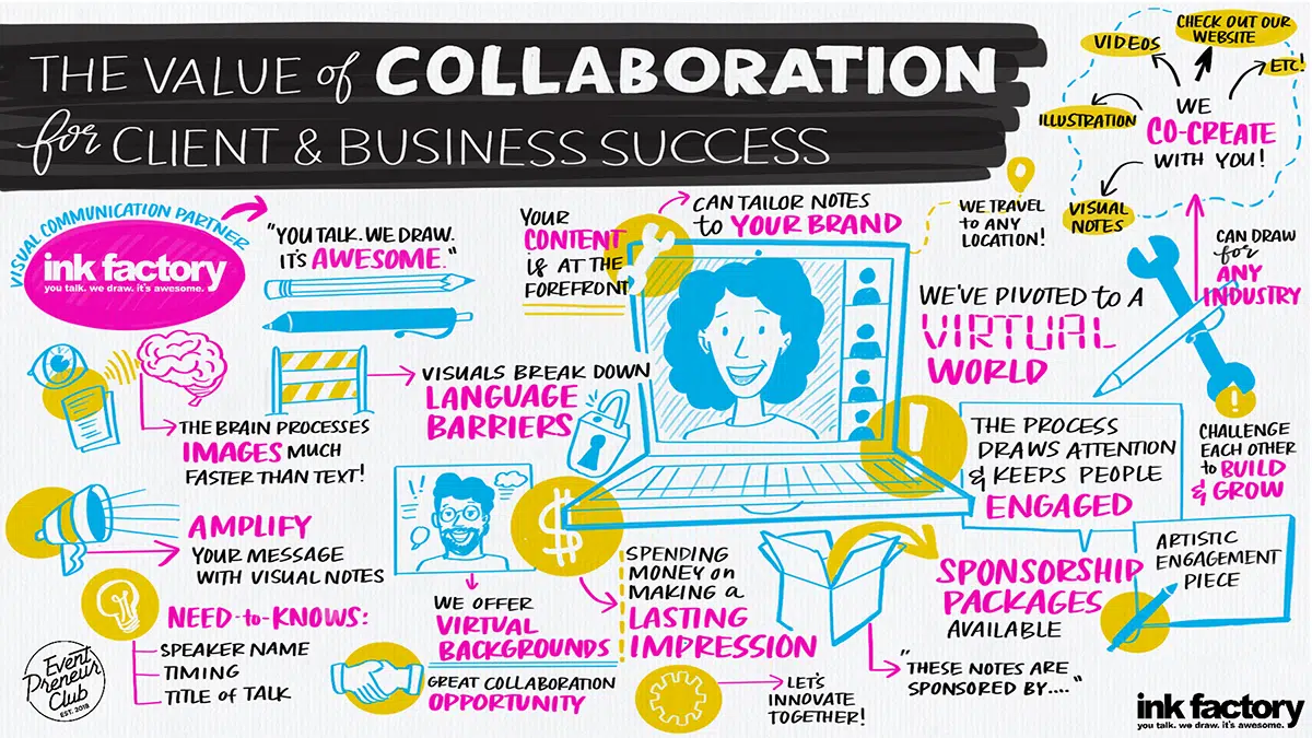
Digital Graphic Recording
If your presentation is happening during an online event, our artists can connect to your virtual platform and draw along live. Graphic recordings are a welcome dose of creative inspiration in the monotonous virtual work landscape.

Live Sketch Artists
Our artists work with markers, creating unique visual notes drawn live for the length of your presentation. Audiences and presenters alike love to see artists bring ideas to life by drawing.
Illustrations for Presentations
For a polished visual, our team can work with you to create an illustrated, building slide deck that pairs with your presentation.
Animated Presentation Videos
Incorporate a video explaining a new process or initiative into your presentation. Videos are the most engaging way to present your content.

What our clients are saying
“Our attendees were amazed at how well the artist visualized the messages from each presenter’s session.”
Kelley Shannon, Bozzuto

“Ink Factory interpreted our words and inked our vision. They walked 1,000 of my colleagues down a path of learning like it was nobody's business.”
Sean Manzanares, Autodesk
“The entire Ink Factory team is easy to work with when coordinating details and never fail to prepare and follow-through, making our event team very happy!” Susan Mooney Cusick, Chicago Theological Seminary
Why visuals are great for presentations
Impress Your Audience
Unlike typical slide decks, hand-drawn visuals grab attendees' attention and keep them interested throughout the duration of your presentation.
Clarify Your Content
Our artists listen and distill your presentation content down into its key concepts, illustrating them in a way that's quick and easy to understand.

Stay Memorable
Visual notes, illustrations, and videos are great for sharing with your audience after a presentation ends. Use your visuals for newsletters, social posts, and more.
you talk. we draw. it’s awesome.
Contact us to bring visual note-taking to your next event.
Get started
Privacy Overview
Necessary cookies are absolutely essential for the website to function properly. This category only includes cookies that ensures basic functionalities and security features of the website. These cookies do not store any personal information.
Any cookies that may not be particularly necessary for the website to function and is used specifically to collect user personal data via analytics, ads, other embedded contents are termed as non-necessary cookies. It is mandatory to procure user consent prior to running these cookies on your website.
How to use Google Slides, Google's free slideshow presentation maker
- Google Slides is Google's slideshow presentation program that allows real time collaboration.
- Google Slides is part of the Google Workspace suite, which also includes Google Docs and Gmail.
- Google Slides differs from Microsoft PowerPoint in its simplicity and collaboration options.
Google Slides is a presentation program that's part of Google Workspace, a group of productivity apps that also includes Gmail, Google Sheets, Goole Docs, Google Meet , and more. Workspace has more than 3 billion users worldwide.
With Google Slides, users can create, present, and collaborate via online presentations from various devices. You can present during Google Meet calls directly from Slides and embed charts from Google Sheets. You can also add YouTube videos to Slides presentations.
Google recently announced plans to add artificial intelligence features like its Gemini AI tool to its Workspace programs, which include Slides. Users will be able to use Gemini to create images or written content for slides, or even reference other files in their Drives or emails in their Gmail accounts.
What is Google Slides?
Google Slides is a cloud-based presentation program that's part of the Google Workspace. Google Slides can be used to create and deliver presentations online.
Several different themes are available in Slides for designing presentations. Users can customize Slides presentations in a variety of colors and styles. You can add photos, videos from YouTube, charts from Google Sheets , and information from many other sources. Different members of a team can contribute and collaborate on the presentation in real time.
There's no specific limit on how many slides you can add to your Google Slides presentation, but there is a 100 MB file size limit.
How to download Google Slides
To access Google Slides, visit slides.google.com .
Related stories
You can also open Slides while Gmail or Google Chrome is open by clicking on the Google Apps icon in the upper-right corner (shown as three rows of dots) and selecting Slides.
Another option is to download the Google Slides app for your Apple or Android device. Search for Google Slides in the Apple App Store or Google Play Store.
What templates are available?
Dozens of Google Slides templates are available, depending on your needs. For instance, there are general presentation templates, photography portfolios, pitch decks, case studies, science fair projects, and more.
To browse the templates available, open Google Slides. Then, click Template Gallery in the upper-right corner. Scroll through the options, choose the one that meets your needs, and start creating a presentation.
What's the difference between Google Slides and PowerPoint?
Both Google Slides and PowerPoint are presentation programs. Google Slides is a program within Google Workspace, and PowerPoint is a Microsoft program. PowerPoint is an offline program, while Slides is online which allows for real time collaboration.
The programs share many features that allow for presentation creation and delivery, but PowerPoint may offer more advanced design features.
You can convert Google Slides into PowerPoint presentations, and vice versa. From the top menu in Slides, click File, Download, and choose Microsoft PowerPoint.
How to learn to use Google Slides
Through Google Workspace, you can access several quick-start guides, cheat sheets, and troubleshooting resources to help you learn to use Google Slides. There are also many YouTube videos with tutorials for using Slides.
On February 28, Axel Springer, Business Insider's parent company, joined 31 other media groups and filed a $2.3 billion suit against Google in Dutch court, alleging losses suffered due to the company's advertising practices.
- Main content
👀 Turn any prompt into captivating visuals in seconds with our AI-powered design generator ✨ Try Piktochart AI!
- Piktochart Visual
- Video Editor
- AI Design Generator
- Infographic Maker
- Banner Maker
- Brochure Maker
- Diagram Maker
- Flowchart Maker
- Flyer Maker
- Graph Maker
- Invitation Maker
- Pitch Deck Creator
- Poster Maker
- Presentation Maker
- Report Maker
- Resume Maker
- Social Media Graphic Maker
- Timeline Maker
- Venn Diagram Maker
- Screen Recorder
- Social Media Video Maker
- Video Cropper
- Video to Text Converter
- Video Views Calculator
- AI Brochure Maker
- AI Document Generator
- AI Flyer Generator
- AI Image Generator
- AI Infographic
- AI Instagram Post Generator
- AI Newsletter Generator
- AI Quote Generator
- AI Report Generator
- AI Timeline Generator
- For Communications
- For Education
- For eLearning
- For Financial Services
- For Healthcare
- For Human Resources
- For Marketing
- For Nonprofits
- Brochure Templates
- Flyer Templates
- Infographic Templates
- Newsletter Templates
- Presentation Templates
- Resume Templates
- Business Infographics
- Business Proposals
- Education Templates
- Health Posters
- HR Templates
- Sales Presentations
- Community Template
- Explore all free templates on Piktochart
- Course: What is Visual Storytelling?
- The Business Storyteller Podcast
- User Stories
- Video Tutorials
- Need help? Check out our Help Center
- Earn money as a Piktochart Affiliate Partner
- Compare prices and features across Free, Pro, and Enterprise plans.
- For professionals and small teams looking for better brand management.
- For organizations seeking enterprise-grade onboarding, support, and SSO.
- Discounted plan for students, teachers, and education staff.
- Great causes deserve great pricing. Registered nonprofits pay less.
AI-Powered Poster Generator
With the Piktochart AI poster generator, you can turn any prompt into a gorgeous poster in seconds. No design skills? No problem. Just tweak it as you wish, then share your poster.
The new way of creating posters
Create in a Flash
Prompt to poster in 10 seconds
Say goodbye to complicated design steps. Simply type in your theme and watch as our AI poster maker transforms it into reality.
AI Image Generation
Bring your vision to life
Go stock photos and generate images that are contextualized to your needs with our advanced AI image generator. Put your creativity to the test and generate highly realistic images that make you stand out.

Create Without Limits
Where every idea finds its canvas
For events, marketing, learning, or personal creations, Piktochart AI delivers captivating poster designs for every need. Dive into a universe of impressive imagery tailored to suit any subject.

Create Your Vision
Piktochart starts, you put the finishing touches
Our AI sets the stage with a professionally crafted poster, then passes control to you, allowing you to modify and refine each detail to amplify your visual impact while keeping true to your brand.
Posters created using Piktochart’s AI-powered poster maker

Professionals like you use Piktochart’s free online poster maker to:

- Create eye-catching promotional materials that align with brand identity, ideal for advertising campaigns, product launches, and trade shows.
- Design captivating posters for corporate events, webinars, and conferences.
- Communicate new offers, services, or store openings.

HR & Internal Comms
- Internal announcements, motivational quotes, or event notifications.
- Job advertisements and onboarding materials to attract and welcome new employees.
- Convey important company policies and reminders through clear, engaging posters, ensuring better compliance and awareness.

NGOs and Government Organizations
- Develop impactful posters for awareness drives, fundraising events, and community outreach programs.
- Attract volunteers, highlighting the roles, benefits, and the difference they can make.
- Announce charity events, workshops, and seminars.

- Create informative posters on health topics, wellness tips, and medical advisories.
- Showcase healthcare services, specialist departments, and new medical technologies available at healthcare facilities.
- Display important health and safety protocols within healthcare settings.
How to Make a Digital Poster
1. Define Your Story
Briefly describe (within 120 characters) the purpose behind your poster. Whether it’s for promotion, making an announcement, driving awareness, or sharing health information.
2. Select from Our Varied Poster Designs
Jumpstart your project with our array of ready-to-use poster templates, perfect for shining a spotlight on any subject. After picking your preferred design, you’ll find yourself in our editing suite.
3. Tweak the Design with Piktochart Editor
With your template chosen, hitting the “Edit” button grants you entry into the Piktochart editor. This is your playground to adjust, alter, and align the design to reflect your personal touch and message.
4. Enhance with Visual Elements
Piktochart’s user-friendly drag-and-drop editor makes personalization a breeze. Tap into our rich collection of complimentary photos, icons, illustrations, and text options to craft a poster that stands out. Enhancing and tailoring colors is just a click away with our versatile design tool.
5. Publish and Promote
Once your poster is exactly as you envisioned, it’s time to save and share your work. Export in various formats like JPG, PNG, or PDF, catering to both digital platforms and print materials.
AI-Powered Visualization for Any Topic
What kinds of posters can be generated using this AI tool?
Navigating design elements and finding the right visual style can be daunting. With Piktochart AI, it’s easy to transform data into high-quality posters . Excellence made simple, just for you.
Event posters
Drum up buzz and awareness for an upcoming event. Piktochart AI transform dense data and information into engaging invitational posters for your events.
Advertising posters
Spark emotions that incite action – whether it is to make a purchase, improve brand opinion, donate to a cause, or make a lifestyle change. With Piktochart AI, it’s achievable at the click of a button.
Conference posters
Inform your audience with a glance about an upcoming conference. Whether it’s for a medical conference, marketing conference, or any conferences, Piktochart AI’s user-friendly poster maker helps you catch the attention of your audience effortlessly.
Ready to use AI to design posters like a pro?
Join more than 11 million people who already use Piktochart to create stunning posters.
Is it possible to personalize my poster with my own photos and diagrams?
What’s the limit on poster creation, how do i enhance the quality of my posters, is signing up mandatory to use piktochart, poster resources.

How to Make a Poster in 6 Easy Steps [2023 Guide With Templates]

25 Poster Ideas, Templates, and Tips for Creative Inspiration

Communications
7 Types of Posters and What Makes Them Stand Out
What else can you create with piktochart ai.
IMAGES
VIDEO
COMMENTS
Presentation drawing, also known as a rendering, is a crucial aspect of the design process. It's a means of visually communicating ideas to clients, colleagues, and contractors. Presentation drawings can take many forms, from quick sketches to highly detailed, realistic illustrations. Regardless of the format, the goal of presentation drawing ...
Presentation drawing in architecture is a creative visual form of communication used to convey information about buildings, structures, and other aspects of the built environment. It is an important part of the architect's skill set and allows them to effectively communicate their ideas. Presentation drawing is used to demonstrate a building ...
Presentation drawings are one of the most important tools available to an architect, and they can have a huge impact on the success of a project. From allowing the client to get a better understanding of the project to helping to identify potential problems in the construction process, presentation drawings can make a huge difference in the ...
Presentation Drawings. Presentation drawings are used to communicate the final design to clients, stakeholders, and the public. These can be rendered in various mediums and styles, from traditional watercolor to sophisticated digital 3D models, and are designed to convey the aesthetic and functional aspects of the project compellingly. ...
Produce architectural digital presentation drawings that effectively communicate the depth or 3rd dimension of an object, as well as material finishes and textures. Architectural Presentation & Rendering Techniques and Methods. Master shading, stippling, cross-hatching, and other methods to enhance object form and project impressions. ...
Architecture presentation boards are a tool to showcase your work. They are a way to draw your viewers into your design process and methods, providing an overall summary and vision for the project. You are communicating your design and showcasing your artistic skills, and your sense as a designer. Every successful project has a central concept ...
For presentation plan drawings the necessary annotations are minimal. They include section tags, drawing titles, north arrows and scale notations. The sizes noted below are recommendations for 1/8" scale plans. If you are printing to a different scale, it is recommended that you adjust the sizes of the graphics.
Winning a project bid requires architectural presentation drawings that demonstrate to the potential client the merits of the structure's design concept and is a direct indication of an architectural firm's skill in creativity and technical ability. Poorly drafted presentation drawings can result in losing great projects to other firms. We offer four different avenues to presenting your ...
General Tips. 7) Minimize text on your presentation board. Write a short and concise concept statement and add a very brief explanation, if needed. Don't waste your time composing elongated descriptive text because no one will read it. 8) Replace words, whenever possible, with simple illustrative sketches and figures.
The single line drawing presentation styles is used extensively these days, where the presentation appears to be more an info-graphic than an architectural drawing. This style is used mostly when the 3D view expresses the major portion of the design and the elevation and section drawings are merely present for further understanding. Often ...
Presentation drawings are a very important part of public hearings and design reviews as a structure is studied by government and private agencies to determine its impact on the community. In residential architecture, presentation drawings are frequently used to show compliance with review board standards and to help advertise existing stock ...
Use the "Pen" to draw free-hand. Click the pen icon on the left side of the toolbar to choose this tool, which lets you make basic line drawings. You can use your touchscreen, touchpad, digital tablet, or mouse to draw with any of these tools. 5. Use the "Highlighter" to draw transparent lines.
Presentation drawings were finished, non-utilitarian works of art, as opposed to preparatory drawings for a work in another medium. The earliest known presentation drawings dating from the Italian Renaissance are two drawings of the 1420s by Lorenzo Monaco. From: presentation drawing in The Concise Oxford Dictionary of Art Terms ».
6. Use diverse line styles and weights. A drawing, like architecture itself, often begins with single lines. Line can define, outline, highlight and capture attention. A diversity of line styles and weights allows you to distinguish depth and emphasize different parts of a drawing.
1. Drawing Improves Memory and Recall. Drawing engages both the visual and motor cortex of the brain, which enhances memory retention. When you draw during a presentation, you create a visual memory for yourself and your audience, making the information more memorable.
Turn on the pen and draw in Slide Show. On the Slide Show tab, ensure that Use Presenter View is turned on. On the Slide Show tab, click either From Beginning or From Current Slide to start your slide show. In Presenter view, some helper buttons appear at the lower left corner of your slide. The one that looks like a pen determines how the ...
Emphasize key points with text and images. Label your slides to prompt your memory. 1. Include less text and more visuals in your presentation design. According to David Paradi's annual presentation survey, the 3 things that annoy audiences most about presentations are: Speakers reading their slides.
Plan, Section, and Elevation are different types of drawings used by architects to graphically represent a building design and construction. A plan drawing is a drawing on a horizontal plane showing a view from above. An Elevation drawing is drawn on a vertical plane showing a vertical depiction. A section drawing is also a vertical depiction ...
Presentation drawing - Presentation drawings is prepared as a part of proposals, for exhibitions, or even for publications. This type of drawing includes any kind of drawings. Process flow diagram - A PFD is a type of flow-chart which demonstrates the relationships between major components of a plant unit. It is very frequently used in ...
This clarifies the overall purpose of your talk and reinforces your reason for being there. Follow these steps: Signal that it's nearly the end of your presentation, for example, "As we wrap up/as we wind down the talk…". Restate the topic and purpose of your presentation - "In this speech I wanted to compare…". 5.
Presentation drawing in architecture is the production of a drawing for the purpose of gaining support, such as at a presentation of an architectural...
Learn how to doodle at IQ Doodle School: https://school.iqdoodle.com/Step 1: How would you draw a presentation? Is there an easy way to represent this? Well,...
Live drawings for presentations. Are you working hard on a project, pitch, or proposal to make sure your ideas are presented at their fullest potential? Hand-drawn visuals are the best way to grab your audience's attention and keep them focused on your content. Watching the drawings come to life in real-time is a proven way to make your ...
Use clear and legible fonts, and maintain a consistent design throughout the presentation. 2. Visual appeal: Incorporate visually appealing elements such as relevant images, charts, graphs, or diagrams. Use high-quality visuals that enhance understanding and make the content more engaging.
To browse the templates available, open Google Slides. Then, click Template Gallery in the upper-right corner. Scroll through the options, choose the one that meets your needs, and start creating ...
4. Enhance with Visual Elements. Piktochart's user-friendly drag-and-drop editor makes personalization a breeze. Tap into our rich collection of complimentary photos, icons, illustrations, and text options to craft a poster that stands out. Enhancing and tailoring colors is just a click away with our versatile design tool. 5.